Directed Sentence Drawings
By: Jeff Clark Date: Thu, 01 May 2008
In my post earlier today about Sentence Drawings I mentioned that the overall shape of the graphic doesn't really express anything useful. I have come up with a variation on the idea that tries to address this.
In the sentence drawings produced by Stephanie Posavec or David Sparks each line segment is turned 90 degrees to the right relative to the previous one. This makes the overall shape highly sensitive to minor variations in the text which is why the overall shape doesn't carry much meaning - it's almost random.
I call my diagrams Directed Sentence Drawings because the direction of the line segments are a function of their topic. As before, each sentence is assigned a topic or remains neutral based on the vocabulary it contains. I place a neutral point in the middle of the diagram and four other topic points form a diamond shape around it (see below). For the State of the Union diagrams produced below I used the four topics Government, Domestic, Economy, and Security. The algorithm is as follows:
- start at the neutral point
- find the topic for the sentence and use it to set the color for the line
- draw the line from the current position towards the topic that it is about
- the length of the line is proportional to the length of the sentence
- if the line is continuing in the same direction as the last segment, draw a small circle at the starting point
- if the line is reversing direction, use a small arc to shift it over so it doesn't overlay the previous segment
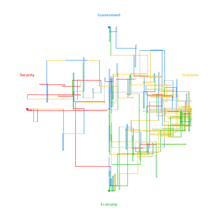
The diagram immediately below is constructed from the State of the Union Address for the year 2000. It shows there were many sentences about both Domestic and Economic issues, a fair number concerning Government and fewer about Security. The dominant colours give this away but also the overall shape makes it obvious. There is a greater density of lines near the Domestic and Economic topic nodes.
Directed Sentence Drawing for SOTU 2000
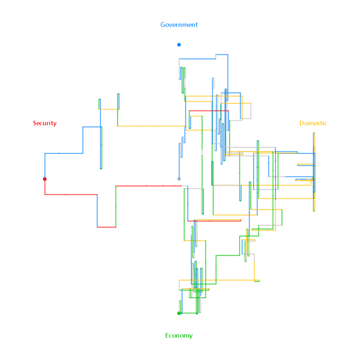
This next diagram is for the SOTU of 2001, the first delivered by George W. Bush. It's obvious that it was much shorter, had even less discussion of Security issues than Clinton's in 2000, and also not much sustained discussion about Domestic issues.
Directed Sentence Drawing for SOTU 2001
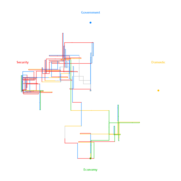
The SOTU for 2002 was delivered after 9/11 and clearly shows that Security has become the predominant concern.
Directed Sentence Drawing for SOTU 2002
This last diagram is for the SOTU of 2008 and shows that Security is still very topical but that Economic and Governmental issues are starting to recapture attention.
Directed Sentence Drawing for SOTU 2008
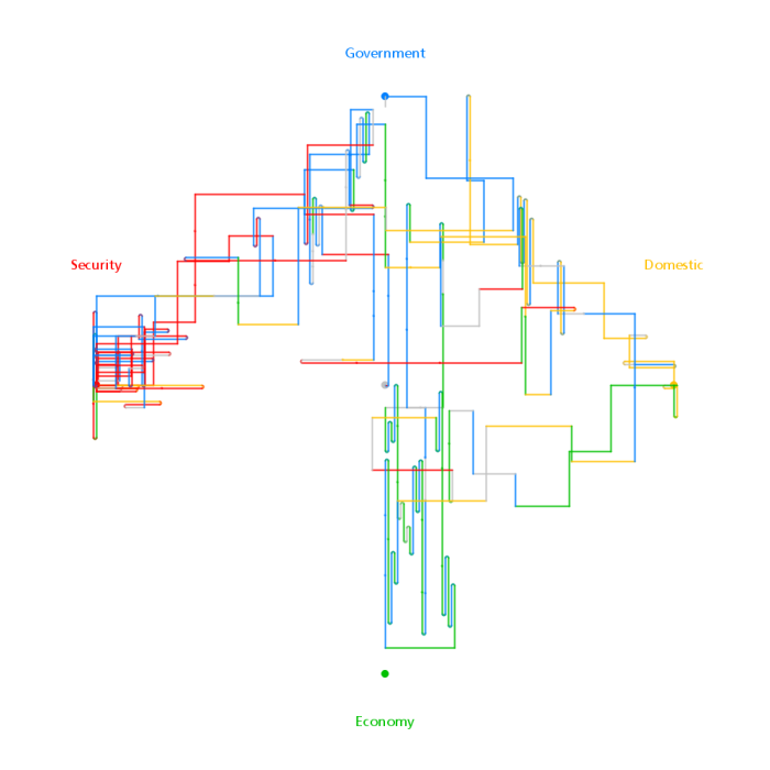
One interesting property of these diagrams that emerged from the algorithm used to create them is that it is possible to figure out which direction each line segment was drawn. This gives a direction to the flow of the line. For example, in the 2008 diagram above, just on top of the neutral (middle) point there is a stretch of horizontal red line. This segment must be drawn from the right towards the left since that is where the red (Security) topic node is. So, despite the fact that the number of overlapping segments and the lack of starting point and ending point markers make it confusing to follow the trace it is possible to see the direction locally.
Directed Sentence Drawings are also more compact on average compared to the 'always turn right' diagrams that inspired the idea. This is because there are attractors that serve to pull the line trace back towards the middle.
There are obviously clearer ways to illustrate which topics are emphasised in a text. These diagrams, in particular, make it extremely difficult to see when the topics were discussed. A simple bar for each sentence in the order they occurred in the text and coloured by topic would be much better in most respects.