Neoformix is a company that provides services in the creation of custom data visualizations and generative design.
We are currently available for new projects so contact us through Email or Twitter if you are interested. Neoformix is based in Toronto but our clients are world-wide.
Selected projects are shown on this page or have a look at the Blog to see the latest updates.
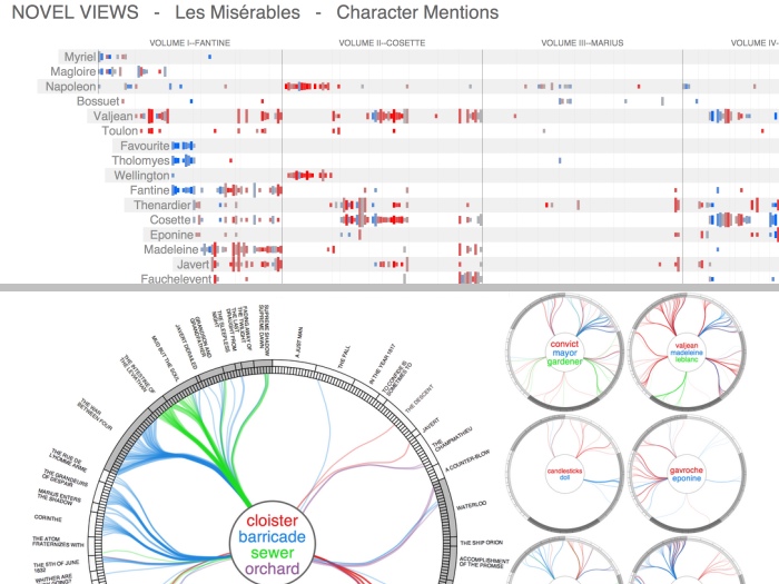
Novel Views
Novel Views is a project that consists of a series of visualizations of the novel Les Misérables by Victor Hugo. Details...
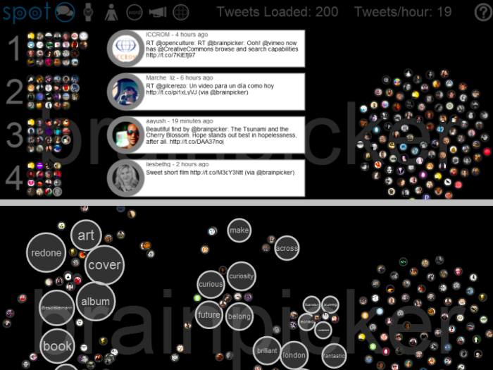
Spot
Spot is an interactive real-time Twitter visualization that uses a particle metaphor to represent tweets. The tweet particles are called spots and get organized in various configurations to illustrate information about the topic of interest. Details...
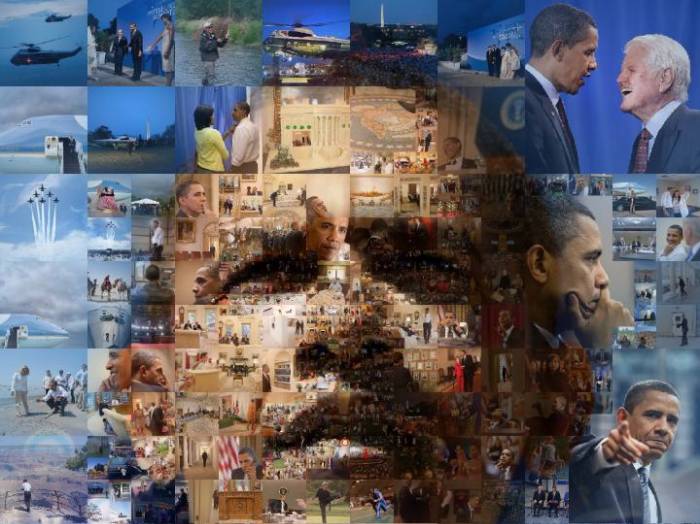
Multiscale Mosaics
Multiscale Mosaics are a variation on the photomosaic technique which can produce images that carry meaning at multiple visual scales. Details...
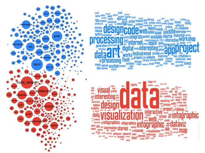
The Data Visualization Field on Twitter
A detailed analysis of 1000 Twitter users active in the field of data visualization was completed and several visualizations were produced that illustrate the subgroups within the field. Details...
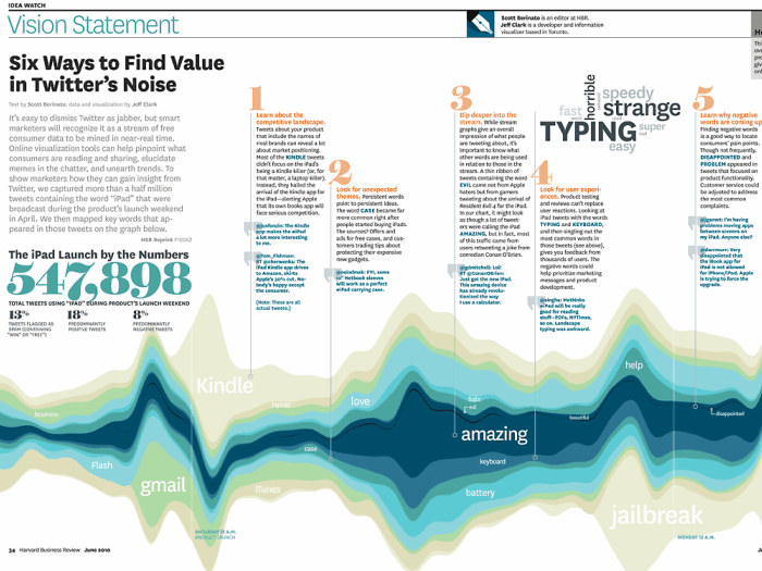
Six Ways to Find Value in Twitter's Noise
Appearing in the June 2010 Issue of the Harvard Business Review this is a Streamgraph visualization showing tweets about the iPad during the launch weekend. Details...

Word Portraits
Word Portraits are images that are reconstructed using words in various sizes and colors. Details...
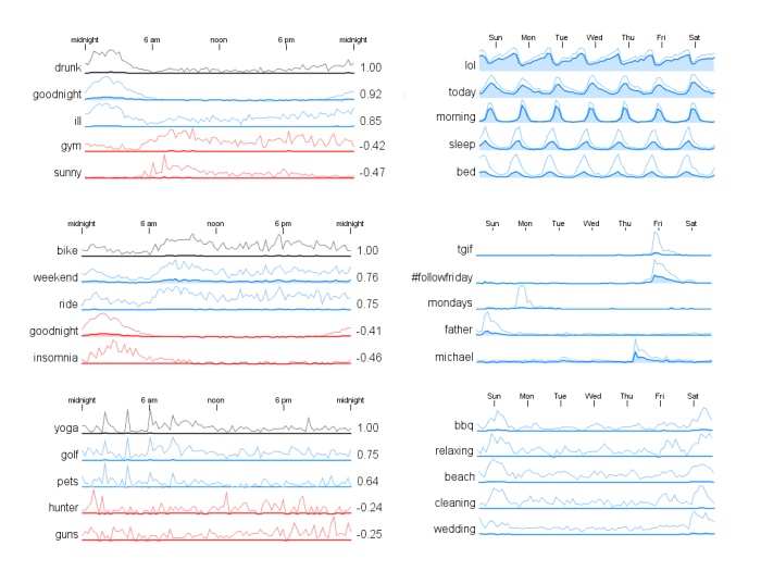
Temporal Correlation for Words in Tweets
Patterns in the time-of-day usage for the words from a large collection of tweets are illustrated. It includes both positive and negative correlation relationships between words. Details...
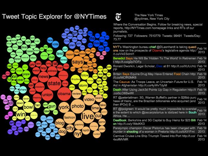
Tweet Topic Explorer
This is an online interactive tool for showing the topics a person tweets about most often. It uses word cluster diagrams to show word frequency and groups of related words. Details...
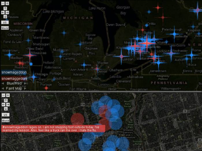
Exploring Tweets over Time and Space
This project is an online interactive tool for exploring a collection of tweets both geographically and at specific points in time. Details...
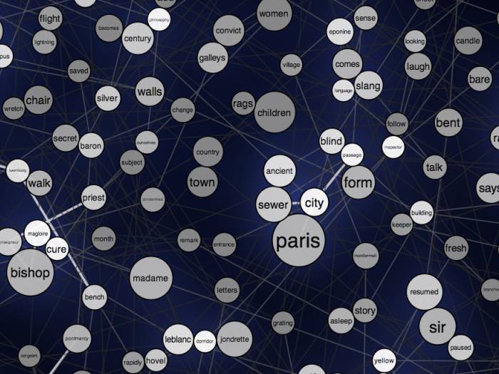
Les Misérables Word Graph
This is a word graph for the text of the novel Les Misérables by Victor Hugo. Size reflects frequency and words are positioned near each other if they are often used together in the text. Details...