Neoformix Blog
Random Racer
By: Jeff Clark Date: Mon, 09 May 2022
I've noticed over the last little while that sometimes people use random number pickers to help them make decisions where they want even odds. There are many 'picker wheel' type random selectors available on the web that people use or some are very simple 'pick a number between 1 and N'. I think it is fairly common for teachers to use these as a fair way to choose a student for some task.
It occurred to me that we could make the process much more fun by spreading out the decision over time. I built a little tool that does a simulated race among the choices where each choice has an equal chance of winning. Emoji's are assigned randomly and there are also a few different race strategies to make the results more interesting. Here is an example run:
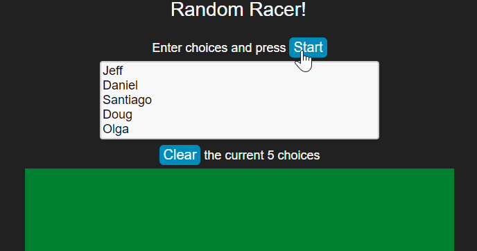
After the race is complete you can scroll down to get the complete finishing order. This is useful if you want to give prizes for 2nd place and 3rd place for example. It can also be used to pick some subset group - choose the top 5 finishers for some task.
The movie below shows an example with 100 random runners. There is obvious overlap but towards the end of the race the names of the leading contenders are legible.
(More...)
FaceFun
By: Jeff Clark Date: Mon, 02 May 2022
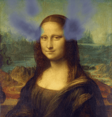
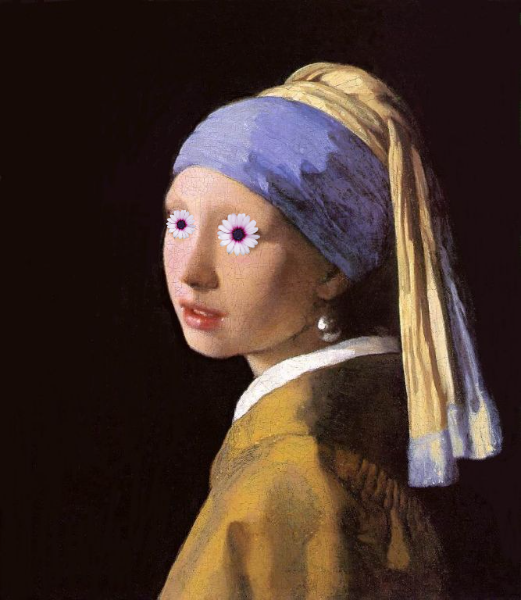
Over the last couple of weeks I've been playing with face detection and building fun animations or interesting images on top of an input photo. There are currently three different animated effects that build Gifs and six overlay static effects. Here are some examples of the effects.
Animated Fly:
Ear Smoke:
Eye Spin:

Bunny Mask:

Dog Mask:

Cat Mask:

Mouth Eyes:
Eye Flowers:
You can upload any image and try it at Face Fun.
Tileable Animations
By: Jeff Clark Date: Thu, 21 Apr 2022
I have been playing with Gif animations lately and it occurred to me that it is possible to build animation tiles that when placed together build a larger more complex animation. An example of one such tile is shown below.

If you place these tiles beside each other they fit together nicely with some dots flowing smoothly from one to a neighboring tile.
Provided you keep the boundary conditions the same you can design an infinite number of animated tiles that fit together perfectly. Here is an example with a random collection of tiles that show more varied motion.

This particular set of tiles have too many that are regular and reveal the center. This makes the compound result look more like a grid. Overall, it's an interesting idea I will likely explore further.
Crazy Phrase
By: Jeff Clark Date: Fri, 25 Mar 2022
It's no secret that Wordle has taken the world by storm in early 2022. It's reportedly been played by millions of people and many of them share their results with friends every day. The game has an elegant simplicity that I find very appealing. I also love the idea of everyone in the world working on the same daily puzzle. It's a lovely example of how a simple digital task can, in some small limited way, build connection and community.
It was evident from the beginning that the simplicity of the game makes it a great starting point for variations. There has been an explosion of games based on the core idea. Here is a list of 67 Games Like Wordle to Play.
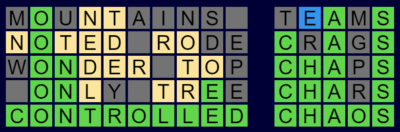
I have built one more to throw into the mix. It's called Crazy Phrase and it is available now to play for free. Anyone who has played the original Wordle will find the rules very familiar. Basically, you guess a phrase instead of a single 5 letter word, and there is a new clue color - blue means the letter is present in a different word. Here is a simple example below.
The main difficulty in Wordle is trying to think of words that give you as much information as possible. In Crazy Phrase the words can be very long and for myself, and I suspect many other people, it is very hard to think of long words with specific letters in particular locations. To combat this I chose to relax the requirement that every letter slot needs to be filled. You can leave slots blank and use 2 or more words to fill a one word field. You just need to leave at least one space between words as you would expect. Here is an example of what I mean:
Thank you to Josh Wardle for creating the original game. Thank you also to Jason Davies for creating this implementation of Bloom filters which I used to efficiently do checking of valid words. Thanks also to my family members who have been trying it out for me and Doug Peterson for early use and promotion.
If you enjoy word games then please give Crazy Phrase a try!
GifBuilder
By: Jeff Clark Date: Tue, 22 Feb 2022
I spent some time building a simple online Gif Builder tool. You can enter multiple lines of text (including emojis), customize foreground and background colors, choose one of five animation styles, and press a button to create an animated Gif all in the browser.
Here are a few sample outputs. Give it a try!


Genuary 2022
By: Jeff Clark Date: Tue, 01 Feb 2022
I finished all 31 prompts for Genuary 2022. Thanks to all the organizers and all the wonderful code artists who participated. Thanks also to all the people building powerful tools to make this kind of work more accessible to all. I tried to stick with vanilla javascript as much as possible but did use the amazing three.js, and chroma.js in many of the compositions.
Here is a quick peek at most of the work I produced this month. You can page through each one individually starting here


Genuary 31: Negative Space
By: Jeff Clark Date: Sun, 30 Jan 2022
The prompt for Genuary 31 is 'Negative Space'. I used three.js again and designed a two-faced circle packed arrangement. The animation rotates around 90 degrees to show both faces.
Genuary 30: Organic output with Rectangles
By: Jeff Clark Date: Sun, 30 Jan 2022
The prompt for Genuary 30 is 'Organic looking output using only rectangular shapes'. I made some plant-like shapes from rectangles.
Genuary 29: Isometric
By: Jeff Clark Date: Sat, 29 Jan 2022
The prompt for Genuary 29 is 'Isometric'. I built some scenes in three.js exploring shapes, lighting, and shadow,
Genuary 28: Self Portrait
By: Jeff Clark Date: Fri, 28 Jan 2022
The prompt for Genuary 28 is 'Self Portrait'. I reworked my plant-growing code to grow around an image of my face.
Genuary 27: Fixed Palette
By: Jeff Clark Date: Thu, 27 Jan 2022
The prompt for Genuary 27 is a set of specific colors:
#2E294E #541388 #F1E9DA #FFD400 #D90368
I reused bits and pieces of previous work to create this 3D perspective design.
Genuary 26: Airport Carpets
By: Jeff Clark Date: Thu, 27 Jan 2022
The prompt for Genuary 26 is 'Airport Carpets'. I created a system to make tileable designs from overlapping circles and random color palettes.
Genuary 25: Perspective
By: Jeff Clark Date: Tue, 25 Jan 2022
The prompt for Genuary 25 is 'Perspective'. I created a scene with about 2200 colored spheres that when viewed from the proper perspective show an image. This was my first project with the wonderful three.js and I have a lot to learn.
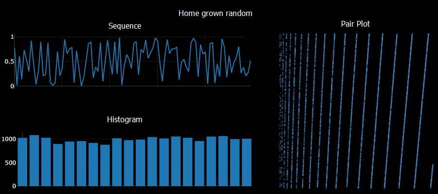
Genuary 24: Create your own pseudo-random number generator
By: Jeff Clark Date: Mon, 24 Jan 2022
The prompt for Genuary 24 is 'Create your own pseudo-random number generator and visually check the results'. I tried a system like:
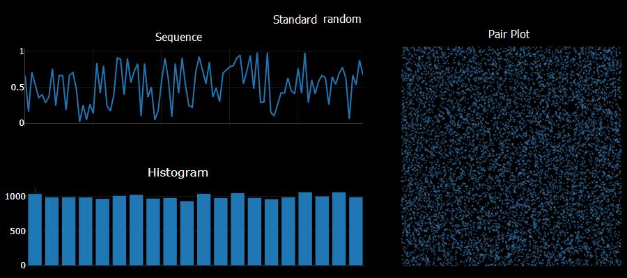
	a = Math.sqrt(Math.abs(seed*Math.E))*11
	seed = (a - Math.floor(a))
Checking sequential generated numbers there are no obvious patterns. Checking the histogram of 10,000 values yields a pretty uniform result. Unfortunately taking pairs of numbers generated sequentially and plotting them shows obvious patterns - a sure sign of a poor quality result. I did try using a larger constant multiple - say 1234 instead of the 11 used above and saw no obvious 2D patterns in that case.
The standard javascript Math.random did very well in comparison on these simple tests.
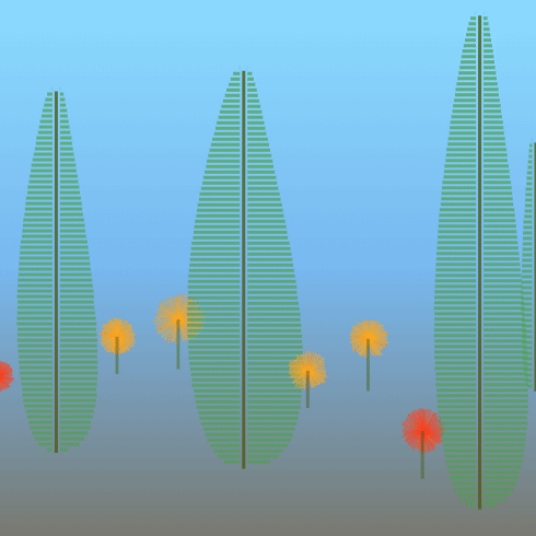
Genuary 23: Abstract vegetation
By: Jeff Clark Date: Sun, 23 Jan 2022
The prompt for Genuary 23 is 'Abstract vegetation'. I built a simple plant growing system. Plants grow towards the light and avoid obstacles by weaving around them.
Genuary 22: Something that will look different in a year
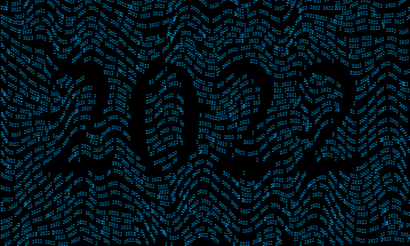
By: Jeff Clark Date: Sun, 23 Jan 2022
The prompt for Genuary 22 is 'something that will look completely different in a year'. Text reading '2022' along flow lines that are broken by a large version of the text. There are still problems with text collision but I'm moving forward to the next day.
Genuary 21: Combine two or more
By: Jeff Clark Date: Fri, 21 Jan 2022
The prompt for Genuary 21 is 'Combine two (or more) of your previous pieces'. This uses the sunset generator but replaces the sun with the Penrose triangle. The final image is dithered to 6 colors using the Atkinson dithering algorithm.
Genuary 20: Sea of shapes
By: Jeff Clark Date: Thu, 20 Jan 2022
The prompt for Genuary 20 is 'Sea of shapes'. I made a generator that uses shapes and textures to make images of a sunset on the sea. I can think of lots of ways to improve it but it shows some promise.
Genuary 19: Text/Typography
By: Jeff Clark Date: Wed, 19 Jan 2022
The prompt for Genuary 19 is 'Text/Typography'. I revisted my single-curve drawing code to draw out the word 'Scribble'. I used a nearest-neighbour approach to connecting points. It's not as good as the simulated annealing approach I used last time but it is much quicker.
Genuary 18: VHS
By: Jeff Clark Date: Tue, 18 Jan 2022
The prompt for Genuary 18 is 'VHS'. I added a few different types of visual noise reminiscent of the artifacts you see when playing old VHS tapes.
Genuary 17: 3 colors
By: Jeff Clark Date: Mon, 17 Jan 2022
The prompt for Genuary 17 is '3 colors'. I figured out how to do Atkinson dithering for color images and applied to these two images. Each uses 3 hand-picked colors plus black.
Genuary 16: Color gradients gone wrong
By: Jeff Clark Date: Sun, 16 Jan 2022
The prompt for Genuary 16 is 'Color gradients gone wrong'. I used the excellent chroma.js for some color functions and produced 1 nice gradient with 7 variations on 'wrong'.
Genuary 15: Sand
By: Jeff Clark Date: Sat, 15 Jan 2022
The prompt for Genuary 15 is 'sand'. I used the wonderful p5.js and started from the code here. Thanks! I added algorithmic placement and coloring using noise and trig functions. I also added some randomness to the falling state for more variation. I would like to revisit this idea in the future.
Genuary 14: Something you'd never make
By: Jeff Clark Date: Fri, 14 Jan 2022
The prompt for Genuary 14 is 'Something you'd never make'. I made a simple animation based on the well-known impossible figure usually called the Penrose Triangle.
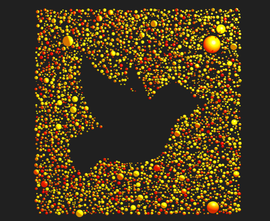
Genuary 13: 800x80
By: Jeff Clark Date: Thu, 13 Jan 2022
The prompt for Genuary 13 is '800x80'. There are 800 balls that come together to make 80.
Genuary 12: Packing
By: Jeff Clark Date: Wed, 12 Jan 2022
The prompt for Genuary 12 is 'Packing (squares, circles, any shape…)'. I went back to my rose image. Circle sizes vary approximately with color variation so that more interesting areas of the image have more detail.
Genuary 11: No computer
By: Jeff Clark Date: Tue, 11 Jan 2022
The prompt for Genuary 11 is 'No computer'. I took out some colored pencils I haven't used in at least a decade and hand-colored one of my Loopy Doopy images created for prompt 7.
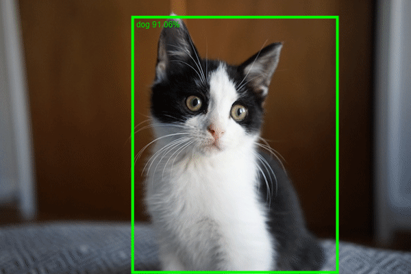
Genuary 10: Machine Learning, wrong answers only
By: Jeff Clark Date: Tue, 11 Jan 2022
The prompt for Genuary 10 is 'Machine Learning, wrong answers only'. I built a state-of-the-art dogtector. It finds the dog in a picture and draws a bounding box around it and labels with a confidence score. This was based on this example from ml5js.org
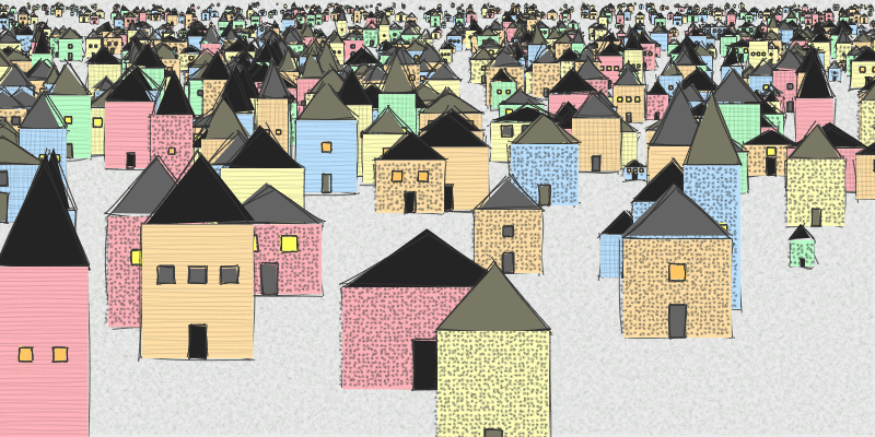
Genuary 9: Architecture
By: Jeff Clark Date: Tue, 11 Jan 2022
The prompt for Genuary 9 is 'Architecture'. I created a system to generate a collection of simple rough buildings. I finally had a chance to play with Rough.js which supports creating graphics with a hand-drawn, sketchy appearance.
Genuary 8: Single curve only
By: Jeff Clark Date: Mon, 10 Jan 2022
The prompt for Genuary 8 is 'Single curve only'. I generated a single color-varying curve that sketches out an image of a rose.Thanks to this Voronoi tessellation code, this code for drawing smooth curves, and this code for solving traveling salesman problems.
Genuary 7: Sol LeWitt Wall Drawing
By: Jeff Clark Date: Sat, 08 Jan 2022
The prompt for Genuary 7 is 'Sol LeWitt Wall Drawing'. I was inspired by Wall Drawing #879, Loopy Doopy design. I would like to improve the fluidity of the curves when I get back to this in the future.
Genuary 6: Trade styles with a friend
By: Jeff Clark Date: Sat, 08 Jan 2022
The prompt for Genuary 6 is 'Trade styles with a friend'. He's not a friend but I do really like the stained glass designs of Frank Lloyd Wright. I built a system that creates variations on his Hollyhock Flower design. I got the main ideas across but it would take more time than I have now to create more intricate and varied designs.
Genuary 5: Destroy a Square
By: Jeff Clark Date: Sat, 08 Jan 2022
The prompt for Genuary 5 is 'Destroy a Square'. I extended the work on flowfields to fit this theme.
Genuary 4: Fidenza Inspired
By: Jeff Clark Date: Thu, 06 Jan 2022
The prompt for Genuary 4 is 'the next next Fidenza'. Fidenza is a beautiful generative artwork by Tyler Hobbs. There is obviously a lot more to explore in this area than what I accomplished today.
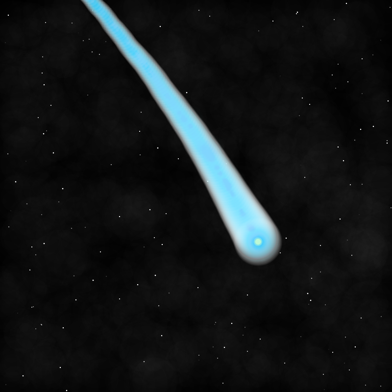
Genuary 3: Space
By: Jeff Clark Date: Wed, 05 Jan 2022
The prompt for Genuary 3 is 'Space' - I was inspired by this image of comet Leonard.
Genuary 2: Dithering
By: Jeff Clark Date: Tue, 04 Jan 2022
The prompt for Genuary 2 is dithering - represent an image with black and white pixels only. I used the Atkinson dithering algorithm as implemented here.
Genuary 1: 10000 Circles
By: Jeff Clark Date: Mon, 03 Jan 2022
I have decided to have some fun and join the Genuary 2022 generative art project. I started a bit late so here is my first entry. The prompt was 'draw 10,000 of something' - I've used 10,000 circles of various colors and sizes placed based on a photo of a rose.
Canada Covid Vaccine Rates
By: Jeff Clark Date: Mon, 20 Dec 2021
So far Canada has had a strong vaccine campaign compared to the other countries in the G10.
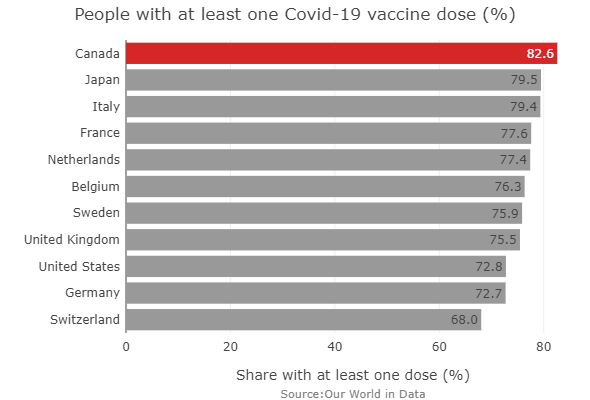
Source:Our World in Data
Canada Covid Deaths Compared
By: Jeff Clark Date: Sat, 18 Dec 2021
Covid-19 has been a long exhausting disaster around the world and Canada is no exception. One obvious measure of the severity is how many people have died compared to the total population. It's interesting to see how Canada has faired relative to the other countries in the G10.

Our World in Data
By: Jeff Clark Date: Sun, 08 Dec 2019
One of my favourite sites on the web is Our World in Data. Their stated goal is to use research and data to make progress against the world’s largest problems. It's obviously an important goal and they have done an excellent job of showing the state of the world and how it has changed over time. From their About page:
It is possible to change the world
To work towards a better future, we need to understand how and why the world has changed in the past. There are two reasons for this:
It shows us that progress is possible. The historical data and research shows that it is possible to change the world. In many important ways global living conditions have improved. While we believe this is one of the most important facts to know about the world we live in, it is one that is known by surprisingly few. Many believe that the world is stagnating or getting worse in aspects where the opposite is true.
The second reason is that it allows us to learn. Progress is possible, but it is not a given. If we want to know how to reduce suffering and tackle the world’s problems we should learn from what was and was not successful in the past.
Here is an example chart from the site with sources clearly provided, options to view as a chart, map, or table and ability to focus on particular countries of interest. You can download the data or embed in your own site as I have done here. It's an excellent resource and I encourage you to take a look!
SciArt Tweet Storm
By: Jeff Clark Date: Sun, 03 Mar 2019
Right now the SciArt Tweet Storm is happening on twitter. The idea is to advance the presence of images in science communication and culture and was started in 2015 by the Symbiartic team at Scientific American. I have embedded a few of my favourite images below.
The #sciart Tweet Storm week has returned! I'm starting with these 3 plates of #paleoart I did in 2017-2018 featuring often overlooked prehistoric creatures. #fossilfriday pic.twitter.com/klruwfaouu
— franz-anthony.pdf (@franzanth) March 1, 2019
More fish for the #SciArt tweet storm! I paint a lot of fish. These were for research on marine fish diversification. pic.twitter.com/Hw6StdEVdO
— Life Science Studios (@jehimes) March 2, 2019
My first contribution to this year’s #SciArt tweet storm are these colorful little retina cells that I recently completed! pic.twitter.com/ula7A7Vrjl
— Meredith Hoffman (@hoffmanvisuals) March 1, 2019
The #sciart #TweetStorm week has returned!! Here a collection of beetles I illustrated, one of my favourite subjects. #longhornbeetle #woodland #bugs #illustration #drawing #art #beetles #insectart #insects #Entomology pic.twitter.com/M9PWhTLFxN
— Claudia Hahn (@Claudia_Hahn) March 2, 2019
Continuing the #SciArt tweet storm with this digital illustration of a Rusty-patched #bumblebee on New England Aster.
— Emily S. Damstra (@EmilyDamstra) March 1, 2019
See more of my work: https://t.co/LSnDHi4qTT#insectart pic.twitter.com/YmiIajO2fM
Happy #WorldWildifeDay! For the past decade, I've been doing my best to help save frogs from extinction. You can help support my work by purchasing artwork from https://t.co/q7DbqXx4Xa or from https://t.co/fgnXzar8rJ #WWD2019 #ConservationOptimism #wildlife #sciart pic.twitter.com/HQcOGVduGq
— Dr. Jonathan Kolby (@MyFrogCroaked) March 3, 2019
A mature dendritic cell #sciart #3dart #scicomm pic.twitter.com/5LPQKs6l1W
— W (@nanoclustering) February 23, 2019
Large group of Cyanobacteria (Oscillatoria sp.) moving back and forth. Sped up 10x. For more info: https://t.co/5Yy8L5qrM2#scicomm #sciart #biology #cynanobacteria #microbiology #microscopy #art pic.twitter.com/t2cfZQF6dM
— Julia Van Etten (@CouchMicroscopy) February 27, 2019
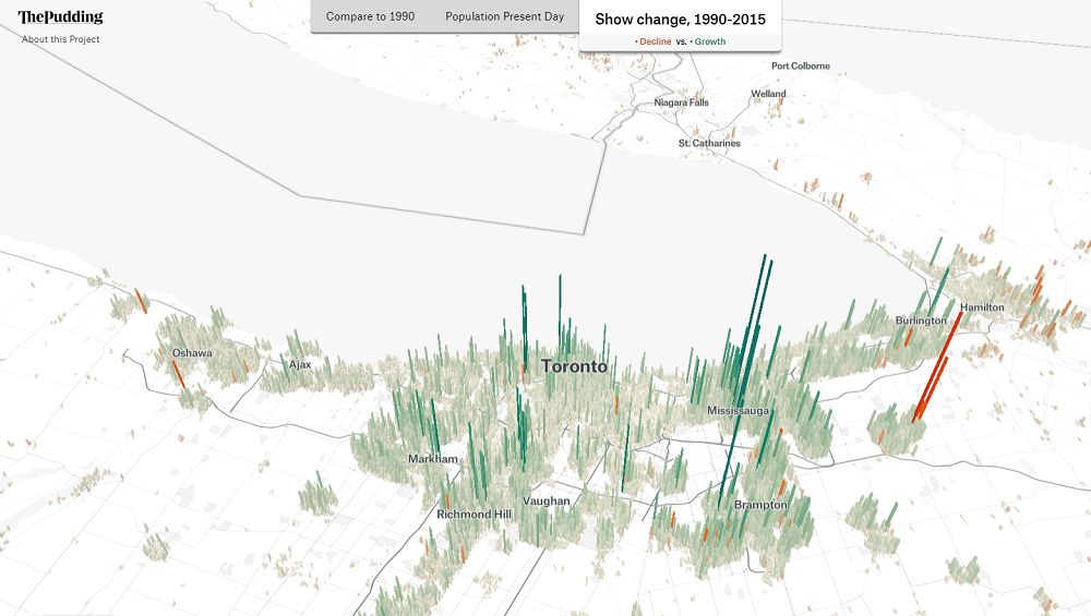
Human Terrain
By: Jeff Clark Date: Sun, 24 Feb 2019
Human Terrain is a great project by The Pudding that visualizes the world's population in 3D.
This first image shows the population density around Toronto and Markham, where I live. I rotated the view to look southward so the tall bars showing high density in downtown Toronto don't hide the values for the suburbs.
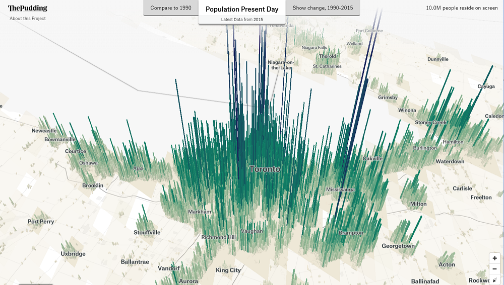
This second view shows the population change during 1990-2015.
Short Update
By: Jeff Clark Date: Sun, 03 Feb 2019
Hello everyone! It's been quite a while since my last update. In fact last year, 2018, was the first time I didn't post during a whole year since I started this blog back in 2006.
Here is a simple plot of the number of posts here over the course of time:
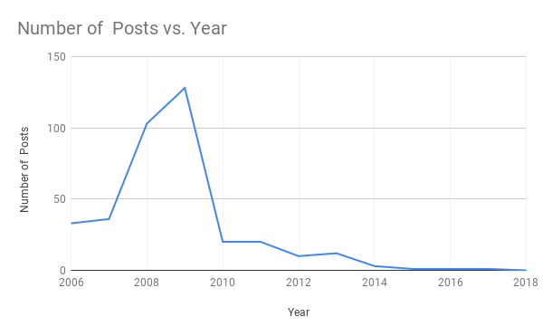
I hope to publish more often this year. Thanks for sticking around!
Toronto Coffee Shop Territories
By: Jeff Clark Date: Sat, 18 Nov 2017
A week or so ago I put together a simple project illustrating the locations of coffee shops within the Toronto area. I was curious about the density of coffee shops within the city and also the distributions of the larger coffee chains. In the image below the small dots are locations and the areas are coloured based on the closest location. The colours are Red - Tim Hortons, Green - Starbucks, Yellow - Second Cup, Purple - Coffee Time, Orange - Country Style, Blue - Other.
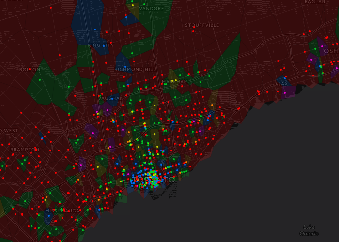
The Tim Horton's red dominates much of the geography outside of the city and the location density is obviously much higher in the downtown area. Zooming in to downtown shows a more fractured landscape with strong pockets for Starbucks and the independent or small cafes.
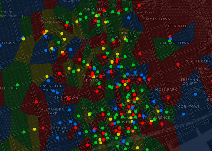
Here is the interactive coffee territory map of Toronto. Data was gathered from OSM, interactive map built using Leaflet, and the voronoi overlay created with D3.
Ten Years
By: Jeff Clark Date: Fri, 08 Apr 2016
Today is the tenth anniversary of my first post on Neoformix! Thank you all for your attention and feedback over the years. I never dreamed I would be doing this for so long but it's been great fun. Thank you also to all the creators of interesting and informative work in the field of data visualization and creative coding.
I have written 368 posts over the ten year span and they are all available in the Archive. The pace of new posts has slowed down lately but I'm very active on Twitter and Pinterest.
Pinterest Boards
By: Jeff Clark Date: Thu, 17 Dec 2015
I have been using Pinterest for the last few years to collect images related to my areas of interest. There are over 1000 images pinned so far and you may find them interesting. Take a look!

Stars and Stones
By: Jeff Clark Date: Wed, 05 Nov 2014
I just launched my first mobile app. It's a game, called Stars and Stones, and you can download it now on the Apple App Store for free.
I enjoy games that have a simple natural user interaction, are easy to learn, but have a rich depth of play - an elegant complexity. That's what I attempted to create and I think I came close in many respects. Stars and Stones is a series of dynamic puzzles that get progressively more challenging. There are over 100 levels and the first 50 are free.
In each puzzle you drag a token around to try and capture five stars while avoiding stones. The stones move as you move and their speed is relative to your own - the faster you move, the faster they move. When you stop, they stop. Most of them in the early levels move like brainless physical objects. As you progress they take on more complex behaviours - they chase you, or block your progress, or block your access to the boosters which aid you in your task. The stones all look the same so to succeed in the game you must recognize patterns in their movement and exploit them.
Here are a few images to give you a feel for the game.


It's available for iPhone and iPads and I'd be very happy for you to try it and let me know what you think!
A Short Reflection on Storytelling in Data Visualization
By: Jeff Clark Date: Mon, 28 Apr 2014
The role of storytelling in Data Visualization has become much discussed over the last year or so. One reason I find this aspect of Data Visualization so interesting is that my own natural tendencies are to focus on exploratory visualization. Much of my own past data visualization work is weak in the storytelling side of things. Coming from a scientific background and personally enjoying the act of discovering patterns in data means my default approach is to build exploratory tools. For me, personally, this whole storytelling aspect seems a rich area to mine in order to improve my work.
I just finished listening to the latest Data Stories podcast called Visual Storytelling which is a discussion of the topic by hosts Moritz Stefaner, Enrico Bertini, and their guests Alberto Cairo and Robert Kosara. It's an excellent conversation from a number of perspectives on the subject and I found it very stimulating. If you haven't already heard it then make sure you have a listen.
I was surprised that one aspect of the topic wasn't discussed in the podcast: storytelling techniques in data visualization can be abused to express falsehoods. One thing that is of critical importance to me in data visualization work is that it is grounded in reality - it's based on data which are, hopefully, objectively true or based on some real measurements. To be sure, there is often uncertainty involved and for some topics objectivity is difficult but still, data visualization should be about describing reality as best we can.
Like many people with an engineering, mathematical, or scientific background, I'm suspicious of salesmanship and marketing. I'm wary of other people using emotion and a good story to persuade me to believe something that isn't true. I have some concern that data visualization work that emphasizes storytelling is more likely to be 'Data Fiction' - or propaganda. The designer, through careful choice of selected facts, use of emotion, drama, conflict, and all the other techniques of storytelling can craft a message at odds with reality. The use of 'data' will even lend an air of authority to that message.
Storytelling is a powerful tool for leading a person efficiently to the main points uncovered in a dataset and can dramatically increase the impact of a work. It's very important that the story emerges from quality data and that this connection is open to inspection. Let's make sure that all our data stories are true.
Markham Winter of 2014
By: Jeff Clark Date: Tue, 01 Apr 2014
Winter has finally ended in Markham where I live and it has seemed a very long and cold season this year. I decided to take a look at the weather data from Environment Canada and see whether my impression is supported by the data. The result is the graphic below. Click on it to see a larger version.
Yes, 2014 was the coldest winter in Markham since 1994. We had an average temperature during the winter of -8.2 C this year and in 1994 it was -9.2 C. Both last year and especially 2012 were warmer than usual so it likely felt that much worse in comparison. We also had the 4th most snow in the last 20 years so it was both very cold and snowy.

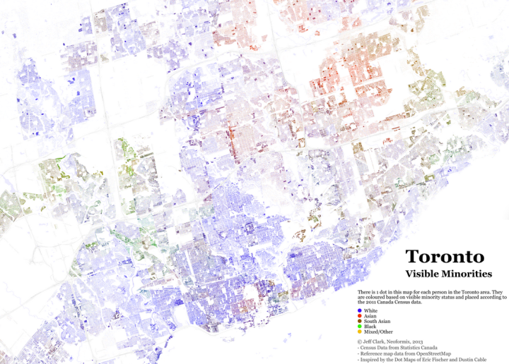
Toronto Visible Minorities
By: Jeff Clark Date: Fri, 27 Sep 2013
Toronto is the most multicultural city in the world. According to the 2011 National Household Survey, 46% of the population were foreign-born immigrants and 47% are members of a visible minority. (ref) These immigrants come from a wide variety of places across the globe and their diversity makes the city a truly remarkable place.
I have created a Dot Map that shows a single point for every person in the Toronto area, coloured by visible minority status. There are 5,700,628 in all and they are positioned at their place of residence and coloured based on the information from the 2011 census and National Household Survey. They do not depict actual individual locations but are based on the statistics over small areas.
This first image is zoomed in slightly and shows Toronto with only a few outlying areas. You can see regions of higher and lower population density as well as how the visible minorities are distributed across the city.
You can explore the map in detail with this Zoomable Dot Map of Toronto.
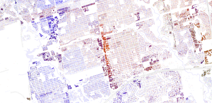
The section below is a close-up of the high-density string of condos along Yonge Street north of HWY 401. You can spot the blank rectangle of the cemetery to the left, the Don river valley, and commercial areas where no people reside.
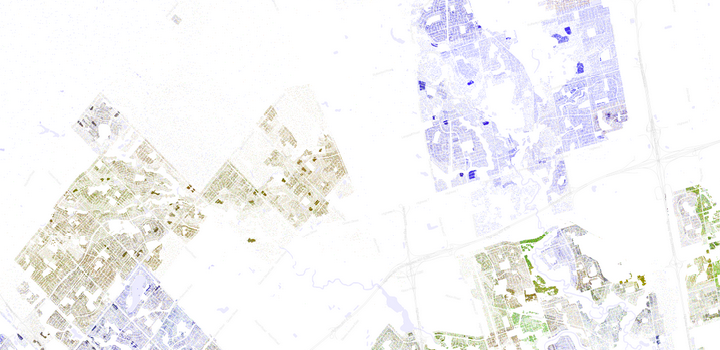
The next image shows the white, predominantly Italian, area of Woodbridge with the South Asian concentration obvious to the west in Brampton.
This work was inspired by the previous creations of Eric Fischer, and Dustin Cable.
It was created with population data from Statistics Canada and map reference data from OpenStreetMap. The OpenStreetMap data was taken from the very helpful Metro Extracts provided by Michal Migurski. The TileMill tool from MapBox was used to compose a map used to mask out non-residential areas and also the basemap underneath the dots. Custom code written with Processing was used to place the actual dots and create the final images. Thanks!
Toronto 311 Visualization
By: Jeff Clark Date: Fri, 06 Sep 2013
The calls people make into the 311 service line in Toronto give an interesting glimpse into the pulse of the city. The City of Toronto makes this data available through their Open Data initiative. I did some analysis and design work with it to produce a visualization for illuminating time-based patterns during 2012.
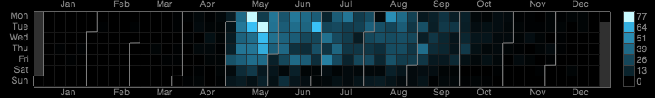
The visualization is a set of small multiple calendar heatmaps, one for each data series. The one shown above is for reports about 'long grass and weeds'. I was inspired to use this visual form by this example: Vehicles involved in fatal crashes by Nathan Yau. I experimented with a few different visual methods but this one did the best job of revealing both the seasonal and day of week patterns. I chose to use a unique colour scale for each series in order to maximize the amount of detail.
The image below shows the top 20 most common types of requests. Click on the image to load the full sized version. You can also view all the data series with an interactive version of the Toronto 311 Visualization.

This was created with Processing JS and contains information licensed under the Open Government Licence - Toronto.
Visual Book Selector
By: Jeff Clark Date: Wed, 08 May 2013
One common pattern I see in many interactive applications is to support a person who is selecting a few items from some larger set. Often these items have various characteristics that the person wants to use in some way to guide their selection process. The characteristics can be numeric quantities, dates, categories, or names of things. Showing all the items in a list and allowing the person to sort by one of the attributes is often a decent default solution.
In other cases it's more useful to consider multiple attributes at a time during the selection process. Maybe you want items that are high in one attribute, low in another, and are from a particular category. Ideally the selection process should be one of exploration and successive refinement where various filtering criteria are adjusted until some small subset of items are defined and they can be investigated individually.
I have built an example of this concept which I call the Visual Book Selector. The books are directly represented with small circles and filters can be applied to progressively exclude books by various criteria. The filters are depicted visually as gates through which some of the items can pass and others cannot. The image below shows one possible configuration.
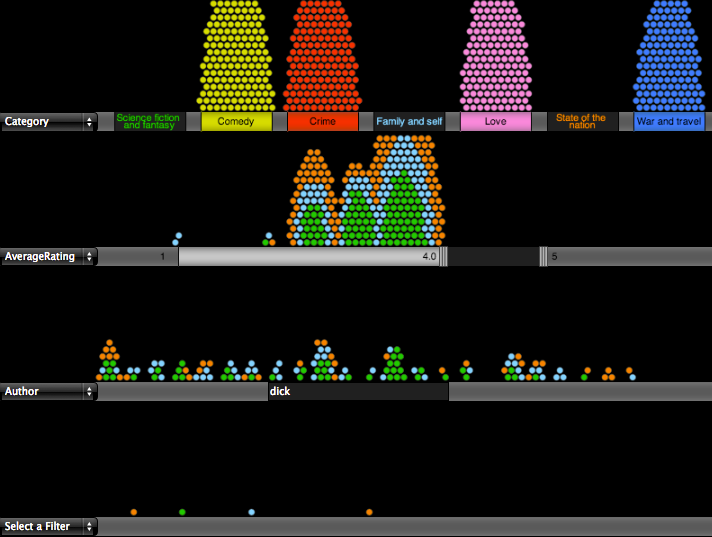
There are about 1000 books which start in the top segment of the display when no filters have been applied. In this example three of the category gates have been opened so books from those categories can pass through. The ones that don't pass this filter pile up near their closed gate which helps give some understanding of their distribution. The books that pass the first criteria encounter a second filter on the average rating of the book from Google Book reviews. This filter gate is set to only allow books having an average rating of at least 4.0 to pass through. The final gate does a pattern match on Author name and allows 4 books to the bottom which have passed all of the criteria.
The best way to get a feel for it is to try out the Visual Book Selector yourself. You can use the dropdown selectors on the left of each segment barrier to choose different criteria on which to filter. Hover over a book to see details and click on it's circle to visit the corresponding Google Books page.
The list of books and their categories comes from the 2009 article in the Guardian 1000 novels everyone must read: the definitive list. The other data was gathered from Google Books.
I should also note that an excellent solution to this multi-attribute selection/exploration problem posed here is the Elastic Lists concept by Moritz Stefaner. It supports what's called Facet Browsing and enhances it with the visualization of proportions and distributions as well as animated transitions.
Star Wars Movie Fingerprints
By: Jeff Clark Date: Wed, 27 Mar 2013
Recently YouTube had a video that showed all six Star Wars movies at once. They were placed in a 2 by 3 matrix and had an audio track of all the movies superimposed. It was an interesting experiment that has since been removed based on copyright grounds. Before it was removed I was able to do some simple analysis on the video and extract some details of the individual episodes of the Star Wars series.
Basically, I produced something very similar to a classic work called Cinema Redux™ by Brendan Dawes, done in 2004. Each individual movie in the series was reduced to a collection of small snapshots taken at 1 second intervals. The snapshots are layed out 60 images per row so a row corresponds to a minute in the film. These 'fingerprint' images reveal some aspects of the film structure.
Click on any of these images to see higher resolution versions.


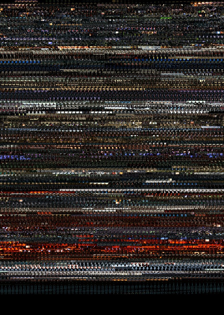


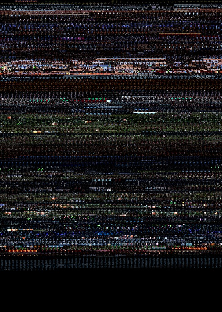
I used some fairly simple code in Processing to analyze the video and create the output images.
Obesity Slopegraph
By: Jeff Clark Date: Tue, 26 Feb 2013
Last week the wonderful Guardian Datablog published an interesting post called Obesity worldwide: the map of the world's weight. It contains a map that shows with color the rates of obesity around the world. The accompanying chart gives data for different time frames and for both male and female which you can select and view on the map. When I saw the chart I immediately thought of a number of interesting questions that could not be easily answered with the map or chart.
- What is the trend over time?
- Do these trends exist worldwide?
- Which countries are exceptions to the trend?
- Which countries have the highest or lowest rates of obesity?
- Are there large gender-based differences in obesity rates in various countries?
Much of my past work has been driven by personal curiousity. That, together with my own background in science, have shaped my work such that most of it has been exploratory in nature. Recently I have been thinking more about the storytelling or communicative aspect of data visualization. This has been triggered by my admiration for the amazing work of the New York Times Graphics Department, and the writings of Alberto Cairo, Robert Kosara, Andy Kirk, and Jonathan Stray.
I decided try and build an interactive visualization that helped answer the questions above. I also tried to build something that explicitly highlighted some of the more interesting aspects of the data without sacrificing freeform exploration. I settled on using a Slopegraph which was first described by Edward Tufte and is featured on the cover of Cairo's excellent book The Functional Art.
This first image shows the trend for male obesity organized by continent. It's a difficult problem to show labels for so many countries along one axis so I tried to alleviate it by letting the user expand or hide countries by continent group. In this case 'North America' is expanded to show its' individual countries. Labels are only shown if they don't overlap with others. The largest countries by population are placed first.
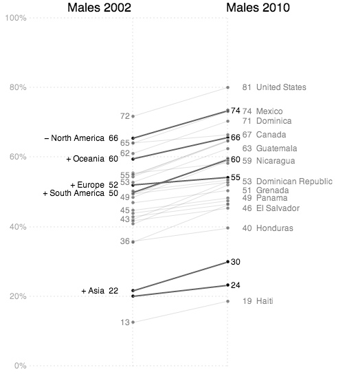
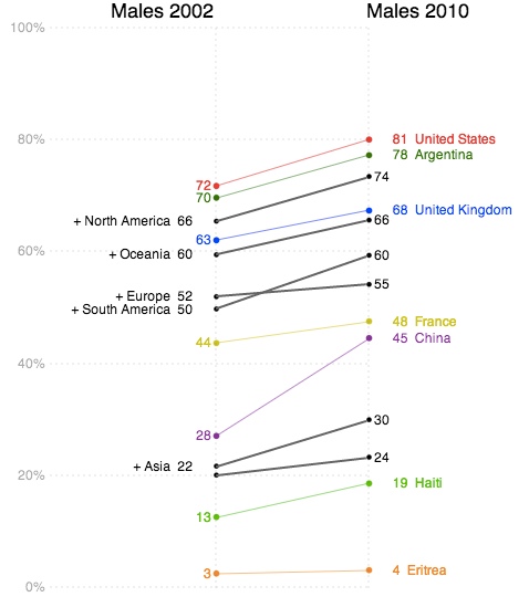
Individual country lines can be clicked on to emphasize them with colour.
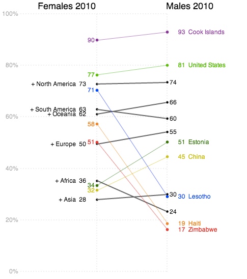
The third example shown below charts female values on the left against male values on the right in order to emphasize gender differences.
The interactive visualization includes a 'stepper' that takes the user through four different views. This helps introduce functionality gradually as well as serving to emphasize important patterns in the data.
In addition to the people and organizations mentioned above I would like to acknowledge the people behind Processing and Processing JS which was used to build the application. The code for the dashed lines comes from J David Eisenberg. Thanks!
Neoformix Site Redesign
By: Jeff Clark Date: Tue, 19 Feb 2013
In 2006, I started this blog as an outlet for my creative personal work as well as to gather in one place references to interesting work by other people. Since then, Neoformix has grown into a full-time business for me specializing in the development of custom data visualizations. I have just spent some time giving the website it's first facelift in 7 years. I hope you like it!
I've tried to simplify the design and emphasize that Neoformix is a business by designing a main page that highlights some projects and moving the blog to a secondary page. Thanks to Twitter Bootstrap for a powerful front-end framework which I made use of in the redesign.
Word Hearts Updated
By: Jeff Clark Date: Tue, 05 Feb 2013
About five years ago I posted a simple little application called Word Hearts which lets you fill a heart shape with words. Last year it was the most visited page on my site despite the fact that it was still a java applet based application which many modern browsers won't render. I have updated this tool to use ProcessingJS so it runs well in modern browsers. There is also enhanced functionality like:
- You can fill circles, diamonds, stars, and squares as well as the original heart shape
- There are more fonts to choose from
- You can easily use small symbols like hearts, happy faces etc., in your list of words
- A nice color picker
- Word orientation options
- Vary the word colors so it looks more interesting
- Save your image
Here are a couple of examples of what you can do:


Launch the interactive version of Word Hearts to try it out.
This was created with Processing JS and also uses the JSColor color picker and the JQuery Font Chooser. Thank you!
Grimm's Fairy Tale Metrics
By: Jeff Clark Date: Thu, 31 Jan 2013
I have built another little digital humanities project based on the text of the 62 stories in Grimm's Fairy Tales. This one is called Grimm's Story Metrics and presents an interactive matrix of stories together with various metrics calculated from their text. You can click on a column to sort by that data, click again to reverse the direction, and click on a story name to open it in another window. The image below shows the stories sorted by the 'Royalty' metric which indicates, as you would expect, how many references there are to words related to the topic of royalty. Click on the image to go to the interactive tool.

Hovering over any of the bars shows details about that particular measurement. Most of the metrics, like 'Royalty', are based on topics and the details shown are the words characteristic of that topic used in the story. So, for example, the details for 'Royalty' in the 'Frog-Prince' are princess, prince, king, kingdom which are listed in frequency order. These topical metrics are normalized based on total words in the story so longer stories have no scoring advantage.
The 'Lexical Diversity' is a ratio of the number of unique words in the story to the total words. These stories are fairly short and you can observe a rough inverse relationship between 'Story Length' and 'Lexical Diversity'. 'Clever Hans' is an outlier in this relationship. If you examine the text for this story you'll see that there is a great deal of repitition.
This was created with Processing JS. The text analyzed is the English translation by Edgar Taylor and Marian Edwardes available at Project Gutenberg. Thank you!
Les Miserables Word Graph
By: Jeff Clark Date: Fri, 25 Jan 2013
Here is a word graph for the text of the novel Les Miserables by Victor Hugo. Click on the image to see a large (4 MB) version which makes all the words legible.
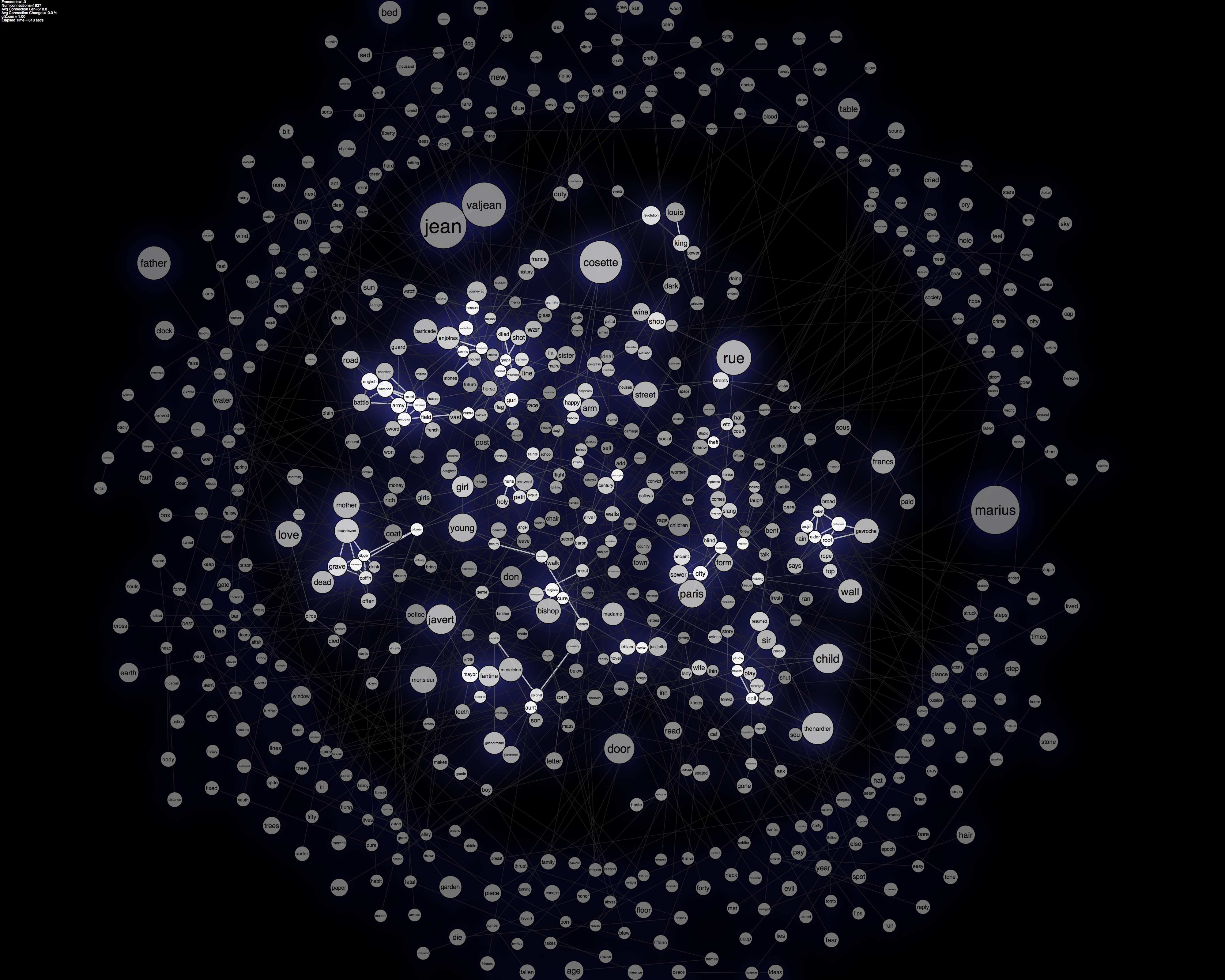
Area of the words reflects frequency in the text. The top three most similar words are considered for connections with the word similarity metric defined by collocation within the text. The outer ring of words only have one weak connection to another word in the graph.
Grimm Fairy Tale Browser
By: Jeff Clark Date: Tue, 22 Jan 2013
My previous post on the Grimm's Fairy Tale Network showed a graph illustrating the strongest connections between the various stories. I used a few techniques to try and prevent the usual mess of connections that often obscure the relationships of interest.
Another way of tackling graphs with lots of connections is to only show a small portion of the graph at a time and use interaction to provide navigation. This lets you browse around a complex network of nodes and relations and repeatedly get views centered on a node of interest. I've created an example of this for the Grimm's fairy tale data which I call the Grimm Fairy Tale Connection Browser.
The image below shows the connections to the story 'Little Red Riding Hood'. The larger circles are stories and the smaller ones represent key words in the collection. The inner ring shows the words and stories closely connected to the story of interest. The outer ring gives the related stories and words that are related but with less strength. You can click on any story or word to make it the new focus node. Click on the image below to launch the interactive version.
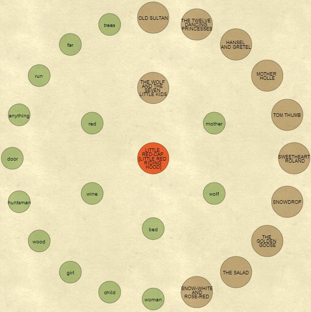
This second example shows the stories and other words highly related to the word 'wolf'. The interactive tool shows the Gutenberg version of the stories in a panel on the right. When a new story is made the central focus of the visualization the right panel shows the story text.
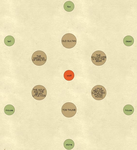
This was created with Processing JS.
Grimm's Fairy Tale Network
By: Jeff Clark Date: Tue, 15 Jan 2013
I have had some fun playing around analyzing the text of the stories in Grimm's Fairy Tales. There are 62 stories in this set and they contain many popular tales such as Little Red Riding Hood, Snow White, and Rapunzel. The text analyzed is the English translation by Edgar Taylor and Marian Edwardes available at Project Gutenberg.
Story Connections
The graphic below is a simple network showing which stories are connected through the use of a common vocabulary. There are three different strengths of connection shown and I've tried to minimize the usual 'hairball' nature of these types of diagrams by only showing the top three connections for a story. Some stories will have more than three links because the link meets the top-three threshold for the story on the other end of the link. The shade of blue simply indicates the number of connections for that story - the darker the shade the more connections. Click on the image to see a larger version.
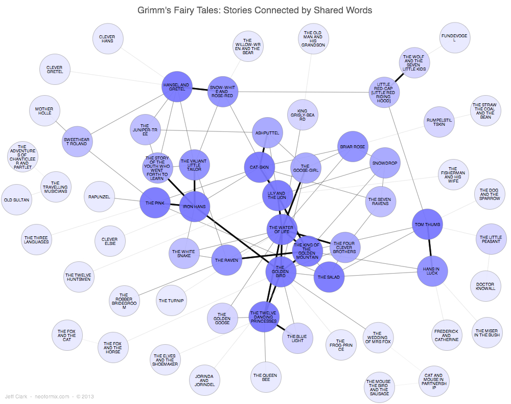
The diagram shows in the upper-right corner for example that 'Little Red Riding Hood' is strongly linked to 'The Wolf and the Seven Little Kids'. My analysis shows that the strength of this connection is due to them both using words like wolf, stones, door, belly, scissors, drowned, and devour.
Novel Views: Les Miserables
By: Jeff Clark Date: Tue, 08 Jan 2013
The project 'Novel Views' consists of a series of visualizations of the novel Les Miserables by Victor Hugo. The text analyzed is the English translation by Isabel F. Hapgood available at Project Gutenberg.
Character Mentions
This graphic shows where the names of the primary characters are mentioned within the text. Click on any of these images to see larger versions.
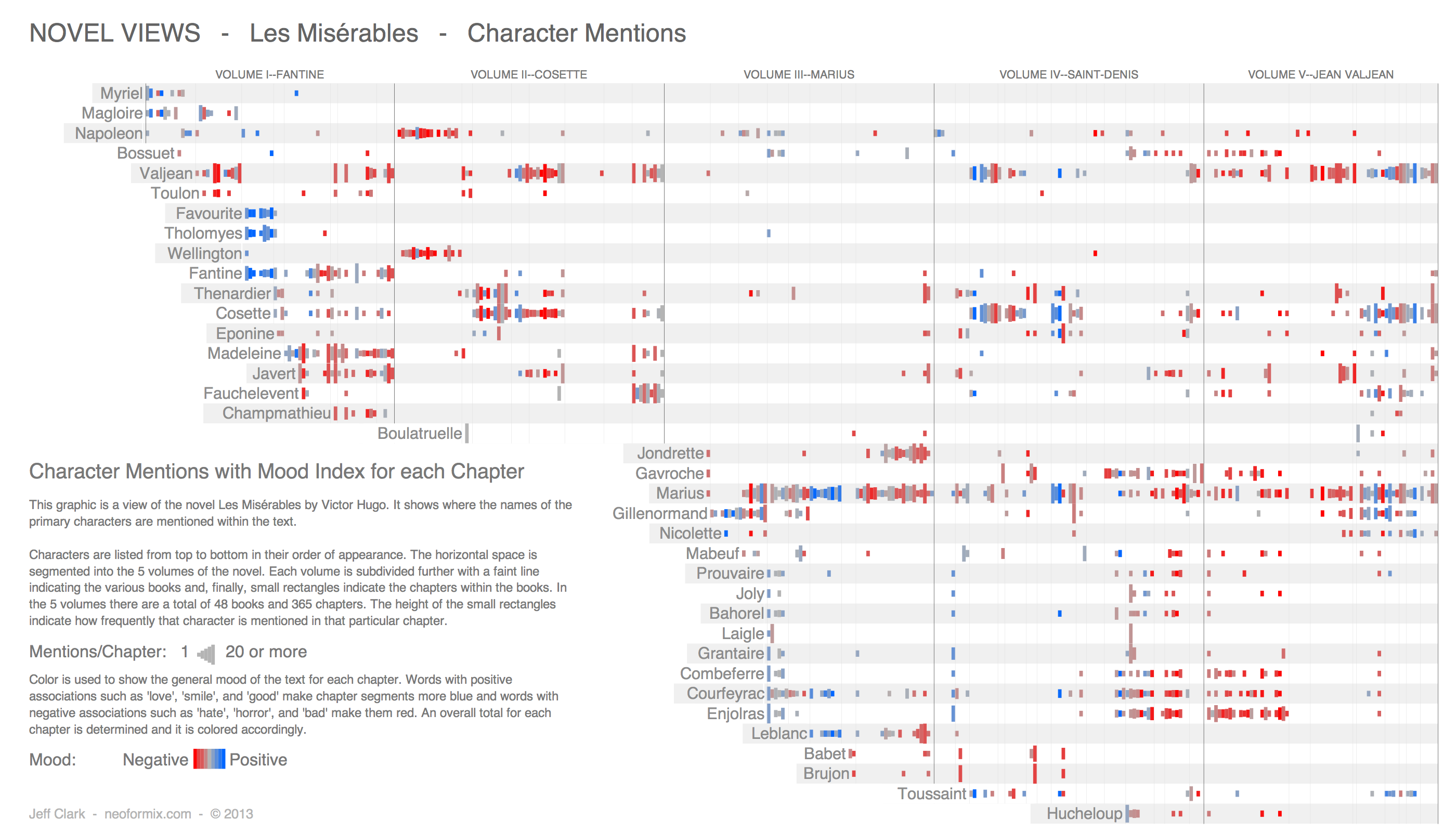
Characters are listed from top to bottom in their order of appearance. The horizontal space is segmented into the 5 volumes of the novel. Each volume is subdivided further with a faint line indicating the various books and, finally, small rectangles indicate the chapters within the books. In the 5 volumes there are a total of 48 books and 365 chapters. The height of the small rectangles indicate how frequently that character is mentioned in that particular chapter.
Radial Word Connections
A word used in multiple places in a text can be interpreted as a connection between those locations. Depending on the word itself the connection could be in terms of character, setting, activity, mood, or other aspects of the text. This graphic shows a number of these word connections.
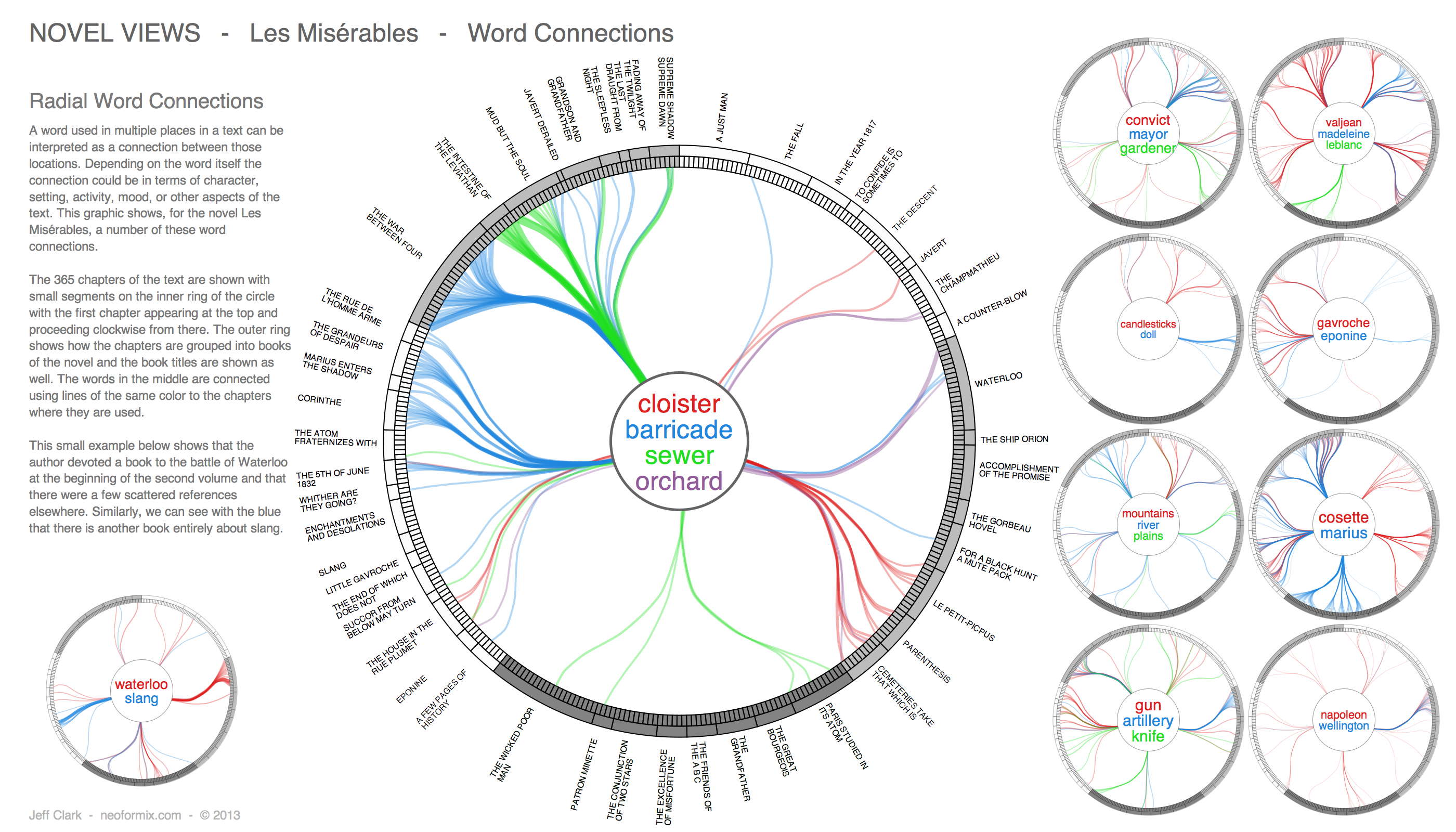
The 365 chapters of the text are shown with small segments on the inner ring of the circle with the first chapter appearing at the top and proceeding clockwise from there. The outer ring shows how the chapters are grouped into books of the novel and the book titles are shown as well. The words in the middle are connected using lines of the same color to the chapters where they are used. The edge bundling technique together with the Volume - Book - Chapter hierarchy of the text are used so the patterns of connections are more easily revealed.
(More...)
Delaunay Images II
By: Jeff Clark Date: Tue, 02 Oct 2012
A few years back I played around with creating Delaunay Images as described here and here. That work was inspired by these Delaunay Images created by Jonathan Puckey.
The delaunay process involves creating a triangular mesh in order to construct a more abstract version of a starting image based on some control points. In the past I either manually selected the control points or chose them randomly. I just recently came across some javascript code by 'atm2' for creating these types of images and discovered that it uses a more clever approach. Basically, edge detection is done on the base image and the delaunay control points are chosen from points on the edges. Using this idea as a starting point I modified the code a bit to make the triangles more transparent as they decrease in size. This basically lets us create a triangularized abstract version of an image while letting the details of the original show through in key areas. An example is below:
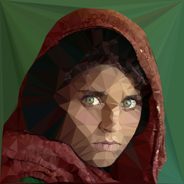
I really like the effect and it's completely automatic which opens up some interesting possibilities. The original base image is by Steve McCurry and is of Sharbat Gula. A retrospective on her life done by National Geographic can be found here.
Ablaze
By: Jeff Clark Date: Thu, 20 Sep 2012
I recently came across an interesting javascript tool to generate images based on connecting lines between pairs of moving invisible points if they come within a threshold distance. It's called Ablaze and it was created by Patrick Gunderson. It's got a bunch of options to give you some creative control over what gets produced.

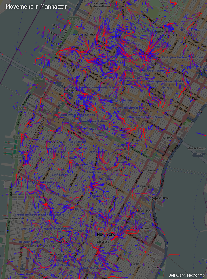
Movement in Manhattan Video
By: Jeff Clark Date: Tue, 08 May 2012
In my last post about visualizing Movement in Manhattan I mentioned that it would be interesting to explore a more direct view of the data by using an animation. I have created such a video based on a fresh collection of tweets from Monday, April 30th. I gathered new data because I realized that my previous data set was collected over the weekend and I suspected that a weekday might provide more obvious patterns. It compresses 24 hours of data into 1 minute of video. Here it is:
I was influenced by the 'Fireflies' video showing iPhone traces done by Michael Kreil. In particular, I like the idea of using larger but more transparent graphics to represent the increased uncertainty when drawing interpolated locations. Basically, if a person tweets at location A and then again at location B ten minutes later the model I used assumes they moved at a constant speed in a straight line between those two events. This is an obviously crude approximation and leads to unrealistic paths in many cases. By increasing the transparency in between the two measured events it shows this uncertainty in a visual manner.
Again, as I saw in the original version, the patterns of tweets, both moving and static are quite chaotic. You can easily see the rise and fall of tweets over the changing time of day and some local patterns that look interesting but the patterns are still a bit of a jumble.
The geolocated tweets were collected with the library Twitter4J which was used from code written in Processing. I used this tutorial created by Jer Thorp to get started with the library. Code from this flow field sample by Daniel Shiffman was used as a starting point to create my flow maps. The background map is from OpenStreetMap. Thanks everyone!
Movement in Manhattan
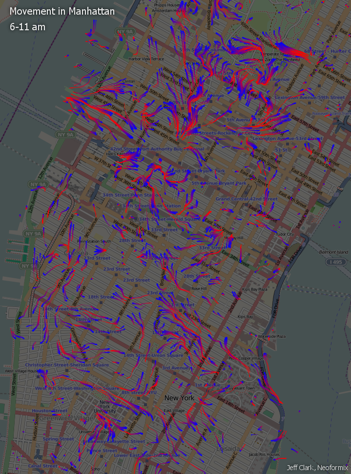
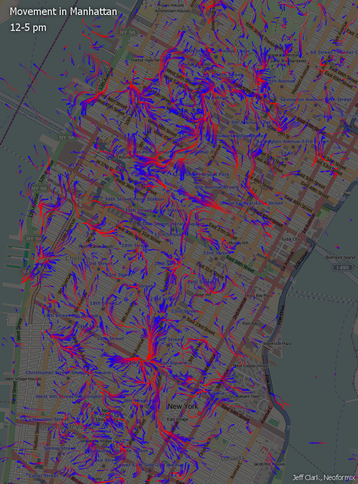
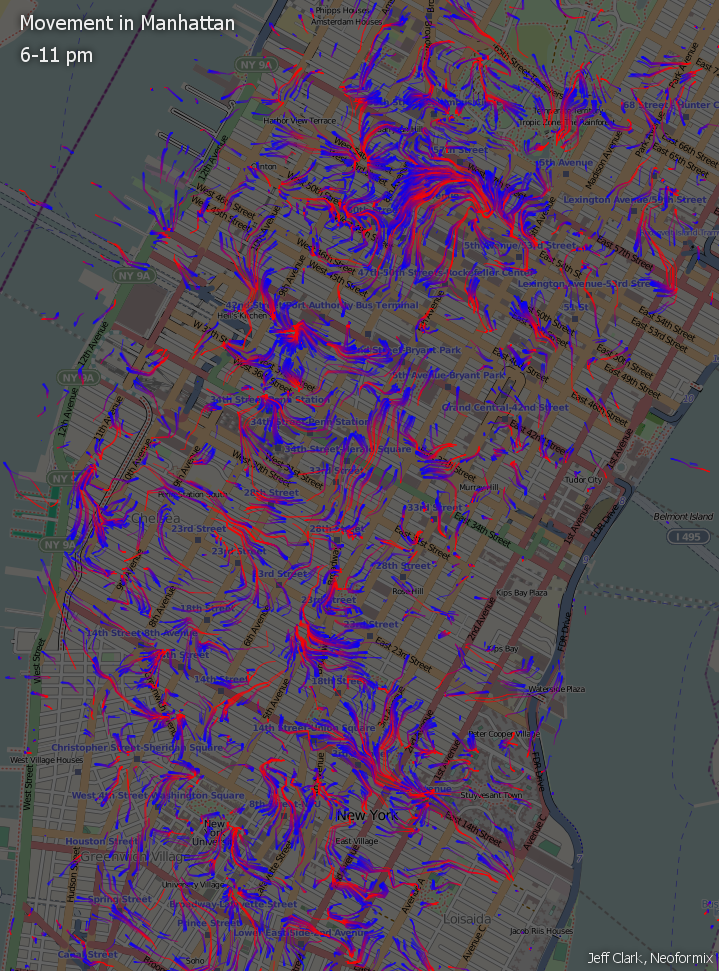
By: Jeff Clark Date: Wed, 18 Apr 2012
Inspired by the beautiful and elegant Interactive Wind Map created by Fernanda Viegas and Martin Wattenberg I have begun to explore the flow of people within a city. An ideal dataset to do this would include the GPS traces from thousands of people wearing trackers for weeks as they go about their daily lives. Organizations such as crowdflow.net and OpenPaths collect voluntarily donated data of this type and might be fruitful to explore. I decided, instead, to use geolocated tweets to try and see how the movement of people is affected by the urban landscape.
The image below shows an area of Manhattan roughly from Houston Street north to 72nd Street which corresponded to the region with the most geolocated tweets that I collected. It includes Times Square, Grand Central Station, the Empire State Building, Rockefeller Center, the southern portion of Central Park, and many other well known landmarks. The blue and red markings are an attempt to show the flow of people based on the data.
Basically, tweets sent by the same person within a 4 hour time-window were used as samples of speed and direction. These samples were used to construct a vector field representing the average flow of people within the area. The vector field and total tweet density over the space were then used to simulate the movement of people. Particles, representing people, were released at locations where actual tweets were recorded and their subsequent movement was determined by the flow field. The particles start out blue and gradually change through purple to red over time so each trace shows the direction of movement. Locations where there is little movement will have blue dots or very short blue traces. Longer traces with more red show a greater speed at that point.
The density and direction of the flow patterns seem reasonable but they do appear fairly chaotic - much more so than the patterns seen in wind flow for example. This makes sense for many reasons. One, people are much less deterministic than the molecules that make up the air. Secondly, the environment that they exist in is extremely complex. Also, statistically we are dealing with a much smaller sample size. In this case, roughly 34,000 geolocated tweets with only 9,600 path segments. If we had a million-times more data then the average patterns would be more clear. Another important factor is that this data was collected over a few days and so there may be clear patterns for specific times of day that are mixed together visually.
I have produced three more images that separate out the data by time of day. This first one only uses data from 6-11 am. It does appear to be a bit simpler and shows a few interesting patterns but it is still fairly chaotic. There is a strong flow east out from Central Park near 65th Street. There is also a more scattered flow from the east into New York University near the bottom left.
The afternoon flow map shows a greater overall density indicating a greater number of locations from which people are tweeting. There also appears to be a strong convergence on the area of 14th Street - 4th Avenue.
The evening map is also quite busy with lots of small local patterns. There is heavy action between 50th and 57th Streets. Comparing these three versions is easier with this Flickr lightbox version of the images.
Overall, there are lots of flows and some of them likely reflect real movement of people within Manhattan. Many others probably just reflect noisy data because the sample size is so small. It's difficult to distinguish between the two cases here. The technique itself might warrant further study with more data. Another interesting avenue to explore would be to more directly visualize the data with an animation like this 'Fireflies' video showing iPhone traces done by Michael Kreil.
The geolocated tweets were collected with the library Twitter4J which was used from code written in Processing. I used this tutorial created by Jer Thorp to get started with the library. Code from this flow field sample by Daniel Shiffman was used as a starting point to create my flow maps. The background map is from OpenStreetMap. Thanks everyone!
Datavis Subgroup Word Analysis
By: Jeff Clark Date: Mon, 05 Mar 2012
This is Part 4 of a set of posts related to the analysis of the Data Visualization Field on Twitter. For context or more information you may want to read those other posts first. They are:
- The Data Visualization Field on Twitter
- Data Visualization Field Subgroups
- Datavis Blue-Red Connections
In the previous posts we have seen that there are two fairly cohesive subgroups of twitter accounts that emerged from our analysis of the original 1000 accounts. I've been calling them the 'blue' and the 'red'. They were determined by looking exclusively at the references to twitter IDs within the tweets that were sent.
Presumably the fact that there are two fairly distinct groups would also be reflected in what they are discussing. I've done some analysis of the words used within the tweets for both groups. English stop words ('the' , 'and' , 'or', ... ) and other words commonly found in tweets ('new', 'via', 'like', 'day', ...) were excluded. Word clouds definitely have their limitations but I believe they can be an effective way to get a qualitative feel for a body of text. I have used Wordle to construct word clouds for the two groups.
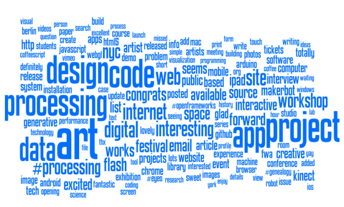
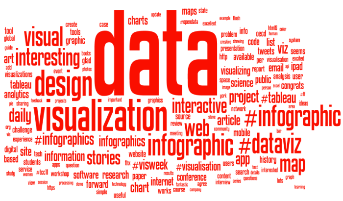
It's clear that the blue group tweets a lot about 'art', 'code', 'design', 'processing', 'project', 'app' and 'workshop'. The red group tweets about 'data', 'visualization', 'design', 'infographic', and 'visual'. There is some overlap for sure but it's clear that they emphasize different things in what they are talking about.
Right from the very start I was calling the whole set of accounts the 'Data Visualization Field'. Of course, a more accurate description was that I was looking at the 'Set of Accounts on Twitter Connected Through Tweet Mentions from @moritz_stefaner, @datavis, @infosthetics, @wiederkehr, @FILWD, @janwillemtulp, @visualisingdata, @jcukier, @mccandelish, @flowingdata, @mslima, @blprnt, @pitchinteractiv, @bestiario140, @eagereyes, @feltron, @stamen, and @thewhyaxis'. It doesn't exactly roll off the tongue. From looking at these word clouds it appears that the red group could reasonably be named 'The Data Visualization Field' and the blue group something like 'Computational Artists and Designers'.
If we want to contrast these two groups more directly we can look for words that are used much more frequently in tweets of one group than the other. I've done this for words that met both an overall frequency threshold and an author support threshold - they were used by at least 10% of the group members. The bar charts show the frequency proportion. So, for example, in the large sample of tweets I looked at from both of the two groups if you count the number of times the word 'makerbot' was used then 99% of those instances were in tweets from people in the blue group.
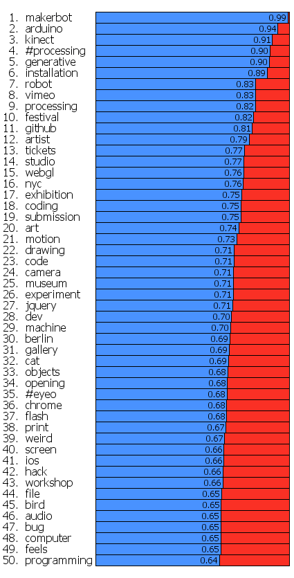
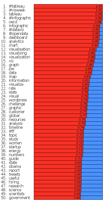
This shows even more clearly the different things that these two groups emphasize.
Datavis Blue-Red Connections
By: Jeff Clark Date: Fri, 02 Mar 2012
The recent post on Data Visualization Field Subgroups had an interesting reaction on Twitter that I didn't expect. Many people that were placed in the 'red group' by the community detection algorithm in Gephi joked about being part of the 'team' and being happy to represent it and be grouped together with the others. Jen Lowe lightheartedly suggested a scrimmage at #eyeo between the red and blue. There was much less reaction from the 'blue group', likely because I'm embedded within the reds myself and so they likely paid more attention to my posts and the subsequent reaction on twitter.
There does, indeed, seem to be two fairly cohesive groups of people here but I suspect there are very many connections between the groups as well. We can use some simple network analysis to get a feel for this. Here are a few statistics calculated on the blue and red groups only:
| Characteristic | Blue | Red |
|---|---|---|
| Number of Nodes | 216 | 244 |
| Total In-Links | 6734 | 5712 |
| Total Out-links | 6070 | 6376 |
| Avg In-Links | 31.18 | 23.41 |
| Avg Out-Links | 28.1 | 26.13 |
| Total Intergroup links | 665 | 1329 |
| Total Intragroup links | 5405 | 5047 |
| Percent Intergroup links | 10.96% | 20.84% |
Both groups are pretty similar in most respects. The primary difference is that blue group members have on average more incoming links and that the percentage of intergroup links going from someone in one group to someone in the other is roughly double for reds. Remember that a link from A to B means that A referenced B in a tweet through a reply, a retweet, or just mentioning them in some context. When considering just the links between these two groups the people in red are referring to the people in blue at twice the rate of the reverse.
If you look at the graph showing both groups together (edges not drawn) it's clear that some nodes, for example blprnt and pitchinteraciv, are on the border between the groups which suggests they likely have a fair number of cross-group connections.
By looking at the details of the connections and their strengths we can quantify the 'blueness' or 'redness' of any particular node. This indicates how embedded they are within their own group. We can also do this separately for both incoming and outgoing links but I'll keep it simple for now and show one value that reflects both types of links together. This first table shows the top blue accounts (by degree) sorted by how 'blue' they really are.
| Blue Account | Degree | Blueness % |
|---|---|---|
| factoryfactory | 134 | 99.03 |
| kcimc | 166 | 98.5 |
| theowatson | 147 | 98.39 |
| shiffman | 136 | 97.51 |
| memotv | 149 | 96.78 |
| zachlieberman | 148 | 96.38 |
| flight404 | 191 | 93.69 |
| reas | 231 | 92.76 |
| creativeapps | 232 | 90.46 |
| golan | 276 | 88.57 |
| mariuswatz | 249 | 87.18 |
| generatorx | 149 | 86.99 |
| aaronkoblin | 181 | 85.62 |
| seb_ly | 123 | 84.42 |
| cedrickiefer | 126 | 84.18 |
| lennyjpg | 135 | 77.7 |
| ben_fry | 207 | 73.75 |
| eyeofestival | 187 | 73.19 |
| blprnt | 309 | 66.23 |
| feltron | 132 | 54.73 |
You can see that feltron, blprnt, eyeofestival, and ben_fry are all tending towards the red which matches what we see in the network graphic where they are on the border. This table below shows how 'blue' the top twitter IDs are that were placed in the red group. Again we see that some accounts had significant linkages to the blue group.
| Account | Degree | Blueness % |
|---|---|---|
| pitchinteractiv | 165 | 35.48 |
| moritz_stefaner | 326 | 24.34 |
| jeffclark | 163 | 18.27 |
| janwillemtulp | 290 | 18.25 |
| driven_by_data | 198 | 17.71 |
| mslima | 146 | 15.9 |
| wiederkehr | 149 | 14.48 |
| visualizingorg | 142 | 11.49 |
| datavis | 180 | 10.34 |
| krees | 172 | 7.98 |
| mbostock | 154 | 7.57 |
| infosthetics | 243 | 7.45 |
| noahi | 133 | 6.17 |
| flowingdata | 244 | 5.77 |
| periscopic | 140 | 4.66 |
| visualisingdata | 239 | 2.46 |
| eagereyes | 199 | 1.44 |
| albertocairo | 138 | 1.36 |
| jcukier | 204 | 0.8 |
| filwd | 163 | 0.44 |
Data Visualization Field Subgroups
By: Jeff Clark Date: Tue, 28 Feb 2012
There was some interesting discussion yesterday on Twitter about my post on the Data Visualization Field on Twitter. Moritz Stefaner pointed out that he didn't see a big improvement over his VIZoSPHERE and a quite similar topology. Furthermore, he noted that if you rotate my version 90 degrees counter-clockwise many of the primary nodes line up fairly closely with his. He's right, and it's something I missed noticing completely. It's not really surprising that an analysis of most of the same twitter accounts using a different connectedness metric would yield similar results. I do still feel the map based on tweet text account references is slightly better at the detailed local level but I have no objective evidence that this is the case.
Another interesting thing I learned yesterday was that Lynn Cherny did an excellent analysis of Moritz's data back in September which is reported in Combing Through the Infovis Twitter Network Hairball. She focused on the detection of sub-communities within the network using both Gephi and NetworkX and has some nice results.
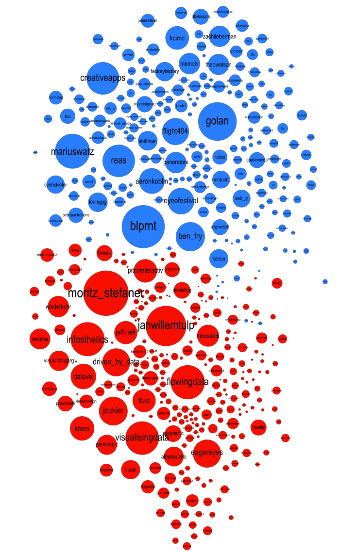
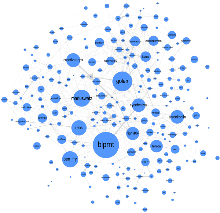
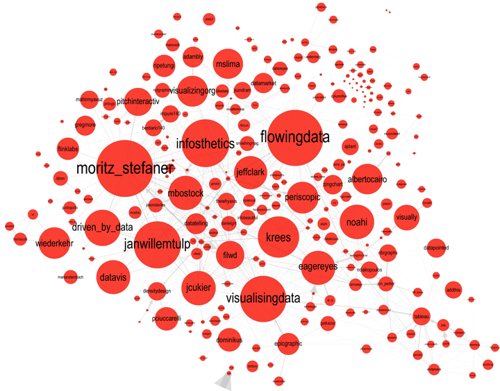
Following Lynn's lead I have spent some time looking at the communities within my data. Doing this analysis with Gephi yields subgroups that look like this:
The modularity score was .356 which is slightly under the .4 boundary for significance. By visual inspection of the image above it seems clear that there are two coherent groups to the left and four other groups that are intermixed and less clearly defined. These two coherent groups correspond pretty well to what I saw by eye yesterday. The top-left blue group has people who focus on computational design, generative art, or design in general. The bottom-left red group, as I noted yesterday, seem focused more on the practical aspects of data visualization.
Below is a map showing only the blue group. I've also shown the top 3% of edges as well. I wasn't able to emphasize the flows as much as I would have liked but you can see some of the stronger edges and their direction. One of the strongest relationships visible in this map goes from @eyeofestival to @blprnt which indicates that a relatively high fraction of the tweets sent by @eyeofestival mention @blprnt.
Here is the map for the red group below. Note that you can click on any of these images to get PDF versions where you can zoom in or search for a particular account.
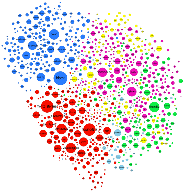
Data Visualization Field on Twitter
By: Jeff Clark Date: Sun, 26 Feb 2012
I consider myself one small part of a community on Twitter that focuses on information visualization, computational design, and interaction design. Collectively we tweet about our personal work, highlight other work of quality or that has interesting characteristics, critique approaches or individual designs, discuss tools and techniques, and suggest interesting datasets or projects. I'm grateful to be connected with such an interesting group of people and I've learned a great deal from them.
Moritz Stefaner is an important part of this group and in July 2011 he created an interesting map of this community he calls The VIZoSPHERE. Basically, he started from a set of 18 selected twitter accounts, found their friends and followers and included any twitter account that met a minimum criterion of connectedness. A small version of part of this map is below. Node sizes reflect the number of followers within this community.
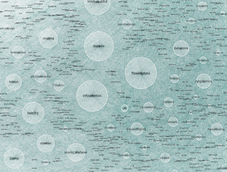
It's a fairly standard graph view of the network data and the sheer number of connections makes them extremely difficult to traverse. Like many such large network graphs the primary utility seems to come from seeing which nodes are largest and seeing which ones seem to be grouped together, presumably reflecting nodes that have a similar set of connections to the rest of the network or strong connections between them. This can sometimes visually suggest sub-groups within the overall community.
After stumbling across this work recently I decided to explore the same problem myself. Rather than rely on follower information for connectedness I decided to analyze the actual tweets sent and look for mentions of twitter IDs. These could be retweets, replies, or just references to someone in a tweet. For a given twitter account we are essentially looking at who they talk to or talk about. Unlike the binary nature of the follower connections we can also measure the strength of this connection by looking at how often one person mentions another.
I started with the same set of accounts that Moritz used: @moritz_stefaner, @datavis, @infosthetics, @wiederkehr, @FILWD, @janwillemtulp, @visualisingdata, @jcukier, @mccandelish, @flowingdata, @mslima, @blprnt, @pitchinteractiv, @bestiario140, @eagereyes, @feltron, @stamen, and @thewhyaxis. I looked at the 1000 latest tweets (or as many as they had if they hadn't sent 1000) and found all the twitter accounts they mention. For each mentioned account I calculated its' support - the number of accounts in the original 18 that mentioned it and used that ranked list to enlarge my set to 50. The latest 1000 tweets for this larger set were retrieved and analyzed in the same way to enlarge the community to 100. I repeated this once more and used tweets from these 100 accounts to finally get a list of the top 1000.
The total number of tweets analyzed for these 1000 accounts was 821,407 and I used them to determine a directed connection strength between each pair of accounts. This connection data was loaded into Gephi which I used to produce the graph below.

For a searchable and zoomable version use the PDF.
As in Moritz's VIZoSPHERE there were so many connections that I didn't think they provided any useful information that could be seen with the eye so I left them out. They are used to layout the nodes for each account and also the node sizes are determined by the degree - the number of edges coming into or out of the node. The bigger nodes can be read off from this graph - @blprnt, @moritz_stefaner, @flowingdata, @visualizingdata, @janwillemtulp, @infosthetics, @golan, @mariuswatz, @reas, @ben_fry, @brainpicker, @nytimes, @timoreilly. Many of these larger nodes are, unsurprisingly, the original seed accounts we started with.
Looking at the details of which accounts are placed near each other seems to give reasonable results. @Eyeofestival is near @blprnt, @krees near @periscopic, and @mccandelish near @infobeautiful. It's very likely that many nodes are placed near each other based on more global or indirect factors so there are still likely some surprising juxtapositions.
Many of the initial seed accounts are in the lower left part of the diagram and seem to reflect a subgroup focused more on the practical aspects of data visualization. The top left accounts seem more to be in the area of computational design, generative art, or design in general. @Blprnt seems to lie between these 2 subgroups. The right side of the diagram seems to be more general media and data sources. I suspect that many of the accounts on the left side mention those on the right but the reverse is not true. In fact, I suspect that many of the accounts on the right side aren't really part of the community in that they don't strongly interact with it. They are sources but not contributors. It would be interesting to repeat my enlargement process from the original seed accounts with some minimum criterion for two-way interaction.
The nodes are colored based on the total number of incoming links which represent people in this community mentioning that account. The darker the color the more incoming links there are. So there are a lot of different people within this community referring to @blprnt, @flowingdata, @brainpicker and @nytimes for example. You can't extract much quantitative detail from a color range but it does give you a feel for which accounts are highly referenced. Note that the color is based on the absolute number of incoming links - not the proportion of incoming to total links. That would be a more interesting measure but I couldn't easily map it to color with Gephi.
This looks like an interesting view of the data and I'm curious to explore a few related variations. Note that prominence within this graphic is a fairly crude measure of overall contribution to the field of data visualization. Many key figures in the field, Stephen Few for example, don't use twitter and so aren't represented here even though his critiques have a huge impact and are discussed within the twittersphere. Many others, such as Ben Shneiderman (@benbendc) and Edward Tufte (@edwardtufte), do use twitter but not extensively and not to a level that reflects their value to the field. They do appear in this map but have very small bubbles.
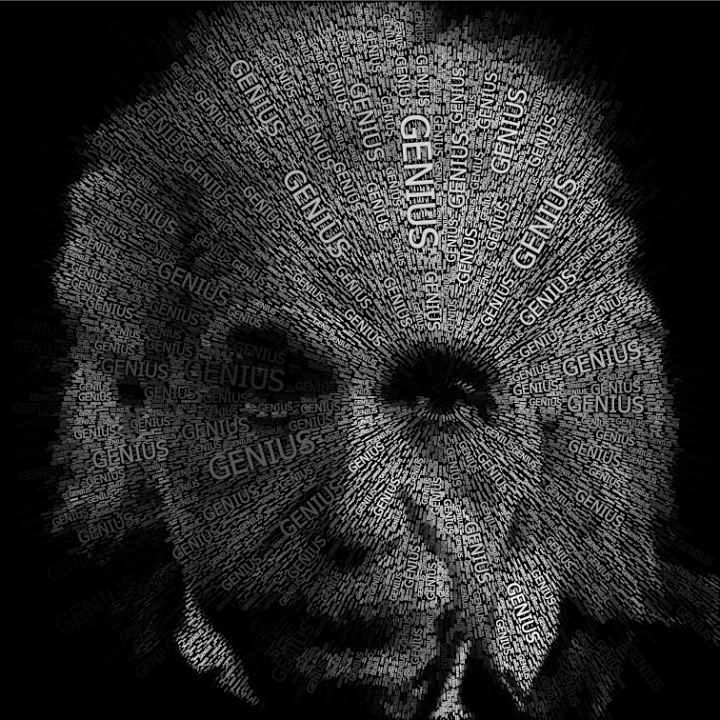
Einstein Word Portraits
By: Jeff Clark Date: Thu, 16 Feb 2012
I have created many word portraits in the past and have always limited myself for the sake of simplicity to completely horizontal or vertical words. My interest in word portraits has been re-ignited by a recent client project and I've started to play with allowing angled text.
In this first example below the words are flat when near the horizontal middle and gradually turn to vertical at the edges. I also swap the orientation below the vertical middle.
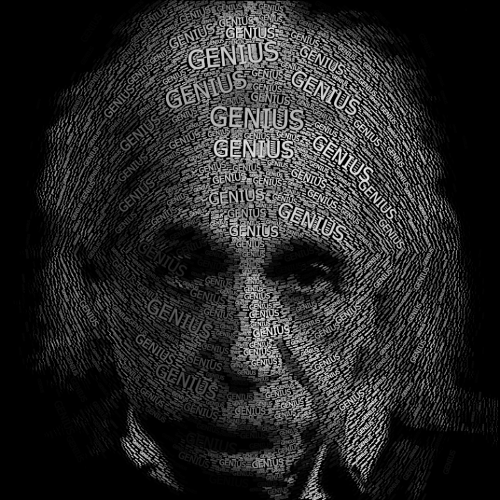
In the next example the angle of the word is determined by the brightness level at that point in the image. White regions are flat and dark are vertical. This gives a reasonable contoured effect because the brightness levels in the image vary in a natural fashion.
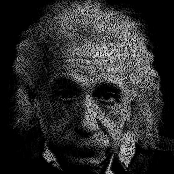
For this last one the words are all angled towards a point on one of Einstein's eyes.
Spot
By: Jeff Clark Date: Thu, 12 Jan 2012
This post was modified on February 15th, 2012 to reflect changes in the software.
Spot is an interactive real-time Twitter visualization that uses a particle metaphor to represent tweets. The tweet particles are called spots and get organized in various configurations to illustrate information about the topic of interest.
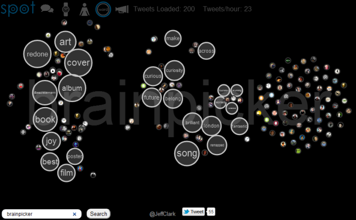
Spot has an entry field at the lower-left corner where you can type any valid Twitter search query. The latest 200 tweets will be gathered and used for the visualization. Note that Twitter search results only go back about a week so a search for a rare topic may only return a few. When you enter a query the URL is changed so you can easily bookmark it or send it to someone. The query brainpicker gives you a display something like this:
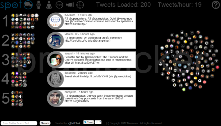
At the top left, next to the logo, are six icons to access the different views. The first is called Banner mode and is shown above. Basically, tweets that share a lot of the same words are grouped together and the top five groups are shown. Tweets are often grouped because they are retweets of the same original content but this doesn't have to be the case. They may be tweets from different people that don't even know each other but happen to be discussing the same thing. The intent is to show quickly the most popular things people are saying about a particular topic. Tweets that are more unique are placed in the phyllotaxy spiral to the right.
All the tweet spots show an image of the sender and at any time can be clicked on to see the tweet details. Clicking on the text of an open tweet will show the original in another browser window. Click on the background or an open tweet spot to close it or you can directly click on another spot.
The Different Views
Here is a complete list of the views and what they show:
- Banner View (speech icon) shows the top five groups of similar tweets
- Timeline View (watch icon) places tweets along a timeline based on when they were sent
- User View (person icon) shows a bar chart with the people sending the most tweets in the set
- Word View (Word Circle icon) directly shows word bubbles with tweets attracted to the words they contain
- Source View (Megaphone icon) a bar chart showing the tool used to send the tweets (or sometimes the news source)
- Group View (circles in circle icon) places tweets that share common words inside large circles
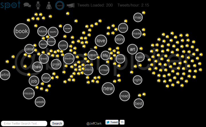
The Word View, again for the query brainpicker:
User and Twitter List Queries
The string 'brainpicker' matches the wonderful twitter account by Maria Popova and the results shown above are mainly retweets of or discussions about the tweets she has sent. You can also do a search for @brainpicker including the @ sign to see the latest tweets sent from that account. This uses the standard Twitter API to get the data and so can go back farther in time. The Word View for this query clearly shows the Brainpicker focus on books, reading, writing, art, and maps.
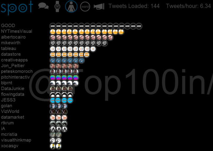
You can also retrieve the latest tweets from a twitter list. Here is an example for a list I created by analyzing who was on various lists created about data visualization. In the search field enter @Top100in/datavis and you should get something like this for the User View:
Technology and Credits
I was inspired to create this when playing with the wonderful Twitter visualization called Revisit by Moritz Stefaner. Another influence was the Stamen work on Digg swarm which is no longer active but there is a video. My academic background in physics makes it natural for me to think in terms of interacting particles.
This application was created with the wonderful Processing.js which is the javascript-based extension of the Processing tool I have used in the past. Thanks to Ben Fry, Casey Reas, John Resig, David Humphrey and the other people in the Centre for Development of Open Technology at Seneca College. Thanks also to Jim Bumgardner for the excellent tutorial on phyllotaxy spirals and to The Noun Project for five of the icons. Thanks also of course to Twitter and all the people who fill it with great content!
Performance is pretty good with the Chrome browser, and decent in Firefox and Safari. It will not work in Internet Explorer (except perhaps the new IE 9). It seems to work reasonably well on the newer iPads although the search field is broken currently in that environment. The application will go out and get new tweets periodically. For popular queries the analysis and display of those tweets will often cause lagging to occur.
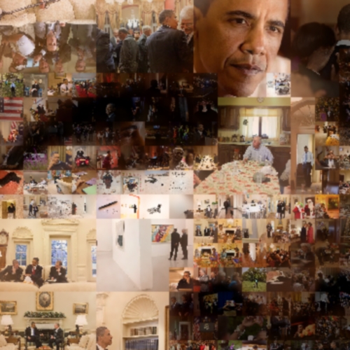
Obama Mosaic Portrait
By: Jeff Clark Date: Wed, 30 Nov 2011
Here is a Multiscale Mosaic of Obama created from hundreds of pictures taken during his time in office.
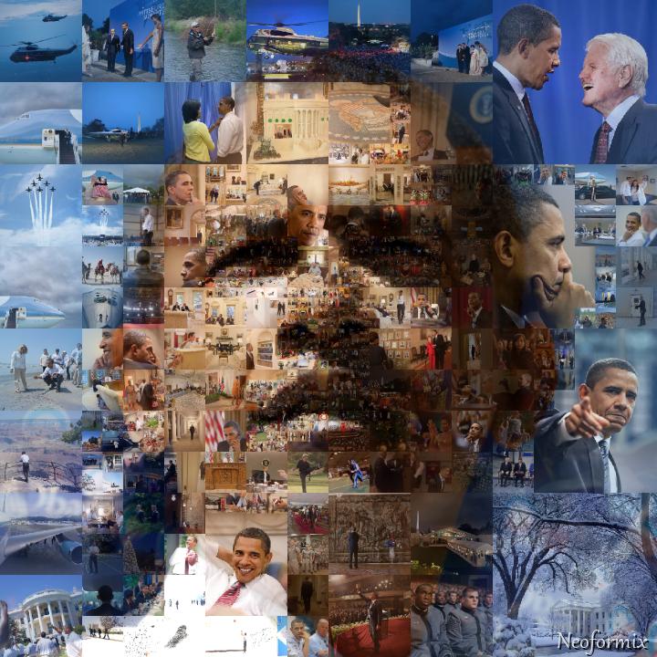
The Van Gogh Portrait Mosaics were fun but I wanted to try an example that uses photographs as opposed to paintings. I settled on a portrait of Obama because of the widespread availability of photographs of him that are free of copyright restrictions. The subimages for this design are taken from the White House's Flickr photostream and seem to have been primarily taken by Pete Souza. I downloaded the 1000 most 'interesting' photos from the stream and used those as input to my process. I also manually selected and hand-centered about 10 interesting regions from these images to augment the set.
Here is a close-up showing the detail near the eye and nose.
Van Gogh Mosaic Portraits
By: Jeff Clark Date: Wed, 23 Nov 2011
Here are four mosaic portraits of Vincent Van Gogh. The primary images and all the various component tiles are regions of paintings by Van Gogh.
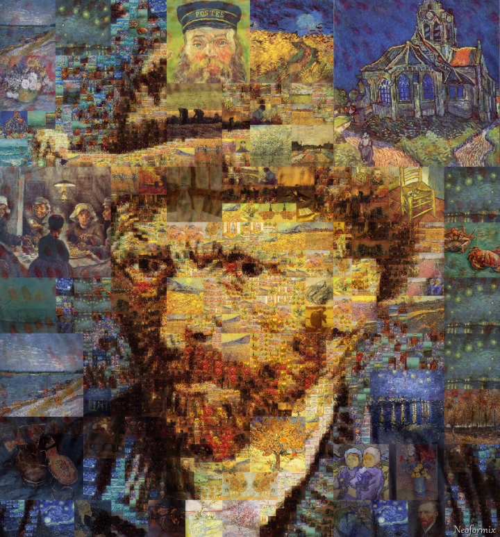
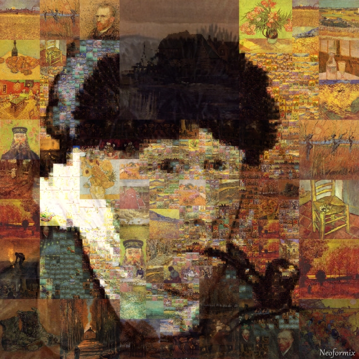
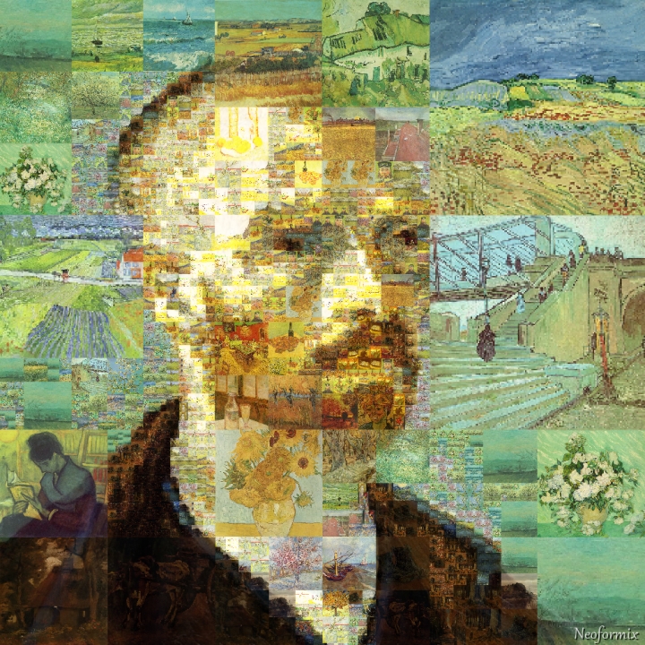
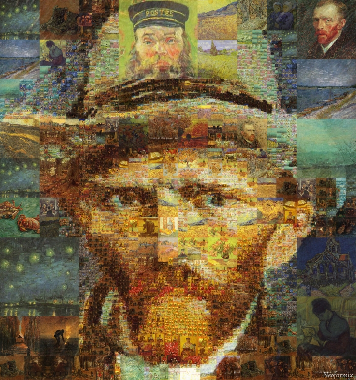
A few more details on the multiscale mosaic process can be found in the post Multiscale Mosaics. The portrait images are all from WikiMedia Commons. The other Van Gogh paintings came from here. I created these by writing custom code in Processing.
Multiscale Mosaics
By: Jeff Clark Date: Tue, 22 Nov 2011
I have been further refining my multiscale mosaic technique in search of the overriding goal of reconstructing an image from sub-images in such a way that balances the clarity of the large target image and the sub-images. I have tried out lots of ideas and the ones that seem to have the most potential for creating interesting multiscale mosaics are:
- Allow use of lightened and darkened versions of the sub-images
- Allow manual adjustment of the detail level (size of sub-images used) in different regions of the image
- When matching sub-images to regions consider how often each sub-image has already been used in order to increase the number of different sub-images used in the final product
- Do some limited blending of the target image with the sub-images
I have used a cropped region of Vincent Van Gogh's painting Self-Portrait With Grey Felt Hat as my target image while developing these ideas. The sub-images are sections of Van Gogh paintings. They are either the central squares or a few are manually selected square regions that focus on some interesting detail.
These techniques do seem capable of producing interesting mosaic images that can carry meaning at multiple visual scales.
Phyllotaxy Spiral Mosaics
By: Jeff Clark Date: Tue, 15 Nov 2011
The post Mona Mosaics showed a number of ways to segment a flat surface and build mosaics by filling regions with the average colour for that region in some underlying image. Here is another example of the same technique but this time using a Phyllotaxy spiral, sometimes called a Fibonacci spiral. It's an arrangement commonly found in plant growth - for example in the Sunflower.
Jim Bumgardner has an excellent tutorial where he develops the idea and gives code for producing the pattern and several variations. I'm using something based on his Example 10 code to produce the mosaic below from a simple radial gradient. I love the swirling spirals in opposite directions found in the pattern.

And of course we must apply it to the Mona Lisa image as well.

Mona Pizza
By: Jeff Clark Date: Thu, 10 Nov 2011
In the previous posts Mona Mosaics, Recursive Mona, and Blended Mona I played around with some ideas for reconstructing the famous Mona Lisa image in different ways. One of the things I did was to build up the image from smaller versions of itself. I was using simple image tinting and blending to get reasonable results.
This time I'm going to select sub-images from a set of pictures and use those to build the large image. This has been done for many years now and there are various tools to support it but I thought it would be interesting to try it myself. For this test rendering I'm using a small set of 23 images related to pizza. For simplicity they are all square images so they map well to the square regions determined by my algorithm. The algorithm selects the best-matching sub-image for each region and if the match isn't very good then it sub-divides the region and tries again at a smaller scale. This version uses blending to try and balance clarity of both the sub-images and the global picture.
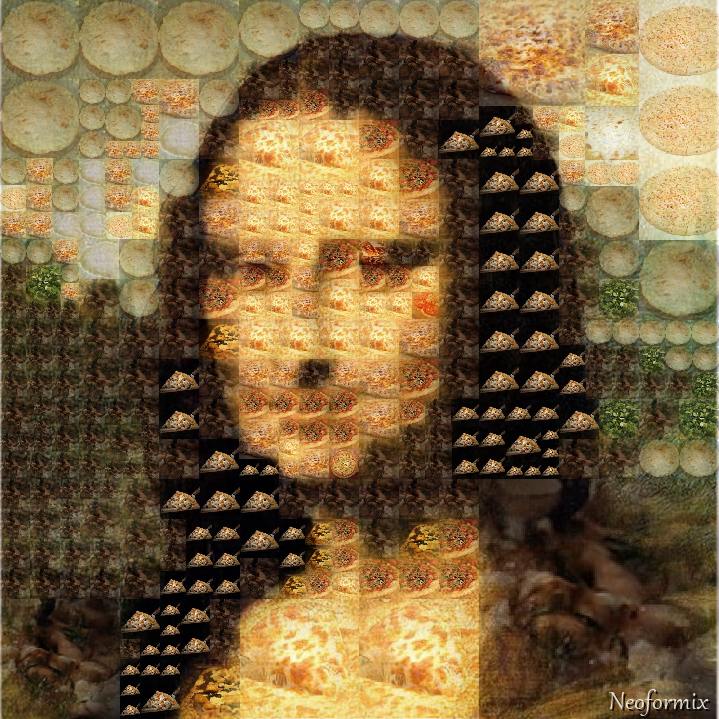
For purposes of comparison here is the same image with no blending applied. You can see the sub-images more clearly but the overall image is only vaguely defined. This could be improved by using smaller sub-image pixels or a larger collection of sub-images to choose from.
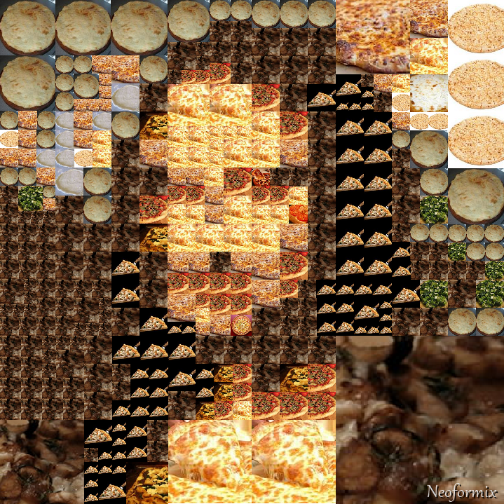
Blended Mona
By: Jeff Clark Date: Wed, 09 Nov 2011
The previous post, Recursive Mona, showed an image of the Mona Lisa constructed from smaller versions of itself. One of the things I don't like about that image, and most other 'photographic mosaic' type images, is that the grid structure controlling the sub-images is so visually prominent. Using multiple scales as I did helps to some degree but the regularity detracts from the overall image.
I've tried to improve this by breaking down the squares that require a more detailed rendering into subsquares in a more varied fashion. There are now 5 or 6 different splitting algorithms used to get the sub-components. This reduces the number of places where you see large numbers of consecutive tiles with the same geometry.
Another technique I've tried out is to blend the sub-images into the overall image at their edges. This tends to smooth out the edges between adjacent sub-images so it looks more natural and also has the impact of strengthening the overal global image. Here is Mona again with both of these techniques applied.
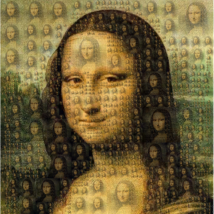
Recursive Mona
By: Jeff Clark Date: Mon, 07 Nov 2011
One of the ideas presented in Mona Mosaics was to break down an image into square areas at different scales where the colour doesn't vary much. A natural extension of this is to redraw a tinted version of the original image inside each square. Repeat a few times and you get a version of the starting image built recursively from smaller and smaller versions of itself. Here is an example of the concept applied again to the Mona Lisa.
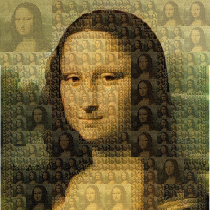
Iconic Faces
By: Jeff Clark Date: Mon, 07 Nov 2011
Here are a few iconic faces that I have reconstructed with triangles. Source images came from 100+ Portraits of Iconic People of All Time. The faces are Che Guevara, Salvador Dali, and Audrey Hepburn.
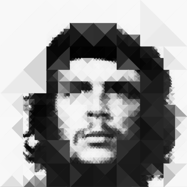
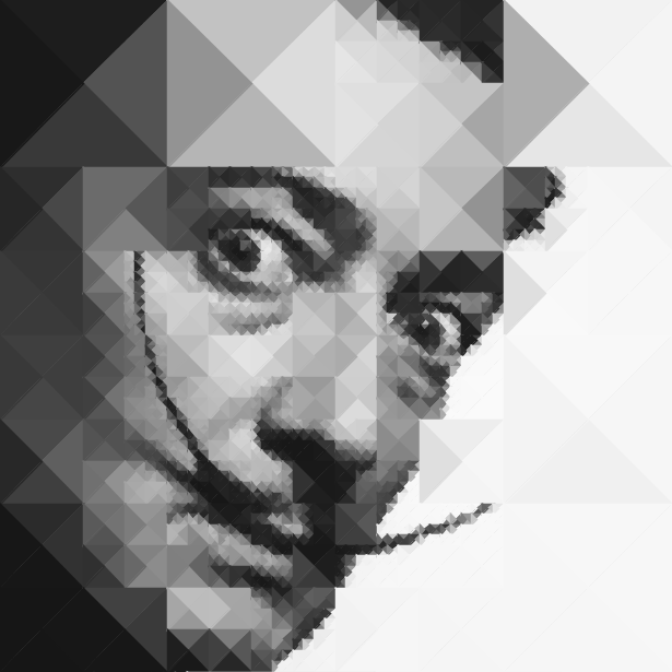
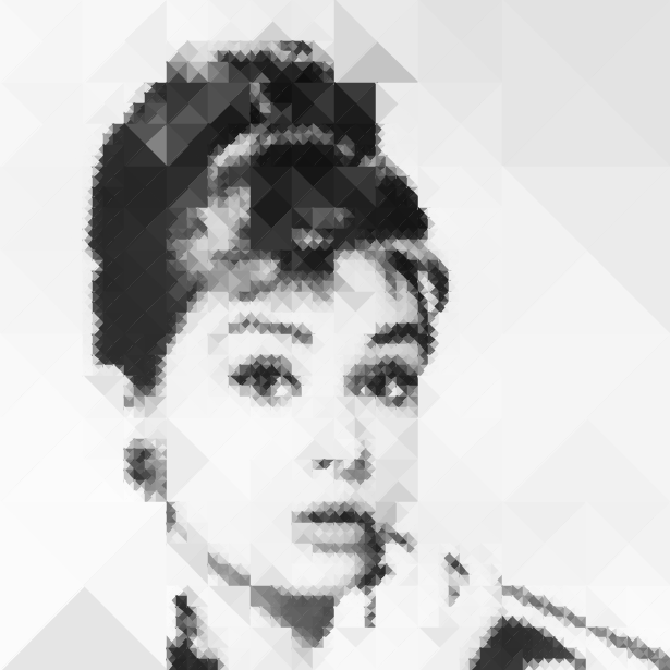
Mona Mosaics
By: Jeff Clark Date: Sat, 05 Nov 2011
A couple of years ago I explored reconstructing images based on Delaunay triangulization and Voronoi decomposition. Inspired by the work of Jonathan Puckey and Andy Gilmore I've revisited the idea of rebuilding images using some geometric-based simplification.
The source image for all these example is the Mona Lisa. The first rendering is a simple square grid where the colour of each square is the average colour in that region of the underlying image. By using a smaller grid size one can obviously get more detail than is shown here.
The image beside it is much more interesting. I start by looking at large square regions to see how much the colour varies. If it is fairly consistent then that implies there is less detail in that region and I can draw it as a simple large square. If the colour variation is higher than some threshold I look at the smaller subsquares and repeat the process recursively until some lower size is reached. This gives us a version of the image that has smaller more detailed squares where the image varies a lot and larger blocks of colour elsewhere.
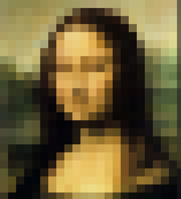
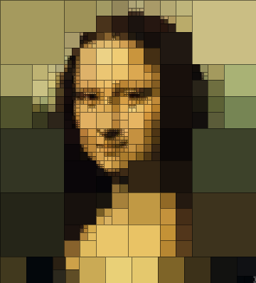
Images 3 and 4 are similar but use triangular regions rather than squares. Another wrinkle which I added to the recursive process is to define a location on the base image that shows the 'center of attention'. I then vary the colour consistency threshold based on distance from that point. This allows for manually defining, to a limited degree, where the regenerated image will be more detailed. For these examples I used a point in the middle of the Mona Lisa's face.
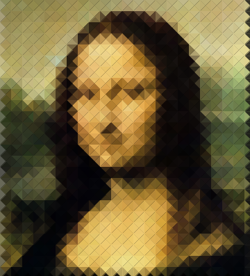
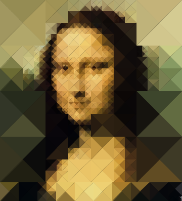
The next 2 versions use circular regions which don't filll all the space so a background colour shows through.


These 2 fill the background of each circle with the average colour of that region and this gives a much more pleasing result.
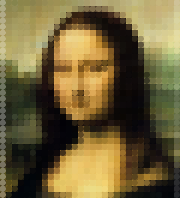
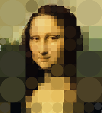
This last image uses a recursive triangle decomposition as well but the sub-triangles are defined in a more varied fashion.
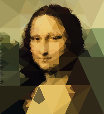
Sparklines for MLS Season
By: Jeff Clark Date: Tue, 25 Oct 2011
Edward Tufte defines Sparklines as intense, simple, word-sized graphics, that should also be high-resolution. They are a very useful technique, especially when combined with the idea of small multiples.
I generated the example below based on the results of the 2011 Major League Soccer regular season. In this case, a whisker-style sparkline was generated for each team to show the complete Win-Loss-Tie sequence for the season. A small upward blue bar shows a win, a grey bar in the middle a tie, and a downward red bar is, of course, a loss.
The graphic succinctly illustrates how each team did over the season. A few interesting tidbits:
- Los Angeles was consistently strong over the entire season
- Real Salt Lake ended the season poorly with 4 losses then 2 ties
- Sporting KC had a horrible start going 1-6-1 but then recovered well
- DC United had no wins in their last 6 games
- Vancouver had many more ties in the first half of the season than the second half
Radial Scans
By: Jeff Clark Date: Fri, 21 Oct 2011
Here are a couple of portraits done with a simple radial scan technique. Arc segments are drawn that are coloured by sampling an image source.

Top Ten Cars in the UK
By: Jeff Clark Date: Mon, 30 May 2011
I created some print graphics for Live Magazine back in February. I enjoyed the project a great deal and would be very happy to tackle more print projects. Send me an email at web1@neoformix.com if you are interested.
The graphic shows a streamgraph illustrating the top selling automobiles in the UK from 1973 until 2010. The various series were sorted to group the same brands together as much as possible and to add the newer brands to the outside of the graph.
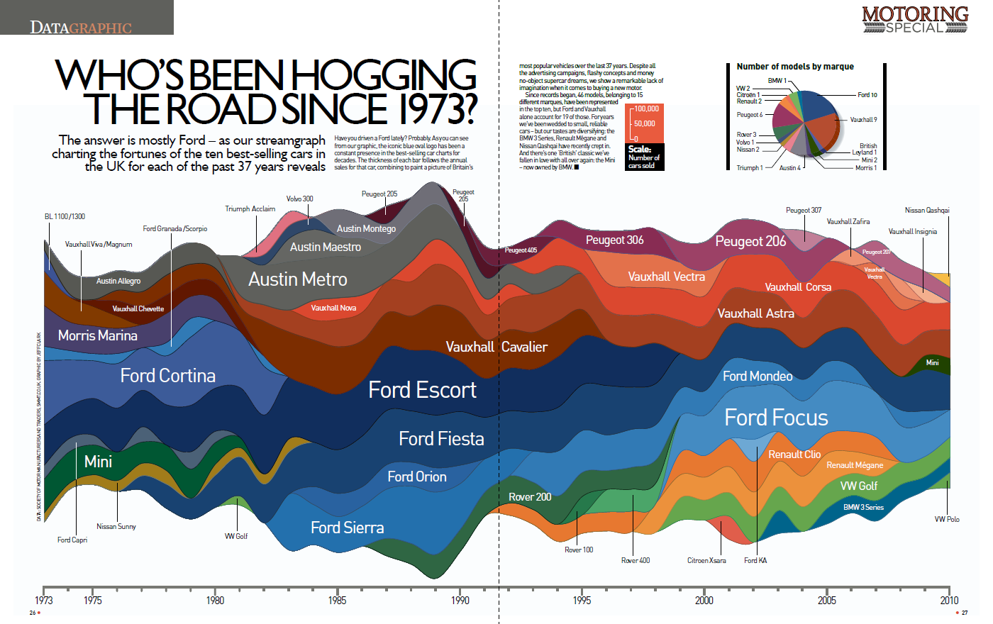
I used custom code created with Processing to create vector output in PDF format and then fine-tuned the graphics with Adobe Illustrator.
Minor Site Changes
By: Jeff Clark Date: Tue, 17 May 2011
I made a couple of minor changes to the Neoformix.com website. The first was that I removed the google Ads. They made virtually no money and cluttered the display up unnecessarily. The second change was that I added a 'Tweet' button at the bottom of every article page to make it easier to share my content on Twitter.
War and Peace
By: Jeff Clark Date: Fri, 13 May 2011
I've created two new Word Portraits titled War and Peace. Both the template images of Hitler and Gandhi are from the wonderful Wikimedia Commons.
I experimented a bit with adding a more 3D impression to the image by using a tool to bring forward the brighter parts of the image. This was done more for the Gandhi image since the highlighted parts of Hitler didn't correspond very well to depth. The tool I used was DeepImage by Daniel Hawkes.
Explore Twitter Lists
By: Jeff Clark Date: Sat, 30 Apr 2011
It has been very gratifying to see the interest in my recently launched Tweet Topic Explorer. In the week since it was made available there have been posts about it on Infosthetics, FlowingData, Cool Infographics, and many other places. It has also had over 1,200 tweets sent about it. Thank you everyone for trying it out and telling your friends!
Much of the initial attention came from people in Europe looking at non-English accounts. The tool was enhanced a few days after launch to ignore stop words in German, Italian, Spanish, French, and Dutch. It's not a perfect implementation and of course misses many common languages but it does make the tool more useful for many more people.
Another request for improvement that I was able to deliver was the capacity to analyze the tweets from Twitter Lists. You can now enter a list name in the field to see a Word Cluster Diagram for the latest tweets from the people on the list. The volume of tweets on a list is usually pretty high so the last 800 tweets (which is how many are used by the tool) will not go very far back in time. When using the Tweet Topic Explorer with a list the tweets on the right are enhanced to include the account and icon for the author of each tweet.
Here is the result for the Twitter List @Top100In/DataVis:
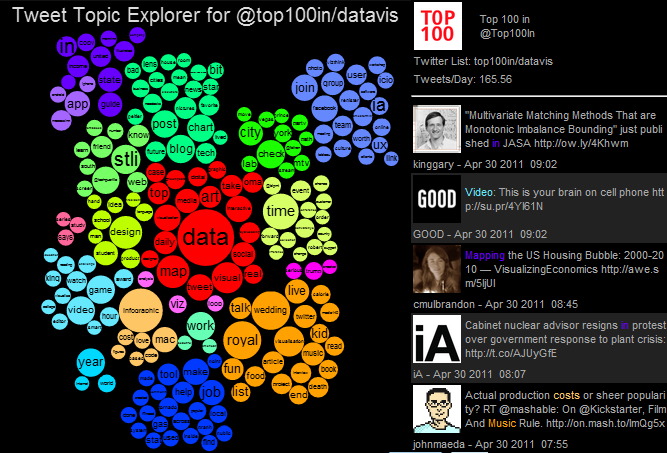
And here are a few others without the tweet list shown. @mashable/marketing:
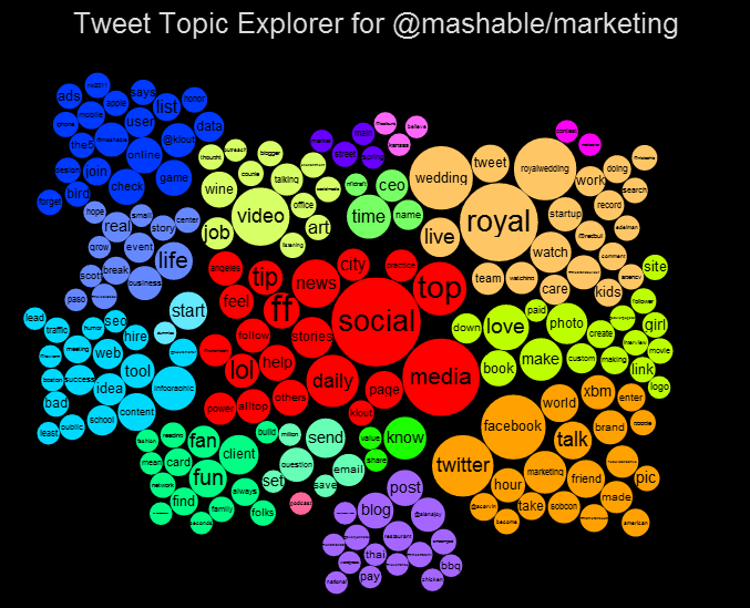
And @Scobleizer/iphone-and-ipad:
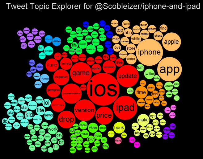
Tweet Topic Explorer
By: Jeff Clark Date: Tue, 19 Apr 2011
One problem I face on a daily basis is to decide for a given Twitter account whether I want to follow it or not. I consider many factors when making the decision such as language of their tweets, frequency, whether they interact on twitter with other people I admire, or if I have some personal or geographic connection with them. But the most critical factor for me is whether they tweet about things that match my interests. Sometimes you can get a hint about this by looking at their short one line twitter bio but the best way is usually to scan their latest tweets.
I have created a new tool to help see which topics a person tweets about most often. It also shows the other twitter users that are mentioned most frequently in their tweets. I call it the Tweet Topic Explorer. I'm using the recently described Word Cluster Diagrams to show the most frequently used words in their tweets and how they are grouped together. This example below is for my own account, @JeffClark, and shows one word cluster containing twitter,data,visualization,list,venn, and streamgraph. Another group has word,cloud,shaped,post etc. It's a bit hard to see in this small image but there is a cluster about Toronto where I live and mentions of run, marathon, soccer. Also, there are bubbles for some of the people on Twitter I mention the most often: @flowingdata, @eagereyes, @blprnt, @moritz_stefaner, @dougpete.
For all these images below you can click on them to go to a live version of the tool.
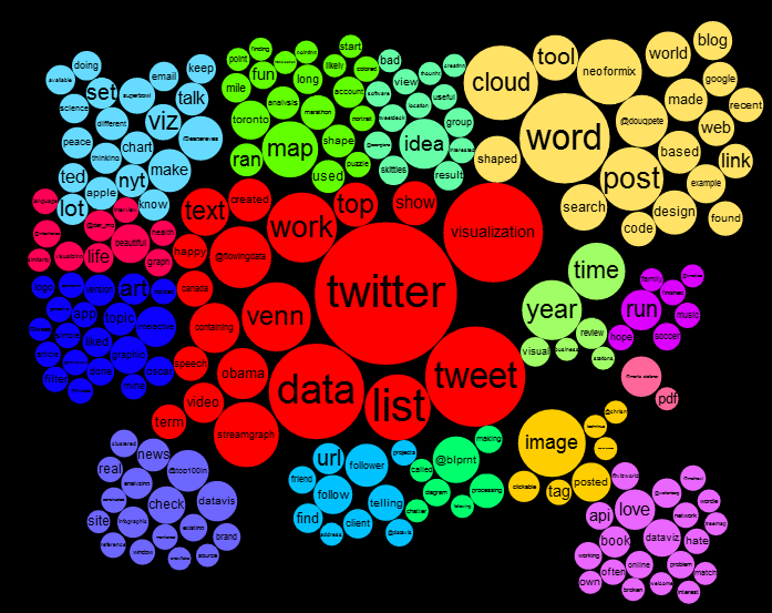
Here is another example showing the full tool. This one is for one of my favourite accounts to follow, @brainpicker, by Maria Popova. In this case the word 'book' has been highlighted with a click and the list to the right shows the tweets that contain the word. The words in the tweet list are coloured if they appear in the word cluster diagram. Clicking a different word bubble will select that word instead. You can click on any twitter @ID in the tweet list to load the data for that account. The tool is currently configured to load the last 800 tweets. For my account this goes back a couple of years in time but for more prolific tweeters it may only span a few weeks. The entry field at the lower left lets you explore the tweets for any twitter user.
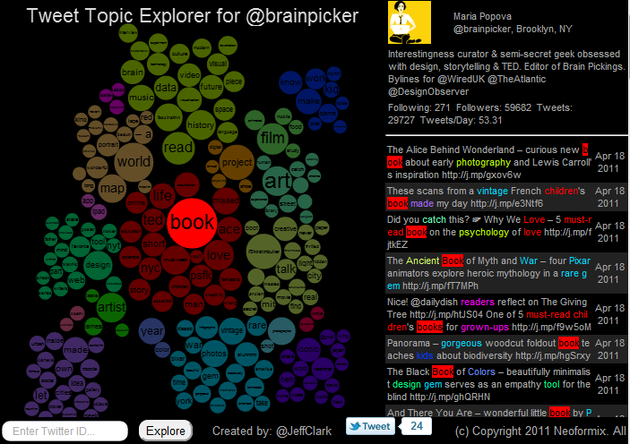
Here are a few more examples of the word cluster diagrams generated from some twitter accounts. @acarvin is doing an extraordinary job of covering the events in the Middle East.
(More...)
Word Cluster Diagram
By: Jeff Clark Date: Mon, 18 Apr 2011
A few years back I introduced the idea of Clustered Word Clouds which use word size to indicate frequency but also use positioning and word colour to group words together that were highly correlated in the text. It works reasonably well I think. See the example below:
I've come up with a new variation on this idea that tries to improve a couple of things. In many word clouds, including those generated by Wordle and my clustered clouds, the font size of the words are proportional to the word frequency. This has the effect that words with many letters (for example 'indisposed') cover a much greater area than a word with fewer letters (say 'ill') if they have the same word count. Some word clouds are constructed so that the area of the word is proportional to the word count rather than font height. This often has the opposite effect of unnaturally emphasizing words with fewer letters. My new design uses solid circles of colour whose area is proportional to the count. I think they may do a slightly better job of giving the proper visual emphasis to the words.
By using larger blocks of colour I think it's also easier to visually distinguish the groups in a clustered cloud. I'm calling this new variation a 'Word Cluster Diagram'. The one below is for the same text as the older style above but the clustering algorithm, and stop word list are a bit different so they aren't directly comparable. I think it has some promise although it's not as space efficient as using the words on their own.
Five Years
By: Jeff Clark Date: Fri, 08 Apr 2011
Five years ago today, I published my first entry on Neoformix.com. I wasn't really sure if anyone would pay attention. You have, and for that I thank you all. Thanks especially to everyone who has written about my work or passed it along to your friends.
Except for the first few months, virtually all the images, interactive applications, and analysis presented on this blog were created using code I wrote with Processing. Thanks very much to Casey Reas, Ben Fry, and the community around that wonderful tool. Thanks to all the amazing researchers, coders, artists, and designers that have most directly influenced my work, especially: Ben Shneiderman, Martin Wattenberg, Fernanda Vi�gas, Ben Fry, Casey Reas, Chris Harrison, Nathan Yau, Lee Byron, Moritz Stefaner, Jonathan Feinberg, Gui Borchet, Jer Thorp, Robert Kosara, Andrew Vande Moere, Manuel Lima, Frederik Vanhoutte, Mario Klingemann, Robert Hodgin, and Tom Carden.
I've selected images from a few representative posts from the past five years. Click on the image to visit the respective post. Thanks again everyone and I'm looking forward to what the next five years will bring!
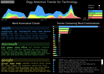


Love and Hate on Twitter
By: Jeff Clark Date: Mon, 14 Feb 2011
I have been collecting tweets containing the words 'love' and 'hate' for a couple of years now and decided to analyze them to see what could be discovered. It was a fun project that I finished just in time for Valentine's Day. I hope you love it!
For the data I chose to use every tenth tweet containing the word 'love' and every tenth tweet containing the word 'hate' from all of 2010. This yielded 658,391 love tweets and 503,489 hate tweets. Incidentally, this means there were roughly 6.5 million tweets last year containing 'love' and about 5 million containing 'hate'.
The first set of diagrams in the graphic show the love/hate ratio for various sets of related words. Basically, I counted the number of times a word appeared together with 'love' and together with 'hate'. A simple percentage of 'love' associations out of the total gives a basic measure of sentiment - let's call it the Love Quotient ;) A value near 100% means the word is used almost exclusively with 'love' and never with 'hate' and the graph will show hearts all the way to the right side. Each full heart represents 5% over the 50% neutral point so, for example, 'amazon' has six and a bit hearts showing so its' Love Quotient is about 82%.
Using simple word association is a pretty crude measure of sentiment. It obviously would be fooled by a sarcastic tweet like: Ugg - liver and onions again. Don't you just love the food in the cafeteria? Even so, by looking at large quantities of data it seems to give reasonable results in many cases. The data definitely settles the age-old question: pie > cake!
The diagram with all the photos is actually a Treemap. Surprisingly, this is the first treemap to appear on Neoformix since my second post back in April of 2006 about The Map of the Market. This one shows the people who were mentioned most frequently with the word 'love'. It's dominated by celebrities, mostly singers who appeal to young teenagers.
The StreamGraph shows how the word 'love' was used together with various sports over the course of 2010. The term 'football' combines references to both american football and international football (soccer). You can see the peak in June for the World Cup and peaks for both hockey and skating during the winter olympics in February.
Text analysis and creation of the various graphics was done with custom code created in Processing. The Treemap diagram used the Treemap library created by Benjamin B. Bederson and Martin Wattenberg. Thanks!
State of the Union 2011
By: Jeff Clark Date: Wed, 26 Jan 2011
President Obama delivered the State of the Union speech last night for 2011. I've created a few diagrams that compare it with the speech from last year to try and understand how it differs.
First we have two Sentence Bar Diagrams for the speeches from 2010 and 2011. Sentence Bar diagrams use color coding to show the topic of the various sentences in the text and bar length to show how long the sentences are. In these diagrams I did combine adjacent pairs of sentences so it wouldn't be too long. These two texts are almost the same length, have a very similar breakdown over the four topics, and both have a segment towards the end about security issues. The 2011 speech has slightly more emphasis on the domestic issues of education and less on economic matters.
This next diagram shows the words that were used much more frequently in 2010 vs 2011. For example, the word 'families' - the third down the list, was used 17 times in 2010 but only 2 times in 2011. Other prominent words from last year compared to this year: bill, businesses, security, national, recovery, act, banks, energy, and insurance.
This one below shows the words used much more often this year than last year: new, world, race, future, high, technology, research, education, progress, and innovation.
Finally, we have a Document Contrast Diagram comparing the two speeches.
Simple Visual Designs
By: Jeff Clark Date: Fri, 19 Nov 2010
I've been exploring algorithmic generation of images from combinations of simple shapes. I'm using alpha-blending with grayscale sub-components and then taking the various shades of gray created through overlap and recoloring based on a palette. Here are a couple that I think turned out pretty well.


Designs by Juan Osborne
By: Jeff Clark Date: Wed, 03 Nov 2010
If you enjoy my Word Portraits you should definitely take a look at the work of Juan Osborne. He has some wonderful designs. Here are a couple of samples:
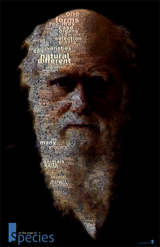

Six Ways to Find Value in Twitter's Noise
By: Jeff Clark Date: Mon, 07 Jun 2010
The June 2010 Issue of the Harvard Business Review contains a small data visualization piece by myself and Scott Berinato. It's called Six Ways to Find Value in Twitter's Noise and has a StreamGraph showing tweets about the iPad during the launch weekend. I collected and analyzed the data and created the StreamGraph. Scott did a great job picking out some interesting features and explaining what it all means. It was a fun project and it's great to see my work in such a prestigious print magazine. Thanks for the opportunity Scott!
StreamGraph for Makers
By: Jeff Clark Date: Sat, 15 May 2010
A few weeks ago I had the pleasure of reading Makers, a novel by Cory Doctorow. It's an interesting story, well told, and filled with stimulating ideas related to technology, creative culture, and intellectual property.
Cory makes his work available for free download so I was able to create a Document StreamGraph based on the text of the book. The document is split up into 24 equal sized segments and the word counts are done within each segment. These segments are used in place of time along the horizontal axis of the StreamGraph. I chose to show capitolized words and the resulting image does a reasonable job of illustrating the ebb and flow of the various characters within the narrative.

Some Thoughts on Flash
By: Jeff Clark Date: Thu, 29 Apr 2010
Steve Jobs published some thoughts today about why Apple isn't supporting Flash on their mobile platforms. The Shaped Word Cloud below was created from the text.
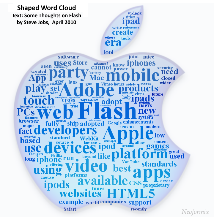
Just for fun I made a Clustered Word Cloud as well.
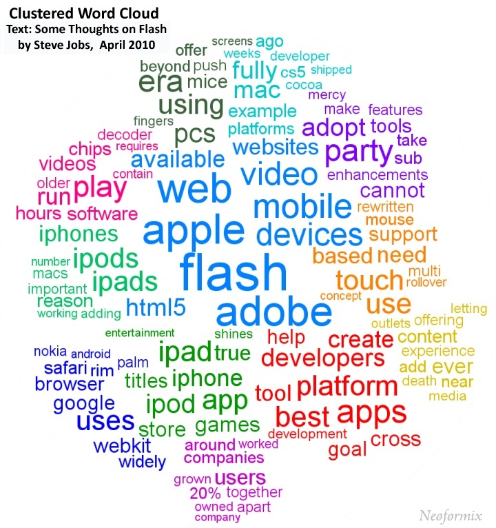
The Art of Tatiana Plakhova
By: Jeff Clark Date: Wed, 21 Apr 2010
I really like the work of Tatiana Plakhova and have been following her Flickr stream since last year. Some of her images make me think of alien life forms or cities of the distant future. The one on the top right here below reminds me of Cerenkov Radiation.


Using her image from the top left above as inspiration I created a simple animation that tries to recreate her style. This video isn't great quality but seems to get the idea across.
Blue Flow 1 from Jeff Clark on Vimeo.
NHL Points Over Career
By: Jeff Clark Date: Mon, 19 Apr 2010
One charting technique that I really like is to take time series for related data that occured over different time periods and align them to a common starting point so they can more easily be compared. One good example is this graph comparing this recession to the last five in terms of employment decline. Another one, this time interactive, is from the NYT and depicts Paths to the Top of the Home Run Charts.
I have created a couple of simple line charts showing cumulative point production (goals + assists) for selected NHL players over their careers. I'm actually using Adjusted Points which try to control for the fact that teams played fewer games in the past and rule changes and other factors impact the ease of scoring goals over time. Data is from Hockey-Reference.com.
This first chart shows many of the top players from the past. I only showed data up until age 43. Gordie Howe did get points in the NHL at age 51 but they were negligible in the overall results other than to illustrate his amazing longevity as a player. The graph clearly shows why Wayne Gretzky is called the 'Great One'. You can also see the various plateaus due to injury for Lemieux, and early career end for Bobby Orr (who is also the only defenceman shown here).
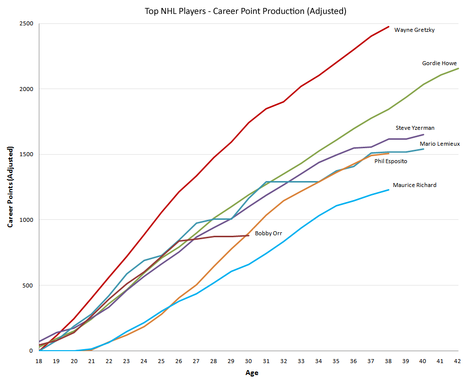
The second graph keeps Gretzky and Richard for comparison but highlights many of today's top stars. Crosby appears to have a legitimate chance to match Gretzky but has a long way to go...
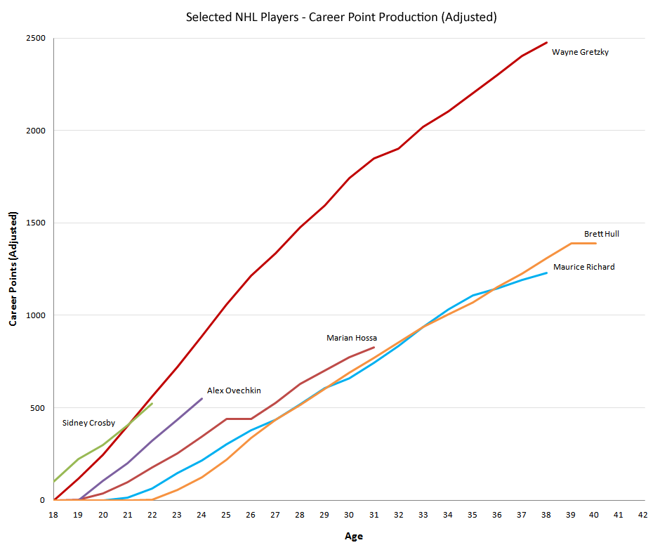
Tweets Containing Love
By: Jeff Clark Date: Fri, 09 Apr 2010
I have been collecting tweets containing the word 'love' for more than a year now and just analyzed a sample to see what other words are being used in conjunction with 'love'. I naively assumed I'd see lots of company or product names as the top non-generic terms. There were a few near the top - iphone, ipod, and starbucks for example. The most commonly used non-generic terms were actually almost all Twitter accounts for singers. The person with the most references was @justinbieber. Note that I analyzed 1 out of every 50 tweets so the counts shown here are ~50 times smaller than the real totals for the year.
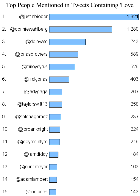
During the last few months the total for @justinbieber exceeded the next top 14 combined. The streamgraph also shows a strong decrease for @mileycyrus and @ddlovato. References to @jonasbrothers seem to have split into separate streams for both @nickjonas and @joejonas.
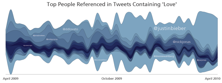
Here is a PDF version of the streamgraph.
Inline Images for Twitter Clients
By: Jeff Clark Date: Wed, 03 Mar 2010
Wouldn't it be cool if your twitter client could directly show tweets with small embedded images? Things like stock charts, graphical weather reports, server status, traffic reports, graphical emoticons expressing emotional state of your friends, mini-graphical movie ratings with thumbs up/down or stars, sports record summaries, or a million others that I haven't though of? Perhaps something like this?
This shouldn't be very hard. In fact, I think all that's required is the following:
- Somebody create a new URL shortener that by convention is only for links to images of dimensions 234x60 pixels or smaller. It should verify at the time of link creation that images fulfill the size constraint. I'll call it inpic for now but any short name would work.
- Twitter clients that want to support inline images in tweets are modified to recognize tweets with links to http://inpic.com/ABCD and display the image inline rather than the text link. Twitter clients that don't support inlining would show the text link and people could see the image with a click as they do now.
Step 1 is easy. There are hundreds of URL shorteners already in existence. We just need to adopt one that indicates by its' name that it points to a small embeddable image. An alternative that would avoid having to get different companies to adopt the same convention would be to use a special hashcode to indicate the same thing. Have all tweets with any link and the tag #inlinedimage handled by showing the image inline. If the link is invalid or doesn't point to a small image then the twitter client should revert to showing the text form.
Step 2 is easy as well since Twitter clients already show images in tweets - the user avatar images. I chose the size constraint by measuring the space used by TweetDeck to show the text of a tweet - I got about 237x62 pixels. This is just slightly bigger than the standard half banner size of 234x60 used for online advertising so I chose that instead.
Here are a few more things that could be added to make this even more useful:
- The URL shortener service (inpic or whatever it gets called) would host images in a manner similar to twitpic.com
- Twitter clients would support letting people easily embed graphical emoticons.
- If a second link in an inline image tweet is provided it would act as a browser target link if the inline image is clicked on. So an inline image in a tweet would give summary information and when clicked on the user would see more details inside a browser window.
- Twitter clients that support this might have an option to turn it off for anyone who prefers to always see text.
I think many people would find this valuable and it seems quite simple to accomplish. Come on TweetDeck, Twhirl, and other Twitter Client companies - get to work!
Where this idea came from
This morning I came across the interesting post Visualizing time series data embedded in tweets by Chris McDowall. The basic idea he discusses is to send time series data in tweets and have twitter clients recognize the format and present it as a small graph ( or Sparkline ) embedded in the tweet stream rather than just text. Chris seemes to have been inspired by the Twitter Data proposal.
It's an intriguing idea and Chris created a proof of concept twitter client called the Twitter Sparkline Visualizer.
One problem I see is that a twitter client that doesn't recognize the special data format would show the cryptic form which would probably be undesirable in most cases. Also, the 140 character limit of a tweet would put a fairly tight boundary on how much could be encoded. In a comment on the post, Tom Carden suggested looking at the Google Charts API as a "good example of a concise vocabulary for passing chart data around using URLs".
Tom's suggestion triggered an idea for me: Use any RESTful api like Google Charts to encode small charts in a URL, then use a URL shortener to construct a tweetable link representing the chart. Furthermore, we can use a specially named URL shortener that indicates to a twitter client that all of its' links point to small inline charts. This lets a twitter client determine efficiently that a given link can be rendered inline.
It makes sense to generalize the idea further to support use of any small image rather than charts in particular.
Profile in Harvard Business Review
By: Jeff Clark Date: Sat, 27 Feb 2010
About ten days ago I was contacted by Scott Berinato, an editor at the Harvard Business Review, who was interested in writing up some of my visualization work for the HBR Research blog. We had a nice chat and he subsequently published Four Ways of Looking at Twitter which profiled my four twitter visualization tools.
He did a wonderful job and the article got lots of attention on Twitter. I've been tracking many of the tweets about the article and there have been at least 1500 tweets sent by various people telling their friends to read it. All the extra attention has made this the busiest week on Neoformix over the past year. Thank you to Scott for creating the article and thanks also to everybody who passed it along to all their friends!
Apple Logo from Products
By: Jeff Clark Date: Tue, 02 Feb 2010
I was looking for pictures of the new Apple iPad and stumbled across this image of Apple Form Factor Evolution. It's got lots of images of Apple products on a nice simple white background and was perfect fodder to use with the Image Foam Technique so I made this version of the Apple logo from the product sub-images.
SOTU 2010 Word Cloud Map
By: Jeff Clark Date: Thu, 28 Jan 2010
Last night President Obama delivered the State of the Union Address. The Shaped Word Cloud below was created from the text.
More Visualization Links on Twitter
By: Jeff Clark Date: Sat, 23 Jan 2010
In a recent post I showed the Top 20 Individual Data Visualizations Mentioned on Twitter and remarked that many of the most frequently mentioned twitter links were to collections of visualizations. Shown below is a meta list of the top collection-type data visualization or infographic links.
Top Collections of Data Visualization Links
- 50 Great Examples of Data Visualization - Webdesigner Depot
- Data Visualization and Infographics Resources - Smashing Magazine
- 15 Stunning Examples of Data Visualization - Web Design Ledger
- 20 Essential Infographics & Data Visualization Blogs - Inspired Magazine
- Is Information Visualization the Next Frontier for Design? - Fast Company
- 28 Rich Data Visualization Tools - InsideRIA
- The Beauty of Infographics and Data Visualization - Abduzeedo
- 50 Great Examples of Data Visualization - Sun Yat-Sen University
- 20 Inspiring Uses of Data Visualization - SingleFunction
- 5 Best Data Visualization Projects of the Year – 2009 - FlowingData
- Data Visualization: Stories for the Information Age - BusinessWeek
- Data Visualization: Modern Approaches - Smashing Magazine
- The 21 Heroes of Data Visualization: - BusinessWeek
- 20+ CSS Data Visualization Techniques - tripwire magazine
- MEDIA ARTS MONDAYS:Data Visualization Tools - PSFK
- 37 Data-ish Blogs You Should Know About - FlowingData
- 5 Best Data Visualization Projects of the Year - FlowingData
- 30 new outstanding examples of data visualization - FrancescoMugnai.com
- Infosthetics: the beauty of data visualization - PingMag
- 5 Beautiful Social Media Videos - Mashable
Here are the top product type links in the field according to Twitter data between March 24 and Dec 31, 2009.
Top Data Visualization Product Links Mentioned on Twitter
- Axiis : Data Visualization Framework
- The JavaScript InfoVis Toolkit
- Microsoft - What is Pivot?
- Many Eyes
- Roambi - Your Data, iPhone-Style
- Flare - Data Visualization for the Web
- Gapminder.org - For a fact based world view.
- SpatialKey - Location Intelligence for Decision Makers
- Tableau Software - Data Visualization and Business Intelligence
- SIMILE Widgets
and finally:
Top Data Visualization Websites Mentioned on Twitter
Charting the Beatles
By: Jeff Clark Date: Mon, 18 Jan 2010
Michael Deal has published an interesting collection of graphics in his Charting the Beatles project. This first snippet below shows the beginnings of a graph illustrating authorship and collaboration in songwriting throughout their song collection. The full graphic clearly shows the trend towards less collaboration over time in songwriting, the increasing contribution from George, and increasing contribution by outside contributors.
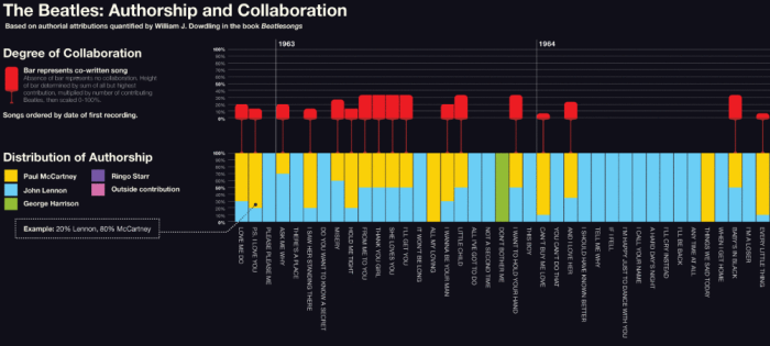
This second image is from a chart showing references in Beatles songs to earlier songs. There are full images and several other interesting graphics on his site.
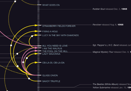
Top 20 Data Visualizations Mentioned on Twitter
By: Jeff Clark Date: Mon, 18 Jan 2010
For many people Twitter has become the best place for discovering the latest and most interesting work in a variety of fields. In my twitter client I keep a search column open that gets constantly updated with the latest tweets pertaining to data visualization or infographics and I see lots of beautiful content flow by. I've been collecting these tweets for quite a while and thought it would be interesting to analyze them and see which visualizations were shared through twitter the most often.
Many of the top links in the domain were articles containing collections of visualizations chosen to be the 'Top NNN' by some panel of experts. For example, the top most shared link was 50 Great Examples of Data Visualization by Web Designer Depot. I will have another post in the near future that lists the most popular of these types of links as well as separate lists for products/frameworks and news/analysis. For this list I chose to focus instead on references to individual data visualizations or infographics.
Here are the top 20 ordered by popularity. Click on either the link or image to go to the original article.
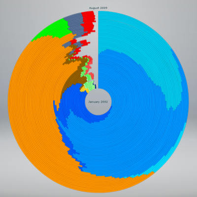
2. Stunning data visualization in the AlloSphere - Video on TED.com
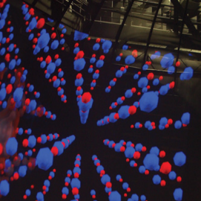
3. Worldwide Real-Time Firefox Downloads
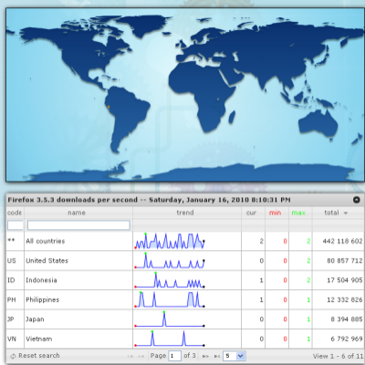
4. The Geography of Jobs - TIP Strategies
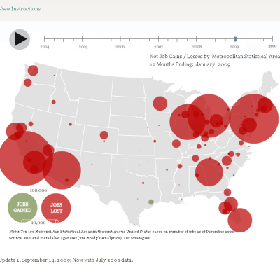
5. Realtime Downloads from the App Store - Michael Lebowitz
6. Manhattan's Population By Day vs Manhattan's Population By Night - Manhattan population - Gizmodo
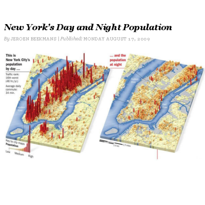
7. Take a new look at health - GE
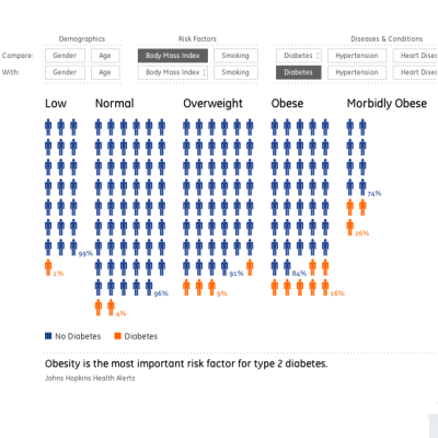
8. The Billion Dollar Gram - Information Is Beautiful
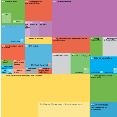
9. Death and Taxes 2009 - WallStats
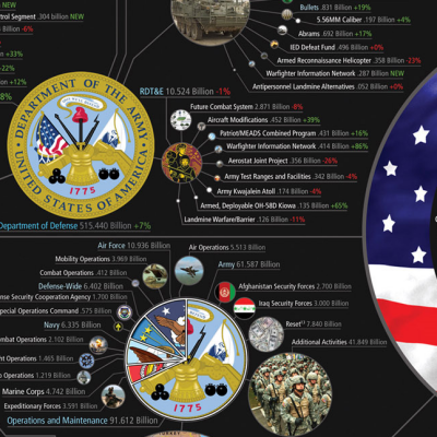
10. Turning a Corner? - NYTimes.com
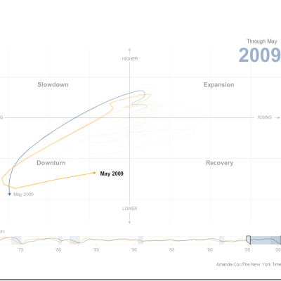
Note that the link made popular on Twitter for #9 Death and Taxes was actually a link to an image on imageshack and I have used instead a link to the original source of the material.
The tweets for this entire analysis were collected from March 24, 2009 until December 31, 2009. Only the first link to a specific item from each Twitter ID was counted so that one person did not unfairly impact the results by tweeting frequently about the same thing.
Items 11-20 are listed below.
(More...)
Twitter Word Map for Android
By: Jeff Clark Date: Sat, 16 Jan 2010
Here is a Shaped Word Cloud for tweets containing 'android' from 2009. I removed the tokens 'android' and '#android' from the analysis. You can click on the words to jump to Twitter Search and see the matching tweets. It's pretty clear that android is a 'google' 'phone' and is related to 'iphone' and 'htc'.

Obama 2009 Tweets and #tcot
By: Jeff Clark Date: Mon, 11 Jan 2010
I've taken another look at the set of tweets from 2009 that contain 'Obama'. This time I started by focusing on the most popular hashtags that were used. This graph shows the top 10 hashtags, their distribution over the course of 2009, and the total references to them. The top hashtag by far was #tcot which stands for 'Top Conservatives on Twitter'.
How do tweets that contain #tcot differ from those that don't have it? What words seem especially associated with the tag? What topics do people using the tag seem to be focusing on?
I've done an analysis on the word frequency inside tweets containing the tag versus tweets without it. This chart below shows the words that are used much more frequently in the #tcot tweets compared to the baseline. Words on the left like 'CARE' and 'BUSH' are used at a rate of around 100-120% of the baseline rate. Words on the right like 'BHO' (shorthand for Barack Hussein Obama) and 'RASMUSSEN' are used around 500% of the baseline rate - or, in other words, they occur around five times as often in #tcot tweets as they do in non-#tcot tweets.
The chart is an interesting collection of terms and is an attempt at distilling what the people who use the tag #tcot are saying in relation to Obama. Some notable words in the set are 'DANGEROUS', 'SOCIALIZED', 'EXPOSE', 'RADICALS', 'ARROGANT', 'MARXIST', 'COMMUNIST', 'CLIMATEGATE'.
Tweets About Obama in 2009
By: Jeff Clark Date: Thu, 07 Jan 2010
I collected all the public tweets containing 'Obama' during 2009. There were over 5 million recorded during the course of the year. I've done some analysis on a sample containing every 20th tweet. This first graph simply shows the distribution over the course of the year of the number of times the name 'Obama' was used. The curve has a big peak during the inauguration, a few smaller ones in February and March and is then remarkably level for the rest of the year.
This set of graphs shows other words that were used frequently in the tweets about Obama and that had distributions with a high concentration near specific dates during the year. When ordered by the peak date for each graph they give an interesting graphical narrative of Obama-related events during 2009.
Snow Doves
By: Jeff Clark Date: Tue, 05 Jan 2010
It's been snowing where I live for the last month or so and I've been playing around with generating a dove image from snowflake constituents. This first image is constructed from smaller snowflakes built using the Text Snowflake Creator based on the words PEACE, LOVE, and TRUTH. The dove image is from Wikimedia Commons.

This second version uses the three unicode snowflake characters in the font Arial Unicode MS. I've also applied a small variation in color.

Neoformix Review 2009
By: Jeff Clark Date: Mon, 04 Jan 2010
Thank you everybody for your interest in Neoformix over the past year. I wish you all a Wonderful and Happy 2010!
These are the 20 most popular posts published on Neoformix during 2009 ordered by their popularity. There are a large number of popular posts based on the Shaped Word Cloud concept and a few more on the related Image Foam Technique.
2. September 11 Pager Data Visualization
3. Butterfly Plane
4. Oscar Chatter on Twitter
5. Hudson River Landing
6. Fish Tank
7. Butterfly Falcon
8. Shaped Word Clouds
9. TED Shaped Word Cloud
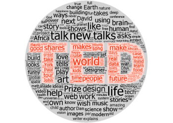
10. The Raven
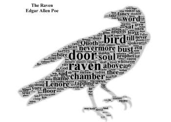
11. Apple Twitter Word Map
12. Obama Twitter Word Map
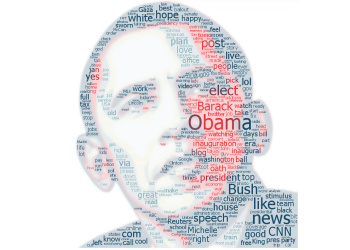
13. Earth Day Twitter Map
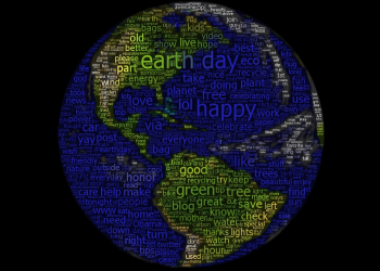
14. Peace Dove
15. World News Clustered Word Cloud
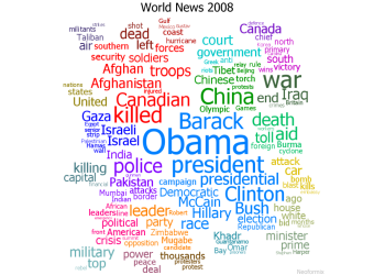
16. Word Portrait: Michael Jackson
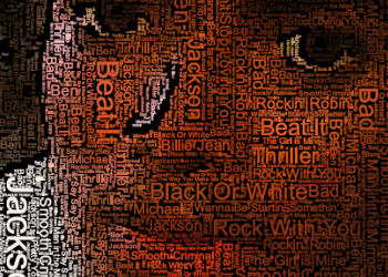
17. Obama Inauguration Speech
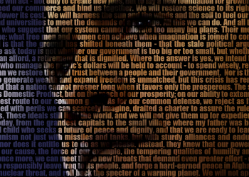
18. Twitter List Profile Clouds

19. Toronto Twitter Community
20. Temporal Correlation for Words in Tweets
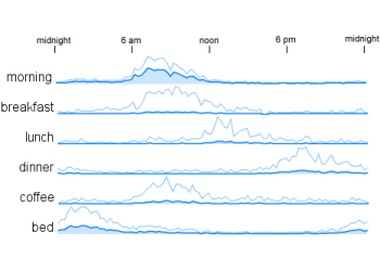
Note that many of the most popular parts of Neoformix visited during the past year were for projects published prior to 2009 and include Twitter StreamGraphs, Twitter Venn, Big Small, and Word Hearts.
Twitter Venn Birthday
By: Jeff Clark Date: Thu, 17 Dec 2009
One year ago today I launched Twitter Venn. Those of you who have not used it before or have forgotten about it might want to check it out. The image below is an example of what it produces.
ACM Crossroads Cover
By: Jeff Clark Date: Tue, 15 Dec 2009
I'm very pleased to announce that an image from my Twitter StreamGraphs tool was chosen as the cover for the current issue of ACM Crossroads - the Student Journal of the Association for Computing Machinery. There is also a small writeup inside about the image. It depicts the streamgraph for the phrase 'data visualization' and suits the issue well since it is dedicated to the Social Web. The entire issue is available online.
Thanks to Chris Harrison, the editor-in-chief, for inviting me to contribute the image and to Senior Editor Jill Duffy for sending me some copies of the issue.

Climate Change Clouds
By: Jeff Clark Date: Mon, 07 Dec 2009
Fifty-six papers in forty-five countries published a front page article today calling for action at the climate summit in Copenhagen. I've taken the text of the article and created a couple of images. The first is a Clustered Word Cloud which shows the more prominent words from the article grouped into clusters based on whether they were used together.
This second image takes the word clusters and arranges them in a starburst type pattern. The visual form was influenced by the Word Associations work by Chris Harrison. It's a little more interesting to look at and makes the groupings more obvious but has the drawback that the words are smaller than in the first format.
Animated Word Clouds
By: Jeff Clark Date: Wed, 02 Dec 2009
Last night Obama outlined the new policy in Afghanistan in a speech at West Point entitled The Way Forward in Afghanistan and Pakistan. Like many people, I have mixed feelings towards a larger military effort in the region. I have tried to represent that ambivalence with an animated word cloud based on the speech that transitions from one symbol to another.
This was created with custom code written in Processing. The two images came from here and here.
If you like this work you might want to 
9/11 Pager Data Visualization
By: Jeff Clark Date: Sat, 28 Nov 2009
The organization Wikileaks recently published a data set of pager intercepts from the 9/11 tragedy. As described on their website:
Text pagers are usually carried by persons operating in an official capacity. Messages in the archive range from Pentagon, FBI, FEMA and New York Police Department exchanges, to computers reporting faults at investment banks inside the World Trade Center
The archive is a completely objective record of the defining moment of our time. We hope that its entrance into the historical record will lead to a nuanced understanding of how this event led to death, opportunism and war.
I have taken this data and done an analysis for 100 phrases selected to summarize the events of that horrible day. I have focused on the time period from 8am until 8pm, September 11th, 2001.
This video below shows a Phrase Burst Visualization of the data. The larger the text the more frequently it was used during the 12 hour period. Text appears bright during the times of high usage and fades away otherwise. The color hues are cosmetic. This phrase burst visualization is basically a word cloud where the brightness of the words varies according to how prominent the words were during specific periods of time. You can drag the playhead for the video around to examine specific times.
Pager Data from 9/11 - Phrase Cloud Visualization from Jeff Clark on Vimeo.
Perhaps a more useful view of the data is provided by this set of timeline graphs. They are ordered by the time of the highest peak for the phrase and in this arrangement provide a narrative of the events.
Video, graphing, and analysis done with custom code created with Processing.
If you like this work you might want to
Swine Flu Deaths - Altered
By: Jeff Clark Date: Tue, 24 Nov 2009
I believe that the recent Swine Flu pandemic has been dramatically overplayed in the media. This morning I came across the image below on dataviz.tumblr.com that shows the number of deaths in the last 300 days from various causes including Swine Flu. There are a lot of things done really well here - the most important of which is that the deaths due to swine flu are put in a proper context.
Unfortunately the choice of using a solid red bar for emphasis beside the bar graph for Swine Flu deaths confuses the message because at first glance the bar can be interpreted as an extension of the bar graph itself. The first impression (and for some viewers the only impression) is that the deaths due to swine are exceptionally high - the very myth that the graphic is trying to dispel.
I have made a small intervention to the graphic that I believe makes the message less likely to be confused. The bar has been replaced with a text label and three arrows that can't be confused with an extension of the graph itself but still draw attention to the relatively small number of deaths for Swine Flu.
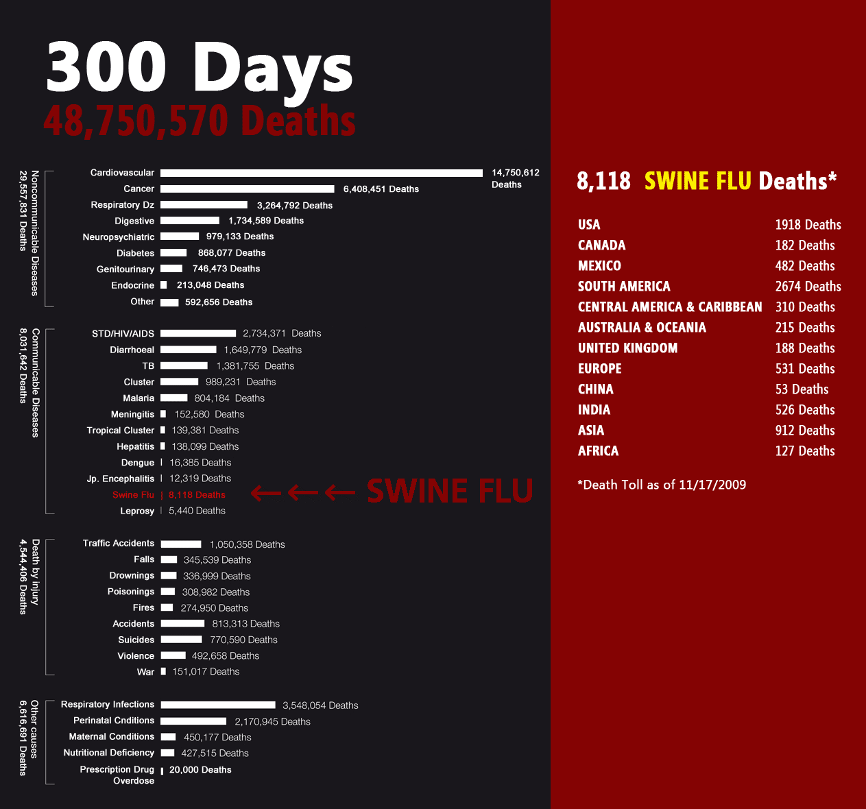
Unfortunately there is no reference on dataviz.tumblr.com to either the source of the original graphic or the data depicted. If anyone knows then send me a note and I'll add proper attribution here.
Creating Topical Twitter Lists
By: Jeff Clark Date: Sat, 21 Nov 2009
In a recent post I defined the idea of Twitter ListMates as IDs that are frequently grouped together on the same twitter lists. The listmates for some starting ID give an interesting perspective on how that ID is perceived by others and are in some sense similar to it.
If the starting 'seed' ID is highly characteristic of some particular domain then the highest ranking listmates will also be characteristic of that domain. As a concrete example, let's start from infosthetics, the twitter account for one of the central websites in the area of data visualization. The top ranking listmates are: flowingdata, datavis, and infobeautiful which are all very important voices in the domain.
If we start with all four of these IDs, find the lists they are on, and see who else appears on the same lists the most often we can get an excellent quality list of twitter IDs for the field of data visualization. By starting with a small set of IDs rather than just one we introduce less bias into the result. Another technique that can be used to improve quality is to only use twitter lists whose name matches the domain as well - for example include the members of a list called 'datavis' but not of one called 'friends' when determining the listmates.
I have used this technique to define a number of twitter lists for various domains and saved them under the twitter ID Top100in. The lists defined so far are:
These meta-lists seem to be filled with interesting accounts for the various topics although the datavis one does have a few IDs that are more focused on digital art and design rather than visualization in particular. Feel free to follow them!Twitter StreamGraph Supports Lists
By: Jeff Clark Date: Mon, 16 Nov 2009
I have updated Twitter StreamGraphs to support the new twitter lists. You just enter a list in the standard format in the text box to see the graph for the latest 1000 tweets from all members of the list. The standard format looks like this: @scobleizer/web-innovators.
More Twitter ListMates
By: Jeff Clark Date: Mon, 16 Nov 2009
In Twitter ListMates I introduced a name for the idea of people who are often grouped together on Twitter lists. The idea has value because listmates have been grouped together by multiple people who independently decided that those accounts are similar in some sense. Doing this type of analysis starting from my account, JeffClark, helped me find new people to follow.
I have repeated the process for four other accounts to try and confirm that this technique is indeed useful. The results are shown below.
| For Robert Scoble (scobleizer) we get: | For Shaquille O'Neal (THE_REAL_SHAQ) we get: |
| For John Mayer (johncmayer) we get: | And for Alex Payne (al3x), an engineer at Twitter: |
Again, it seems to give good results: Scoble is grouped with other influential people in the field of technology; Shaq with a mixture of athletes and other celebrities; John Mayer with musicians and celebrities; And Alex with a mixture of developers, other twitter employees, and people influential in technology.
Twitter ListMates
By: Jeff Clark Date: Thu, 12 Nov 2009
In the recent post called Twitter List Profile Clouds I explored how the Twitter list names to which a person has been added can reveal how they are perceived across the twittersphere. Another interesting idea is that when somebody adds an account to a list they are implicitly defining a relation between that account and every other account on the same list. They are essentially making a declaration that all the members of the list share some characteristic. The name of the list usually offers a clue about how all the list members are related.
So, for example, the fact that datavis and flowingdata both appear on a list together means that somebody thinks they are similar in some sense. And if the list name is called 'datavisualization' then that reveals how the list creator thinks they are similar.
I think of two accounts that appear on a list together as 'listmates'. It seems a reasonable name for the concept and follows the pattern of schoolmates, roommates, teammates etc. If you take all the Twitter Lists that an account is listed on and find all the members of those lists you can define a set of users related to the starting account. Keep track of how many times they appear in total and you also get a numeric score for how similar they are.
I tried out the idea using my own account, JeffClark, as a starting point. Here are my top 25 Twitter Listmates:
- datavis
- flowingdata
- ben_fry
- infosthetics
- moritz_stefaner
- stamen
- colorfuldata
- infobeautiful
- pitchinteractiv
- reas
- visup
- krees
- blprnt
- mslima
- eagereyes
- nbrgraphs
- jcukier
- vizworld
- mcristia
- infojocks
- infochimps
- datamasher
- teamswivel
- sunlightlabs
- densitydesign
The list is a who's who of people I respect and admire in the field of data visualization and I'm very pleased that others have grouped us together. I believe this technique has promise for finding interesting new accounts to follow.
Two Sides of the Same Story
By: Jeff Clark Date: Mon, 09 Nov 2009
Jer Thorp has been doing some amazing work over the last couple of years. He just wrote an excellent post called Two Sides of the Same Story: Laskas & Gladwell on CTE & the NFL where he introduces a small visualization tool to look at the similarities and differences between two articles published in October about head injuries and the NFL. The articles are Game Brain, by Jeanne Marie Laskas and Offensive Play, by Malcolm Gladwell. The image below shows an example of what his tool can do.
I have previously explored the idea of comparing and contrasting document pairs with my Document Contrast Diagrams. The diagram below was created from the same two articles that Jer used in his analysis. There are obviously a lot of differences between the two visualizations both in appearance and in the technical means of constructing the diagrams but the underlying organizational metaphor is the same:
- Size of words reflect frequency of use
- Horizontal position reflects which document uses the word the most
- Vertical position reflects where the words are used in the documents the most
Jer's tool seems designed more to be for interactive exploration whereas mine is focused more on creating static diagrams that try and show more information all at once. Mine also tries to illustrate emotional tone (with the little coloured triangles), the overall document size difference, and the fraction of unique or shared vocabulary.
Just to be clear, I'm NOT suggesting Jer used my work as a starting point for his own - although I'd be flattered if he did! It's just a case of two people tackling the same problem and independently coming up with a fairly obvious approach to represent the information. Those of you who like my work should check out his blog blprnt.com. Jer has recently published the source code for a number of his projects and has plans to set free the code for this tool as well.
Twitter List Profile Clouds
By: Jeff Clark Date: Sun, 08 Nov 2009
Twitter recently introduced the Twitter List feature which lets people define sets of user accounts that are related in some manner. The lists are given a name and can be followed by other people who are interested in seeing all the tweets from the accounts in the list. Popular twitter users such as Robert Scoble appear on thousands of lists - 3963 for Robert at this time. My twitter Id JeffClark, appears on a more modest 40 lists for comparison.
The act of assigning someone to a list is a type of tagging operation and the name of the list gives a clue regarding how that person is regarded by others. I've used the new Twitter List API to get the names of all the lists that Scoble currently appears on. Some simple counting (using code of course) gives us a table showing the most common names for lists that he appears on. The first few entries are:
- tech: 567
- social-media: 127
- technology: 116
- socialmedia: 87
- bloggers: 51
- geeks: 43
I have used these names and frequency counts to generate a Shaped Word Cloud that illustrates the various list names that list creators associate with Scoble.

Here is another Twitter List Profile Cloud below - this one is for Guy Kawasaki. It has many similarities to the one for Scoble but there some names much more prominent for Guy: marketing, business, and entrepeneurs for example.

And here is a third. Can you guess who it's for?

The icons used for the word clouds are from here: man ,woman .
More Abstract Images
By: Jeff Clark Date: Sat, 07 Nov 2009
Here is another Delaunay Image, this one created from a well known photograph by Steve McCurry for the National Geographic. The subject was Sharbat Gula and a retrospective on her life done by National Geographic can be found here.
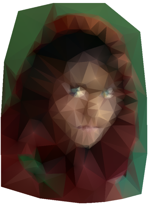
Here are a couple of more Voronoi designs based on the same image.
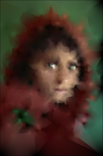
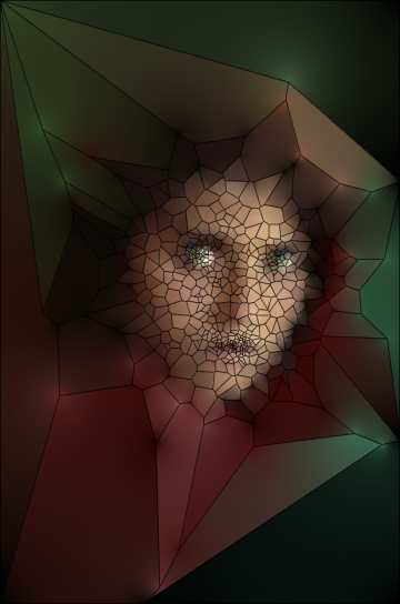
I created these images with custom software written in Processing that relies heavily on the Mesh library by Lee Byron. I also used the Mesh demo created by Marius Watz as a starting point for my code. Thanks!
Delaunay and Voronoi Mona Lisa
By: Jeff Clark Date: Sat, 31 Oct 2009
One reason the images I referenced in my previous post caught my eye was that I've been playing around with a similar technique for a couple of months now. I dusted off the code and improved it to support Delaunay images as well as to do shading of the triangles or polygons.
Image 1 below shows a Delaunay image constructed from the Mona Lisa. The triangles in the first image are coloured evenly and the shade is the average colour of the three vertices. Image 2 is the same except I'm colouring the triangle pixels based on a function of how far they are from the various vertices and the colours at those vertices. It gives a much more realistic image.
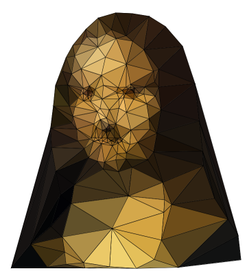
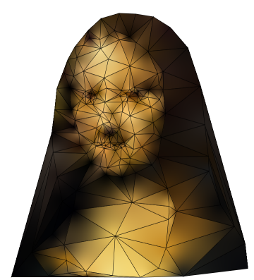
I've removed the triangle edges in image 3 and image 4 is the original for reference. I like this technique because you can easily control where the resulting image is more detailed by just using more control points in that region or by shading the triangles differently.

There is a related type of diagram that is based on Voronoi cells. This next image is the Voronoi diagram using the same control points as above. The regions are polygons of arbitrary number of sides rather than triangles. The last image uses more control points to get more details from the underlying base image.


I created these images with custom software written in Processing that relies heavily on the Mesh library by Lee Byron. I also used the Mesh demo created by Marius Watz as a starting point for my code. Thanks!
Delaunay Images
By: Jeff Clark Date: Fri, 30 Oct 2009
I really like these Delaunay Images created by Jonathan Puckey. The expressiveness derived from a few well chosen triangles is quite impressive. The link above shows a few more as well as a video showing one being created.


Random Tiles
By: Jeff Clark Date: Sun, 25 Oct 2009
I stumbled across this image by Hugo Dechesne and liked the sense of depth suggested by the stacked tiles. Click on his image to see a higher resolution version.

I've tried to recreate the technique and applied it to a more famous image. The second version below just uses smaller tiles. I'm pretty happy with how it came out for such a simple technique but I still prefer the shading in Hugo's images. I think he's using a more diffuse and rounded shadow.

Alphabeasties
By: Jeff Clark Date: Sun, 25 Oct 2009
I love typographic designs. When I was doing my first work with Word Portraits a year ago it occurred to me that I could probably make a really cool childrens ABC book where the representative images were constructed with words or letterforms. I thought it might be visually interesting and that potentially there might even be an educational benefit for the kids learning to read if the images helped them remember the beginning letter for the word. I haven't pursued the idea yet but I just stumbled across a beautiful example of the same idea. It's called alphabeasties: and other Amazing Types and was created by Werner Design Werks.
Here are a couple of images from the book:
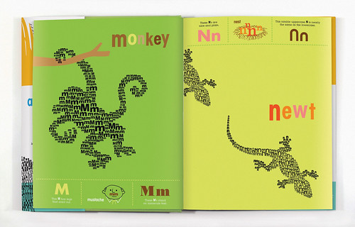
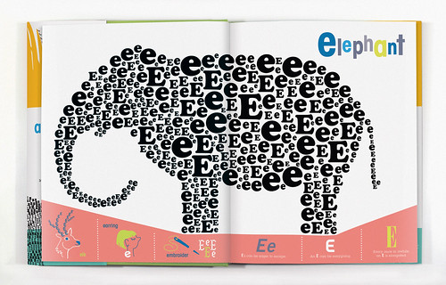
I encountered this via grain edit.
Cameron/Brown Contrast Diagram
By: Jeff Clark Date: Tue, 13 Oct 2009
Last week I produced several Document Contrast Diagrams comparing speeches by various political leaders in the UK. The diagrams were used in an article for The Times called How the party leaders' speeches compare. See the article for all three diagrams and a description of how to interpret the diagram. The one for David Cameron and Gordon Brown is shown below.
Thanks to Jonathan Richards and The Times for the opportunity to get some exposure for the technique.
Tundra Trek
By: Jeff Clark Date: Thu, 08 Oct 2009
A couple of months ago I attended the grand opening of a new exhibit at the Toronto Zoo called Tundra Trek. While I was there I noticed they were promoting it with a cool composite design made from symbols of local landmarks. I couldn't find it online at the time but just looked again and found it at adsoftheworld.com . Design by Lowe Roche, Canada.
Thanks to Joe Sapiano a long-time zoo volunteer (and my father-in-law) for the invitation to the event.

Peace Dove
By: Jeff Clark Date: Fri, 02 Oct 2009
Here is a typographical piece about peace. It's called 'Peace Dove' and uses the word 'peace' translated into 21 different languages - English, Hindi, Chinese, French, Russian, Dutch, Hebrew, German, Greek, Czech, Filipino, Arabic, Hungarian, Icelandic, Indonesian, Irish, Italian, Japanese, Korean, Portuguese, and Swahili. How many can you find ? The dove image is from Wikimedia Commons and I used Google Translate to get the word in the different languages.
My original image had the characters shown in reverse order for both arabic and hebrew. The image shown below has been corrected. Thanks to Ori Folger for pointing out the problem.
Apple Fruit References in Tweets
By: Jeff Clark Date: Fri, 02 Oct 2009
This is the fourth part in a series analyzing a years worth of tweets containing the word 'apple'. The first three sections are:
- Apple Brand References in Tweets
- Company References in Tweets
- Simplistic Sentiment Mining from Tweets
The graphs below showing distribution over time have been normalized to remove the trend of increasing number of tweets over time. This helps show the underlying patterns related to the specific term of interest. Note that the month labels are positioned at the beginning of the month.
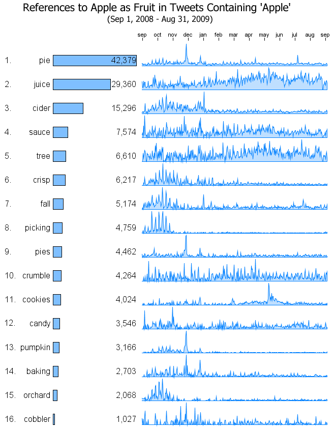
Here are a few observations:
- 'pie' has a series of small peaks in the fall with a huge peak at the end of Nov for American Thanksgiving and strong peaks as well for Christmas and July 4th
- 'cider' is used primarily in the fall with a huge drop-off right after Christmas/New Years
- both 'juice' and 'sauce' are fairly consistent during the year although 'juice' seems to have an increase in references during the warmer months of Mar-Aug
- 'crumble' has roughly 4 times as many references as 'cobbler'
- 'picking' shows a very strong regular pattern of peaks localized to September and October. They appear to correspond to fall weekends where people talk about going apple picking.
- There is a strong peak for apple + 'cookies' at the end of April beginning of May that falls off fairly slowly. I'm not sure why.
Google Trends shows a similar pattern although not as strong.
Additions to Portfolio
By: Jeff Clark Date: Fri, 02 Oct 2009
I added five more links in my Portfolio section a couple of days ago. The link is (currently) found near the top right of all the pages on Neoformix. If you are looking for a post of mine based on the memory of an image it might prove to be a useful starting point since all the links have small thumbnail images associated with them.
In case you weren't aware the Archive link brings you to a page showing all the posts on Neoformix. It does take a while to load and I will likely reorganize them by year before 2010 begins.
Obama UN Speech StreamGraph
By: Jeff Clark Date: Thu, 24 Sep 2009
Here is a StreamGraph prepared from the text of Obama's speech to the UN. I've tried to show more words than in some of my other text-based StreamGraphs but I'm not sure it is successful. More words means more slices and less of a chance that you can follow an individual slice through the speech to see the rise and fall of it's frequency.
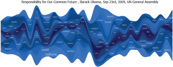
Simplistic Sentiment Mining from Tweets
By: Jeff Clark Date: Tue, 22 Sep 2009
This is the third part in a series analyzing aspects of a years worth of tweets containing the word 'apple'. The first part of the series discussed Apple Brand References in Tweets and showed which Apple brands were referenced the most and their distribution over time. It also included word clouds showing the terms most often associated with each of the primary brands. One of these is shown below for 'ipod'.

It's interesting and gives some indication of the other topical words related to 'ipod' and their relative frequency. One thing it doesn't do is show what people feel about ipods. Do they Love them? Hate them? Can we figure it out from all this data?
One simple method of approaching this problem is to see which emotion-laden adjectives or declarations occur together with the various brands in tweets. This is a crude form of sentiment mining that makes no attempt at detecting sarcasm or the even more common inversion due to modifiers like 'not'. The size limitations of tweets mean that they seldom express ideas in a subtle or linguistically complex fashion so it might be appropriate to use such a simplistic approach - especially when we are dealing with large volumes of tweets like we are here (570,464).
I have repeated the word association analysis done in Apple Brand References in Tweets but have restricted the words of interest to a small set of terms that are often used to express feelings. Have a look:
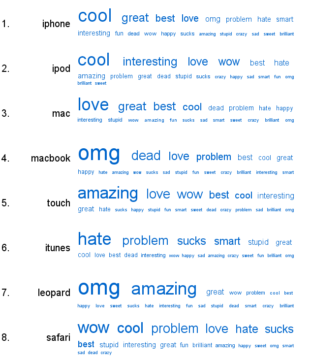
There appears to be considerable variation in the spectrum for the different brands. People seem to find 'iphone', 'ipod', 'nano', and 'shuffle' to be cool and interesting. They love the 'mac' and are much more negative towards 'itunes'. I suspect this technique might indeed be valuable.
Company References in Tweets
By: Jeff Clark Date: Mon, 21 Sep 2009
This is a second installment in a series analyzing aspects of a years worth of tweets containing the word 'apple'. The previous post showed which Apple brands were referenced the most and their distribution over time. This one focuses on the other companies mentioned in tweets containing 'apple'. The data is from Sep 1st, 2008 until Aug 31, 2009 and I collected a total of 2,852,320 tweets in this time frame and analyzed every fifth tweet emitted (570,464 of them) to get the results below.
Apart from Apple itself, the most frequently mentioned company in the data was Google followed closely by Microsoft. The spread over time is very spiky for all the companies but some exhibit very little attention apart from the spikes - Dell, Adobe, and Facebook for example. Verizon shows a significant drop off in attention over this time span and both AT&T and Palm have become discussed more often over time. As in my previous post these distribution graphs have been normalized using the number of tweets in each time period to remove the overall trend of increasing twitter use from the picture. They are also scaled independently in the vertical direction in order to show the most detail for each graph.
I've created accentuated word clouds that show the words used in conjunction with the various companies to give some idea of what was being discussed in relation to Apple and the respective company. In an accentuated word cloud the sizes of the words are a function of both the frequency with which they occur and their prominence relative to a baseline text.
Apple Brand References in Tweets
By: Jeff Clark Date: Fri, 18 Sep 2009
Which Apple brands are most discussed on Twitter? I have analyzed a large set of tweets that contain the word 'apple' sent out over the course of an entire year - from Sep 1st, 2008 until Aug 31, 2009. I collected a total of 2,852,320 tweets in this time frame and analyzed every fifth tweet emitted (570,464 of them) to get the results below.
The following graph shows the distribution over time of the number of tweets containing the word 'apple'. There is an obvious overall rising trend as we would expect since the use of twitter has grown greatly over the course of that year. There are also many large peaks throughout the year and at least one large trough in late Aug 2009 that was likely due to a failure in my data collection infrastructure. There also appears to be a relative slowdown in activity in July and August but examining data from multiple years might be necessary to confirm this.

The most frequently mentioned apple brand in the data was 'iphone' by far which had 97,166 references in the 570,464 tweets (17%). The bar graphs below show the total number of references for some other Apple brands and how they compare to 'iphone'. Also shown are the distribution of the brand usage over time. These distribution graphs have been normalized using the number of tweets in each time period to remove the overall trend from the picture. They are also scaled independently in the vertical direction in order to show the most detail for each graph.
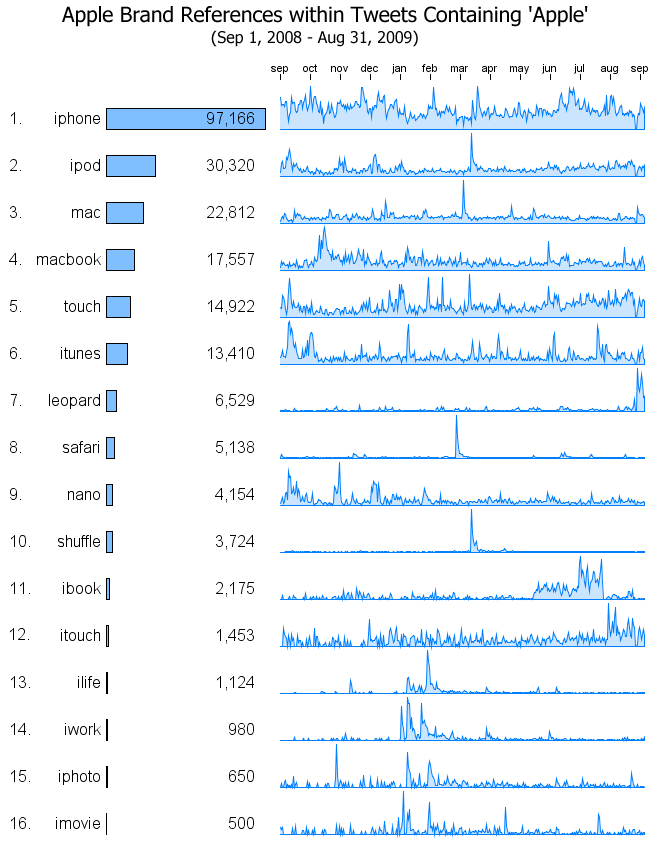
Note that these results are for tweets containing 'apple' and the brand in question. There are obviously a lot of tweets that mention these brands without explicitly referencing 'apple' but they are not a part of this analysis.
I lined up the initial graph showing the total number of tweets with the brand distribution graphs and you can see that several of the peaks in number of tweets in March correspond to big spikes in references to 'iphone', 'ipod', and 'mac'. The brands 'safari', 'shuffle', 'ilife' , and 'iwork' have surprisingly few references apart from the big spikes - people just aren't tweeting about them. All the top 6 brands, together with 'nano', and 'itouch', seem to have more consistent chatter about them in the twittersphere. The term 'leopard' (as in Snow Leopard) is obviously of more recent interest.
These graphs above give a great idea of how often the various brands were mentioned and the distribution over time. What are people actually saying about these brands? I've created accentuated word clouds that show the words used in conjunction with the various brands.
In an accentuated word cloud the sizes of the words are a function of both the frequency with which they occur and their prominence relative to a baseline text. For example, the word 'new' may be used quite frequently in tweets about 'iphone' but if it is used proportionally less often than in other tweets it will be made smaller. Similarly, a word like '3gs' may appear much more frequently together with 'iphone' than in other tweets and so its' size is increased.
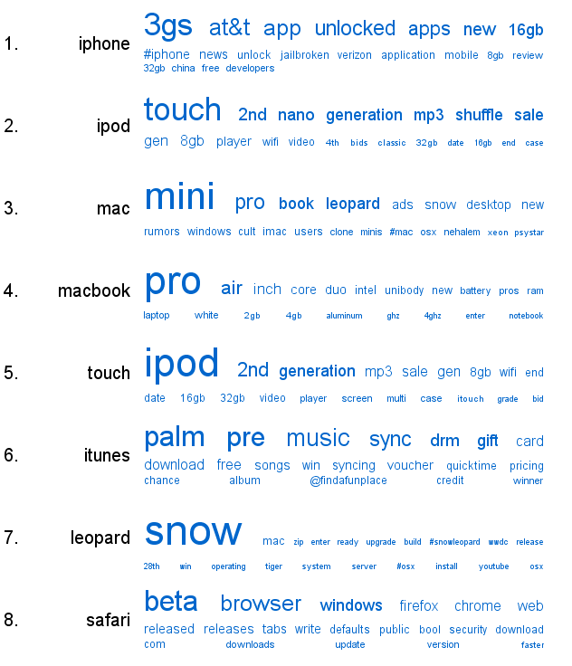
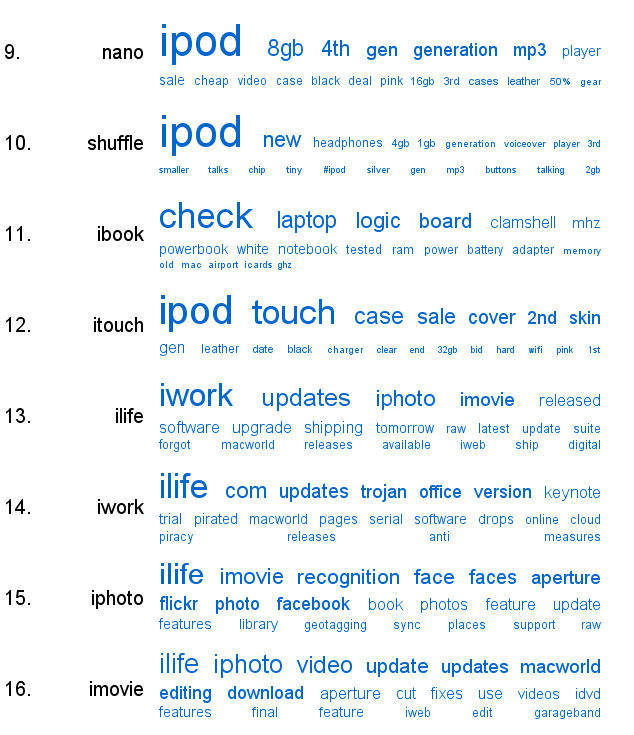
Obama School Remarks
By: Jeff Clark Date: Tue, 08 Sep 2009
Today, in Arlington Virginia, Obama delivered some Back to School remarks to the students of America. Here are a few choice snippets:
Where you are right now doesn�t have to determine where you�ll end up.�No one�s written your destiny for you.�Here in America, you write your own destiny.�You make your own future.
...
No one�s born being good at things, you become good at things through hard work.
...
So today, I want to ask you, what�s your contribution going to be?�What problems are you going to solve?�What discoveries will you make?�What will a president who comes here in twenty or fifty or one hundred years say about what all of you did for this country?
I have constructed the Shaped Word Cloud shown below from the complete text. The red apple image template came from Wikimedia Commons.
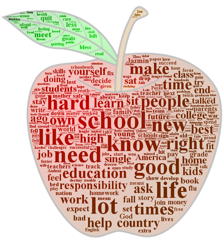
True Blood Twitter Spam
By: Jeff Clark Date: Mon, 31 Aug 2009
One of the trending phrases on twitter lately has been 'True Blood' due to the popularity of the True Blood TV series. I've noticed lately that most trending terms in twitter have quite a large number of spam tweets and this is no exception. I've used Twitter Venn to try and get a feel for what the proportion of the spam tweets are for this topic. A quick glance at the search results showed large numbers of spam tweets mentioning free grocery money or gift certificates so I did a twitter Venn of 'True Blood' versus 'grocery'.
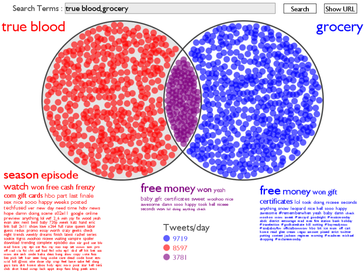
Based on the tweets at this time there are 8597 tweets/day for 'True Blood' that don't mention 'grocery' and 3781 that mention both. This gives us a spam proportion of approximately 3781 / (3781 + 8597) = 31% without even including spam that don't mention grocery. If you look at the red word cloud for 'True Blood' without 'grocery' you can see that there are several other spammy words that are fairly prominent - 'won', 'free', 'cash', 'gift', 'cards'. This suggests that the amount of spam for this topic is even higher.
These numbers do change quickly because they are based on the latest tweets only. To do an accurate analysis would require looking at more data over a greater period of time.
Tweet Words By Week Day
By: Jeff Clark Date: Fri, 28 Aug 2009
I have been having fun recently exploring how the use of words in tweets varies over the time of day ( #1, #2, #3, #4, and #5 ). A minor change in the code I use for the analysis of the text in the tweets lets me look instead at how use of words varies over the course of a week. The dataset contains over a million tweets sent from Toronto during June and July, 2009 so we have roughly 8 weeks of data. I've binned the data into 2 hour segments by day of the week.
As in the charts below, many of the time series show obvious daily patterns with no apparent variation across the different days. Note that the day of week labels are positioned at noon of the respective day.
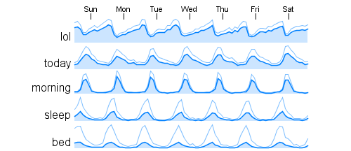
Other words show strong peaks for certain days of the week. The terms 'tgif' (Thank God It's Friday), '#followfriday', and 'mondays' appear in the expected locations. Why is 'father' localized to Sunday ? And 'michael' on Thursday ?
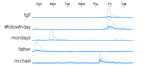
Let's check out the terms that have similar shaped curves to these words. For 'father' we get:
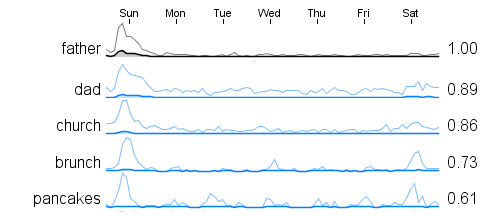
From these terms that are temporally related I suspect the tight association between Father and Sunday is because of Father's Day which was on Sunday, June 21st this year which was in the range of data we used for this analysis.
Similarly for 'michael' we get the graphs below and it's easy to see that Michael Jackson died on a Thursday.
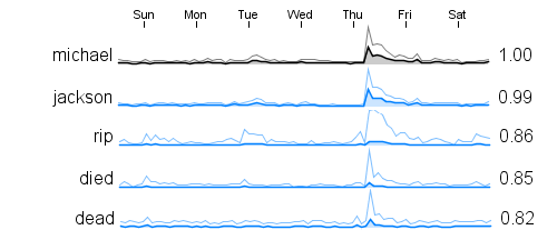
Here are a few terms that seem relatively high on weekends:
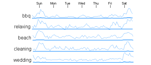
Overall the technique seems to work well for analyzing day of week patterns. As is often the case, much of what gets revealed seems obvious in retrospect. I suspect, however, that this type of analysis could discover non-obvious patterns as well.
Normalized Word Time Series
By: Jeff Clark Date: Fri, 28 Aug 2009
Here is a fifth post in a series looking at word usage by time of day in tweets. The first four posts are useful background material if you haven't read them yet:
- Time Series for Word Counts in Tweets
- Temporal Correlation for Words in Tweets
- Some Word Usage Time Series
- Time of Day Word Correlations
If you look at the time series for the top ten words you will notice that many of them have a very similar shape. For the words 'lol', 'new', 'time', 'love', 'know', 'great', and 'twitter' they all seem to peak around 1-2am, drop off to a lowest point between 3-5am, and gradually rise during the day. Why should there be a relationship between the curves for these words ? Do lots of people write tweets that use these words together ? Or is there some special temporal relationship between these words ?
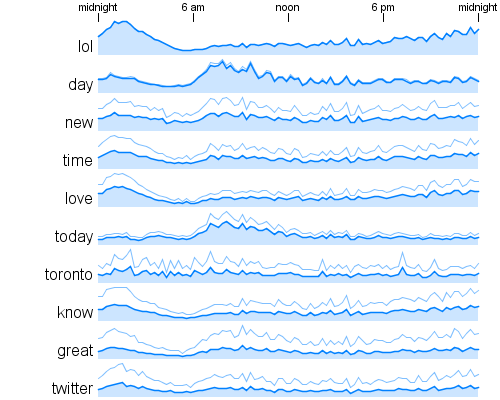
The answer is much simpler. One of my readers, Kyle McDonald, posed an interesting question: is tweet density (tweets over time) relatively constant throughout a day?. The data I'm using here all comes from Toronto. It's a single location and is therefore from a single time zone which is important when looking into the time of day that the words were used. If we look at the curve for number of tweets over time of day for this data we get this:
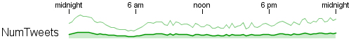
So, no, the tweet density is not relatively constant throughout the day for a specific location. This curve is very similar to the common shape we see for the set of words listed above. The counts for these words are basically just tracking the number of tweets. Or, in Kyle's terms, the word count density over time is just tracking the tweet density. So the interesting features in the curve for the word 'love' seem to arise because more tweets are getting sent out during those times of day and are not due to any special temporal property of the word itself.
Kyle goes on to suggest that it would be really helpful to see the same plots normalized by tweet density. Here are the normalized curves for the same set as above:
Many of these normalized plots are basically flat except for noise. Those for 'new', 'time', 'know', and 'twitter' seem to show no special relationship with time that isn't accounted for by the simple fact that more tweets are occurring in total during certain periods. Several of the other words still show strong peaks, 'lol', 'day', and 'today' for example. The series for 'toronto' now has a jagged set of peaks evident just before 6am which were not apparent in the raw time series shown in blue. This technique does indeed appear to be useful in highlighting those words that are used preferentially during certain times of day.
Time of Day Word Correlations
By: Jeff Clark Date: Fri, 21 Aug 2009
This is another post in a set looking at word usage by time of day in tweets. This time the data includes all the tweets sent from Toronto in June and July of 2009. The post Temporal Correlation for Words in Tweets probably has the most relevant background.
Each of these sets below consists of 5 line graphs showing usage of the word in tweets with the time of day along the horizontal axis. The first series, in black, is the word of interest. The next 2, in blue, are highly correlated with the focus word - the words tend to be used during the same times of day as the word of interest. The last 2 words, in red, have a negative correlation.
Note that these aren't necessarily the words with the strongest correlation. From the stronger matches I've selected the ones that seem most insightful. Many of the strongest positive correlations arise because the words are often used together within the same tweets. For example there are quite a few tweets that talk about eating 'pancakes' or 'eggs' at 'brunch' so it isn't especially surprising that their time of day profiles are similar. The combination 'yoga' and 'pets' seems a bit more surprising. I've checked in the actual tweets and can't find any that contain both words at once.
The negative correlation between 'yoga' and 'guns' isn't very strong but I find it kind of amusing. The strong correlation between 'drunk' and 'ill' and the negative match with 'gym' seems appropriate.
Shaped Word Search: Perfumes
By: Jeff Clark Date: Thu, 20 Aug 2009
A mysterious person calling herself the perfumeladi contacted me a few weeks ago and asked nicely for a Shaped Word Search puzzle for perfumes. Here it is:
The bottle is for a Vera Wang product and the names are a subset of those found in Haute-Couture Brands on osMoz.com.
Some Word Usage Time Series
By: Jeff Clark Date: Thu, 20 Aug 2009
I'm continuing my exploration of how frequently words are used in tweets during the various times of day. If you haven't seen them already, you might want to read Time Series for Word Counts in Tweets and Temporal Correlation for Words in Tweets for background information and details about the dataset.
Here are some word graphs for a few different beverages. 'Coffee' shows the strongest time dependence and is of course at it's peak during the morning hours. Both 'beer' and 'wine' rise gradually from about noon until 2-3am. Showing pretty flat (but noisy) graphs are both 'tea' and 'water'.
Some more collections of graphs follow. You can spot the trends yourself so I won't describe them all. Note that many of these charts are quite noisy. They could obviously be improved by using more data although I am already analyzing half a million tweets to get these results. Using 30 minute time slices rather than the 15 minute slices I'm currently using would smooth out the graphs as well.
Tweet Word Time of Day Traces: Acronyms
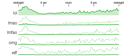
Tweet Word Time of Day Traces: Feelings
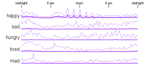
The graph for 'happy' has some unusual peaks that look like they occur around 10am, 11am, noon, 1pm, and 2pm. I'm not sure why the regularity over time. These tweets are from Toronto during the month of July which includes the data for Canada Day on July 1st. Here are the graphs for the words highly correlated with 'happy' :
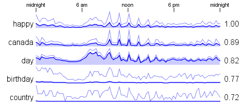
Temporal Correlation for Words in Tweets
By: Jeff Clark Date: Wed, 19 Aug 2009
In my last post, Time Series for Word Counts in Tweets, I showed some graphs illustrating how often a word was used in tweets during the various times of day. I'm using the same data here, 575,962 tweets sent from the Toronto area in the month of July 2009. Some of the graphs show very similar shapes, for example 'morning', 'breakfast', and 'coffee' in the set below.
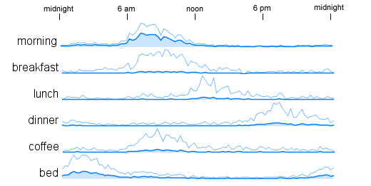
We can spot these visually but if we are analyzing a large number of words, say 1000 or more, it would be useful to be able to calculate the similarity of the curves in order to find matches automatically. We want 'scale invariant' matches - curves with the same shape but not necessarily the same scale. Our curves are just plots of 96 numbers - since I'm summing the counts within 15 minute time buckets and 24 hours * 4 (buckets/hour) = 96 buckets. We can compare two curves by looking at the correlation between their time series values. If the curves go up and down in the same places then they are visually similar and the correlation gives us a way to quantify this.
If we select a time series for a word of interest we can calculate the correlation between that series and each of the others in turn. Then we can show the graphs with the highest correlation to see those with the most similar profile over time of day. Here are the top matches for 'morning':
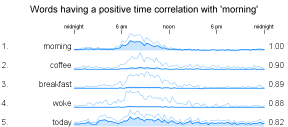
The correlation coefficient is shown to the right of the graph. A value of '1' means perfect correlation, around '0' is no correlation, and a value of '-1' means an inverse or negative relationship. Below are shown some series that show no correlation at all with 'morning'. I was surprised to see that 'bed' isn't used in tweets around the same time of day as 'morning'.
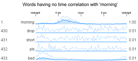
Here are a few examples of negatively correlated words. The relationship isn't quite as strong as for the best positive matches , -.55 compared to +.90 .
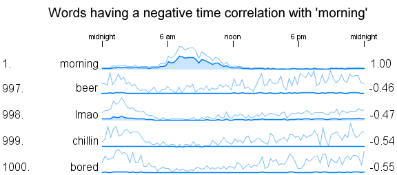
So the word with the strongest inverse relationship with 'morning' is 'bored'. Interesting - I guess people don't get bored in the morning as much as the rest of the day.
Time Series for Word Counts in Tweets
By: Jeff Clark Date: Tue, 18 Aug 2009
I have been playing around with a fairly large collection of tweets looking into the patterns of word usage over the time of day. The dataset contains 575,962 tweets that were sent out from accounts located within 50 miles of Toronto during the month of July, 2009. For each of the most common 1000 words (except for stop words) I counted how often they were used in each 15 minute period of the day. The counts for all the days in July were simply added together so the shape of the series is for a typical July day. The following graph shows the time series plotted for the most common word - 'lol'.
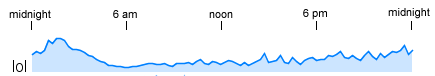
Both the beginning and end of the horizontal axis represent midnight and noon is in the middle. This graph shows a peak around roughly 2-3am in the morning and a low point around 6am.
If we look at the traces for the #1, #10, and #100 most popular words and keep the vertical scale the same we don't have any detail in the smaller series ( for 'girl' ).
If we scale each graph independently so that the fine details are present for each series then we can no longer tell when looking at a set of graphs which ones have the larger counts.
I've been experimenting with drawing both the absolute and independently scaled versions on the same graph so that both the detail and overall magnitude are evident.
It seems to work pretty well. I've used the darker line with the filled area underneath for the absolute scale to give it more prominence.
Here is a set of graphs for some obviously time-dependent terms:
These series seem more interesting than those with a more even distribution over time. Rather than visually scanning a large set of graphs to find these candidates I constructed a metric that measures the clumpiness of each series and used that to focus my search.
There is an obvious similarity evident in the curves for 'morning', 'breakfast', and 'coffee'. In a future post I will describe a technique for detecting these matching curves automatically and show some results based on it.
Shaped Word Cloud: Apple
By: Jeff Clark Date: Fri, 07 Aug 2009
I just recently finished gathering a complete year of tweets containing the word 'apple' - from Aug 7th, 2008 until Aug 6th, 2009. There were approximately 2.7 million public tweets over that year containing the word. I have used a sample comprised of every 10th tweet of the complete set to create a shaped word cloud showing the words most frequently used. This is a re-creation of a shaped word cloud visualization I did in January that only included tweets from Jan 20-21, 2009.
The dominant words don't seem too surprising. You can click on the words to jump to Twitter Search and see the matching tweets.
City Differences in Tweet Content
By: Jeff Clark Date: Fri, 07 Aug 2009
In Word Clouds from Adjusted Counts I introduced the idea of accentuated word clouds and mentioned the possibility of breaking down a collection of tweets by geographic origin and contrasting the word counts to uncover geographic patterns. I've done something similar with a large collection of tweets sent from either Toronto, London, or San Francisco. They are actually a 1% sample of all the public tweets sent within 50 miles of the respective city centers during the month of July, 2009.
The three blocks of words reflect those words used frequently and proportionally more often in tweets being sent from the respective cities. Apart from the city names, some prominent words are:
- San Francisco: hella, humidity, oakland, collision, winds, hotjobs, giants
- London: like, good, new, news, morning, bbc, work, flu
- Toronto: lol, good, like, love, canada, know, strike, pumper
The prominence of 'pumper' for Toronto puzzled me a bit so I looked into the data more closely. There is a series of twitter accounts similar to ToFireE that pump out alerts for every emergency fire unit dispatched in the city. They include reason for dispatch, location information, and also the vehicle which is often named pumper-nnn where nnn is some number.
Another interesting thing that you can pick out from the clouds is that San Francisco tweets contain a lot more hashtags than in London or Toronto. Those that seem largest are: #science, #gaming, #loss, #prop8, #discount, #ffs, #weight, #wine, #sfgiants. It might be interesting to more carefully examine the proportion of tweets that contain hashtags and whether it is changing over time.
Shaped Word Search: Animals
By: Jeff Clark Date: Fri, 17 Jul 2009
I have created another set of Shaped Word Search puzzles. This set of 26 puzzles are in black and white and will print nicely on a black and white printer. The theme is animals and the simple silhouette images are from the freeware font called 'Animals' by Alan Carr.
All 26 puzzles are found in a single PDF file. There are actually two versions: easy and hard. The hard versions use a smaller font size so there are more letters, add more partially matching distractors, and have more of the words in reverse order.
Feel free to print these off for your own personal use but don't post the PDF anywhere else or try and sell it. Have fun!
Shaped Word Search: Vehicles
By: Jeff Clark Date: Fri, 17 Jul 2009
This new collection of Shaped Word Search puzzles is based on vehicle designs by cemagraphics. They all use the same transportation-related word list which I constructed with a little help from Google Sets.
Click on the images below or use these links to get high-quality PDF versions to print: VW bug, bus, truck, and ferrari. They look great when printed in colour but probably not so good in grayscale.
Have fun!

Shaped Word Search: Insects
By: Jeff Clark Date: Thu, 16 Jul 2009
Here is a collection of four Shaped Word Search puzzles based on insect shapes. The insect images are from Iconshock and all the puzzles use the same word list derived from this list of insects.
Click on the images below or use these links to get high-quality PDF versions to print: ladybug, dragonfly, mantis, and ant. They look great when printed in colour but probably not so good in grayscale.
Have fun!


Differences in News Coverage
By: Jeff Clark Date: Mon, 13 Jul 2009
I'm continuing to explore the idea of accentuated Word Clouds that I introduced in the previous post about New Testament Word Clouds. This time I compared the news coverage from four different sources about Obama's recent speech delivered in Ghana. The source texts are from the New York Times, Fox News, Al Jazeera, and AllAfrica.com.
The first word cloud was created from the text of all four articles put together and does a reasonable job of showing the key words for the event. The top words are 'Obama' , 'Africa', 'Ghana', 'president', 'life', 'future' etc.
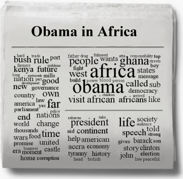
These four accentuated clouds below are created by comparing each source article in turn against the overall collection. They illustrate the words that are used frequently and proportionally more often in that particular text.
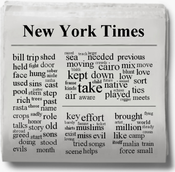
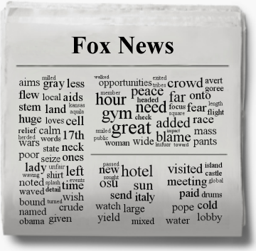
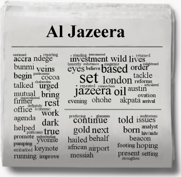
Here are a few prominent words that I notice from a quick glance at these clouds:
- NYT - 'take', 'kept', 'cairo', 'effort', 'muslims', 'bill', 'rich'
- Fox News - 'great' , 'need', 'gym', 'hour', 'peace', 'blame', 'hotel', 'stem', 'cell', 'pope'
- Al Jazeera - 'set', 'based', 'oil', 'jazeera', 'london', 'investment', 'gold', 'cocoa'
- AllAfrica.com - 'civil' , 'control' , 'brother', 'returning', 'speaking', 'map', 'liberation'
New Testament Word Clouds
By: Jeff Clark Date: Sun, 12 Jul 2009
The word cloud below was created from the text of the four gospels of the New Testament of the Christian Bible. I used the King James Version from the wonderful Project Gutenberg. The primary words of emphasis are not surprising - 'jesus' , 'son', 'father', 'lord', and 'god'.
Lately I have been exploring the idea of using clouds built from relative word frequency counts to emphasize the differences between a text and some baseline text. I'm leaning toward calling these accentuated word clouds.
I have created four separate accentuated word clouds for each of the gospels and show them below. The baseline text was all four gospels together so each cloud shows which words are used frequently and proportionally more often in that text versus the overall collection. This kind of cloud illustrates the unique aspects of that particular text.
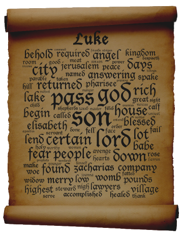
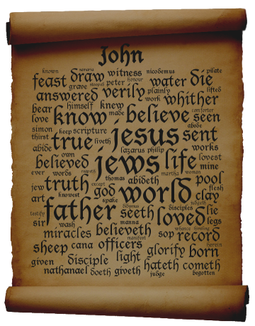
Let's look at a word that is very prominent in one of the clouds. In the gospel of John, the word 'jews' seems central but it either doesn't appear or is very small in the other three. The number of times it appears in the four gospels is 5, 6, 5, and 67 for Matthew, Mark, Luke, and John respectively. If you calculate the number of occurrences per 1000 lines to account for the different sizes of the various texts then you get 1.4, 2.6, 1.3, and 23.2 times/1000 lines.
These accentuated word clouds appear to be doing a good job of highlighting the terms that are characteristic of the various gospels. It is certainly possible to design a visualization that more directly shows the relative frequency of the key words in different texts but the visual simplicity of these accentuated word clouds have some advantages.
Michael Jackson Flower Portrait
By: Jeff Clark Date: Wed, 08 Jul 2009
Here is a flower portrait of Michael Jackson created from one of the images on his album Number Ones. The flower images are from Wikimedia Commons.

Word Clouds from Adjusted Counts
By: Jeff Clark Date: Tue, 07 Jul 2009
When trying to understand something it is often very useful to compare and contrast the data of interest with some related data. This can serve to emphasize the unique characteristics of the data you are studying. Another way of thinking about it is that you are filtering out the background noise in order to clarify the signal.
I mentioned in the recent post Shaped Word Cloud: Canada that I had adjusted the word counts according to how frequently they occurred in a baseline dataset. In this post I give a graphic example of the effects of this type of adjustment.
The data used is a collection of 16,504 tweets gathered during the month of June, 2009 and containing the word 'starbucks' . They are every 10th tweet of the full 165,040 that I collected during this time period. I also discarded the tweets that were obviously non-English. The words 'starbucks' , 'coffee' , and any twitter ID were not used in the analysis.
The following word cloud was constructed from the word frequencies found. It includes stop words and the cloud shows that 'in' , 'to' , 'at', 'is' and many other small words are frequently used in the text. The problem is that this is true for any sizable amount of English text and so this word cloud doesn't illustrate any real useful information specific to 'starbucks'. For this reason, stop words are almost always excluded from word clouds.

This next cloud was generated from the same data and the only change was that stop words were excluded. Now we can start to see some interesting emotion-laden words like 'love' , 'good' , 'work' , 'like' as well as some that are obviously characteristic of the search term like 'hot' , 'cup', 'mocha', 'frap', and 'drinking'.
To reveal more detail specific to 'starbucks' I have adjusted the word counts in this final cloud based on how frequently the words occurred in a baseline data set. The baseline I used here was a collection of tweets containing the word 'coffee' taken over the same time period as the original starbucks tweets. I won't describe the math in detail but, basically, I boosted the counts for words by a factor that is a function of the word frequency rate in the two data sets. If a word is used much more frequently in the starbucks data than the coffee data then it's count is elevated so that it becomes more prominent in the cloud.
This word cloud is much more revealing of those things discussed in tweets together with 'starbucks'. Some of the large terms include, '#starbucks', several variations on 'frap', 'ruling', 'fructose', 'lemonade', 'venti', 'card', and 'sponsorship'.
By choosing different baseline datasets it is possible to accentuate different perspectives of the original data. For example, breaking down a collection of tweets by geographic origin and contrasting the data using this technique would let you uncover geographic patterns. What are people saying about Starbucks in San Francisco that is different from what they say in New York , or London ? If you break up the tweet collection by time you can answer questions like: What are people saying about Starbucks at lunchtime versus in the morning ? Or, What are they saying on Tuesdays versus Saturdays ?
I believe this technique may prove very useful in revealing information from large amounts of text.
Declaration of Independence
By: Jeff Clark Date: Sat, 04 Jul 2009
The blog Computational Legal Studies has a word cloud using the text of the Declaration of Independence created with Wordle. I liked the idea and so to help all my American readers celebrate the 4th of July I've created a word cloud using the same text in the shape of the US map. I added some stars to fill out the shape better. The word colors are random.
Shaped Word Cloud: Canada
By: Jeff Clark Date: Wed, 01 Jul 2009
Happy Canada Day ! This is a Shaped Word Cloud created from the text of approximately 168,000 tweets containing the word 'canada'. The tweets were gathered over an 11 month period from July 31, 2008 to June 30, 2009.
Basically, the larger the word the more frequently it appears in the text. Stop words were discarded. I also adjusted the size based on the relative frequency of the word in the canada dataset versus a baseline dataset containing tweets about india and china. A word like 'country' or 'travel' is used approximately the same for canada as for india and china and so will be de-emphasized. Words like 'hockey' , 'canadian', 'snow' and place names within canada will appear bigger. Because of the baseline content the result will not properly reflect any strong associations between canada and india or canada and china. As usual you can click on a word to see the current twitter search results.
Word Search: Canada Map
By: Jeff Clark Date: Tue, 30 Jun 2009
Here is another Shaped Word Search in honour of Canada Day tomorrow, July 1st. This one is in the shape of a map of Canada and uses Provinces, Territories, and cities in the word list. Click on the image or here for the PDF version.
Feel free to print this in any newspaper or magazine. I only ask that you keep the reference to http://neoformix.com and that you send me an email letting me know.
Word Search: Maple Leaf
By: Jeff Clark Date: Tue, 30 Jun 2009
In honour of Canada Day tomorrow, July 1st, I have created a Shaped Word Search with a maple leaf design and words I associate with Canada. I improved my tool slightly to sort the words in alphabetical order so it is more convenient to look them up. Thanks to Joe S. for the suggestion. Click on the image or here for the PDF version.
Feel free to print this in any newspaper or magazine. I only ask that you keep the reference to http://neoformix.com and that you send me an email letting me know.
Word Portrait: Michael Jackson
By: Jeff Clark Date: Sat, 27 Jun 2009
Here is a Word Portrait of Michael Jackson created from the titles of many of his top songs.
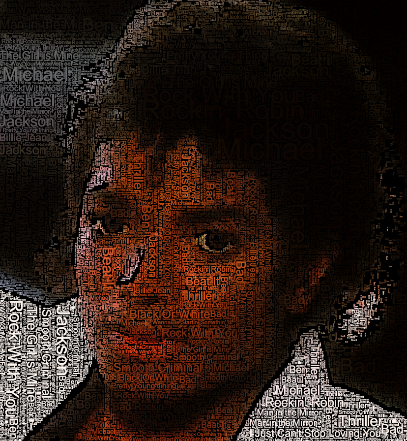
Twitter Venn: Celebrity Deaths
By: Jeff Clark Date: Fri, 26 Jun 2009
Here is a Venn Diagram made with Twitter Venn that shows the relative frequency of tweets made about the recent deaths of three celebrities - Michael Jackson, Farrah Fawcett, and Ed McMahon. This analysis was done around 7am EST today and the absolute numbers for tweets/day will certainly increase as more people in the US come online. I expect the proportions among the various combination regions to stay roughly the same.
A couple of points of interest:
- Celebrity interest ranked by number of tweets is Michael > Farrah > Ed with ratios 62:6:1
- Ed was mentioned together with both Michael and Farrah more often than he was by himself
To explore the data using the interactive application click on the image below or this link: Twitter Venn for #michaeljackson, #farrahfawcett, and #edmcmahon.
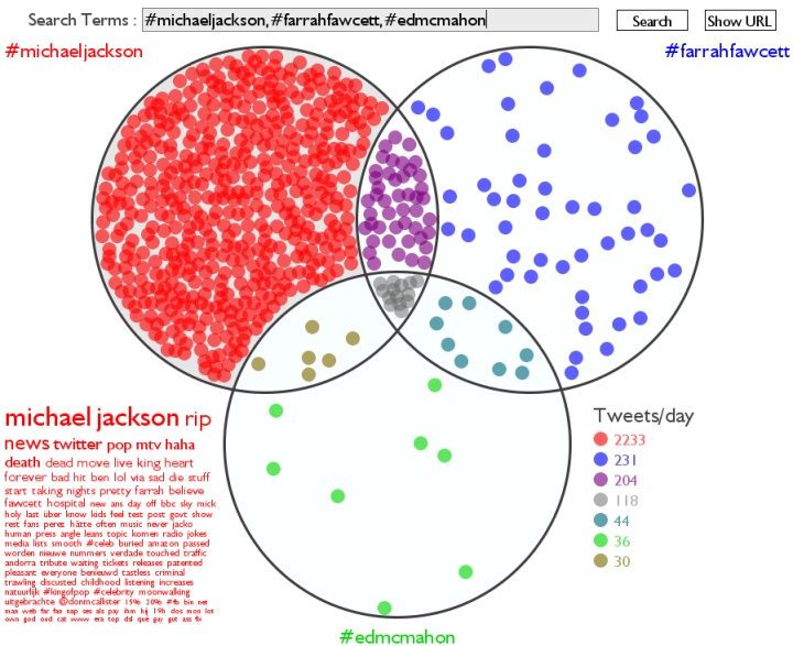
Twitter Employee Clusters
By: Jeff Clark Date: Thu, 25 Jun 2009
Here is a different view of the relationships between the Twitter employee accounts first presented in this post. I measured the similarity between all the twitter employee accounts based on the overlap in vocabulary used in their last 200 tweets. A clustering algorithm was then used to group them together based on the pairwise similarity scores. The algorithm was tuned to limit clusters to have a maximum of 8 members.
The image below was created from the cluster members data, the similarity between clusters, and the similarity within each cluster. To minimize line clutter I am only drawing a connection if it is one of the top 2 strongest for either end node. The clustering and layout code is based on what I used for the Toronto Twitter Community project but has been recently enhanced to support some new client work.
Here is the PDF version of the Twitter Employee Clusters.
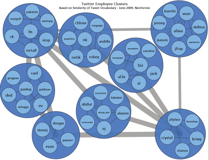
Shaped Word Search - Twitter
By: Jeff Clark Date: Mon, 22 Jun 2009
Here is another example of a Shaped Word Search. This one uses a Twitter Bird as the image and a list of words related to twitter. I also experimented a bit with adding distractors in order to make the puzzle more difficult. There are a couple of partial matches for each word mixed in to the letter matrix. Click on the image or here for the PDF version.

A Shaped Word Search - Malta
By: Jeff Clark Date: Sun, 21 Jun 2009
I celebrated Father's Day this weekend with my wife's parents. While there, I spent a frustrating and unsuccessful 15 minutes looking for one of the few remaining words in a giant word search my father-in-law was working on. We found out later by checking online that there was an error and the word wasn't even present in the puzzle!
Much more enjoyable was the hour or so we spent doing a virtual tour of Malta using Google Earth. My father-in-law was born there and we had great fun zooming in with the aerial views finding the house where he lived, the church where he was baptized, etc. We were also able to easily see wonderful pictures of the many famous churches and natural features like the Blue Grotto. It's a beautiful and fascinating place and I'd love to visit sometime.
Well, the ideas of Malta, word search puzzles, and the usual mishmash from my coding projects mixed together in my brain while I was sleeping and I woke up early realizing I could easily write a tool to create 'Shaped Word Search Puzzles'. Basically, I can take a template image and a list of words and automatically construct a word search puzzle shaped and coloured to match the image.
The first example is below and uses a Maltese Cross with a list of words related to Malta. Most of the words are place names but there are a few other things mixed in as well. For example, Pastizzi are one of my favourite Maltese foods.
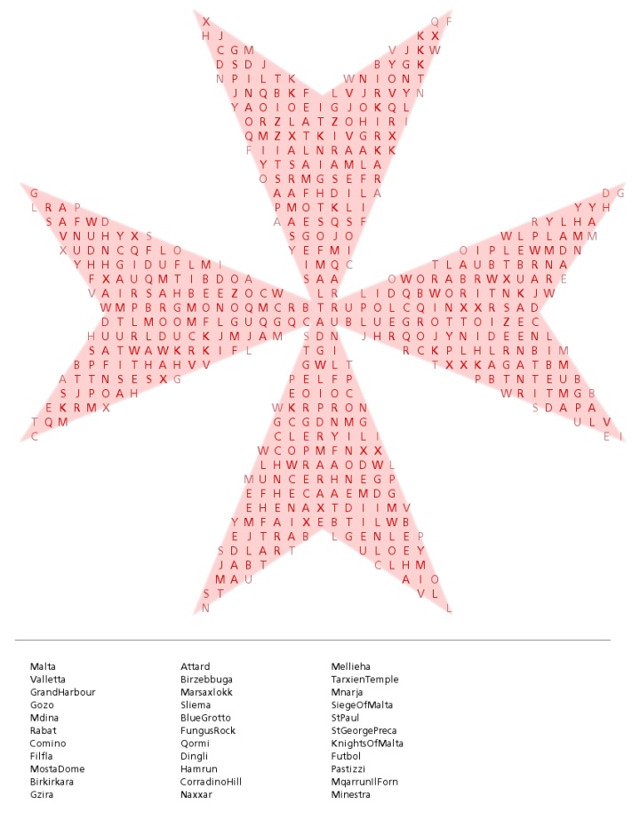
IranElection Tweets Phrase Net
By: Jeff Clark Date: Sat, 20 Jun 2009
I have uploaded the set of tweets I used to create the Iran Election Word Cloud to the wonderful Many Eyes and created a Phrase Net visualization for the data. This image below shows the net for the pattern word1 and word2. So, for example, the arrow connecting 'police' to 'riot' means there were lots of instances of the phrase 'police and riot'.
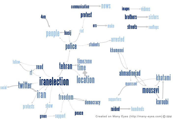
See below for the interactive version.
(More...)
Iran Election Tweet Narrative II
By: Jeff Clark Date: Sat, 20 Jun 2009
I have updated my Tweet Narrative about the Iran election. This one uses 141,000 tweets from the time period June 14-20th, 2009. I have also improved the algorithm that selects the characteristic tweets. The changes are difficult to describe succinctly but did reduce the number of tweets that started with 'RT'. This helps meet my primary goal of constructing a readable summary of the content. For this analysis I also only counted the first 10 tweets from any particular account which helps prevent the tweets from a few individual accounts from dominating the results.
| Date | Characteristic Tweet |
| Jun 14 20:12 gmt | WTF! They're bringing tanks on the streets in Tehran #iranelection * |
| Jun 15 00:51 gmt | @Change_for_Iran 5:17am people outside are burning Saderat bank building or as it seems from this far #iranelection * |
| Jun 15 07:13 gmt | @IranNewsNow HUGE NEWS!!!! CNN reports that GRAND AYATOLLA SANAI has issued FATWA to resist govt that steals #IranElection * |
| Jun 15 10:24 gmt | Iran supreme leader orders probe of vote fraud #iranelection * |
| Jun 15 18:43 gmt | BEST FILTER SHEKAN: www.julo.free4r.com/prox.html #IranElection * |
| Jun 15 21:26 gmt | Please postpone maintenance! #nomaintenance #iranelection * |
| Jun 16 01:52 gmt | Twitter Reschedules Maintenance Around #IranElection Controversy * |
| Jun 16 05:09 gmt | Iran has blocked "#iranelection" Use #Tehran or #Iranians * |
| Jun 16 11:18 gmt | #iranelection cyberwar guide for beginners * |
| Jun 16 16:32 gmt | unconfmd major incident at Azadi - shooting - fires - ppl running #Iranelection * |
| Jun 16 22:28 gmt | pls everyone change your location on tweeter to IRAN inc timezone GMT+3.30 hrs - #Iranelection - cont.... * |
| Jun 17 03:44 gmt | NYT publishing sensitive names of Iranians on Twitter. Get them to stop! #NYTfail #iranelection * |
| Jun 17 05:52 gmt | BLOCK @serv_ SPREADING MISINFOMATIONS #iranelection * |
| Jun 17 09:29 gmt | Tehran march TODAY 5pm - 7Tir Sq - Meydan 7 Tir - silent - sea of green - #Iranelection * |
| Jun 17 15:17 gmt | Show support for #iranelection add green overlay to your Twitter avatar with 1-click - http://helpiranelection.com/ * |
| Jun 17 18:56 gmt | news - Mousavi & Khatami have delivered joint letter to Ministry of Justice demanding release of protestors - #Iranelection * |
| Jun 18 02:15 gmt | "Change does not roll in on the wheels of inevitability, but comes through continuous struggle." -Dr.Martin Luther King #iranelection * |
| Jun 18 05:00 gmt | DOA Remix (Death of the Ayatollahs). Theme song for #IranElection www.myspace.com/revolutionofthemindhiphop * |
| Jun 18 11:00 gmt | Today - Sea of Green - Imam Khomeine Sq - 4pm - Tehran - All wear BLACK - we pray together - #Iranelection * |
| Jun 18 14:46 gmt | MOUSAVI - 25% inflation means IGNORANCE - THIEVING - CORRUPTION - where is the wealth of my nation? #Iranelection RT * |
| Jun 18 21:28 gmt | RT @andylevy BREAKING: Faulty #iranelection results attributed to Clerical errors. * |
| Jun 18 23:15 gmt | confirmed - Saeed Rajaie's (a prominent Iranian wartime martyr) wife has been arrested while praying in Qom - #Iranelection * |
| Jun 19 04:29 gmt | [Mashable] Facebook Releases Persian Translation for #IranElection Crisis http://tinyurl.com/kuzmc4 * |
| Jun 19 09:31 gmt | #iranelection Khamenei: (summery) (( correction )) Crowed yell: Death to england * |
| Jun 19 13:21 gmt | situation in Iran is now CRITICAL - nation is heartbroken - suppression is iminent - #Iranelection * |
| Jun 19 21:06 gmt | Mousavi's offices are trashed, Mousavi's staff in police custody, Mousavi is missing. #iranelection #gr88 #clarification * |
| Jun 19 23:22 gmt | #IranElection Must watch video & read transcript at the same time. Chills Pls RT after you watch. http://bit.ly/10qe5H * |
| Jun 20 06:44 gmt | whenwill we all stand together ascitizens of thewrld and demandour elected officials tohelp? one day wecould be in that crowd #iranelection * |
| Jun 20 08:28 gmt | Google Earth to update satellite images of Tehran #Iranelection http://twitition.com/csfeo * |
| Jun 20 13:26 gmt | Unconfirmed: Bomb Blast in Khomeini's shrine #iranelection * |
Iran Election Word Cloud
By: Jeff Clark Date: Thu, 18 Jun 2009
This is a Shaped Word Cloud created from the text of approximately 84,000 tweets containing the term #iranelection. The larger the word the more frequently it appears in the text. As usual you can click on a word to see the current twitter search results.
Feel free to follow JeffClark on Twitter to get more updates on my work.
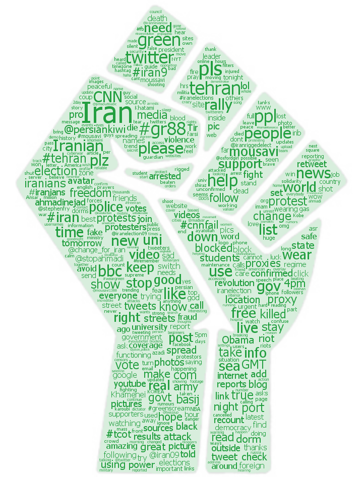
Iran Election Tweet Narrative
By: Jeff Clark Date: Tue, 16 Jun 2009
The world is watching with great interest the demonstrations in Iran related to the recent election. The twittersphere is filled with discussion of the event and, of course, much of it is redundant. I have built a Tweet Narrative based on a collection of ~ 60,000 tweets containing the tag #IranElection. Basically, I divided the tweets into 30 groups based on the time they were published and then statistically select the one tweet most representative for that time slot.
| Date | Characteristic Tweet |
| Jun 14 20:52 gmt | RT @StopAhmadi WTF! They're bringing tanks on the streets in Tehran #iranelection * |
| Jun 14 22:49 gmt | We people of iran want peace! #CNNfail #iranelection * |
| Jun 15 00:09 gmt | RT @persiankiwi students being killed in tehran uni dorm in amirabad right now. this must stop. #Iranelection * |
| Jun 15 00:50 gmt | Follow @Change_for_Iran 5:17am people outside are burning Saderat bank building or as it seems from this far #iranelection * |
| Jun 15 02:49 gmt | RT @parinaz AhmadiN revoked all permits of foreign media & has instructed them to stop reporting or they will face jail time. #IRANelection * |
| Jun 15 05:00 gmt | Will you wear green tomorrow to support freedom in Iran? #iranelection #greenscream * |
| Jun 15 05:38 gmt | RT @greenscreamiran: World to wear green tomorrow for freedom in Iran. RT please. #IranElection #greenscream * |
| Jun 15 07:11 gmt | RT @IranNewsNow: HUGE NEWS!!!! CNN reports that GRAND AYATOLLA SANAI has issued FATWA to resist govt that steals #IranElection RT THIS * |
| Jun 15 08:42 gmt | RT @persiankiwi March is NOT CANCELLED today. Mousavi is in danger of being killed. #Iranelection * |
| Jun 15 11:25 gmt | RT @persiankiwi: March Started: ADVICE - carry photos of imam khomeini. they cannot shoot at us with these. #Iranelection * |
| Jun 15 11:54 gmt | RT @persiankiwi for later we need proxy address to upload film. we have no upload possibility now, can anyone help? #Iranelection * |
| Jun 15 13:27 gmt | RT @persiankiwi: Valli Asr st closed to traffic - tens of thousands marching - unbelievable sight. #Iranelection * |
| Jun 15 15:54 gmt | RT @herrcafe RT @phelo Telegraph reports of Iranian Interior Ministry leak that Ahmedinajad came in thir #IranElection - http://bit.ly/GGUy2 * |
| Jun 15 17:15 gmt | RT @persiankiwi: streets very dangerous now. groups of militia on motorbikes searching for protesters. #Iranelection * |
| Jun 15 18:36 gmt | RT @stephenfry Functioning Iran proxies 218.128.112.18:8080 218.206.94.132:808 218.253.65.99:808 219.50.16.70:8080 #IranElection * |
| Jun 15 20:00 gmt | RT @persiankiwi Gohardasht in Karaj - confirmed - people in street batles with militia - #Iranelection * |
| Jun 15 21:57 gmt | RT @IranRiggedElect: Please postpone Twitter maintenance #IranElection @twitter @ev @bs @ded @ej @lg @nk @rk @vl @al3x @stop #nomaintenance * |
| Jun 15 23:23 gmt | RT @nttajohn maintenance is postponed, twitter will be posting press release soon #nomaintenance #iranelection * |
| Jun 16 00:34 gmt | RT IRAN: we are moving location - seperating - situation in Tehran is tense - cant explain #Iranelection * |
| Jun 16 03:01 gmt | RT From Iran: CONF: #IRANELECTION tag/string is not filtered in #iran. Plz KEEP USING IT! #iran9 * |
| Jun 16 03:59 gmt | People in Iran, use https://twitter.com/ instead of http://twitter.com/ to avoid hashtag filtering #Iran9 #IranElection #tehran #iranians * |
| Jun 16 06:48 gmt | RT from inside Iran: rumour spreading Tehran - Army Generals have met in secret - Army considering position #Iranelection #iran9 * |
| Jun 16 07:16 gmt | RT @stephenfry @arashamel Pls get this out to your followers. #iranelection has been blocked in Iran. Switch to #Iranians , #Tehran, #Iran9 * |
| Jun 16 08:29 gmt | RT @stephenfry RT: pls get this out to your followers. #iranelection has been blocked in Iran. Switch to #Iranians , #Tehran, and #Iran9 ... * |
| Jun 16 10:33 gmt | RT @persiankiwi only official march today is valli asr. others may be a trap - avoid others - #Iranelection #gr88 * |
| Jun 16 12:51 gmt | #iranelection Iran has banned all foreign journalists from reporting on the sts. * |
| Jun 16 13:50 gmt | RT @twistedchick: RT URGENT: Army forces entering Tehran. Barricade streets where protests are on. Now. #iranelection #gr88 * |
| Jun 16 15:05 gmt | RUMOUR: the former prince of #Iran, Reza Pahlavi has announced returning to #Tehran in 36h. #IranElection #GR88 * |
| Jun 16 16:32 gmt | RT [redacted]: unconfmd major incident at Azadi - shooting - fires - ppl running #Iranelection #gr88 * |
| Jun 16 19:38 gmt | RT @PCMag: The U.S. State Department asked Twitter to delay downtime to help with #IranElection. * |
Twitter StreamGraph Update II
By: Jeff Clark Date: Mon, 15 Jun 2009
I have posted a small update to the Twitter StreamGraphs application to make it more useful. Previously it used Twitter Search to get results for simple queries of the type 'from:twitterid'. Twitter Search currently only gives results going back about 14 days - it used to be much longer. For most people who don't tweet frequently this resulted in a poor quality streamgraph because there weren't many results to work with.
I'm now using the standard Twitter API to retrieve the tweets for any simple user query and it will graph up to a maximum of 1000 tweets irregardless of how far back they go. The difference is shown below for Clay Shirky. The second image shows the new improved results which, for him, go back almost a year. The graph is much richer than the first one which can only base the graph on tweets in the last two weeks.
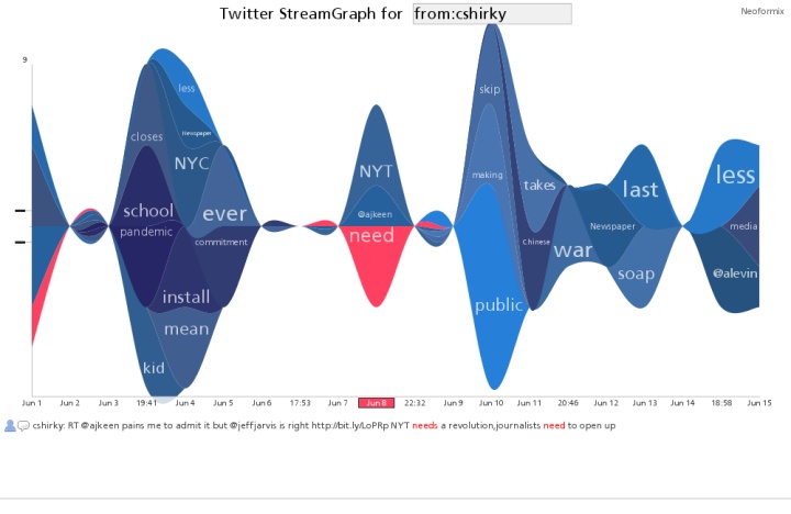
New results for simple queries of the type from:twitterid
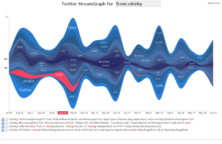
Chinese Ideogram for Flower
By: Jeff Clark Date: Sun, 14 Jun 2009
Here is another design made with the flower images from Wikimedia Commons. It's the chinese ideogram for 'flower' rendered with flowers.
Others in this series: FlowerTank, FlowerCycle, and John Lennon Flower Portrait.

Venn: Iran, Iraq, Afghanistan
By: Jeff Clark Date: Sun, 14 Jun 2009
Here is the result of a Twitter Venn query for Iran, Iraq, and Afghanistan. The recent controversial elections in Iran have obviously grabbed a lot of attention in the Twittersphere. It's interesting that the number of tweets mentioning both Iran and Iraq is roughly the same as the number mentioned Afghanistan and Iraq even though tweets about Iran are so dominant.
Click on the image to see the current Twitter venn diagram for these three terms.
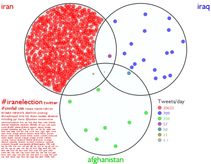
Celebrity Twitter Accounts
By: Jeff Clark Date: Sun, 14 Jun 2009
I recently made some improvements in my graph display code for a client and have used it to create a new graph showing the vocabulary relationships between many celebrities on Twitter. The post More Twitter Account Graphs explains a little about what the similarity is based on.
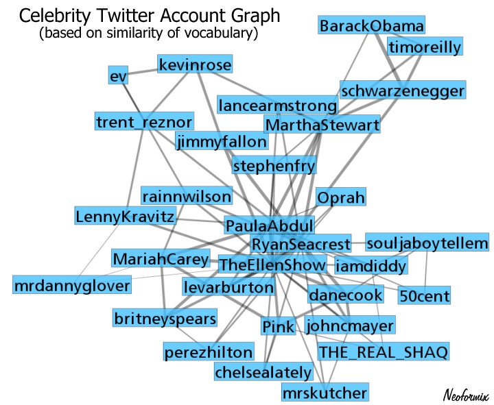
The central people in this set appear to be RyanSeacrest, PaulaAbdul, and TheEllenShow. The similarity score between Ryan and Paula is 19.8% and the top words connecting them together are: 'radio', 'game', 'guys', 'adam', 'movie', 'coast', 'studio', and their respective Twitter IDs.
Another interesting grouping is BarackObama, schwarzenegger, and timoreilly. The similarity score between Obama and Schwarzenegger is 16.7% with the top connecting words being 'health' , 'care', 'video', 'president', 'address', 'vote', and 'event'.
I included jtimberlake in the analysis as well but he was removed from the final graph because he wasn't connected strongly enough with anybody else. His closest match was only 4.5% and was with Oprah.
Beetles
By: Jeff Clark Date: Thu, 11 Jun 2009
After my previous John Lennon Flower Portrait I had the Beatles on my brain and stumbled across a lovely set of photographs of beetles on COLOURlovers. I have tried creating an image of The Beatles using beetles but haven't yet come up with a decent design. Instead I made this beetle outline image from 24 different species. I have seen a lovely physical display of beetles arranged in this manner but I'm not sure where it was. It may have been at the Royal Ontario Museum.
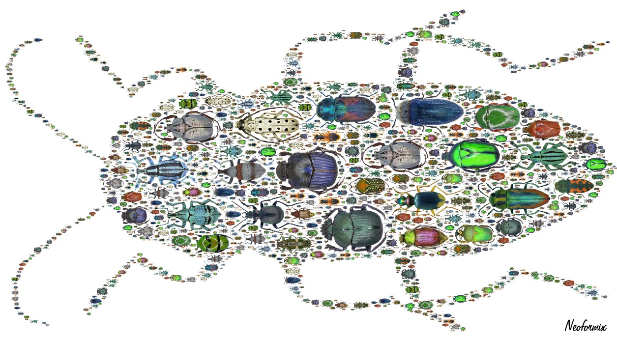
John Lennon Flower Portrait
By: Jeff Clark Date: Tue, 09 Jun 2009
Here is a flower portrait of John Lennon created from the image on the page 100 Portraits of Iconic People of all time. The flower images are from Wikimedia Commons.

John Lennon Word Portrait
By: Jeff Clark Date: Tue, 09 Jun 2009
It has been a while since I've created a Word Portrait. Here is one of John Lennon created from the image on the page 100 Portraits of Iconic People of all time.
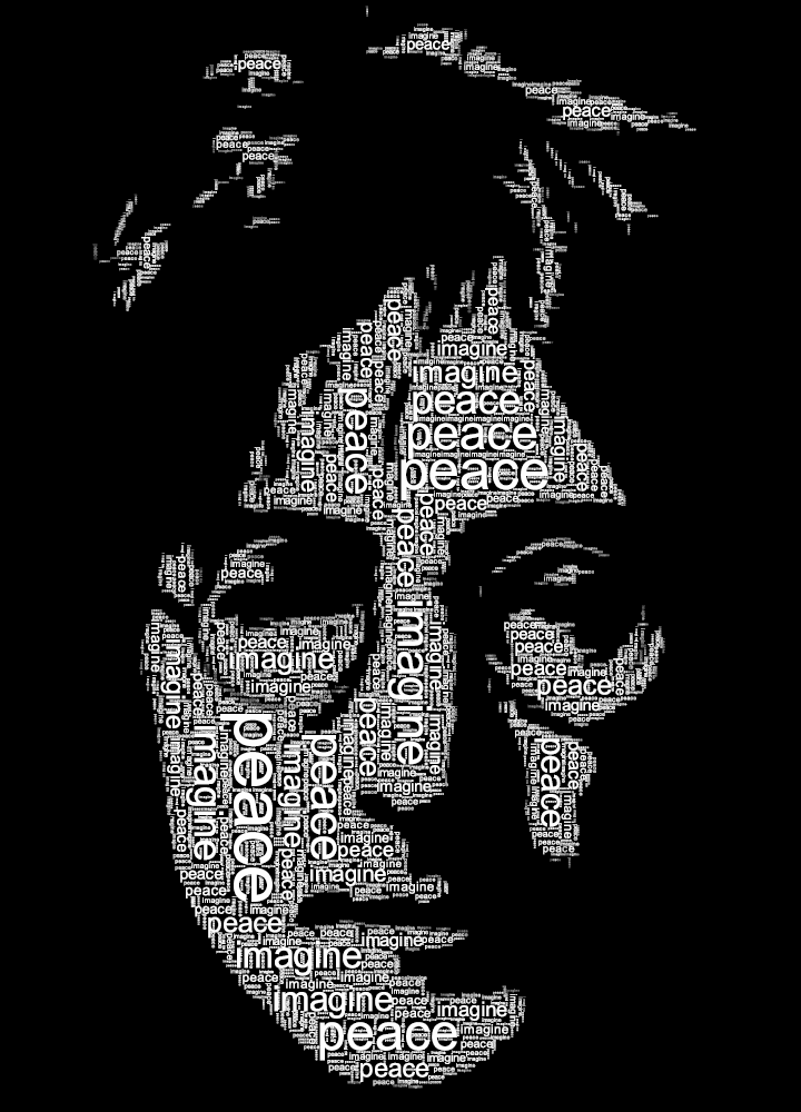
Cairo Speech Word Graph
By: Jeff Clark Date: Thu, 04 Jun 2009
Here is another way to look at Obama's speech in Cairo calling for A New Beginning with Muslims. It uses a standard node link graph to show which words were used near each other in the text. There are virtual springs connecting words that are used frequently together and forces pushing apart nodes so they don't overlap too much. The nodes in orange have been fixed to a certain location and the other nodes move based on the springs and forces until a stable configuration is reached. This allows us to stretch out the graph and easily see where terms lay along a spectrum between 2 or more words of interest.
This first view shows that there was more discussion of 'peace' than 'war' and that words like 'palestinian', 'israel', and 'god' were highly associated with 'peace' relative to the other highlighted words.
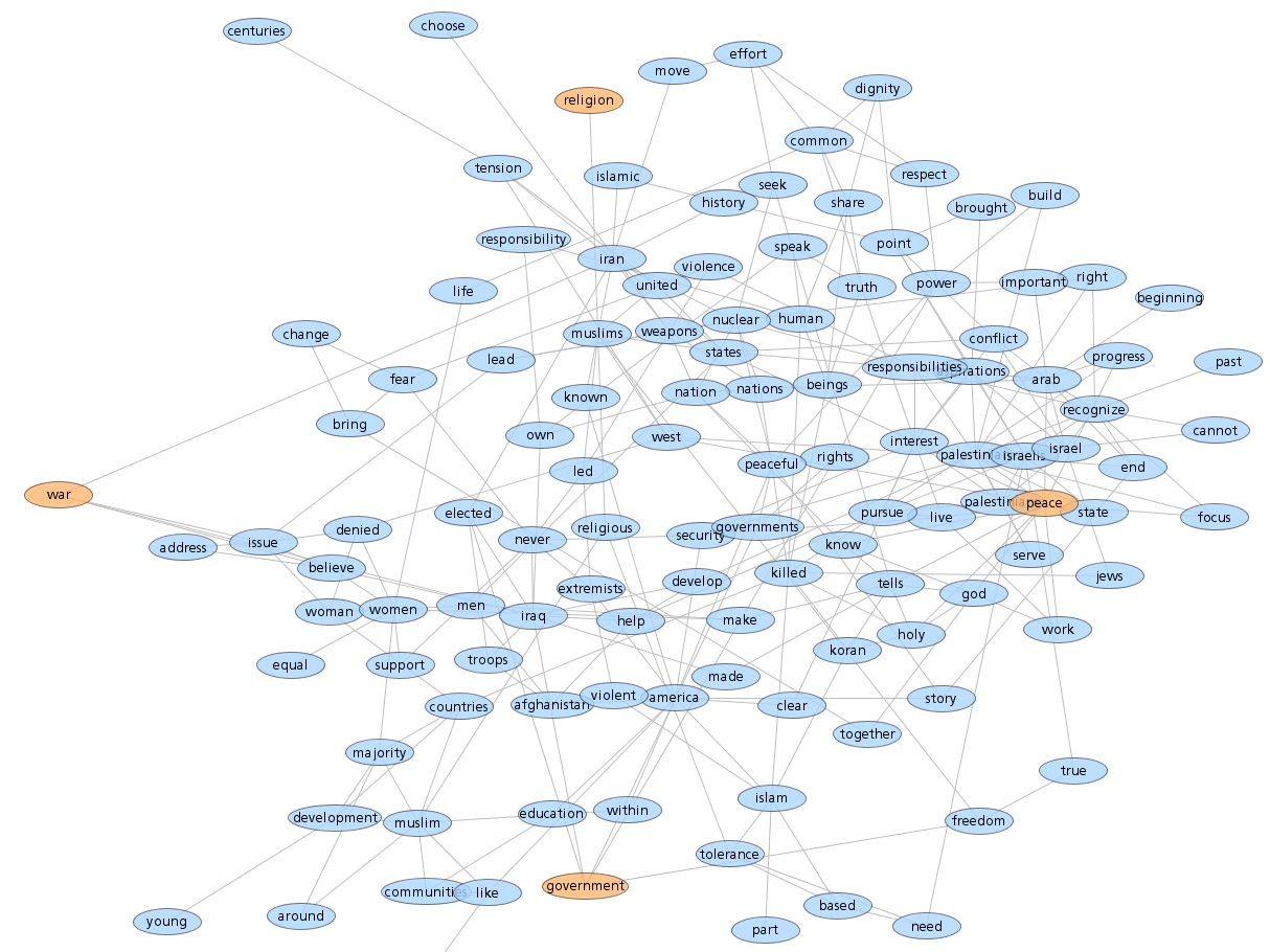
This second view below is of the same graph but with different words pegged in place. The terms 'nuclear' 'weapons' and 'united' 'states' are both closer to 'iran' than the other countries. Similarly, 'women' 'denied' 'equal' is more associated with 'afghanistan'.
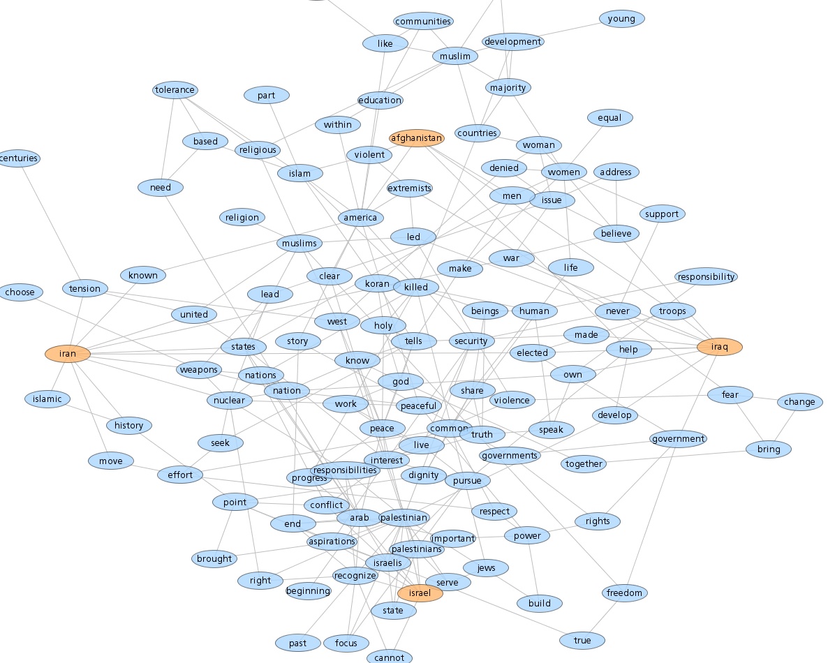
An obvious way to improve these would be to use word stemming to combine different forms of the same word. For example, 'muslim' and 'muslims' would use one node, as would 'peaceful' and 'peace'. This would reduce the number of nodes and probably more clearly expose any relationships.
The code to construct these was written with Processing and makes use of the excellent Traer Physics library.
Obama Cairo Speech StreamGraph
By: Jeff Clark Date: Thu, 04 Jun 2009
Obama just delivered a speech in Cairo calling for A New Beginning with Muslims. Here is a StreamGraph prepared from the text. It does a reasonable job of illustrating which major themes were covered at the various points in the speech.
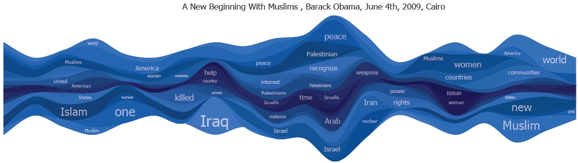
Google Squared
By: Jeff Clark Date: Wed, 03 Jun 2009
datavisualization.ch has a quick review of a new Google offering called Google Squared. It allows you to see the results of a query organized in a table. One of the suggested queries is 'dog breeds' which seemed to work pretty well. The next one I tried was 'mammals' and it seemed OK as well until I looked more closely at the images shown for 'jaguar' and 'wolverine'...
Twitter Employee Account Similarity
By: Jeff Clark Date: Tue, 02 Jun 2009
Dave Winer recently investigated Who do the people of Twitter follow?. He looked at which twitter accounts were followed by the most employees of Twitter and was curious about how that might be related to the accounts suggested to new Twitter users when they sign up.
His idea sparked one of my own - what are the relationships between Twitter employees themselves with respect to similarity of the vocabulary used in their tweets ? Here is the graph created using the same layout technique described in my recent post Twitter Account Graphs.
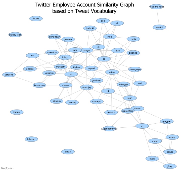
As a whole, the group of twitter employees seem to be well connected based on this vocabulary similarity metric. There are a few people floating around on their own - thuske, akshay_abd, jeremy, lukester, and em33. There is also a doublet separated from the others - keerthi and mikelimondba. They both only have about 40 tweets so this link is more tenuous than the others which are based on the latest 200 tweets. The bottom right shows a fairly cohesive subgroup connected to most of the rest thru ej or perhaps mzsanford/abdur. Co-founder biz seems to be a more central figure by this measure than CEO ev.
WeFollow Twitter Directory
By: Jeff Clark Date: Mon, 01 Jun 2009
WeFollow has quickly become one of the primary directories of Twitter users. The site lets people assign up to 3 tags to their own account in order to describe their interests. People visiting WeFollow can then see for each tag the list of matching accounts sorted by number of followers.
When you categorize yourself on WeFollow, it sends out a tweet to all your followers having the form: 'Just added myself to the http://wefollow.com twitter directory under: #tag1, #tag2, #tag3'. This automatic viral message has helped WeFollow spread across the twittersphere. Some people have complained that they see too many of these and call them spam. Personally, I find it interesting to see how the people I'm following classify themselves.
These automatic registration messages can be tracked using Twitter Search and reveal lots of information about WeFollow that isn't publically available on their own site. I have analyzed the set of WeFollow registration tweets for the two month period Mar 28 - May 28, 2009. There were 144,506 tweets matching my search pattern in this time frame, or roughly 2400 new people added to the directory per day. Here is the graph over time:
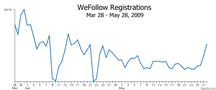
The peak during this time frame occurred at the end of March and was about 6000. The time period for the analysis was shortly after the WeFollow launch which likely accounts for the rough gradual decline shown. It would be nice to see the data for the launch date but unfortunately limitations in Twitter Search prevent me from accessing this data. There appears to be a new peak showing up at the end of May and there are two obvious troughs around April 10th and 22nd. I've checked other data streams I'm monitoring and they don't show troughs or 'holes' during these two dates so it looks pretty likely that there was a problem with WeFollow infrastructure during those periods rather than it being a data collection problem.
The main page of WeFollow shows the 'top tags' but bases this on the number of followers of the people using those tags rather than the tag count itself. Which tags are actually used most often ? An analysis of our sample gives this graph:
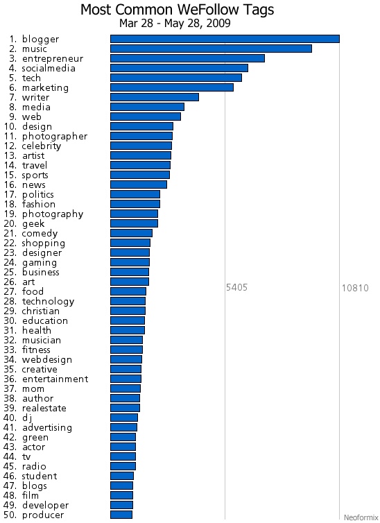
The top three tags by follower count on the WeFollow site are Celebrity, TV, and Entrepeneur. When ranking instead by the number of people who actually self-assign these tags these rankings drop to 12 for Celebrity, 44 for TV, and 3 for Entrepeneur. This shows quite clearly that the average account tagged Celebrity or TV has more followers than, say, those tagged with Blogger.
The WeFollow registration tweets also show which tags are used together. I've constructed a couple of different types of graphics to illustrate the tag similarity relationships. This first one is a Clustered Word Cloud and show colored groups of tags that are frequently used together. The big blue group in the middle seems to contain many of the most frequently used tags and doesn't appear particularly cohesive. Many of the others do, at least subjectively, seem to make sense. Here are a couple of example clusters from the image: (church, conservative, christian, pastor, tcot) , (publishing, poetry, books, writing, poet).
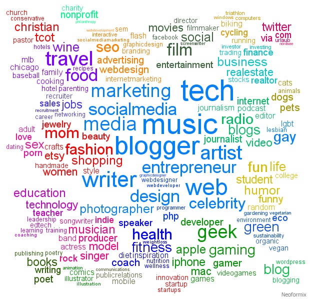
This last image was created using the same layout technique as my recent Twitter Account Graphs. Basically, the tag nodes are positioned near others that they are 'similar to' in the sense that they are often used together.
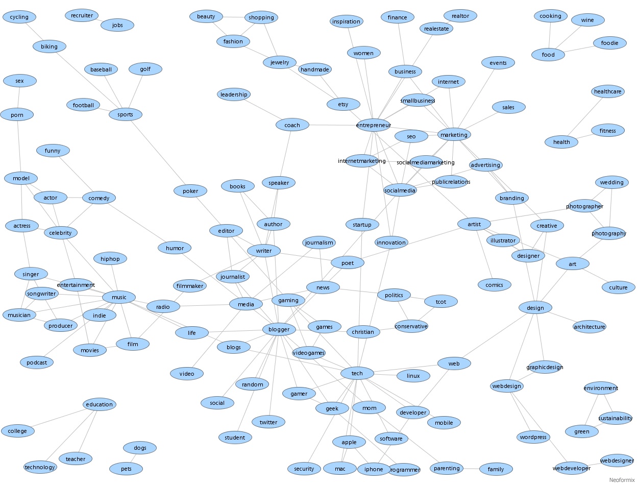
North Korean Flag Word Cloud
By: Jeff Clark Date: Thu, 28 May 2009
The world is watching carefully the things happening in North Korea and there are lots of tweets discussing the issue. I have created a Shaped Word Cloud using 4000 tweets from the last few days and using the North Korean flag as a template. As usual you can click on a word to see the current twitter search results.
More Twitter Account Graphs
By: Jeff Clark Date: Thu, 28 May 2009
Here is another graph showing a larger set of twitter accounts and their relationships based on a measure of shared vocabulary. The middle left cluster contains many Twitter accounts who discuss web technology including Twitter itself. I'm familiar with many of these accounts and know that the ones around my own icon ( JeffClark ) discuss data visualization (eagereyes, flowingdata, datavis, infosthetics). At the bottom right is a cluster of accounts that I follow which are focused on computational art (blprnt, flight404, toxi, mariuswatz, golan, reas, natzke). The group at the very top contains accounts with an interest in music or entertainment.
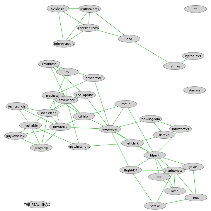
To create this graph I'm connecting nodes with a virtual spring if their similarity was greater than 9%. The stronger the similarity the shorter the spring. There are also long springs connecting extremely dissimilar nodes to push them apart but these are not shown. I've tried to avoid the usual tangled mess by not connecting nodes of medium similarity and also by only connecting two nodes if the link is one of the three strongest for either node.
Tweet Stream Similarity Graph
By: Jeff Clark Date: Thu, 28 May 2009
At the end of the previous post, Tweet Stream Similarity, I suggested using a network graph to visualize the similarity relationships between the twitter accounts. Here is such a graph for the same small set of accounts I looked at before:
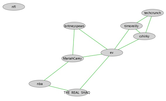
It nicely shows the small group of technology-related accounts (techcrunch, timoreilly, cshirky), the (britneyspears, mariahcarey) entertainment link, and the fact that the nfl account is not closely related to these others. It's interesting that the twitter ceo, ev, is connected to both the technology group and the entertainment group.
The mariahcarey link to the nba surprised me a bit and I looked into the details. Some of the shared vocabulary that caused the link are 'basket' ( as in Easter basket for mariah, and basketball basket for the nba) , and 'shoot' ( as in photo shoot for mariah and shoot the ball for the nba). It's obvious my metric will confuse different senses of the same word. There are many other shared words between these two accounts like friends, guys, baby, twitter, vegas, and everybody. I'm currently using the latest 200 tweets for each user in the analyis. Using more tweets might give better results.
Tweet Stream Similarity
By: Jeff Clark Date: Sat, 23 May 2009
In my recent Twitter Spam post I showed two Twitter accounts that had an almost identical set of tweets. Being able to detect this situation automatically might have obvious benefit in detecting invalid accounts that should be disabled. We can do this by calculating a text similarity measure between the set of tweets coming from the two accounts. A high degree of similarity (say > 80%) is suggestive of automated duplication. This, coupled with some other likely indicators of spam (lots of links to commercial websites, high rate of updates, very low followers/following ratio, lots of followers showing spam-like behaviour) should be good enough for Twitter to find lots of spam accounts automatically.
A tweet stream similarity metric has some other potential uses as well. Given a set of accounts, we could group them into clusters based on similarity of tweet content. Or we could help a twitter user find new people to follow that seem to have shared interests based on tweet content.
There are lots of different functions that can be used to calculate text similarity. The current one I have designed is based on word frequency and excludes standard stop words (the,of,and...) , ignores URLs, ignores some words extremely common in tweets (RT, via), and discounts some other words found often in tweets (like, good, day, thanks...) . This metric can be refined over time and is fairly crude. It completely ignores word order for example and does not consider the semantics of the text at all. I'm hoping it is useful for detecting similarities at a broad topical level.
I have used my metric to calculate the tweet stream similarity between all pairs of 9 fairly well known twitter personalities. I used the last 200 tweets from each account for the analysis with the exception of britneyspears who only has 144 at this time. The lowest similarity score was 2.8% for ev (the twitter ceo) vs nfl (news about the National Football League). The highest was 20.3% and was between cshirky (Clay Shirky - American writer, consultant and teacher on the social and economic effects of Internet technologies) and timoreilly (Tim O'Reilly - founder and CEO of O'Reilly media). The highest score for THE_REAL_SHAQ ( Shaquille O'Neal ) was with the nba twitter account. The highest score for MariahCarey was with britneyspears. The metric seems to be doing a reasonable job. Here is the complete list:
- Sim(cshirky, timoreilly) = 20.0%
- Sim(cshirky, techcrunch) = 16.6%
- Sim(timoreilly, techcrunch) = 15.8%
- Sim(timoreilly, ev) = 14.2%
- Sim(cshirky, ev) = 13.3%
- Sim(MariahCarey, britneyspears) = 12.9%
- Sim(THE_REAL_SHAQ, nba) = 11.8%
- Sim(MariahCarey, ev) = 11.6%
- Sim(ev, techcrunch) = 10.9%
- Sim(MariahCarey, nba) = 10.8%
- Sim(cshirky, MariahCarey) = 10.7%
- Sim(MariahCarey, timoreilly) = 9.6%
- Sim(ev, britneyspears) = 9.2%
- Sim(timoreilly, nba) = 9.1%
- Sim(cshirky, nba) = 9.1%
- Sim(THE_REAL_SHAQ, ev) = 9.0%
- Sim(ev, nba) = 9.0%
- Sim(THE_REAL_SHAQ, MariahCarey) = 8.2%
- Sim(britneyspears, techcrunch) = 8.1%
- Sim(nba, britneyspears) = 7.8%
- Sim(MariahCarey, techcrunch) = 7.7%
- Sim(cshirky, britneyspears) = 7.5%
- Sim(cshirky, THE_REAL_SHAQ) = 7.5%
- Sim(timoreilly, britneyspears) = 7.2%
- Sim(THE_REAL_SHAQ, timoreilly) = 6.5%
- Sim(THE_REAL_SHAQ, britneyspears) = 6.4%
- Sim(nba, techcrunch) = 6.4%
- Sim(nba, nfl) = 4.5%
- Sim(THE_REAL_SHAQ, techcrunch) = 3.9%
- Sim(timoreilly, nfl) = 3.9%
- Sim(nfl, techcrunch) = 3.7%
- Sim(MariahCarey, nfl) = 3.6%
- Sim(cshirky, nfl) = 3.6%
- Sim(THE_REAL_SHAQ, nfl) = 3.4%
- Sim(nfl, britneyspears) = 3.2%
- Sim(ev, nfl) = 2.8%
An obvious next step is to use a better way to visualize this information. I'm thinking of using a network layout with nodes positioned closely and connected for high similarity scores and positioned far apart for low similarity scores. I'm hoping that it would illustrate nicely any structure within the group.
American Idol Tweet Narrative
By: Jeff Clark Date: Thu, 21 May 2009
I have taken the collection of tweets I gathered for the American Idol StreamGraph and run them through my tool for creating a Characteristic Tweets Summary to produce the following output. My initial attempt included some obvious spam tweets so I had to refine my technique a little bit. Basically, a twitter spammer who repeated the same text over and over was highly likely to have one of their tweets selected as the 'characteristic tweet' for the time period containing the spam. The refinement was to only analyze one tweet per user per time period.
In the output table I also de-emphasized the twitter account for each tweet since they are statistically selected to be representative of an aggregate. The trailing '*' is a link to the original tweet which, of course, shows the proper attribution.
| Date | Characteristic Tweet |
| May 03, 2009 | American Idol winner David Cook's brother dies of cancer. * |
| May 04, 2009 | 'American Idol' star David Cook's brother Adam dies of brain cancer! * |
| May 05, 2009 | getting ready to watch american idol. * |
| May 06, 2009 | Headed home for american idol * |
| May 07, 2009 | very mad because Allison Iraheta got off American Idol * |
| May 08, 2009 | tickets for the american idol tour go on sale saturday @ 10!!!!!!!!! * |
| May 09, 2009 | Just got tickets to the American Idol tour!!!! * |
| May 10, 2009 | Tickets for the American Idol 2009 Summer tour on Sale|Tour Dates ... http://tinyurl.com/rdmcyl * |
| May 11, 2009 | Can't wait to see American Idol!!!! * |
| May 12, 2009 | getting ready to watch American Idol * |
| May 13, 2009 | American Idol i'm waiting for who is going home tonight !!!! * |
| May 14, 2009 | @jordanknight who cares about american idol...you're my american idol! * |
| May 15, 2009 | RT @kingsthings: who do you want to win American Idol? * |
| May 16, 2009 | What is the difference between the American Idol and Eurovision? * |
| May 17, 2009 | Clouds on horizon for "American Idol" juggernaut? (Reuters) http://ow.ly/7q1O * |
| May 18, 2009 | britney to perform on American Idol finale? * |
| May 19, 2009 | getting ready to watch american idol. come on,kris! * |
| May 20, 2009 | American Idol finale!!!! come on kris!!! even though adam has it, i really want you to win!!!! * |
| May 21, 2009 | Kris won the american idol * |
Fish Tank
By: Jeff Clark Date: Thu, 21 May 2009
Sorry - I couldn't resist. The fish images are Reef Fish of the Commonwealth of the Northern Mariana Islands and the tank outline comes from the free font Tanks-WW2.
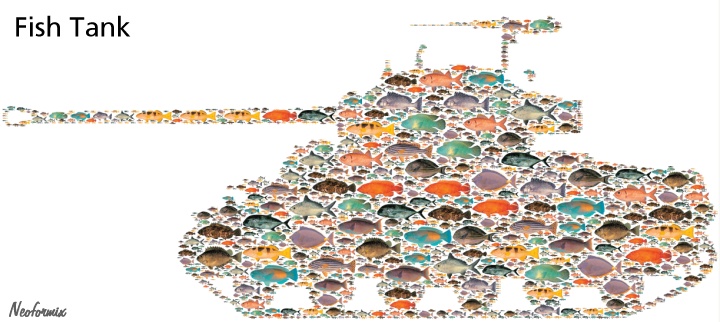
American Idol StreamGraph
By: Jeff Clark Date: Thu, 21 May 2009
Here is a Twitter StreamGraph created from the query "American Idol" OR #idol in the date range of May 3-21, 2009. I had to use a custom version of my tool that used tweet data harvested in a different manner from the online version which is limited to viewing the last 1000 tweets only. Given such a popular topic, 1000 tweets only goes back a few minutes and is uninteresting.
A couple of observations:
- Note the large spikes for 'David', 'Cook', and 'brother' around May 3rd. This occurred because the contestant David Cook's brother had just passed away from cancer.
- The eventual winner (Kris), was mentioned less often than the other finalist (Adam) for most of the time span.
It would be interesting to see the graph for a longer time period but Twitter Search is currently only returning data that goes back around 21 days.
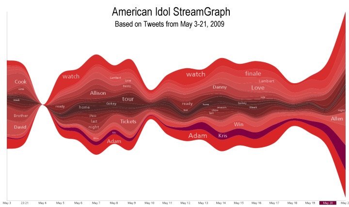
Some Text Art
By: Jeff Clark Date: Tue, 19 May 2009
I recently stumbled across a collection of text art creations at The Gawno Magazine. Those of you who have enjoyed my Einstein Word Portrait or other designs created from text might find it interesting. A few sample designs are shown below. See the larger versions including references to the original art at Micrography: Text Art and Typography

FlowerTank
By: Jeff Clark Date: Fri, 15 May 2009
Here is another simple flower design. The flower images are again from Wikimedia Commons and the tank outline comes from the free font Tanks-WW2.

FlowerCycle
By: Jeff Clark Date: Fri, 15 May 2009
Spring is the time for flowers and ... motorcycles. Why not combine the two together ? The flower images are from Wikimedia Commons and the motorcycle design from The Gerd Arntz Web Archive.

Twitter Spam Update
By: Jeff Clark Date: Fri, 15 May 2009
Yesterday I described how I stumbled across a set of twitter accounts obviously being used for spam. I also mused that it shouldn't be that hard to detect them algorithmically. Well, I happened to check them today and found that Twitter reports they have been 'suspended due to strange activity' ! The accounts had existed for quite some time since they had sent out over a 1000 updates and had a substantial number of followers. I suspect Twitter likely detected them automatically and shut them down as part of a regular process but it does seem a bit of a coincidence that they were shut down so shortly after I wrote about them...
Twitter Spam
By: Jeff Clark Date: Thu, 14 May 2009
I was looking at the Twitter StreamGraph for 'Star Trek' a little while ago and noticed an unusual pattern. There was a peak caused by many users sending the exact same tweet which contained a long list of trending hashtags that were otherwise unrelated - #googlefail, #whyitweet, #hubble, #star trek, #gmail etc. The tweet actually does vary slightly in that a different ow.ly URL is used but they all lead to the same place. It's obvious twitter spam carefully constructed to catch the attention of people following the trending terms.
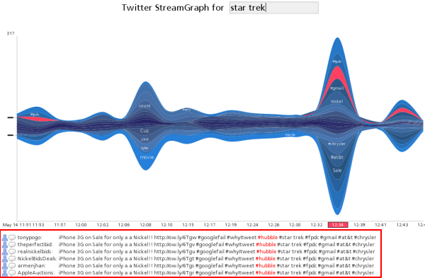
Here are snapshots of two of the accounts showing that their last 6 tweets were identical. They have different numbers of followers with the one account acquiring an impressive 924 - more than I have. Presumably there is a large set of spam accounts and many follow each other. Other characteristics that seem to suggest spam besides the redundancy are no evidence of @replies and the fact that every single tweet seems to mention a product name and include a link.
I suspect it wouldn't be too hard to detect these algorithmically.
More Twitter Venn Examples
By: Jeff Clark Date: Thu, 14 May 2009
Here are a couple of venn diagrams created with Twitter Venn for some topics in the news. The first shows H1N1 vs 'swine flu' and it clearly shows that the less technical name is occurring much more frequently in tweets and also that there is a fair amount of overlap. The second example compares 'star wars' with 'star trek' and has a very similar appearance to the first. I'm surprised that with the launch of the new Star Trek movie it doesn't dominate references to Star Wars even more although it does have about a 5-6 x advantage right now. It may be because there was some discussion recently on twitter about the many plot parallels between the new Star Trek movie and the original Star Wars. Notice in the word cloud for tweets containing both terms the high visibility of 'rips' and 'off'.
Click on the images to see the current diagrams inside the interactive tool.
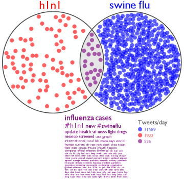
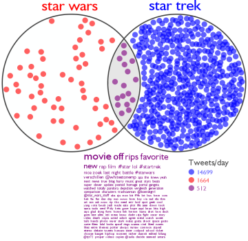
Unilever Logo Reconstructed
By: Jeff Clark Date: Wed, 13 May 2009
| A wonderful example of a composite logo is that of Unilever, one of the world's largest consumer goods companies. There are 25 small icons put together to form a large 'U'. Here is a description of the various icons and what they represent. |
|
Just for fun I've taken the individual icons and rearranged them in a few different ways. Below, see Unilever Man, Woman, and Baby.


The outline icons came from AIGA Signs and Symbols.
Happy Mother's Day
By: Jeff Clark Date: Sun, 10 May 2009
Happy Mother's Day to all the moms out there ! Here are a couple of simple designs to celebrate. The first was created with my recent custom tool for filling space with images and the second was made using the old Word Hearts application. You can use it to create a customized version with your own words and colors.

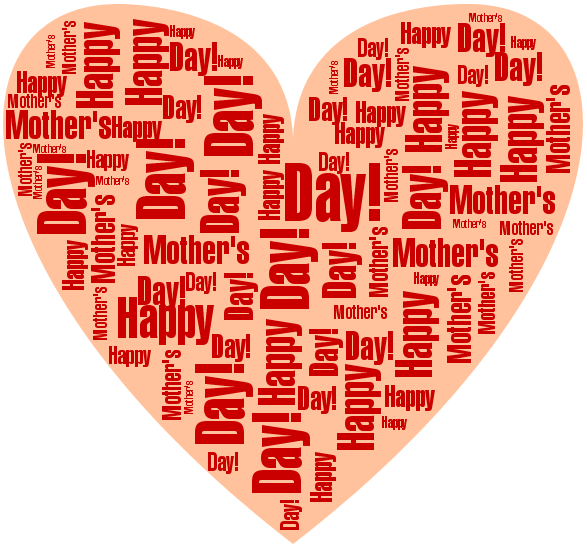
illo Art
By: Jeff Clark Date: Fri, 08 May 2009
I've been thinking lately about composite images that are built from smaller sub-images as in my recent Butterfly Falcon and Butterfly Plane. While wandering in the store yesterday I saw some notepads with some interesting composite image cover designs. I've found the designers online at illo Art. A couple of their designs are shown in small form below.


Integra Magazine Cover
By: Jeff Clark Date: Wed, 06 May 2009
Integra-Magazine is a biannual popular journal on Integrative Tourism and Development, �published by respect, an Austrian based �NGO. I recently gave permission for them to use my World Peace image on the � cover of their next issue which has the theme of Peace/Tourism and Conflict. It just came out of press recently and the cover image is shown below. � The site is in both English and German.

Butterfly Falcon
By: Jeff Clark Date: Tue, 05 May 2009
This one uses a falcon silhouette with the same butterfly image components. Source images are Falcon Silhouette, Butterfly set 1, and Butterfly set 2.
It was generated with custom code written in Processing.
Butterfly Plane
By: Jeff Clark Date: Tue, 05 May 2009
Here is another experiment with images reconstituted from sub-images. It was generated with custom code written in Processing. Source images are Plane Silhouette, Butterfly set 1, and Butterfly set 2. This image might make a nice poster.

Spider Man
By: Jeff Clark Date: Mon, 04 May 2009
This is a different kind of spider man. The image was generated with custom code written in Processing that is a variation on the code used for my Word Portraits. I was inspired by Quasimondo (Mario Klingemann) as mentioned in my last post to experiment with more complex constituent images and image rotations. Source images are Man Silhouette and Spider.
Image Foam Technique
By: Jeff Clark Date: Sun, 03 May 2009
The excellent computational artist known as Quasimondo (Mario Klingemann) has posted an interesting set of images to Flickr that he created with an algorithm he calls 'image foam'. The technique has some similarites to what I do to generate some of my images - World Peace , and Einstein for example. The base concept is to fill 2D space using component images(or letters) without any overlap. Quasimondo has used more complex and colourful constituent images and placed them in a more varied and interesting manner than I have. Smaller versions of a few of his images are shown below - click on them to see his originals.

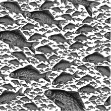
Chrysler Tweet Summary
By: Jeff Clark Date: Sat, 02 May 2009
Here is another example of the Characteristic Tweets idea. The troubles of GM and Chrysler have been in the news for some time now and have been widely discussed in the twittersphere. I have a personal connection to Chrysler having grown up in Windsor, Ontario where they are a major part of the economy and I still have family members who work there.
I have analyzed six months of tweets containing 'chrysler' for the time period Nov 1, 2008 until Apr 30, 2009 - around 66,000 in all. Rather than finding a characteristic message for every day I have split the set into 20 equal-time periods and found the most representative for each period. It tells the sad story fairly well I think. Let's hope if I repeat the exercise in another six months that it has a happier ending.
| Date | Characteristic Tweet |
| Nov 02, 2008 | odanielpavon: No big sellers in sight to save troubled Chrysler (AP): AP - In crises past, Chrysler has somehow managed to stamp out a b.. |
| Nov 13, 2008 | reutersbiz: Goldman suspends GM rating, Chrysler urges aid: DETROIT (Reuters) - Goldman Sachs suspended its rating.. http://tinyurl.com/6pwcgo |
| Nov 21, 2008 | mayankchandak: Chrysler's Web Edition vehicle package: includes WiFi, iPod touch and a Dell Mini 9: Chrysler has been toying with in-car .. |
| Dec 05, 2008 | odanielpavon: Senators grill auto CEOs, eye GM-Chrysler deal (Reuters): Reuters - The chief executives of General Motors Corp and Chrysl.. |
| Dec 12, 2008 | michaelreuter: Chapeau! US Senate "No bailout for GM, Ford, Chrysler" |
| Dec 17, 2008 | nishachittal: Is chrysler really closing all its plants for a month?? |
| Jan 03, 2009 | odanielpavon: Chrysler gets $4 billion U.S. government loan (Reuters): Reuters - Chrysler LLC on Friday received an initial $4 billion emergency loa.. |
| Jan 05, 2009 | studentoflife: Chrysler U.S. December sales drop 53% |
| Jan 20, 2009 | karlturnbull: fiat to buy 35% stake in chrysler |
| Jan 26, 2009 | magneda2: Reuters: Chrysler urges dealers to order cars, cut costs: NEW ORLEANS (Reuters) - Chrysler LLC on Sunday.. http://tinyurl.com/b46y2x |
| Feb 05, 2009 | dugg: GM, Chrysler offer to buyout nearly 100% of hourly workers: General Motors is offering buyouts to virtually all .. http://tinyurl.com/c2sw64 |
| Feb 14, 2009 | googlenewsbiz: GM, UAW talks break off Chrysler talks stall - Reuters: |
| Feb 18, 2009 | latimesnews: GM, Chrysler seek billions more in federal loans: General Motors asks for $9.1 billion to $16.6 billion and says.. http://tr.im/grbq |
| Feb 26, 2009 | feedsontap: Acquisition Chrysler company_beingacquired Fiat SpA company_acquirer |
| Mar 12, 2009 | MobileAuto: Chrysler threatens Canada pull out - The Associated Press |
| Mar 20, 2009 | wopularall: Fiat says it won't assume Chrysler debt in deal http://ff.im/-1CV1s |
| Apr 01, 2009 | alexanderwatson: Obama: Bankruptcy only option for GM and Chrysler. |
| Apr 08, 2009 | toledonews: Chrysler rolls out new Jeep Grand Cherokee after government scolding http://ff.im/-20515 |
| Apr 15, 2009 | borgellaj: Fiat CEO warns Chrysler unions: cut costs or we walk |
| Apr 30, 2009 | SecurityCanada: Chrysler will file for Chapter 11 bankruptcy |
Characteristic Tweets
By: Jeff Clark Date: Fri, 01 May 2009
There are huge numbers of Twitter status messages being created every day. I've been tracking tweets containing the word 'obama' for more than 250 days now and on average there are more than 10,000 tweets/day. There is so much data that it can be overwhelming to try and extract useful information. The nature of the twitter platform means that any useful information for a particular topic is highly fragmented. There is also a large amount of redundant information especially since so many tweets are actually 'retweets'.
Can we construct something approaching a narrative from all the bits ? Can we eliminate much of the redundancy ? I've started to tackle this problem with the following approach:
- Gather a collection of tweets for a topic of interest
- Eliminate non-English tweets
- Partition the tweets into separate bunches by date and time
- Analyze the word frequency in the bunches and determine, for each bunch, what the characteristic words are. These are the words that occur relatively more frequently in that bunch compared to the complete set
- Use the word relative frequency for each bunch to find a 'characteristic tweet' for each bunch. Roughly speaking, this is the tweet in that bunch which contains the highest proportion of words that are characteristic of the bunch
As an example I have analyzed a sample of tweets taken from Obama's first 100 days in office. The table below shows the characteristic tweet for each day. I used every 25th tweet containing 'obama' in the time period and discarded non-English tweets. This left me approximately 75,000 tweets for the analysis. It seems to work fairly well. You can read through them and get a pretty good summary of the various Obama-related events that have recently occurred.
Days 1-50:
| Date | Characteristic Tweet |
| Jan 20, 2009 | charlesta: watching Barack Obama's inauguration on TV |
| Jan 21, 2009 | francis_gt: watching obama's inauguration speech |
| Jan 22, 2009 | GeorgeReese: Obama retakes the oath of office tonight :) |
| Jan 23, 2009 | Hops11: Obama overturned global gag rule! YES! |
| Jan 24, 2009 | PoliticsFix: Obama reverses abortion-funds policy - http://is.gd/h1VQ - WFIE-TV |
| Jan 25, 2009 | odanielpavon: Some global adversaries ready to give Obama chance (AP): AP - In his inaugural address, President Barack Obama signaled conciliation t.. |
| Jan 26, 2009 | dustytrice: Breaking: Obama will direct EPA to move swiftly to grant 14 states the right to set strict auto emission standards on Mon (via @Populista) |
| Jan 27, 2009 | nyycarl07: @ricksanchezcnn Obama's Al-Arabiya interview/Mitchell Mideast visit...mending fences with the Arabic world..meaningful dialog..long overdue! |
| Jan 28, 2009 | YahooNews: Obama open to compromise on $825B stimulus bill (AP) |
| Jan 29, 2009 | keramurphy: Obama signed the Lilly Ledbetter Equal Pay Bill. Love it. |
| Jan 30, 2009 | binikadwa: Even Obama's rooting for the Steelers |
| Jan 31, 2009 | bigkumadog: Obama's half brother arrested on charge of drug possession: NAIROBI, Kenya - George Obama, the half brother of U.. http://tinyurl.com/dzazy8 |
| Feb 01, 2009 | wbaustin: Obama Takes Jab at Chief of Staff at Alfalfa Club Dinner: President pokes fun at his volatile chief of staff Rah.. http://tinyurl.com/cbhkrd |
| Feb 02, 2009 | caerickson: Rooney just thanked Obama for supporting the Steelers! |
| Feb 03, 2009 | Headline_News: Daschle withdraws as HHS nominee: Former Sen. Tom Daschle has asked President Obama to withdraw his nomination f.. http://tinyurl.com/d66eaj |
| Feb 04, 2009 | idigg: Obama To Cap Executive Pay At $500K For Bailout Recipients http://tinyurl.com/abqpq2 |
| Feb 05, 2009 | gregspradlin: Reading about Fairey and AP......AP alleges copyright infringement of Obama image .. http://tinyurl.com/czxvat |
| Feb 06, 2009 | nelking: @joshcagan Headline: "Senate Struggles on Stimulus in Nighttime Session" Related news: Obama adds Dr. Ruth to Economic Advisory Board |
| Feb 07, 2009 | latimesnational: Artist of famed Obama poster arrested in Boston: Police in Boston say the artist famous for his "Hope" posters o.. http://bit.ly/FPN6 |
| Feb 08, 2009 | inaug: #Inauguration Lompoc man has front row seat at Obama inauguration - Lompoc Record: Lompoc man has f.. http://tin.. http://tinyurl.com/bm ... |
| Feb 09, 2009 | ElkhartTruth: Obama: "We've got the best workers right here in Elkhart." #obamaelkhart |
| Feb 10, 2009 | jclayiv: watching the obama press conference |
| Feb 11, 2009 | fwstylewatch: breaking... michelle obama's march vogue cover finally unveiled! |
| Feb 12, 2009 | Love_The_Oscars: Obama praises Lincoln's legacy at Ford's Theatre |
| Feb 13, 2009 | Politisite: Republican Senator Judd Gregg withdraws as Obama's Commerce Pick over conflict on stimulus #tcot |
| Feb 14, 2009 | NewsOnTwitter: MSNBC - Obama: Stimulus bill is 'major milestone': President Barack Obama, savoring his first major victo.. http://tinyurl.com/cvv6gc |
| Feb 15, 2009 | lemonhed77: news update Air Force One is one 'spiffy ride,' Obama says: It's longer than a hockey rink, has two f.. http://tinyurl.com/b8wky4 |
| Feb 16, 2009 | imacsweb: Obama decides on task force to oversee auto industry reform rather than appoint "car czar" http://tinyurl.com/cv66z3 |
| Feb 17, 2009 | keyc: Pres. Obama Signs Stimulus Bill in Denver | http://keyc.tv |
| Feb 18, 2009 | timesnews: Obama to unveil mortgage foreclosure plan http://www.timesoftheinternet.com/47845.html |
| Feb 19, 2009 | caniba: Obama goes to Ottawa, ON, Canada and what do the Internets call it? #Obamawa -- I don't say this enough but... I love you Internets. |
| Feb 20, 2009 | ThomasGalvin: thinks its funny that Obama is lecturing mayors to "spend wisely" |
| Feb 21, 2009 | roadkillrefugee: Obama's Weekly Video Address: Quickest & Broadest Tax Cut EVAH! http://tinyurl.com/dxdg7b |
| Feb 22, 2009 | IvorKellock: Obama aims to halve deficit by 2013 http://ff.im/-1aRkZ |
| Feb 23, 2009 | AccordionGuy: Sasha Obama Keeps Seeing Creepy Bush Twins While Riding Tricycle Through White House: http://is.gd/kyi1 |
| Feb 24, 2009 | sumbonet: NewsOnTwitter: BBC NEWS - Japan PM visits Obama White House: Japan's Prime Minister Taro Aso will be the first... http://ff.im/-1bNY1 |
| Feb 25, 2009 | amyz5: For those who missed my post speech commentweet last night: Obama is to Jindal as Dylan is to the Jonas Brothers. #nsotu |
| Feb 26, 2009 | neilkelty: Disappointed in President Obama's budget. |
| Feb 27, 2009 | profchandler: RT: @NewsHour: At 11:45 Obama will address Marines at Camp Lejeune.expected to announce withdrawal of U.S. combat forces from Iraq Aug 2010 |
| Feb 28, 2009 | headlinenews: AP: Obama moved toward commanders in Iraq decision: WASHINGTON (AP) -- President Barack Obama leaned heavily .. http://tinyurl.com/chavyl |
| Mar 01, 2009 | ReddingNews: Data on Obama's Helicopter Breached Via P2P?: Tiversa, headquartered in Cranberry Township, Pa., reportedly disc.. http://tinyurl.com/cd28gf |
| Mar 02, 2009 | thebodybreaks: Obama nominates Gov. Sebelius for health post: Kansas Gov. Kathleen Sebelius, President Obama's nominee to head .. http://tinyurl.com/d989ha |
| Mar 03, 2009 | atifunaldi: Sources: Obama to shelve species rule |
| Mar 04, 2009 | TechGlance: Obama taps Julius Genachowski to head the FCC http://tr.im/h10T |
| Mar 05, 2009 | leeharveydent: Watching CNN: Obama's Rx for health care reform. |
| Mar 06, 2009 | news_by_robots: Obama to Lift Ban on Funding for Embryonic Stem Cell Research @Washington_Post |
| Mar 07, 2009 | caketeagirl: Pleased about Obama's decision to reverse Bush's limits on stem cell research |
| Mar 08, 2009 | ftantillo: "The Rock" Obama on SNL = awesome |
| Mar 09, 2009 | Atticus_James: yay obama and stem cell research! |
| Mar 10, 2009 | HootieMcBoob: Go Obama on the stem cell research! WOOOT! :D |
Days 51-100:
(More...)
TED Shaped Word Cloud
By: Jeff Clark Date: Tue, 28 Apr 2009
Brain Pickings just built a typographic visualization using Wordle based on the title text from the various TED talks. If you don't know about TED already then be sure to check it out. They provide 'riveting talks by remarkable people, free to the world' and it's some of my favourite content on the web.
Brain Pickings used the title text from this spreadsheet to generate their cloud. I've taken both the title and summary text to produce my own shaped word cloud based on their logo. Click on a word to see the related talks, pick one and then watch it !
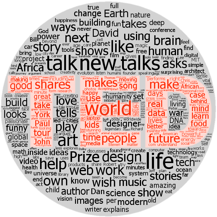
NAS Remarks StreamGraph
By: Jeff Clark Date: Tue, 28 Apr 2009
Yesterday President Obama delivered an address to the National Academy of Sciences. I am a strong believer in the critical importance of science and technology as a means of improving the average quality of life in our world and it was refreshing to hear from a president who believes the same. Here are a few snippets:
At such a difficult moment, there are those who say we cannot afford to invest in science. That support for research is somehow a luxury at a moment defined by necessities. I fundamentally disagree. Science is more essential for our prosperity, our security, our health, our environment, and our quality of life than it has ever been.
we are restoring science to its rightful place ... Under my administration, the days of science taking a
back seat to ideology are over. Our progress as a nation � and our values as a nation � are rooted in free and open inquiry. To undermine scientific integrity is to undermine our democracy.
The streamgraph below was created fom the complete text of the speech. Click on it to see a high resolution PDF version.
Lexical Analysis of Debates
By: Jeff Clark Date: Mon, 27 Apr 2009
I did a fair number of posts last year that analyzed various texts related to the US election. A number of different techniques were used including StreamGraphs , Speech Contrast Diagrams, an interactive transcript visualizer, and, of course, word clouds. I introduced Martin Krzywinski in my last post as the creator of Circos. Martin has also done some excellent work in the area of lexical analysis and visualization of text in the post Lexical Analysis of 2008 US Presidential and Vice-Presidential Debates � who's the Windbag?
Here is a portion of one of his graphics that illustrates thematic profiles for Obama and McCain during a debate. It has some conceptual similarity to my interactive transcript visualizer.
These word clouds below were created by Martin and use different colours to show the words spoken uniquely by Obama in green, uniquely by McCain in blue, and by both men in white. The first one shows nouns and the second is limited to adjectives. I think the idea of limiting the cloud to a particular part of speech is a fruitful one to explore.
In the same document Martin also formulates and calculates an interesting 'windbag index' that is a composite of measures of repetition in various aspects of speech.
Circos
By: Jeff Clark Date: Mon, 27 Apr 2009
FlowingData recently had an interesting guest post about an alternative way of visualizing tabular data. It was by Martin Krzywinski and featured his visualization tool called Circos. Circos can produce a wide variety of information-rich, radial-based diagrams.
Some of the comments on FlowingData were quite negative and inspired a follow-on post by Nathan titled Narrow-minded Data Visualization. His post and the many related comments are interesting reading for those who care about data visualization and the tension between traditional/novel , expert/amateur, and cautious/exuberant approaches.
Some of these diagrams are very information-dense and might be a challenge to decode for those without much experience in interpreting them but I believe they are likely a powerful technique in the right situation. I suspect that no matter what your feelings are on the utility you will find it stimulating to examine a few example diagrams created with Circos.
Earth Day Twitter Map
By: Jeff Clark Date: Thu, 23 Apr 2009
I was too busy yesterday to create this for Earth Day so here it is one day late. Besides, shouldn't every day be earth day? Around 3500 tweets containing the text 'Earth day' were analyzed and the shaped word cloud below was created based on the frequency of the other words used. Click on a word to see the latest matching tweets. I used the same globe image as in My World Has Room For Wildlife and World Peace. The image was made with NASA World Wind.
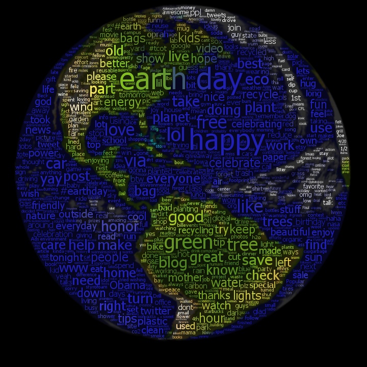
Twitter Spectrum in Print
By: Jeff Clark Date: Mon, 20 Apr 2009
A few months back I was contacted by someone at McKinsey & Company for permission to include a graphic in a publication they were producing. They used my tool Twitter Spectrum to create an image illustrating the words associated with the terms 'collaboration' and 'individualism' in the latest tweets on Twitter. This was used in a section of a printed book called What Matters - Ten questions that will shape our future . The book was distributed to leading business executives and world leaders at the World Economic Forum annual meeting in Davos Switzerland at the end of January. I was very pleased to be associated, even in such a small way, with such a prestigious undertaking.
The online version of the content does not include the image but the scanned image is shown below. It shows that 'collaboration' was used more frequently than 'individualism' in tweets. Dominant terms related to collaboration are: blogging, power, world, strategy, socialtext, and tomorrow. Terms related to individualism include rugged, hyper, sovereignty, obama, and american.
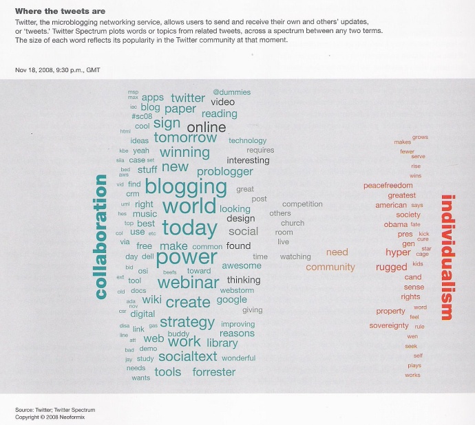
The image above was generated in Nov 2008. Just for fun I have created the current spectrum to see how it compares. It looks quite different and is much more balanced. Note that McKinsey manually recreated the image they used in order to get the colours they wanted.
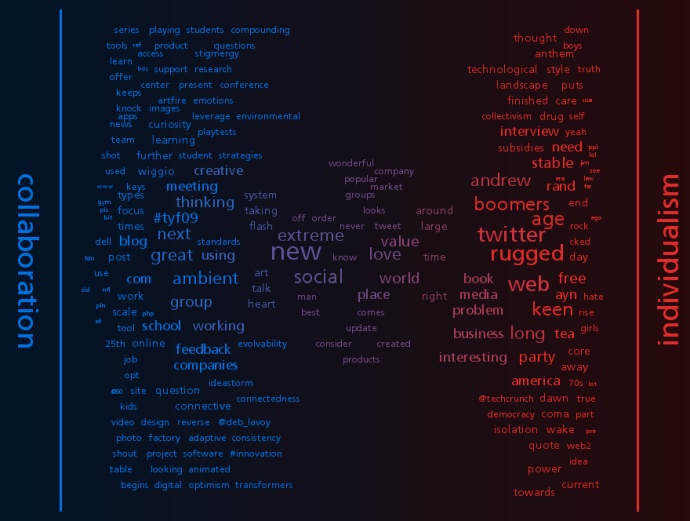
Celebrities on Twitter
By: Jeff Clark Date: Sun, 19 Apr 2009
There has been a lot of attention on Twitter this week to three celebrity-related topics. Early in the week there was a lot of discussion about Susan Boyle, the candidate on Britain's Got Talent. In the middle of the week there was Ashton Kutcher becoming the first Twitter user to have more than 1,000,000 followers. Finally, on friday, Oprah joined Twitter and featured it on her show.
I've used Twitter Venn to compare the current rate at which these three people are being referred to in the TwitterSphere. Susan Boyle is slightly behind Oprah right now and far ahead of Asthon Kutcher. These results reflect the current zeitgeist and could be quite different tomorrow. It's also interesting to note the high frequency of the hashtag #herebeforeoprah within oprah references. Click on the image or this link to see what it's like right now.
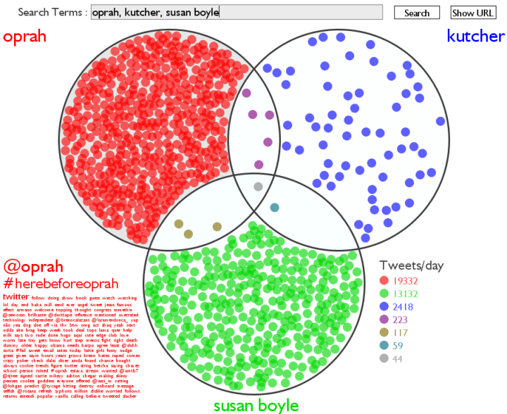
Public Commitment
By: Jeff Clark Date: Sat, 18 Apr 2009
We are 108 days into the year and Neoformix has had 28 posts to date. This works out to about 1 post every 4 days. I'm making a public commitment right now to try and post more often with a target of averaging 1 post/day for the rest of the year. I will continue to highlight my own work but you can expect to see more posts about other data visualization related material on the web.
Thank you to everyone for your continued support. Feel free to recommend ideas for new content through email or Twitter !
Mesh 2009 Word Map
By: Jeff Clark Date: Thu, 09 Apr 2009
The Mesh Web Conference just finished in my hometown of Toronto. I didn't attend but it looked like it would have been an interesting experience. I built another shaped word cloud based on tweets containing the text 'mesh09' sent over the last few days. The larger the word, the more frequently it was used. Click on any word to see the related tweets in Twitter Search. It seems to illustrate the primary topics and speakers reasonably well.
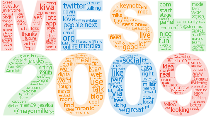
Web 2.0 Expo Word Map
By: Jeff Clark Date: Sat, 04 Apr 2009
The image map below was constructed from the most popular content words in tweets about the Web 2.0 Expo taking place in San Francisco. The larger the word, the more frequently it was used. Click on any word to see the related tweets in Twitter Search.
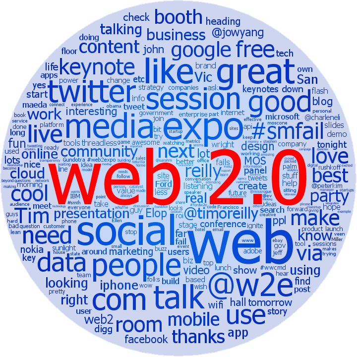
Twitter Venn for G20 Leaders
By: Jeff Clark Date: Thu, 02 Apr 2009
I have used Twitter Venn to look at the tweets containing references to the leaders of the US, Canada, and the UK during the G20. This is a snapshot taken around 9:30 EST on April 2nd. I combined the word clouds for several Venn regions into the single image below for ease of comparison. A few obvious observations:
- Obama is being referenced more frequently the Brown (the host), and both are referenced much more often than Stephen Harper.
- There are a lot of tweets mentioning both Obama and Brown indicating a high interaction between these two leaders.
- Very low association between Harper and the other two leaders.
- Obama's word cloud references Michelle as the highest term, those for the other leaders contain no obvious reference to their spouse.
- Harper's cloud seems to be primarily about him missing the group photo.
Click here or the image below to see the latest Twitter Venn for the names of these leaders in the context of G20.
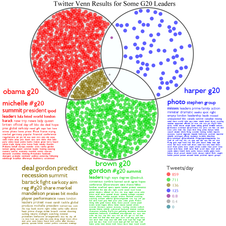
Phrase Nets on ManyEyes
By: Jeff Clark Date: Wed, 25 Mar 2009
The wonderful collaborative data visualization site Many Eyes has just introduced a new type of text visualization called a Phrase Net. It does a brilliant job of letting you explore a text and see which words are related to each other. The image below shows words related through simple juxtaposition. Words in darker blue more often appear at the beginning of a pair and those in lighter blue at the end. This image below clearly shows that 'strawberry fields' , 'good day', and 'blackbird singing' occur frequently in the dataset. The data here is a set of the lyrics from Beatles songs.
static image - embedded interactive version is below
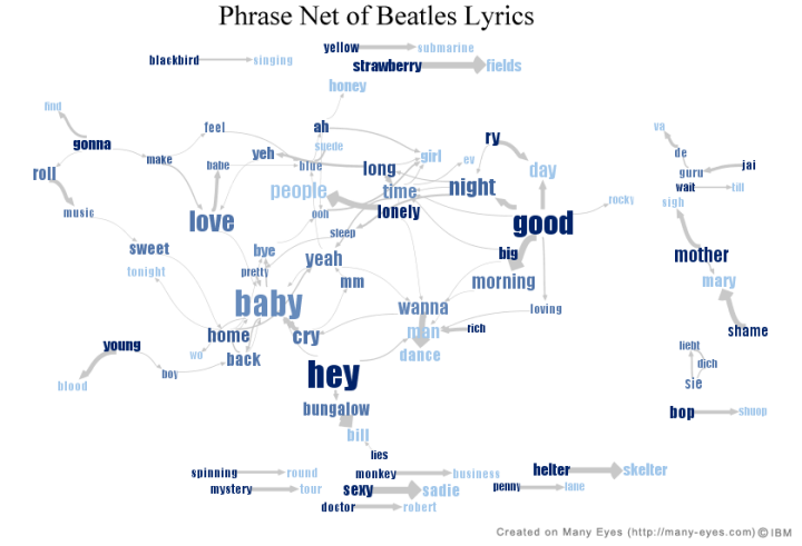
(More...)
Twitter StreamGraph Update
By: Jeff Clark Date: Mon, 09 Mar 2009
I made two minor changes to the Twitter StreamGraphs application. First of all, you now get the latest 1000 tweets containing your search term rather than the latest 200. Secondly, I changed the default search term to 'data visualization'. The first change should help make it a little more useful although for any popular term 1000 tweets doesn't go back very far.
One technique that might be useful is to include more simple words in the query that will match fewer tweets and let you see back farther into time. For example a search on 'coffee' will likely only show a couple of hours back but a search on 'coffee to the and' goes back almost two days. If you are using the 'q=' parameter in the URL then separate different words with '+' like so: http://www.neoformix.com/Projects/TwitterStreamGraphs/view.php?q=coffee+to+the+and
Twitter StreamGraph for 'Data Visualization' (click to use interactive tool)
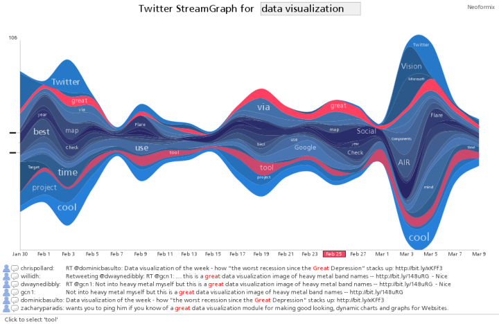
Congressional Address Sentence Bars
By: Jeff Clark Date: Wed, 25 Feb 2009
Obama delivered an Address to the Joint Session of Congress last night. I have compared it below to the last couple of State of the Union Addresses using the Sentence Bars technique. It clearly shows a shift away from Security issues towards Economic and Domestic issues. The summary pie charts at the bottom make it even more obvious - Security fell from around 40% in 2007 and 2008 to 13% this year. Vocabulary associated with the Economy was about 20% in 2007 and 2008 and 40% this year. References to Domestic issues have also increased dramatically this year.
This previous post shows diagrams for 2001 and 2002 as well. The 2001 version, which was prior to 9/11, shows a vocabulary profile almost identical to the one this year - Government 21%, Domestic 29%, Economy 38%, and Security 13%.
Address to Congress - Sentence Bars with Topic Colours (click to see larger version)
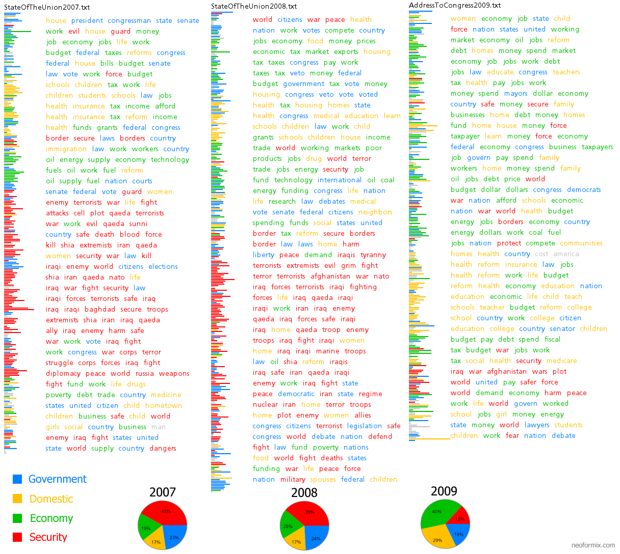
Oscar Chatter on Twitter
By: Jeff Clark Date: Mon, 23 Feb 2009
I really admired the interactive graphic produced by the New York Times that showed the map of popular Super Bowl words used on Twitter. I created something of my own using pretty much the same data. Mine supported many powerful features like the ability to zoom in and out of the map, to see individual tweets, and also to filter the tweets that were shown. Despite this, I preferred the NYT visualization over my own because the design was so accessible and it directly showed something interesting on the map with a minimum of fuss. I decided that I would try and emulate the design in my next twitter visualization.
Lot's of people were twittering away last night during the Academy Awards so I gathered the data and constructed a new visualization very similar in design to the NYT Superbowl map. I grouped words into several categories and let you select which one to see. The categories are:
- People
- Movies
- Best Actor Nominees
- Best Actress Nominees
- Best Supporting Actor Nominees
- Best Supporting Actress Nominees
- Adjectives
This first sample map shows which people were being mentioned the most in tweets shortly after 9:30pm (EST) in the black text. The person being discussed throughout most of the country at that time was Ben Stiller and there were a few areas talking more about Joaquin Phoenix or Natalie Portman. The text in bright red shows the top adjective associated with that person in that location during that time period. If there was no adjective used for that person/location/time combination then the most common adjective associated with that person for any time or location is shown in a darker red color. This technique was not used in the NYT SuperBowl vizualization but seemed like a good way to show more meaningful information.
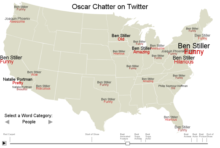
The second example map shows the movies being discussed just prior to the end of the show.
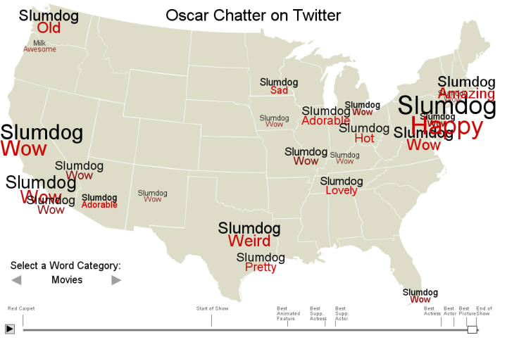
You can grab the handle on the timeline and drag it around or use the arrow keys on your keyboard to move back and forth a single time period. Give the interactive version of the Oscar Twitter Map a try !
Another Darwin Mosaic
By: Jeff Clark Date: Tue, 17 Feb 2009
Those of you who enjoyed my Darwin animal mosaic might like this design by the artist Charles Tsevis. According to the Flickr page for this image it is used as an illustration to accompany an article in Times magazine on Darwin.
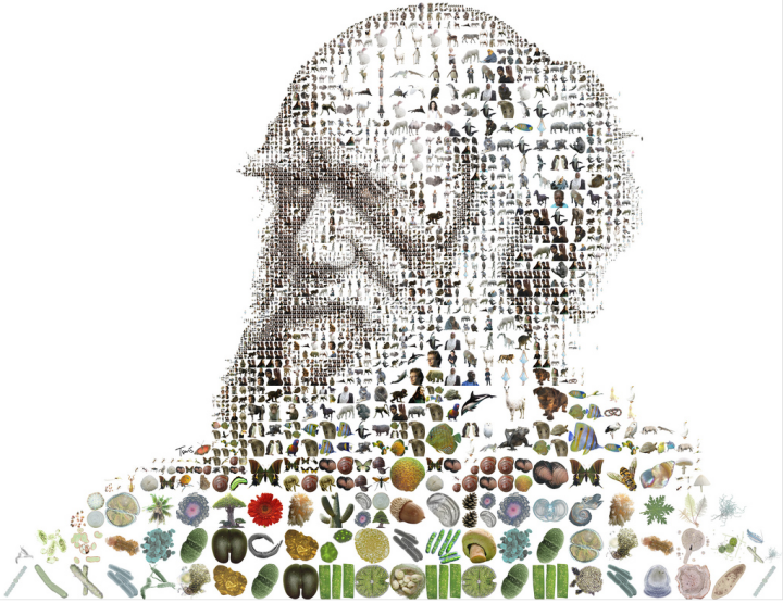
The Shaping of America
By: Jeff Clark Date: Fri, 13 Feb 2009
The Atlantic has an nice interactive feature accompanying the article The Shaping of America by Richard Florida. It shows Patents per Captita for US cities and how they have varied over time as well as population and income data. It has many similarities in structure to my recent interactive maps on Obama's inauguration and the Superbowl as well as the Walmart and Target expansion maps from FlowingData.
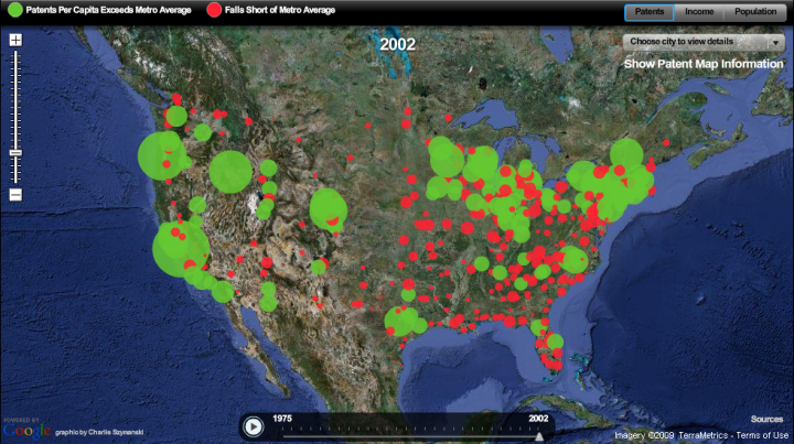
Darwin
By: Jeff Clark Date: Fri, 13 Feb 2009
This year is the 200th anniversary of the birth of Charles Darwin and it has been 150 years since the publication of On the Origin of Species. I read the book when I was 12 or 13 and followed it up with The Descent of Man. It's likely I had encountered the idea of evolution before this but I can still recall, thirty years later, how astounded I was with the weight of the evidence presented and especially the enormous explanatory power of his ideas.
The fact that all the amazingly diverse life on earth shares a common ancestry seems difficult for some people to accept but I find it inspiring. Darwin was a master at discovering and illustrating the patterns in the forms of life he observed. His theory of evolution is an excellent example of the power of simple iterated processes to generate both great beauty and complexity.
This portrait of Darwin below was generated with 10,000 animal shapes and is based on this image. I also have a 9MB PDF version of the portrait. Send me an email or tweet if you are interested.
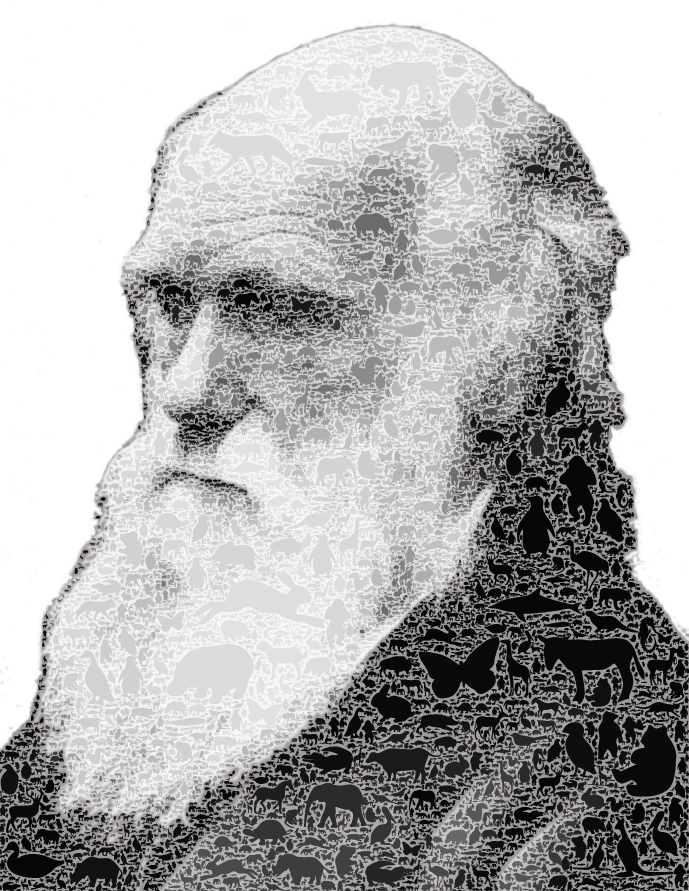
Toronto Twitter Community
By: Jeff Clark Date: Thu, 12 Feb 2009
I have created a structural map of the Twitter community based in the area where I live, Toronto, Canada. Tweets were gathered using the Twitter Search API for a radius of 50 miles around Toronto during the two week period January 17-31, 2009. This yielded 337,782 tweets - approximately 24,000 tweets/day. Of these, 147,166 tweets contained an @ reply directed to at least one other twitter ID. These messages were analyzed to count the number of tweets between pairs of people both residing within the Toronto area. The final raw dataset defining the structure of the community had 3938 distinct twitter IDs and 18,831 relations connecting then together.
Such a large set of nodes and edges is difficult to represent visually in a pleasing manner. With this many connections a standard node and edge diagram is usually a tangled mess. I tried to overcome this by clustering nodes together in a hierarchical fashion based on the connections between them. Connections between individual twitter IDs are only drawn if they are within the same group. Edges are drawn at the group level to show relationships between groups.
If you want to examine the structural map more closely then look at the PDF version of the Toronto Twitter Community Structure. You can do a text search on a name within a PDF viewer to see where you are and who you've been grouped with. Note that a bug in my tools prevented me from placing the text labels precisely where I wanted and when they overlap with another label the text search may fail.
The first image below shows the overall structure. The area in the red square is shown at a higher resolution in the image that comes after it.
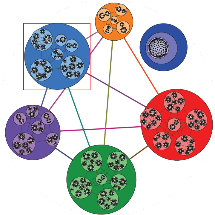
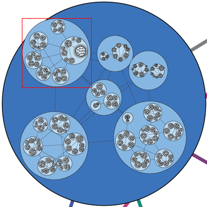
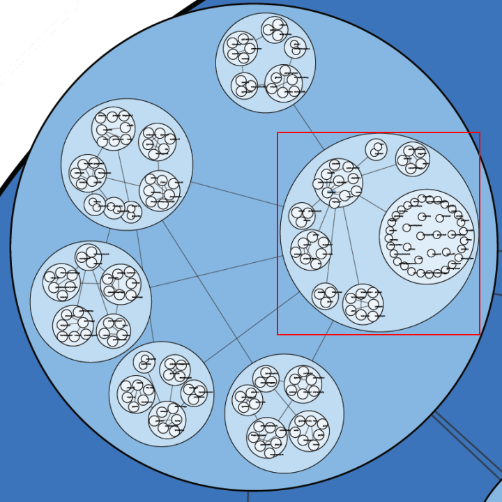
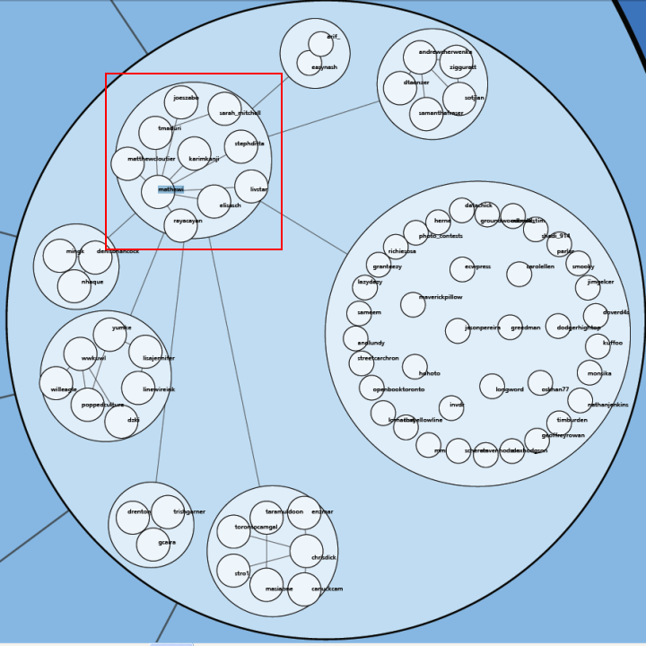
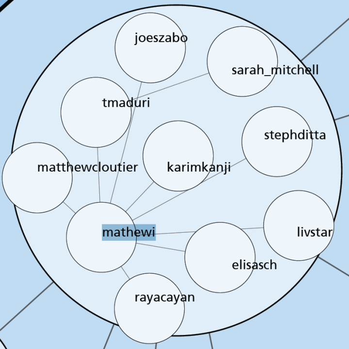
This sequence of 5 images takes us from the whole community to a small group surrounding Mathew Ingram (mathewi), who is a technology columnist at The Globe and Mail and is well known in the Toronto Twitter community. It clearly shows the Toronto-based people he communicated with on Twitter using the @ reply mechanism during the last two weeks of January. For one of these people, sarah_mitchell, there was no direct connection but they were grouped together because Sarah had strong ties to tmaduri.
The second last image shows connections coming out of Mathew's group into several other groups. This shows that there are connections between some of the individuals inside these groups. The clustering algorithm imposes constraints on how large the groups can get so they can't all be placed in one giant group. These high order group connections can occur at every level so it is possible that Mathew had conversations with other people, perhaps some on the far side of the map in the red region. However, the intent is to show most of the people that were tightly bound within the same immediate group.
Note that this diagram completely ignores who follows who on Twitter. It's based entirely on @reply data. There may very well be important members of the community that didn't use @replies to other Toronto people during the time period and so do not show up.
By the way, feel free to follow me on Twitter if you would like to discuss this or hear more about my work in the future. I'm at http://twitter.com/JeffClark
(More...)
Superbowl Twitter Map
By: Jeff Clark Date: Mon, 02 Feb 2009
I've gathered some tweets sent during the time of the superbowl last night and created another map-based tool to visualize them. I took every 10th tweet from 6:00 pm to 10:30 pm EST that contained 'superbowl' or 'super bowl' and plotted all those for which I could find the longitude and latitude coordinates of the author. This process yielded 5711 tweets to explore. The interactive tool can be found here - Superbowl Twitter Visualization.
Here are a few screen shots captured from the tool. The first map shows that references to the two teams seem to be fairly equal and there are no obvious large clumps for one or the other.
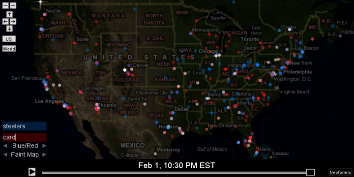
The attention to the event was more global than I expected given that this is a sport primarily played in the US and Canada.
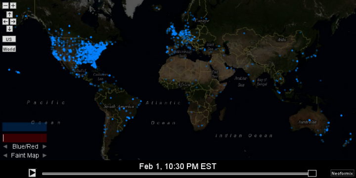
(More...)
Superbowl Word Cloud
By: Jeff Clark Date: Mon, 02 Feb 2009
Here is a word cloud for the Superbowl played last night shaped with the logos of the Steelers and Cardinals. I used a sampling of all the relevant twitter messages between 5:30 and 10:30 EST for the text that was analyzed. In addition to the usual stop words I removed 'superbowl', 'super' and 'bowl' from the analysis since those words were used to select the text and would dominate too much. This cloud is clickable and brings you to matching tweets.
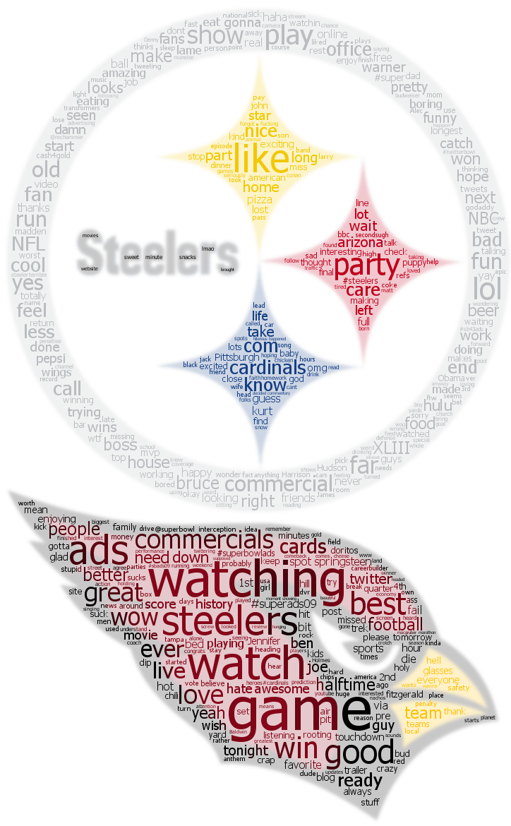
Snowmageddon Twitter Analysis
By: Jeff Clark Date: Fri, 30 Jan 2009
Around the middle of December 2008 many parts of Canada and the US had fairly severe snowstorms. The name 'Snowmageddon' became popular for describing the event. I've collected data from Twitter on how this term, and the spelling variation 'snowmaggedon', was used. I've built a new interactive visualization to support exploring these messages along the dimensions of time, geography, and the actual message content. This is based on the work I did recently showing the tweets related to Obama's inauguration. For the impatient you can try out the application here: Snowmaggedon on Twitter.
Here are some maps showing the results. This first one shows a few things:
- The term was used widely across both Canada and the US with high concentrations in Seattle, Chicago, Toronto, and the US North-East
- Both spelling variations were used widely as well
- Surprisingly high references in warm places like Los Angeles and Florida
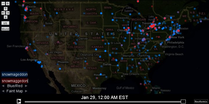
This second image shows the great lakes region around what appears to be the peak which occurred around 2pm on Dec 19th. Starbursts are used to highlight references around the current time and the time slider has been adjusted here to show the maximum number of starbursts.
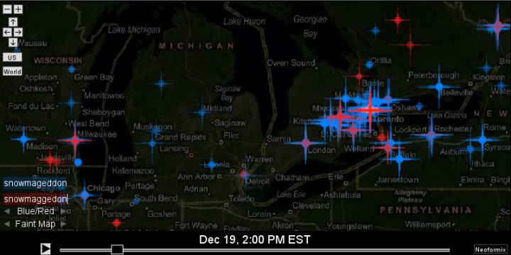
A close-up of Toronto with the filters set to 'love' and 'hate' shows that the extreme weather caused extreme emotions in some people. Note that a little bit of noise was added to the latitude and longitude coordinates so that at high magnifications there is some separation between messages that were sent from the location 'Toronto'.
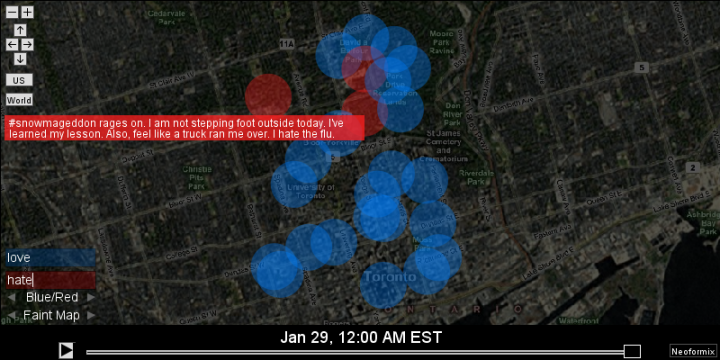
A map showing the entire world shows that use of the term was not limited to Canada and the US.
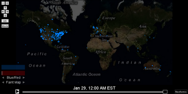
Of course the real fun comes from playing with the interactive version so make sure you give Snowmaggedon on Twitter a try !
Obama Inauguration As Seen Through Twitter
By: Jeff Clark Date: Wed, 28 Jan 2009
There was obviously a lot of attention directed towards Obama's inauguration last week. Naturally, this extended to the twittersphere and there were a huge number of Twitter messages regarding the event. I've built a new interactive visualization to support exploring these messages along the dimensions of time, geography, and the actual message content.
The video below is a bit fuzzy but gives an idea of what the tool does. For those who want to jump right to the application you can find it here: Obama Inauguration As Seen Through Twitter .
The application supports scrolling back and forth through time or animating the changes over time. The map support allows the standard zooming and panning as well as having special buttons to frame both the US and the whole world with one click. The mouse wheel can also be used to zoom in and out. There is text filtering support where you can enter one or two different strings and see which messages match.
I started with about 126,000 tweets but took a subset based on those that expressed strong sentiment and for which I was able to get proper geographic coordinates. The final application uses 11,389 messages. The sentiment filtering step likely had the effect of removing many of the non-English messages since it involved counting English high impact words (love,hate,beautiful,sucks etc).
This is my first map-based application on Neoformix and it was created much more easily because I was able to build it on top of something called Modest Maps. A special thanks go to Tom Carden of Stamen Design and the others who created it !
Full credits:
- Casey Reas, Ben Fry, and the community around the wonderful tool Processing
- Tom Carden of Stamen Design and others for the creation of Modest Maps, especially the Processing version
- Twitter and all the users that create such interesting data
- Dave Troy for the Twittervision API and Yahoo for their Geocoding API
- Microsoft Live Search Maps for the map images
- Nathan from FlowingData who created a similar tool in Flash
Give it a try ! Obama Inauguration As Seen Through Twitter
The Raven
By: Jeff Clark Date: Fri, 23 Jan 2009
A couple of days ago was the second century anniversary of the birth of Edgar Allen Poe. This shaped word cloud is based on his famous poem The Raven. Despite the scrambling of the words the grim mood of the piece comes through well.
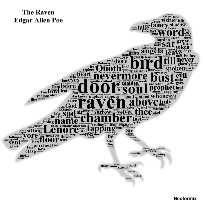
Obama Twitter Word Map
By: Jeff Clark Date: Thu, 22 Jan 2009
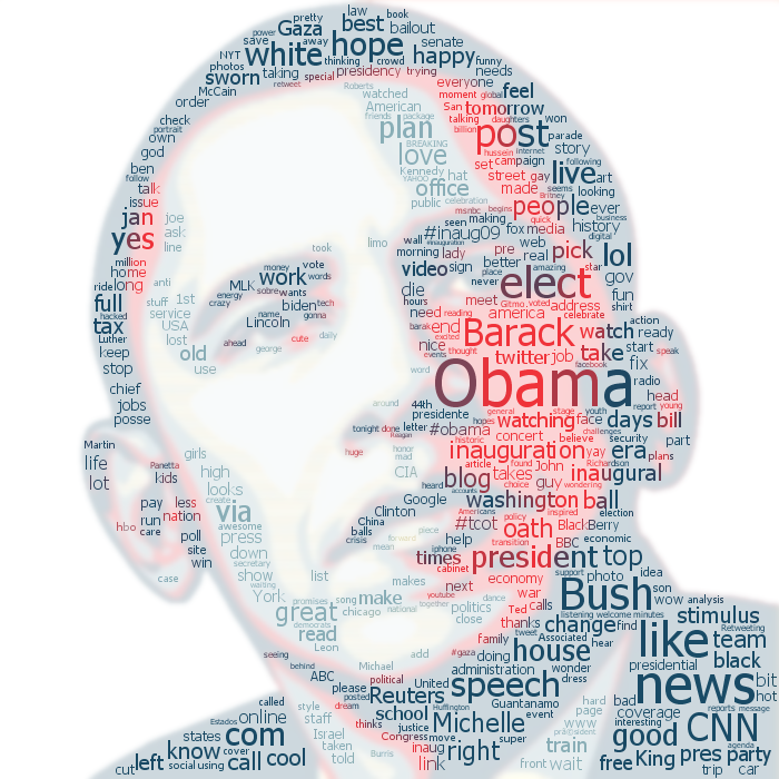
This Twitter word map is constructed from tweets containing 'obama' during January 1-21, 2009. Higher frequency words are larger and you can click on any word to jump to Twitter Search and see the matching tweets. This is done using a simple HTML image map I generate along with the image. The base image is derived from the iconic Hope/Progress image designed by Shepard Fairey.
As always, feedback by email is welcome or, alternatively, send an update to JeffClark on Twitter.
Apple Twitter Word Map
By: Jeff Clark Date: Wed, 21 Jan 2009
Here is another version of the shaped word cloud for tweets containing 'apple'. The major difference from the previous one is that this one is clickable. You can click on the words to jump to Twitter Search and see the matching tweets ! This is using a simple HTML image map I generate along with the image. I also made the image a bit smaller so you can more likely see it all at once.
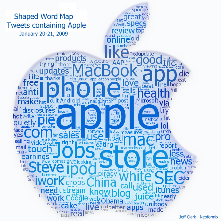
Apple Shaped Word Cloud
By: Jeff Clark Date: Wed, 21 Jan 2009
Here is another example of a shaped word cloud. This one is based on about 7500 tweets drawn from January 20-21 , 2009 that contain the word 'apple'. Mixed in with the many terms obviously related to Apple Inc. are others associated with the fruit - 'juice', 'cake', 'eat', 'sweet', and of course 'pie'.
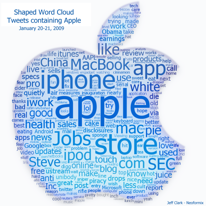
Shaped Word Clouds
By: Jeff Clark Date: Wed, 21 Jan 2009
The web is filled today with various word clouds of Obama's inaugural speech. I've used bits and pieces of code from my tools for both Word Portraits and Clustered Word Clouds to produce the following image. It's a word cloud but is colored and shaped based on a template image. The accuracy of some of the word sizes is sacrificed a bit in order to fit them in nicely.
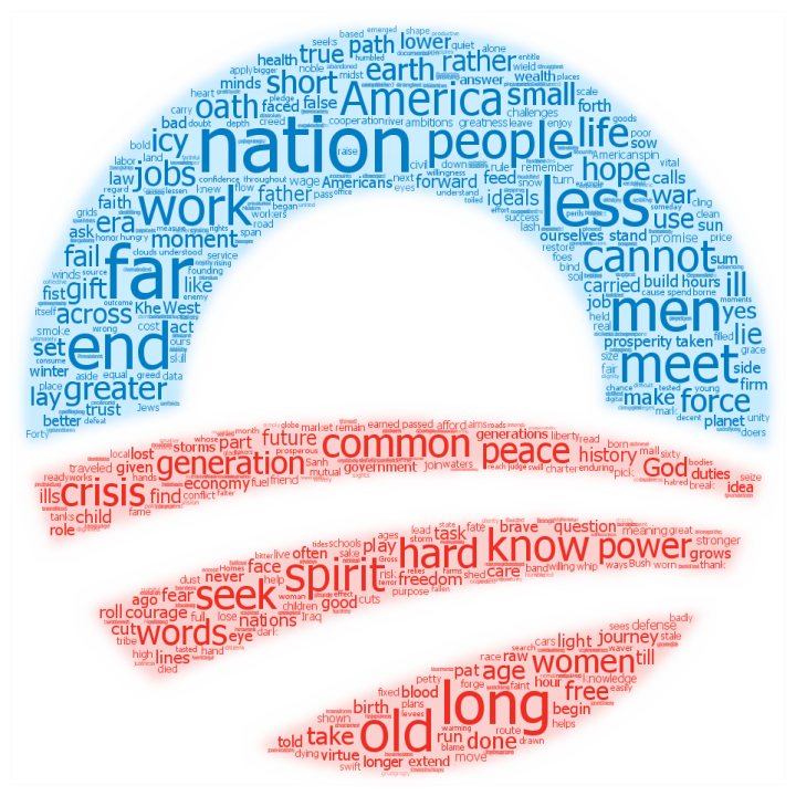
For purposes of comparison, here is a word cloud generated with the wonderful Wordle.
Obama Inauguration Speech
By: Jeff Clark Date: Tue, 20 Jan 2009
I couldn't let this day go by without creating something in commemoration of the remarkable events ocurring in Washington DC. The image below is composed from the complete text of Obama's inaugural speech. Click on the image to see a larger one that is 3200x4000 in resolution and can be printed as a 16"x20" poster.
Weblog URL Changes
By: Jeff Clark Date: Mon, 19 Jan 2009
I just changed neoformix.com to get rid of the 'www.' in references to my own URLs. This change has the side effect of causing RSS feed readers to think my existing items are all new and show up in your list of unread items. Sorry about that ! Existing links to the 'www.' style addresses will, of course, continue to work.
I Have a Dream
By: Jeff Clark Date: Mon, 19 Jan 2009
Happy Martin Luther King day ! The image below is a design that includes the entire text of Martin Luther King Jr's famous 'I have a dream' speech. A 20"x16" poster is available for purchase at Cafepress .

Hudson River Landing
By: Jeff Clark Date: Fri, 16 Jan 2009
Twitter Venn gives us an interesting perspective on what people are saying about the recent plane crash landing on the Hudson River. The first diagram clearly shows that people think the pilot was a hero. The second shows that despite this, the event is most often discussed in terms of being a 'miracle' rather than a result of pilot 'skill'.
You can click on either image to load the application and try out other combinations.
CES Clustered Word Cloud
By: Jeff Clark Date: Thu, 08 Jan 2009
Yesterday it was Macworld, today it's the Consumer and Electronics Show (CES) going on in Las Vegas.
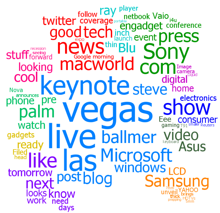
MacWorld Clustered Word Cloud
By: Jeff Clark Date: Wed, 07 Jan 2009
Macworld has been attracting a lot of attention the last few days. I've taken the last 10,000 tweets that mention it and created a Clustered Word Cloud. The primary themes of the conference do seem to emerge from the cloud.
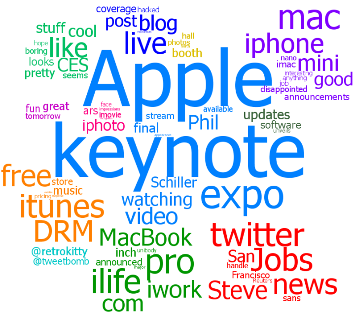
World News Clustered Word Cloud
By: Jeff Clark Date: Wed, 07 Jan 2009
The graphic below shows a Clustered Word Cloud for the world news headlines from 2008. As in my last post, the data comes from the Toronto Star so it comes from a Canadian perspective. Several groups of keywords bear this out including the second largest (in red) which shows there was a lot of coverage about Canadian soldiers killed or injured in southern Afghanistan. The largest cluster by far (light blue) shows that the US presidential campaign received a lot of coverage. The automated clustering did produce the unusual grouping of 'Korea' with 'Carolina', 'primary', and 'victory'. They were linked through frequent use of 'North' and 'South' as in 'North Korea' and 'North Carolina'.
By grouping related words this technique does a much better job of summarizing the most covered international events than the Streamgraph representation. However, in order to do so it sacrifices any attempt at showing the distribution of events over time. Perhaps some combination of these two ideas would be fruitful.
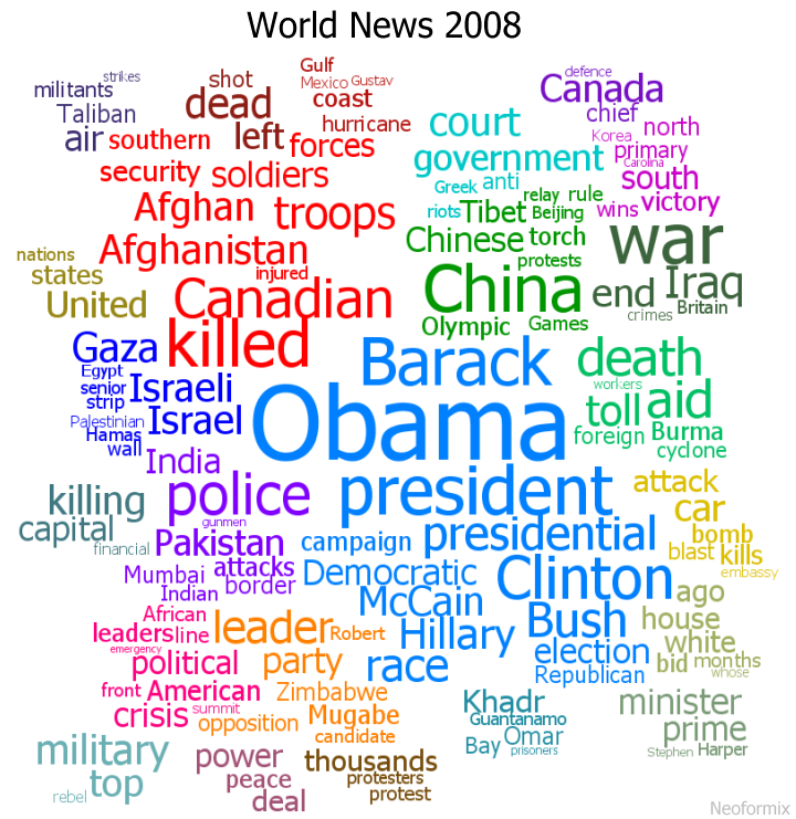
World News Streamgraph
By: Jeff Clark Date: Tue, 06 Jan 2009
Now that 2008 is over I've been thinking about looking at some datasets for the year. One that I have started to explore is a set of world news headlines from my local paper, the Toronto Star. I used some great information I found in here that shows how to use Google Reader to get the latest RSS entries from any feed. The dataset includes 1311 stories and I looked at both the title and summary text for this analysis.
The image shows two StreamGraphs. The top one in red shows the most common capitolized words and when they appeared during the year. The blue StreamGraph shows the popular non-capitolized words over the same time period. The graphic seems to do a reasonable job showing the primary international news events of the year:
- Obama throughout most of the year with coverage peaking at election time
- Wall between Gaza and Egypt in early 2008
- Tibet in March
- NATO, Mugabe in March/April
- China, Burma, cyclone, quake, aid around May
- Georgia,Russia,Hurricane Gustav in August
- India,Mumbai, and Pakistan in late November
- Gaza and Israel again at the end of the year
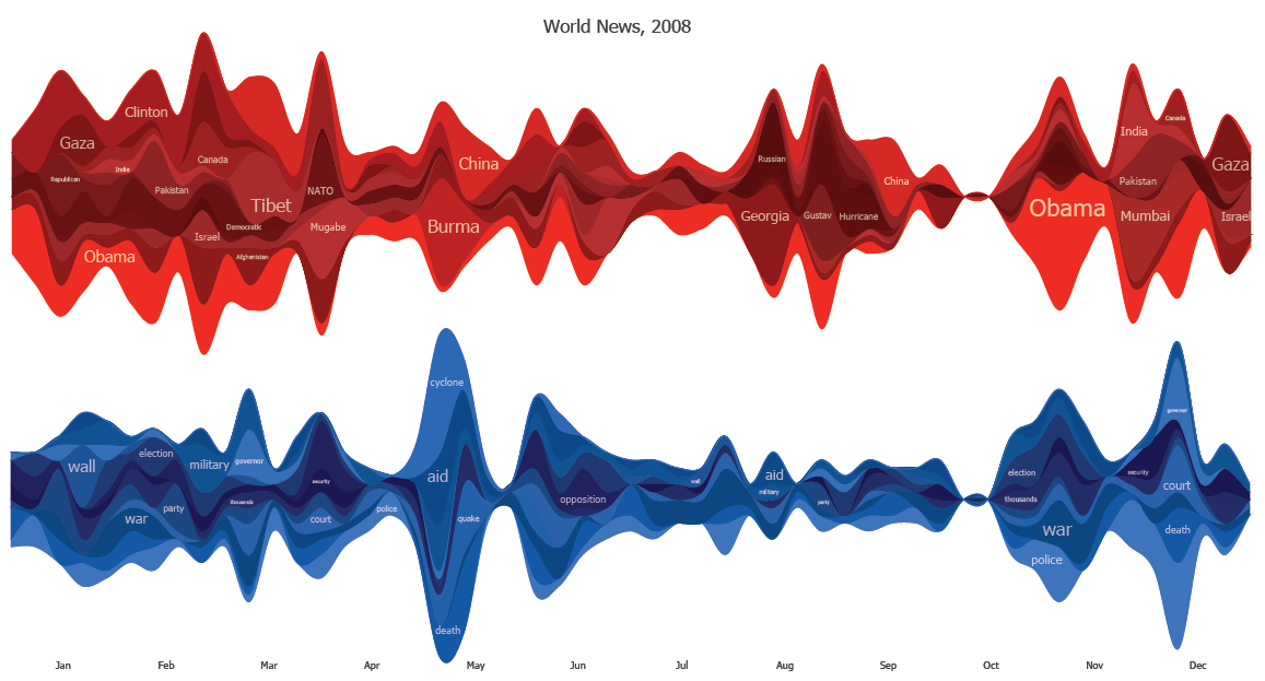
This technique does have many obvious drawbacks as well. It doesn't really show which words are related - we can guess a relationship at times based on our own memory of the events. For example, there is an obvious burst around the end of April for Burma,China,quake, and cyclone but there is no visual indication of which goes with which. Was the quake in China or Burma ? Or perhaps the references occurred around the same time but were not related ? From the graphic you can't tell. There are also the common StreamGraph problems of thin or unlabeled slices that don't carry much useful information at all.
Thank You and Happy New Year!
By: Jeff Clark Date: Wed, 31 Dec 2008
Thank you all for your attention to Neoformix during 2008. This weblog primarily showcases my own work and it is gratifying to see how many people are interested. I am excited about the possibilities of the coming year. Best wishes to all of you in 2009 !
Sincerely,
Jeff Clark
Neoformix Review 2008
By: Jeff Clark Date: Wed, 31 Dec 2008
I think it's natural at the end of the year to look back over the previous 12 months and assess what was accomplished. This post is my attempt to summarize what I think my key contributions were this past year on Neoformix. They aren't necessarily the most popular posts and are ordered chronologically rather than by any notion of importance. I hope this proves useful to those of you who are new to Neoformix or just want a quick review of the key ideas presented during 2008.
I would also like to mention here that many of these ideas were inspired by or build upon the work of other people. I have tried my best in the original posts to give credit where it was due. Feel free to contact me at any time if you think I have forgotten someone.
 |
Digg Trends is an interactive tool that shows the trends in word usage over time and word associations for stories that reached popular status on Digg. |
 |
Word Association Clouds look like standard tag clouds except the topmost word is made distinct in some manner. They show which words are related to the highlighted topic word through colocation in a text of interest. You can type in a new word or click on any associated word to navigate around easily and explore how different words are related in a document of interest. The references within the text are also shown. |
 |
The Document Cloud Comparison tool links two Word Association Clouds together to support exploring the similarites and differences between two documents. |
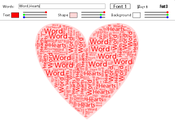 |
Word Hearts is a tool that automatically fills a heart shape with any words you like. This was fun to make and the ideas eventually led me to the tools to create Word Portraits. |
 |
A Document Contrast Diagram is a visual summary of the content of two text documents that illustrates shared words, words that are unique to one document or the other, word frequency, relative size of the two documents, distribution of emotional tone within the documents, related words based on co-occurence, and the most common word in each document segment. |
 |
Directed Sentence Diagrams evolved from the artistic work of Stephanie Posavec. They are my attempt to create something similar that perhaps has a bit more utility. The overall shape and color highlights some aspects of the topics discussed within the text as well as the order and length of the sentences. |
 |
Sentence Bar Diagrams use a simple set of bars to show the sentences in a text. The bars are colored based on the primary topic of the sentence and the most common interesting words for a set of sentences are also shown. |
 |
News Spectrum is a visualization of the words used for two topics in the latest results from Google News. One topic is coloured blue, the other red, and the associated words are coloured and positioned based on how highly they are associated with the two topics. This idea was later used with a different data source to create Twitter Spectrum which was also my first use of the rich Twitter data set. |
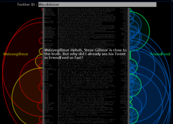 |
Twitter Arcs takes the latest 100 tweets for a twitter ID or term of interest and creates a list representation that has arcs connecting messages sent to the same users or that use the same primary term. You can click on the left side to load the tweets for a new user, on the right side to load the tweets for a specific term, and in the middle to visit the actual tweet. |
 |
Document StreamGraphs apply the StreamGraph idea to documents. The document is split up into 25 equal sized segments and the word counts are done within each segment. These segments are used in place of time along the horizontal axis of the StreamGraph. This document StreamGraph again focuses on capitolized words but ignores a few common ones like 'Mr' and 'Mrs'. I'm also using a longer format for the graph and showing two labels for each word series - one on the left half of the graph, and one on the right. The difference in label size for the same word can show whether it was used more frequently in the first or second half of the document. |
 |
Twitter StreamGraphs is an interactive tool that shows the trends in word usage over time for twitter messages from a particular user or that contain a given search term. |
 |
Clustered Word Clouds are an extension of the common word cloud idea. The words are partitioned into clusters based on how often they were used near each other in the base text. The largest clusters are then shown with the words in them positioned near each other and highlighted with color. |
 |
Word Portraits are images that are reconstructed using words in various sizes and colors. I create mine with custom code written in Processing. Here are a few examples: Obama, Einstein, World Peace, and Eyes from i's. |
 |
Twitter Venn takes two or three search terms and creates a Venn Diagram showing the rate of tweets containing the search terms in the various combinations. A tag cloud can also be shown for one of the regions. |
Twitter Venn Update
By: Jeff Clark Date: Tue, 30 Dec 2008
The Twitter Venn tool I published a couple of weeks ago didn't work properly in cases where the same word was used as part of multiple terms. For example, if you searched on 'toronto snow, montreal snow' it would always return empty result sets. I've fixed this problem so now you can do comparisons that include shared terms. This seems like a natural use case - you are basically asking how do these terms compare in the context of X. The example below comes from http://www.neoformix.com/Projects/TwitterVenn/view.php?q=toronto+snow,montreal+snow,vancouver+snow and shows how tweets for toronto, montreal, and vancouver compare in the context of 'snow'.
If you try it and still get empty sets you likely just need to shut your browser down and restart it.
Fractalius Filter
By: Jeff Clark Date: Mon, 29 Dec 2008
A few weeks ago I stumbled across some images made with the Fractalius photoshop filter by Redfield Plugins and was very impressed. It can take a photograph and create interesting and sometimes surreal variations. A recent post on Boing Boing reminded me about the filter.
Here are a few samples from their site to give you an idea of what it can do.

My First Programming Teacher
By: Jeff Clark Date: Mon, 29 Dec 2008
It's been about 12 days since I launched my little tool called Twitter Venn. I'm happy to see it getting a reasonable amount of attention from many people on Twitter. After the launch I have been monitoring the attention using the excellent Twitter Search. It helps me gauge the interest, answer any questions, and of course get feedback for problems or extensions. I was very happy to see it referenced in Amber MacArthur's show commandN on Dec 22nd.
One of the people who watched her show and then checked out Twitter Venn was my first programming teacher, Doug Peterson. He mentioned it on twitter and I noticed his picture and name. It's great to be back in touch after so long. He has written up his thoughts on the reconnection as well. He introduced me to the joy of programming around 28 years ago and I haven't stopped since !

I have very fond recollections of those days back around 1980 using BASIC on the TRS-80. My best friend Robert Berg and I stayed late at school many evenings in order to get enough time on the school computer. I also remember coding (on about 200 cards!) a picture of my eyeball using ASCII characters. I didn't realize it until a few weeks ago but my recent experiments in Word Portraits are obviously direct descendants of ideas I played around with when I was 15.
Thank you, Mr. Peterson. Your enthusiasm, teaching ability, and knowledge of programming have had a deep positive impact on me. It's given me a career, a hobby, and a creative outlet all at once.
Twitter Venn Examples
By: Jeff Clark Date: Thu, 18 Dec 2008
Here are a few more examples of Venn Diagrams made using my new tool Twitter Venn. You can click on any of the images to jump into the tool loaded with the same terms to see how it looks right now. Note that the number of tweets represented by the colored circles varies between different analyses. For example, in the first 2 images the number of small green circles appears to be roughly the same but they represent 816 matches in the first case and 236 in the second.
This first example clearly shows the tight association between 'ie' and 'patch' at the moment - the relationship is much much stronger than it is between 'firefox' and 'patch'. Thanks to shazzzam for the idea.
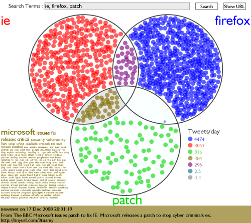
This diagram shows that the chatter on twitter related to bailouts is much stronger at the moment for 'auto' than 'bank'.
In the context of tweets that mention 'Christmas' the santa to jesus ratio is about 4:1 .
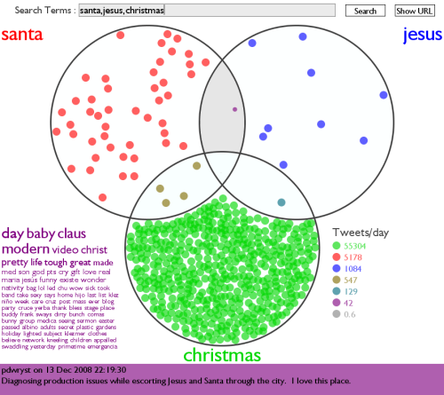
There is a relatively large number of tweets currently referencing the triplet 'jobs', 'apple' , and 'macworld' . Note some of the intriguing keywords in the tag cloud - 'mean', 'cult', and 'death'. This seems to be caused by a number of references to the title of a popular Digg article called 'MacWorld Pullout Signals the Death of (the Cult of) Mac'.
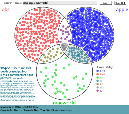
Twitter Venn
By: Jeff Clark Date: Wed, 17 Dec 2008
Venn Diagram's can be used to illustrate the amount of overlap between various sets of items. In the projects section of Neoformix I have just published an application I call Twitter Venn. It supports investigation into the relationship between how words are used within the messages of all the people using Twitter.
Basically, you type in either two or three terms separated by commas, click 'Search', and get something like this:
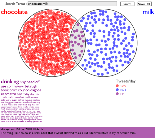
In this example, the large circle on the left contains a great many small red circles which represent messages (tweets) that contain the word 'chocolate' but do not contain 'milk'. The large circle on the right has blue circles representing messages that contain 'milk' but not 'chocolate'. The intersecting area has purple circles indicating how many tweets contain both terms used together. The number of smaller circles is mean't to show how frequently those words or combinations of words are used by people within Twitter. The bottom right area has a small table showing an estimate of the number of tweets/day for the various combinations.
You can click on one of the regions to see a word cloud of the most commonly used words in the corresponding messages. The selected region has a slight gray background. In this example, the purple intersecting region is selected and the word cloud shows that the words 'drinking', 'soy', and 'need' were commonly used in the tweets that contained both 'chocolate' and 'milk'.
The bottom of the application will show tweets matching the selected region. These change every few seconds unless you hover your mouse in the rectangle which will pause at the current one - for you slow readers! If you click in this region a browser window opens showing you the original tweet.
If you enter three terms in the search box you get a diagram with three intersecting circles:
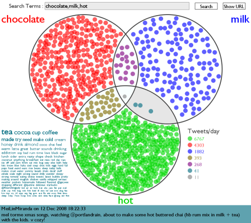
This Venn diagram shows that when I did this analysis the word 'hot' was used more than 'chocolate' which was, in turn, used more frequently than 'milk'. It shows even more clearly that the combinations 'hot+chocolate' and 'chocolate+milk' were much more common than 'hot+milk'.
Note that you can use multiple words as a term or even a phrase within double quotes. So 'christmas party' will match messages that have both words anywhere within them. But '"christmas party"' will only match if they are in that precise order. This third example shows the difference. Note that all instances of messages having the phrase will also match with the two possibly-separate word version. That's why the blue set is empty - the matching messages are all in the intersecting purple region.
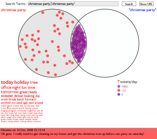
You can also use the special operators 'from:TwitterID' and 'to:TwitterID' to match messages from or directed to a particular person. The example below also shows in the red square a very small purple circle. This indicates that there are tweets in this intersecting region but not enough to warrant the use of a complete symbol.
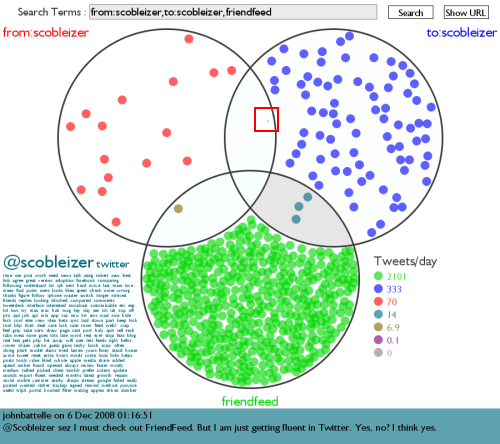
The 'Show URL' button will open another browser window with the URL parameterized to show the current search. This makes it easy to repeat a given analysis over time, to embed a link to something particular, or to show someone something interesting. Just send them the URL with your parameters. Here is an example: http://www.neoformix.com/Projects/TwitterVenn/view.php?q=bank,auto,bailout
The Tweets/day are estimated based on the latest results and can fluctuate quite quickly - especially for commonly used terms. So searching for 'coffee' will give you a lot more tweets/day in the morning than late at night. Rates for uncommon terms will change much more slowly.
Thanks to Processing for the development tools and Twitter Search for the data.
Have fun - give Twitter Venn a try !
Text Snowflake Creator II
By: Jeff Clark Date: Fri, 05 Dec 2008
Last year around this time I released a simple tool that lets you create snowflake-like images out of words. I used a modified version last year to create personalized place setting labels for our Christmas dinner and people seemed to like them a lot. I've just updated the application with a few new features. Check out the new and improved Text Snowflake Creator.
Here are a few sample images I created with it.


Thankful
By: Jeff Clark Date: Thu, 27 Nov 2008
Happy Thanksgiving to all my American readers ! I have created a simple application that shows the latest tweets that use the word 'thankful' and a bar graph showing the most common associated words. Thanks to Twitter for the data and Processing for the tools. The graphs change over time based on the tweets that have been shown. You can click anywhere in the window and jump to that status message.
(More...)
Horse
By: Jeff Clark Date: Fri, 21 Nov 2008
I entered a simple Horse design in a contest at Threadless which sells amazing T-shirts online. If enough people give it a good rating they'll start selling it online (and I'll get a bit of cash). Click on the little image to rate it for me. Thanks !

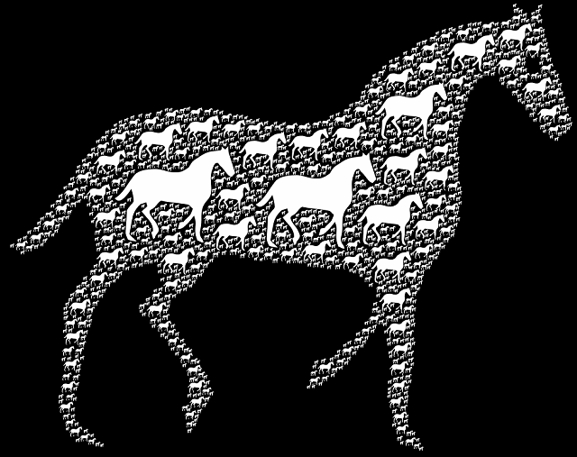
World Peace
By: Jeff Clark Date: Fri, 21 Nov 2008
I've been working on World Peace most of the day and it's finally done. I prefer the first version shown that uses the symbol - or rather 6810 of them. I used the same globe image as in My World Has Room For Wildlife which came from NASA World Wind. These images were constructed with custom software written with the wonderful Processing .
Click image to see a larger version
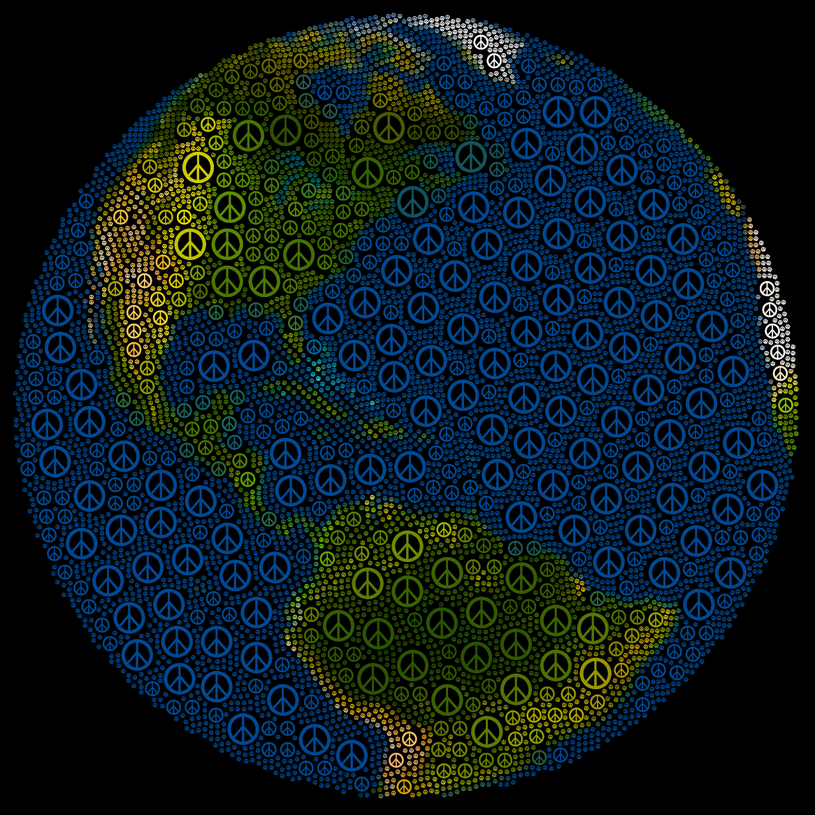
Click image to see a larger version

Canadian Throne Speech
By: Jeff Clark Date: Thu, 20 Nov 2008
The Canadian Government opened a new session of Parliament yesterday with the speech from the throne. It sets down the government blueprint for the coming months and describes which topics the government wants to address. I have created a sentence bar diagram for the speech and also the one from last year as a basis of comparison. I have added a simple pie chart to the diagram as well which shows more clearly which topics were in focus. Here are a few simple observations:
- The speeches were about the same length and had no obvious difference in average sentence length.
- Words related to 'Government' were the most common in both speeches.
- Words related to 'Economy' doubled in share in yesterday's speech compared to last year.
- The increase in Economy related words came roughly equally from the other three categories.
CafePress Online Store
By: Jeff Clark Date: Wed, 19 Nov 2008
I have opened a simple online store for Neoformix using CafePress where you can buy some products bearing my designs. They take care of manufacturing, ordering, and shipping and I just design the products. So far there are two products: a small poster and a black T-Shirt both with the Animal Globe design. I have just ordered a T-Shirt for myself. Feel free to check it out !
Thanks to Tim Graham for the pointer to CafePress.
FlowingData
By: Jeff Clark Date: Tue, 18 Nov 2008
Nathan Yau over at FlowingData has a nice post up today pointing his many readers to some of my recent work - Word Portraits of Famous People - Einstein and Ginger the Cockapoo. I must admit I never expected to see my dog's name mentioned together in a headline with Einstein.
So what is FlowingData all about ? In Nathan's words:
FlowingData explores how designers, statisticians, and computer scientists are using data to understand ourselves better - mainly through data visualization. Money spent, reps at the gym, time you waste, and personal information you enter online are all forms of data. How can we understand these data flows? Data visualization lets non-experts make sense of it all.
The site is an excellent pointer into the world of statistical data visualization. Nathan has also done some high quality visualization work of his own. Below is an image from his visualization Watching the Growth of Walmart Across America. Check out FlowingData if you haven't already !
My World Has Room For Wildlife
By: Jeff Clark Date: Tue, 18 Nov 2008
My work over the last couple of weeks has involved analyzing images and reconstructing them using words and letters. There exist many fonts that actually contain non-letterform designs and my techniques work with them as well. For the image below I made use of the Animals font by Alan Carr to draw the component shapes. The starting seed image of the globe is a screen capture from NASA World Wind.
I have a vector version of this image in PDF format that can be printed at any resolution and I think the design would look great in poster or T-shirt form. I'm going to try a little experiment to gauge the commercial potential of this kind of thing. I will send you the PDF for a minimum donation of $20 US to Neoformix and you may then use it to print up to 10 physical items - posters, mousepads, T-shirts, whatever. The image has a width:height ratio of 4:5 and so would match perfectly a 16 x 20 inch print.
Note that this is a manual process - I don't expect thousands of requests ! After your donation you will likely have to wait a few hours until I process it.
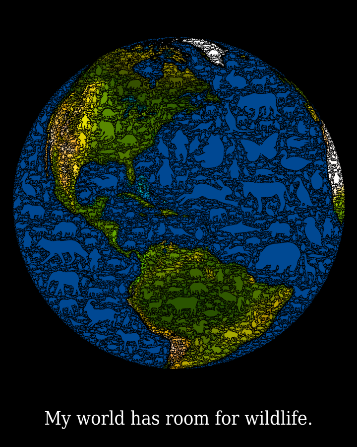
Here is a zoomed image of the area around the Gulf of Mexico:
Eyes From 'i's
By: Jeff Clark Date: Thu, 13 Nov 2008
The 2 eyes in the image are constructed from 19633 repetitions of the letter 'i' in different sizes and colors. The eyes appear courtesy of my 1 year old nephew Ryan. The 'i's appear courtesy of the font Georgia Italic.
Click image to see a larger version

Obama Victory Speech
By: Jeff Clark Date: Wed, 12 Nov 2008
The word portraits I've been creating lately are visually interesting but lack the ability to express longer text passages in a legible manner. I've started exploring another technique for combining images and text that might be better suited for this purpose.
The picture below is constructed from the text of Obama's victory speech on election night together with the iconic Hope/Progress image designed by Shepard Fairey. I had to fiddle a bit with font sizes and spacing to get the text to smoothly fill a complete rectangle but it was a fairly simple process.
Click image to see a larger version
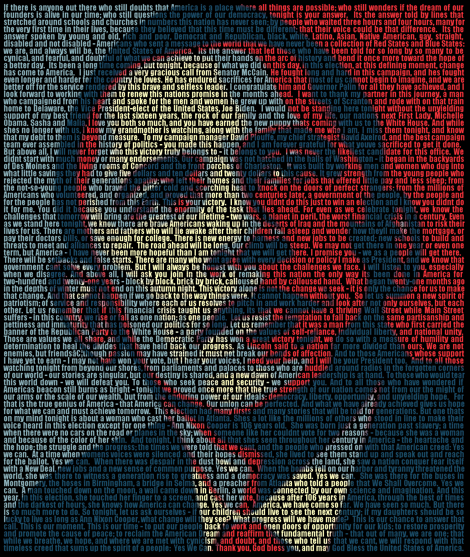
George Boole
By: Jeff Clark Date: Fri, 07 Nov 2008
George Boole was the inventor of a logical calculus of truth values which provided a basis for modern computing. The binary digits '1' and '0' are often used to represent true and false in boolean algebra and seemed fitting symbols to use for his portrait.
President Obama
By: Jeff Clark Date: Wed, 05 Nov 2008
I stayed up all night putting the words in just the right places...
Click image to see a larger version
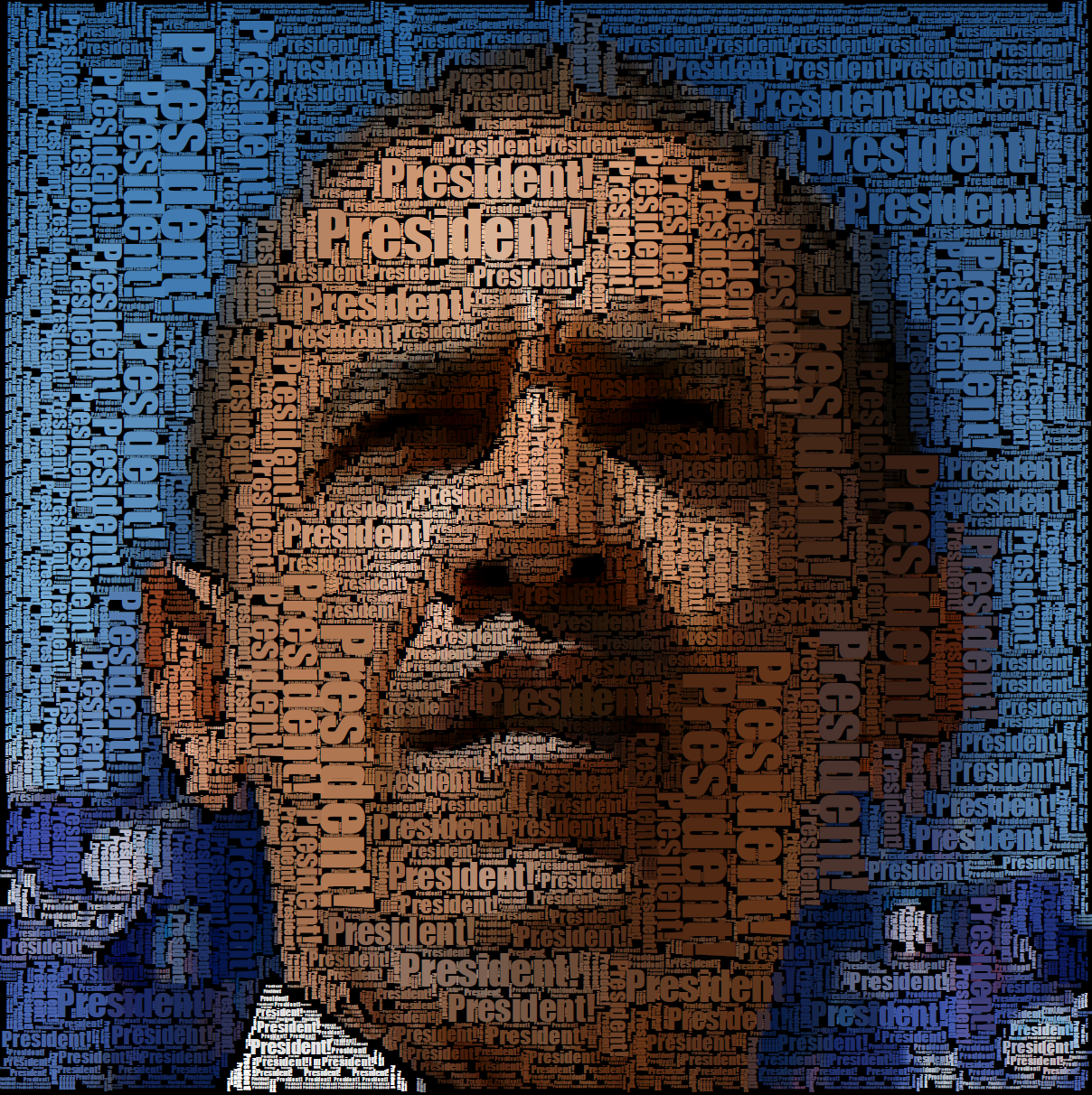
Reconstructing Ginger
By: Jeff Clark Date: Sat, 01 Nov 2008
The Word Portraits that I have been creating lately use an algorithm that analyzes a starting image and finds rectangular patches of a reasonably consistent color. These are then filled in the generated image with words or letters painted with the average color in the rectangle. I thought it might be interesting to explore piecing the generated image together from fragments that aren't based on words and letters.
The subject for this study is my little four-legged friend Ginger. She's a six year old Cockapoo (Cocker Spaniel / Miniature Poodle cross) , very friendly with kids but a little shy around adults she doesn't know. I don't think she'll mind if you look at a few pictures of her.
 |  |
The first image just uses the letter 'O' to fill the color-consistent regions. The second uses a leaf-like patch made from bezier curves. They both leave quite a bit of the black background peeking through so the overall image is darker and loses some realism.
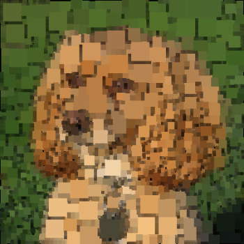 | 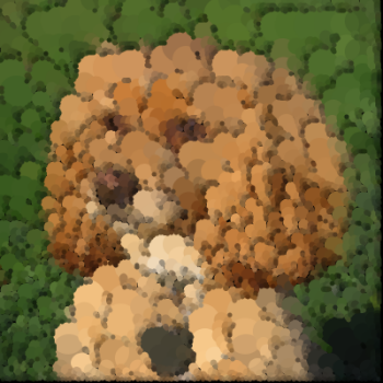 |
These next two images use simple rectangles and circles as the fill shapes. I have also 'overdrawn' them a bit bigger than the original patch which tends to fill up the black gaps. Our eyes pick out the straight edges in the rectangle filled version so it looks less realistic than the one filled with circles. If you squint or look from far away the circle-filled image looks pretty much identical to the original image. This technique could be (and probably has been) used to save images in a compressed form.
 |
This last image uses variations on a spiral shape to fill the color-consistent patches. The area around one of Ginger's eyes is expanded on the right hand side to illustrate the spiral details.
Colored Word Portraits
By: Jeff Clark Date: Tue, 28 Oct 2008
Just for the fun of it I've modified my word portrait code to create colored images. Here is one for Obama again generated from 'HOPE', 'CHANGE', and 'YES WE CAN'. These images also use vertical text which allows filling more of the available space.
Click image to see a larger version
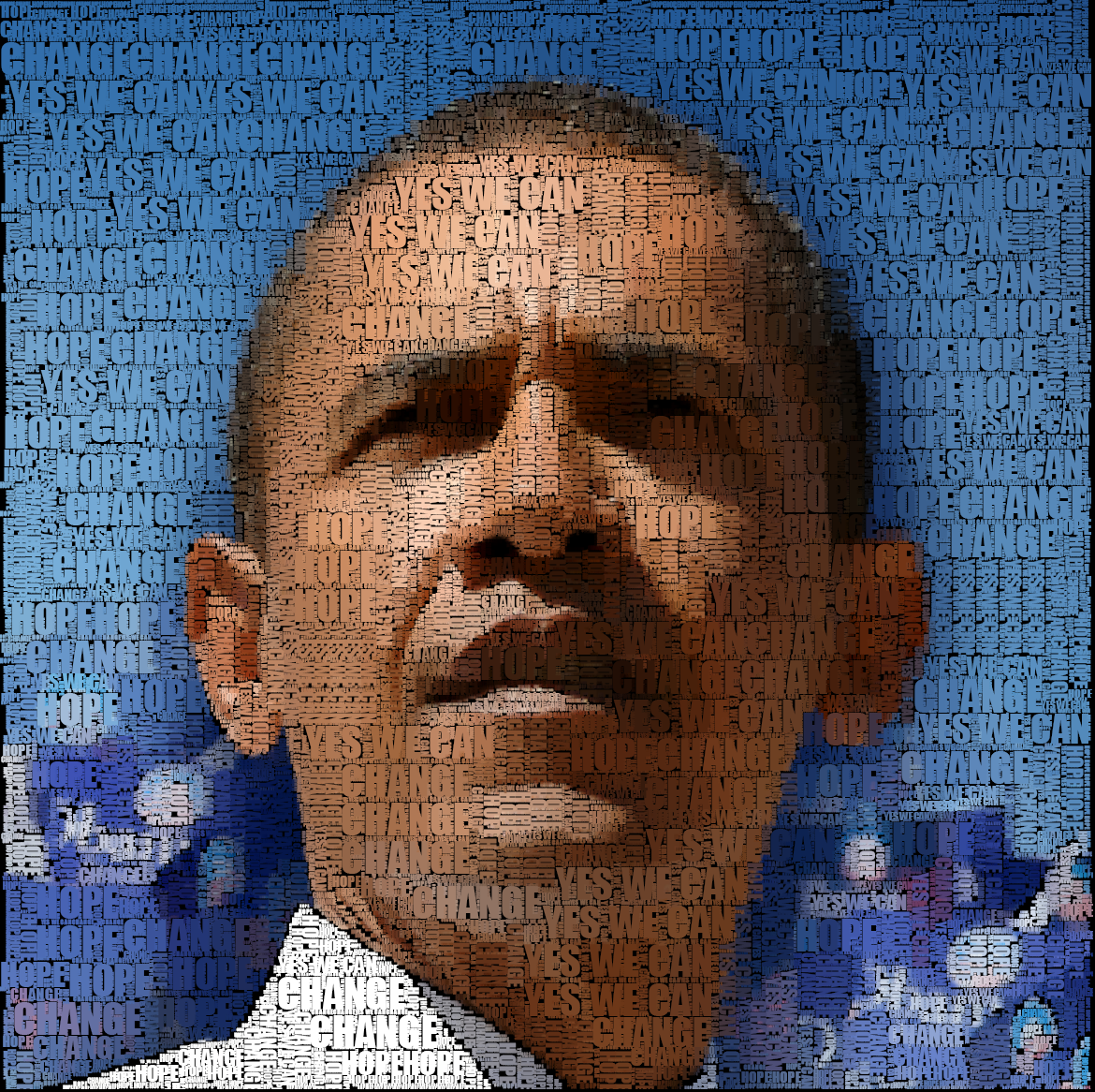
The font used in the image above is called Impact. Here is a second image created with a different font that is very thin - Bernhard Fashion BT.
Click image to see a larger version
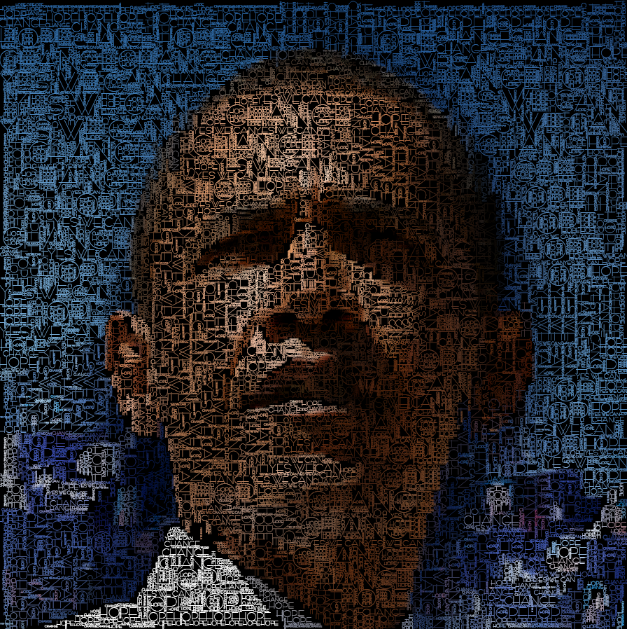
StreamGraph for 'One Week'
By: Jeff Clark Date: Tue, 28 Oct 2008
Here is a StreamGraph constructed from the 'One Week' speech delivered by Obama on Oct 27th, 2008. It does a good job of highlighting the major themes of the speech.
- the words 'one week' are prominent at the beginning and end of the speech
- the strong juxtaposition of the words 'Bush', 'McCain', 'years', and 'change' just after the opening words
- discussion in the middle of the speech of 'taxes', 'jobs', 'health', 'care', 'insurance'
Click image to see a larger version

Einstein Word Portrait
By: Jeff Clark Date: Thu, 23 Oct 2008
Click image to see a larger version

I believe the 'seed' image I started from is by Philippe Halsman. Thanks again to Gui Borchet for the inspiration and to Processing.org for the tools.
Obama Word Portrait II
By: Jeff Clark Date: Thu, 23 Oct 2008
I have created another word portrait of Obama. This one has more instances of larger words in the darker areas as well as more detail.
Click image to see a larger version

Thanks again to Gui Borchet for the inspiration and to Processing.org for the tools.
Obama Word Portrait
By: Jeff Clark Date: Wed, 22 Oct 2008
I stumbled across this image today by Gui Borchet and was inspired to try something similar.
I adapted my space-finding/word-filling code that I have used for Word Hearts, Clustered Word Clouds, and a few other projects and produced this image of Barack Obama. The image is built out of many repetitions of the text fragments 'HOPE', 'CHANGE', and 'YES WE CAN' in various shades and sizes.
Click image to see a larger version

StreamGraphs Featured in Montreal Gazette Ad
By: Jeff Clark Date: Mon, 20 Oct 2008
There is a full-color, full-page advertisment in today's Montreal Gazette that features some StreamGraphs I created. There is no easy link to see it online although you can get to a thumbnail version of the page through their digital edition. An image of the Ad is shown below. It is advertising the newspaper itself and is part of the 'Words Matter' campaign created by bleublancrouge.
These StreamGraphs illustrate the frequency and distribution of the key words in a text. Those in this advertisement are based on the speeches given by the respective party leaders after the Canadian federal election was over last week. They aren't the best examples of StreamGraphs because the speeches were fairly short which causes them to be very wiggly. The technique works better for series that don't vary quite so dramatically over time. They are, however, colorful and unique and seem to grab people's attention. I colored each graph to match the standard colors for the corresponding political party.
Thanks to my new friends at bleublancrouge.ca for offering me the opportunity to get some exposure.
Oct 15th Presidential Debate
By: Jeff Clark Date: Thu, 16 Oct 2008
I made Clustered Word Clouds from the words spoken by the candidates during the debate last night. For some reason I don't understand, McCain's speech led to smaller word groupings than Obama's so I included extra groups to make the total number of words shown more equal. Click on either image to see a larger version.
 |
 |
Obama's Speech on Economy
By: Jeff Clark Date: Tue, 14 Oct 2008
Obama delivered a speech in Toledo, Ohio yesterday on the economy called A Rescue Plan for the Middle-Class. I've created a Clustered Word Cloud based on the text and it is shown below. Notable word groups that stand out are 'create new jobs' , 'tax cut 95% families', and 'Senator McCain worried losing'.
Two Canadian Leaders
By: Jeff Clark Date: Sun, 12 Oct 2008
There is a federal election this Tuesday, Oct 14th, in Canada where I live. I came across some reasonably objective profiles of the leaders of the 2 largest political parties in the Toronto Star. Stephen Harper is currently the Prime Minister of Canada and the leader of the Conservative Party of Canada. St�phane Dion is the leader of the Liberal Party of Canada. I have created Clustered Word Clouds based on the profile articles linked to above.
They seem to do a pretty good job of getting the main characteristics of the two people across. I would have included clouds of the other party leaders as well but couldn't easily find objective written descriptions.
If you are Canadian, make sure you vote on Oct 14th !
Clustered Word Clouds for Books
By: Jeff Clark Date: Sat, 11 Oct 2008
I have made a few changes to the Clustered Word Clouds that I introduced yesterday. I improved the word clustering algorithm to discourage the creation of really large clusters. The layout algorithm has also been changed to be more efficient and it seems to give better results as well. These changes were made to make my tool more suitable for summarizing the content of larger documents. The clustered word clouds for a few books are shown below. Click on any image to see a larger version.
 |
 |
 |
 |
Clustered Word Clouds
By: Jeff Clark Date: Fri, 10 Oct 2008
Tag clouds have become a commonplace method of illustrating the popular words used in a text and do a good job of communicating the gist of what the text is about. The tag cloud below was generated by the wonderful Wordle from the text of 'I Have a Dream' by Martin Luther King Jr. Many people familiar with the famous speech would likely recognize it from this cloud of words. Wordle provides lots of options to control colors, fonts, and the style of layout and produces an excellent result.
I Have a Dream - Martin Luther King Jr.
One critical drawback of tag clouds is that the words are scrambled (or sometimes positioned strictly by frequency) and one cannot tell from the cloud which words were actually used together in the original text. One powerful line from the speech is: little black boys and black girls will be able to join hands with little white boys and white girls as sisters and brothers. The key words from this sentence appear in the tag cloud above but they are so disconnected visually that the meaning is completely scrambled.
I think we can do better. I developed Word Association Clouds a few months back to allow the use of the familiar tag cloud style layout to navigate related words in a text. Why not use word 'relatedness' to control positioning in a tag cloud layout ? Here is my first attempt below.

I partitioned the words into clusters based on how often they were used near each other in the text. I then positioned the words in the largest clusters near each other and used color to emphasize the structure. It's a bit tricky to position them with an algorithm so that the groups stay together and the overal layout is compact so there are a few more gaps than I'd like. I think, overall, that it came out pretty well.
Presidential Debate
By: Jeff Clark Date: Wed, 08 Oct 2008
I have added the Presidential debate on Oct 7 to the interactive transcript analyzer. The static image shown below is a bit blurry but gives an idea of what was discussed. I've kept in the word counts on the right this time since many people find that the most interesting part.
static image only - click to use the interactive application
![]()
A few simple observations:
- It looks like a fairly balanced debate in terms of who spoke the most and length of speeches.
- The primary initial topic was the 'economy' and 'jobs'.
- Next was discussion about 'health' and 'energy' prompted by a question that linked them together.
- More talk about 'tax' and 'jobs'
- 'health' and 'insurance'
- 'Iraq', 'war', and 'Pakistan'
- 'Russia', 'war', 'Iran'
- 'country', 'honor'
- Obama uses 'help' 15 times - McCain 1 time only
- 'honor' - McCain 4 times, Obama 1 time
- 'energy' - Obama 20 times, McCain 6 times
- 'change' - Obama 12 times, McCain 4 times
US VP Debate
By: Jeff Clark Date: Fri, 03 Oct 2008
Last night was the US VP debate between Joe Biden and Sarah Palin. I've taken the words from the debate and added them to my interactive transcript analyzer. The static image shown below gives an idea of what was discussed.
static image only - click to use the interactive application
![]()
A few simple observations:
- It looks like a fairly balanced debate in terms of who spoke the most and length of speeches.
- After the introductions the primary topic was the economy and jobs.
- This shifted into talk about taxes.
- The next subject was energy and coal. Palin used the word 'energy' 26 times compared to Biden's 9.
- There was a short section on 'marriage'.
- 'Iran', 'Iraq', 'War', and foreign policy were next.
- Not discussed directly were 'religion' and 'immigration' .
Marc Smith
By: Jeff Clark Date: Tue, 30 Sep 2008
I saw a note this morning from Marc Smith saying goodbye to Microsoft Research after ten years. He has done some interesting work there. Here are a couple of images generated from his projects.
This first is from a project called NetScan and was generated back in 2003. It is a TreeMap showing the Usenet Newsgroup community where the area of each box is proportional to the number of authors in that group. See here for more details and a larger, less blurry image.
This image below is called an 'AuthorLine' and is a type of dual histogram time-series that has some interesting characteristics. It was taken from a paper called Visualizing the Activity of Individuals in Conversational Cyberspaces.
Word Clouds on Financial Crisis II
By: Jeff Clark Date: Thu, 25 Sep 2008
Here is another tag cloud generated from Bush's speech last night on the financial crisis. Click to see a larger version.
Word Clouds on Financial Crisis
By: Jeff Clark Date: Thu, 25 Sep 2008
Here is a Wordle generated tag cloud for Bush's speech last night on the financial crisis.
Just for fun I've created one using my own tools in the shape of a dollar sign.
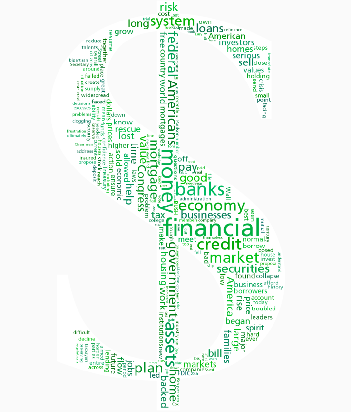
Average Campaign Donation by Occupation
By: Jeff Clark Date: Tue, 16 Sep 2008
I have created another simple graph based on data from the Federal Election Commision about political donations to the Obama and McCain campaigns. This one shows the average contribution amount for the various occupations of the donors. I restricted the analysis to occupations having at least 1000 separate donations. There were 106 occupations that met this criteria and the top 50 are shown below.
A few observations from the graph:
- The top 15 spots seem fairly obvious and are primarily high-level business executives or finance related
- Position #16 is 'homemaker' which doesn't fit the pattern very well. Perhaps donors with this occupation have wealthy spouses.
- I was also surprised that 'student' was #48 - relatively high on the overall list.
(More...)
Obama McCain Donor Occupation Analysis
By: Jeff Clark Date: Mon, 15 Sep 2008
In the current US election there has been much discussion about Obama's advantage in campaign financing. In short, he is collecting much more money from donations than his rival, McCain. The Federal Election Commision has a wealth of data about the contributions made to all the campaigns. They provide details on each individual donor including name, address, employer, occupation, date of donation, and the amount donated. I have taken the contribution data for Obama and McCain and done some analysis focused on the occupations of the contributors.
This first graph shows which occupations contributed the most to the Obama and McCain campaigns. The top blue bar gives the total contributed to Obama from people of the corresponding occupation and the red shows the total contributed to McCain. The darker blue sections show the amount that contributions for Obama exceeded those of McCain for that profession. Similarly, the darker red sections show the amount that contributions to McCain exceeded those for Obama.
For example, the bars for 'attorney' show that they contributed ~ 23 million dollars to Obama and about 7 million to McCain. The darker rightmost portion of the blue bar makes it more visually obvious that contributions to Obama exceeded those to McCain by attorneys by a great margin. The occupations are sorted in the order of total contributions to both of the presidential candidates.
Some observations:
- People listing their occupation as 'retired' contributed more money than any other
- 44 of the top 50 occupations contributed more to Obama than McCain
- Obama has a huge relative advantage in many occupations including 'unemployed', 'professor', 'student', 'lawyer', 'teacher', 'writer', 'artist', 'architect', 'software engineer', and 'registered nurse'
- McCain did not have a huge relative advantage in any of the top 50 occupations
- There were more contributions from 'student' than 'teacher' although 'professor' was higher than both
As noted in the second observation above there were very few occupations in the top 50 that contributed more to McCain. So what occupations did favour him ? The graph below shows which occupations contributed more to McCain than Obama and by how much. The scale seems too large for this data but I wanted to keep it consistent with the one on the next graph showing the same information for Obama.
Some observations on McCain's support:
- None of these show a large absolute advantage for McCain compared the occupations listed on the comparable Obama graph shown below
- Lots of business executive occupations - 'executive', 'chairman', 'chairman and ceo', 'president', and 'business executive'
- Lots of oil related occupations - 'oil and gas', 'oil and gas producer', 'petroleum engineer', 'oil and gas exploration', 'oil and gas investments'
- 'lobbyist' at #10, 'government affairs' at #24, 'campaign staff' at #25
- 'beer distributor' , 'beer wholesaler' in the list. McCain's wife has a lot of wealth that came from the beer industry.
- Support from 'farmer', 'rancher'
- 'homemaker' seems slightly anamolous but the relative edge for McCain was slight
The comparable graph for Obama is below at the same scale.
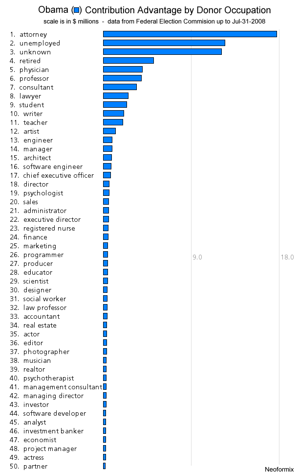
Some observations from this graph:
- Strong support from the legal industry - 'attorney', 'lawyer', 'law professor'
- Strong support from academic professions - 'professor', 'teacher', 'student', 'educator'
- Strong support from health-related professions - 'physician', 'psychologist', 'registered nurse'
- Strong support from the creative class - 'writer', 'artist', 'architect', 'designer', 'actor', 'photographer', 'musician', 'actress'
- Support from some executive classes - 'chief executive officer', 'executive director', 'managing director'
- A greater contribution advantage from 'unemployed' than any other occupation except for 'attorney'
In conclusion, this data shows that Obama has a large contribution advantage across virtually all classes of occupations with the exceptions of some high-level business executives, the oil and gas industry, the beer industry, farmers, ranchers, and homemakers.
(More...)
Convention Speech Sentence Bars
By: Jeff Clark Date: Fri, 05 Sep 2008
These sentence bar diagrams show the topic structure within the speeches delivered by Obama and McCain at their respective conventions. There is a simple bar for each sentence in the order they occurred in the text and coloured by the primary topic for that sentence. The most frequently used topic words are also shown for each region of the text.
Government related terminology dominate the beginning of both speeches. Obama then spent almost half of the entire speech discussing domestic and economic issues followed by a short section intensely focused on security. Obama's closing remarks reflected a mixture of topics. McCain's speech is less thematically coherent. The primary feature in his text is the use of security related words sprinkled throughout the entire speech. It's very obvious that he wanted to portray himself as a 'fighter'. Obama, in contrast, focused more attention on domestic and economic issues.
The republicans are saying 'Life is dangerous - and we will fight to protect you'. The democrats message isn't as simplistic but the gist seems to be 'Your everyday life is hard - and we will help you make it better'.
McCain and Obama 2008 Convention Speeches - Sentence Bars with Topic Colours
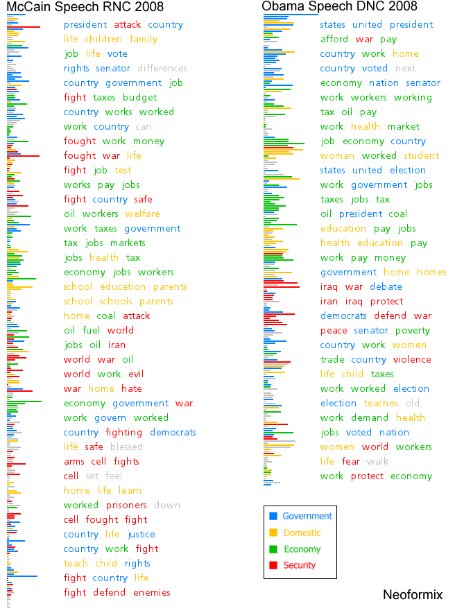
(More...)
Obama McCain Convention Speech Comparison
By: Jeff Clark Date: Fri, 05 Sep 2008
I have built some graphics comparing the speech delivered by McCain at the RNC last night with the speech from last week by Obama. To start with, here are the StreamGraph diagrams for both speeches. Click on either one to see more detail.
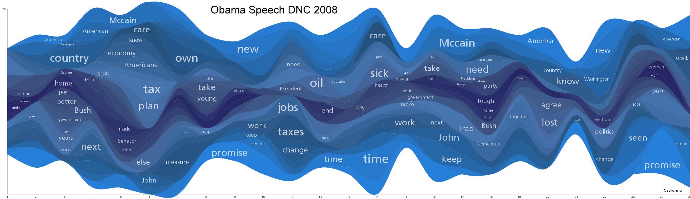
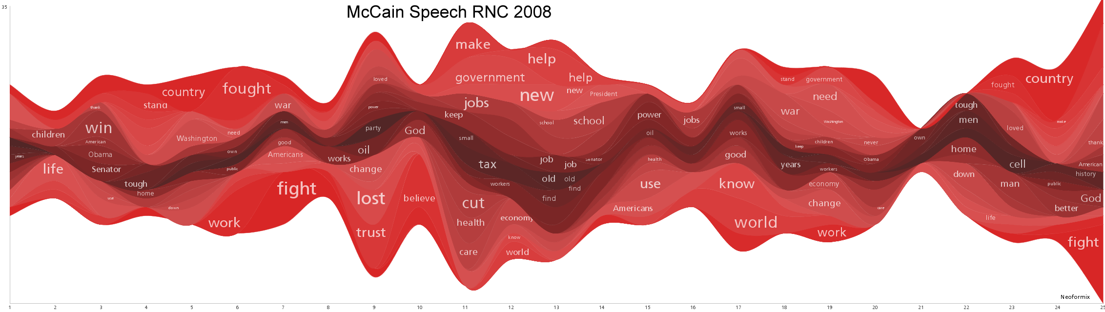
Here is the Document Contrast Diagram:
Contrast Diagram for Obama DNC 2008 and McCain RNC 2008 (click to see larger version)
The interactive Document Cloud Comparison of the two speeches is also available below. Here are some things evident from the graphics and the interactive tool:
- Obama's speech was a bit longer than McCain's
- Words used frequently by both Obama and McCain include 'American', 'country', 'President', 'work', 'families', 'oil', 'jobs', 'tax', and 'Washington'
- Words used much more frequently by Obama include 'promise', 'America', 'John', 'McCain', 'Bush', 'time', 'care', 'lives', 'together'
- Words used much more frequently by McCain include 'fight', 'fought', 'trust', 'works', 'honor', 'school', 'stand', 'prisoners'
- Obama referred to McCain by name 21 times, McCain only used the name Obama 6 times
See this older post on Document Cloud Comparisons for a discussion of how to use it. This tool requires Java and may take a few seconds to start up.
(More...)
Obama Speech Comparison
By: Jeff Clark Date: Fri, 29 Aug 2008
There is a lot of interest today in the speech delivered last night by Barack Obama where he accepted the Democratic Party nomination as their candidate. I'll leave the political analysis to others more qualified than I but I thought it might be interesting to have a look at it through the lense of some of my text analysis tools. I've decided to compare it with the 2004 Democratic National Convention Keynote Address delivered by Obama.
To start with, here are two StreamGraph diagrams for both speeches. Click on either one to see more detail.
Next is a Document Contrast Diagram
Contrast Diagram for Obama DNC 2004 and 2008 (click to see larger version)
And finally is an interactive Document Cloud Comparison of the two speeches. See this older post on Document Cloud Comparisons for a discussion of how it works. Here are a few interesting tidbits that I stumbled across with this tool:
- Obama did not use the words 'black' or 'white' in his acceptance speech last night
- The most common non-trivial word used last night was 'promise'
- The word 'hope' was used much more often in the 2004 speech
This tool requires Java and may take a few seconds to start up.
(More...)
Some Recent Attention
By: Jeff Clark Date: Mon, 25 Aug 2008
Twitter StreamGraphs has triggered some attention for Neoformix over the last month. Some of the major sources were:
- A tweet about StreamGraphs from Tim O'Reilly on August 5th to his 8,680 followers. Tim is the founder and CEO of O'Reilly Media - a publisher of excellent technical books.
- An article written by Scott Gilbertson entitled StreamGraph Maps Twitter Word by Word for Webmonkey. A link to this showed up on the front page of Wired and drove some significant traffic.
- A tweet about using StreamGraphs to follow references to the Olympics from Evan Williams. Ev is the Co-founder and CPO of Twitter and currently has 17,535 followers on the service.
- An article by Tim Showers called Visualization Strategies: Text & Documents that highlighted several of my little tools. His article attracted some attention on Reddit.
Thanks very much to these people and the many others who have let people know about Neoformix !
Another Box Office Graphic
By: Jeff Clark Date: Fri, 01 Aug 2008
Zach Beane has created another variation on a graphic to illustrate movie box office data. See Movie box office charts for the original but here are a few interesting bits:

In Zach's words:
Each page displays trends in the top 25 movies at the box office for each weekend in a year. The color is based on the movie's debut week. Because of that, long-running movies will gradually start to stand out from newer movies with different colors.There is an interactive version as well.
Related posts: Movies Ebb and Flow
Twitter StreamGraphs
By: Jeff Clark Date: Tue, 15 Jul 2008
I just posted a new application in my projects section called Twitter StreamGraphs. It is an interactive tool to let you create StreamGraphs from the latest tweets containing a given word or from a particular user. A few examples are shown below.
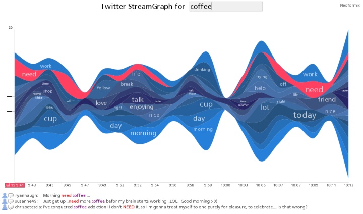
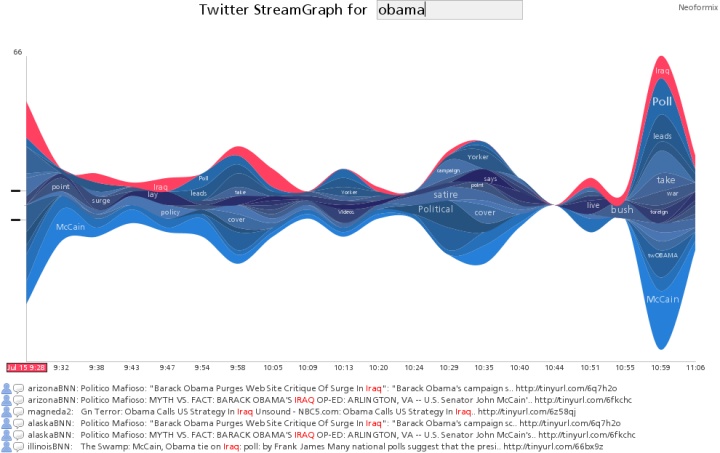
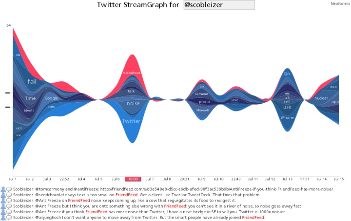
The application shows a StreamGraph for the latest 200 tweets which contain the search word. The default search word is 'interesting' but a new one can be typed into the text box at the top of the application. You can also enter a Twitter ID preceded by the '@' symbol to see the latest tweets from that user. A parameter to the URL can be used to specify the initial search word. For example, use http://www.neoformix.com/Projects/TwitterStreamGraphs/view.php?q=coffee to see the latest tweets about coffee. This makes it possible to link to a StreamGraph for your own tweets from your blog or within a twitter update.
The StreamGraph shows the usage over time for the words most highly associated with the search word. One of these series together with a time period are in a selected state and coloured red. The tweets that contain this word in the given time period are shown below the graph. You can click on another word series or time period to see different matches. In the match list you click on any word to create a different graph with tweets containing that word. You can also click on the user or comment icons and any URL to see the appropriate content in another window. If you see a large spike in one time period that hides the detail in all the other periods it will be useful to click in the area to the left of the y-axis in order to change the vertical scale.
Credits go to Lee Byron for the visual ideas behind the StreamGraph (although I'm using a simpler symmetrical form), to Processing for the development tools, to Martin Porter for the Porter Stemming Algorithm, to Vaga for the two small icons, and to Summize for building a great API into the Twitter data.
Related posts are TwitArcs and Twitter Spectrum.
Canada Day
By: Jeff Clark Date: Tue, 01 Jul 2008
Happy Canada Day ! I've created a simple flag graphic using a few words that come to my mind when I think of Canada.
TechCrunch Analysis Part II
By: Jeff Clark Date: Fri, 27 Jun 2008
My last post explored the company and product names discussed on TechCrunch and how they varied over time. The number of posts written by the various authors and how it varied over time was also illustrated. An obvious follow-up analysis is to look at the interaction between author and company/product names. Do certain TechCrunch authors specialize in writing about particular companies or products ? Or do some authors avoid specific domains ?
I've done this analysis and presented the results below. For each of the top 6 authors and top 60 names the number of times each author used each name was determined. The first graph shows the breakdown for the top 10 names. The second has the same form and shows numbers 11-60 but I've broken it into a separate graph because it uses a different scale. This lets us see more details for these names. I have also colored the bars to show proportional use of the names. A deep blue color means that the name was used proportionally much more often for that author and a deep red shows that it was used proportionally much less often. Paler colors indicate a lesser degree of high(blue) or low(red) usage.
Some things that I spotted quickly from the larger version of the top 10 graphic include:
- There aren't too many names that were discussed a lot more by a particular author - no deep blues
- Perhaps the deepest blue in the graphic shows that Hendrickson discussed FaceBook proportionally more than the others
- Unusually low (deeper red) combinations are Schonfeld-Digg, Kirkpatrick-FaceBook, and to a lesser degree Gonzalez-Microsoft and Hendrickson-Microsoft
- Arrington discusses Life (as in Second Life, Yahoo Life, Online Life, various others), VOIP, Adsense, Silverlight, and P2P proportionally less than average
- High proportional names for Riley include Twitter, Life, Windows, and Silverlight
- Low proportional names for Riley include RSS, Flash, Zoho, AJAX, Salesforce, NetVibes, and Wikia
- High proportional names for Schonfeld include Comscore, Bebo, Salesforce, and especially OpenSocial
- Low proportional names for Schonfeld include RSS, Life, API, URL, Ning, photobucket, and a few more
- Other high proportional pairings are Kirkpatrick-RSS and IM, Gonzalez-VOIP and Zoho, Hendrickson-Bebo,Ning,Hulu and OpenSocial
The data for this analysis was kindly provided by Yuvi from The StatBot.
TechCrunch Analysis
By: Jeff Clark Date: Wed, 25 Jun 2008
TechCrunch is a weblog that reviews products or companies that are having an impact on the internet. Who do they write about and how do references to these companies or products vary over time ? I've analyzed the proper names referenced in their posts in the time frame May 1st, 2006 until April 30th, 2008 - 2 years of data. I discarded place names and people and plotted the top 8 names with the most references in a StreamGraph below.
The graph clearly shows the companies that have dominated TechCrunch coverage over the last 2 years. Google looks biggest with FaceBook, Yahoo, and Microsoft being quite large as well. You can spot the increase in coverage for Microsoft and Yahoo in Feb of this year due to the merger talks. Notice also that MySpace and FaceBook were fairly even until July 2007 when FaceBook began dominating. If you look closely you can also tell that Twitter has become important lately with the number of references in April 2008 very similar to both Microsoft and FaceBook.

 The standard line graph for the same data lets you see some details more clearly. Google was indeed the most referenced company in all but
a few months where it was barely exceeded by Yahoo (Sep 2006, Feb 2008) and FaceBook (Aug and Oct 2007). And references to Twitter did
barely exceed Microsoft and Facebook in Apr 2008.
The standard line graph for the same data lets you see some details more clearly. Google was indeed the most referenced company in all but
a few months where it was barely exceeded by Yahoo (Sep 2006, Feb 2008) and FaceBook (Aug and Oct 2007). And references to Twitter did
barely exceed Microsoft and Facebook in Apr 2008.
The standard line graph cannot usefully show the top 20 names
because so many of the series overlap each other and can't be distinguished.
The StreamGraph version for 20 names is much more useful at full size.
(More...)
Obama/McCain Economic Statement StreamGraphs
By: Jeff Clark Date: Thu, 19 Jun 2008

The above StreamGraphs show the texts delivered by Obama and McCain recently on the American economy. Click on either one to see more detail. Obama's remarks, given the title Renewing American Competitiveness, were delivered at Kettering University in Flint, Michigan on June 16th, 2008. John McCain delivered his remarks concerning America's Leadership in the Global Economy to the National Restaurant Association, in Chicago, Illinois, on May 19, 2008. Of course it's more informative to actually read the texts but these things do jump out from the graphics:
- McCain mentions 'tax' a lot more than Obama
- McCain mentions 'tax' a lot more towards the beginning of his speech than the end
- McCain mentions the large numbers 'million', 'billion' and 'trillion' a lot, they aren't prominent in Obama's remarks
- Obama mentions 'teachers', 'schools', and 'education' a lot, not McCain
- They both discuss 'jobs' and 'trade' although trade is a bit more prominent towards the end of Obama's speech
- Obama mentions 'oil' and 'energy'
- McCain mentions 'farmers' and 'subsidies'
- Obama mentions 'Bush', McCain doesn't mention him with any prominence
My Twitter ID
By: Jeff Clark Date: Wed, 18 Jun 2008
I've been having fun playing with Twitter data lately. It's a wonderful playground for those interested in analyzing text data. I'm also starting to actually use the service a bit more for early announcements of projects I'm working on. Feel free to follow Jeff Clark to see my updates. I try and keep my signal to noise ratio pretty good :-)
Little Brother StreamGraph
By: Jeff Clark Date: Tue, 17 Jun 2008
I have created another StreamGraph, this one for the book Little Brother, by Cory Doctorow. Click on it to see a larger version. It shows the distribution of proper noun references across the text. Here are a few things you can pick out from the graph:
- major people referenced seem to be Darryl, Ange, Van
- lots of secondary characters like Charles, Marcus, Mom, Dad, Jolu
- Jolu appears primarily around the middle of the text
- Ange referenced much more often in the second half of text
- About 1/3 through the text there are lots of references to Booger, Zit, and Pigspleen none of which seem to reappear afterwards to any great degree
- Booger, Zit, and Pigspleen seem associated with Internet, Xnet
- Masha figures prominently in the end of the text but not beforehand
See the post Tom Sawyer Character StreamGraph for a very brief description of how it was constructed. The design of the graph is based loosely on those created by Lee Byron.
Here is another for a different work by Cory, Down and Out in the Magic Kingdom.
Tom Sawyer Character StreamGraph
By: Jeff Clark Date: Tue, 17 Jun 2008
The above image is a StreamGraph for the book The Adventures of Tom Sawyer, by Mark Twain. Click on it to see a larger version. It seems to do a pretty good job of communicating the ebb and flow of the various characters throughout the book. The Mississippi River figures prominently in the book so a stream-like representation of the text seems appropriate.
I have adapted the StreamGraph code used to create the various Twitter Topic Streams so I can create StreamGraphs from arbitrary text documents. The document is split up into 25 equal sized segments and the word counts are done within each segment. These segments are used in place of time along the horizontal axis of the StreamGraph. This document StreamGraph again focuses on capitolized words but ignores a few common ones like 'Mr' and 'Mrs'. I'm also using a longer format for the graph and showing two labels for each word series - one on the left half of the graph, and one on the right. The difference in label size for the same word can show whether it was used more frequently in the first or second half of the document. In the 'Tom Sawyer' graphic above you can clearly see that both 'Ben' and 'Mary' are more prominent in the first half of the text but that 'Huck' is more common in the second half.
Twitter Topic Streams for some Top Users
By: Jeff Clark Date: Mon, 16 Jun 2008
Many people seemed to enjoy the Topic StreamGraph I made a few days back for Robert Scoble so I have created Topic StreamGraphs for some of the other top Twitter users. If you missed my post from last week on Twitter Topic Streams a quick explanation is that they illustrate the most interesting capitolized words used in the tweets for these people. I removed many common terms from consideration including most of the placenames although a few managed to squeak through.
Wordle
By: Jeff Clark Date: Wed, 11 Jun 2008
Jonathan Feinberg has created an interesting toy for building excellent looking word clouds from submitted text. You can adjust the font, color scheme, and choose from a variety of layouts. It's similar in many ways to what I did with Word Hearts a couple of months ago. A few samples are shown below. Great work Jonathan !


Twitter Topic Stream
By: Jeff Clark Date: Wed, 11 Jun 2008
The above StreamGraph illustrates the distribution of the most interesting capitolized words in the StatBot dataset of all the updates for the top 100 twitter users. I removed most place names (NY, Paris, Boston etc) and several common words like 'twitter', 'lol', 'company', 'web', and 'internet'. The interestingness of a word was quantified by a function of the total references as well as the burstiness of the word distribution.
The most 'interesting' words in this data are primarily product, technology, or technology event names with the exceptions of 'Scoble' and 'Obama'. This isn't surprising since the top twitter users are early-adopters interested in technology. I was a bit surprised at the large volume for Seesmic but discovered that it is a company founded by Loic Le Meur, the 6th top twitter user.
I also created the twitter topic stream for Robert Scoble shown below. The graphic does a pretty good job of highlighting the primary technologies Scoble focused on over the last year or so.
(More...)
Top Twitter Users StreamGraph
By: Jeff Clark Date: Wed, 11 Jun 2008
This StreamGraph shows the top twitter users based on the number of tweets sent during the period December 2006 until April 2008. Click the image to see a larger version with more of the labels legible.
Twitter Client Usage StreamGraph
By: Jeff Clark Date: Tue, 10 Jun 2008
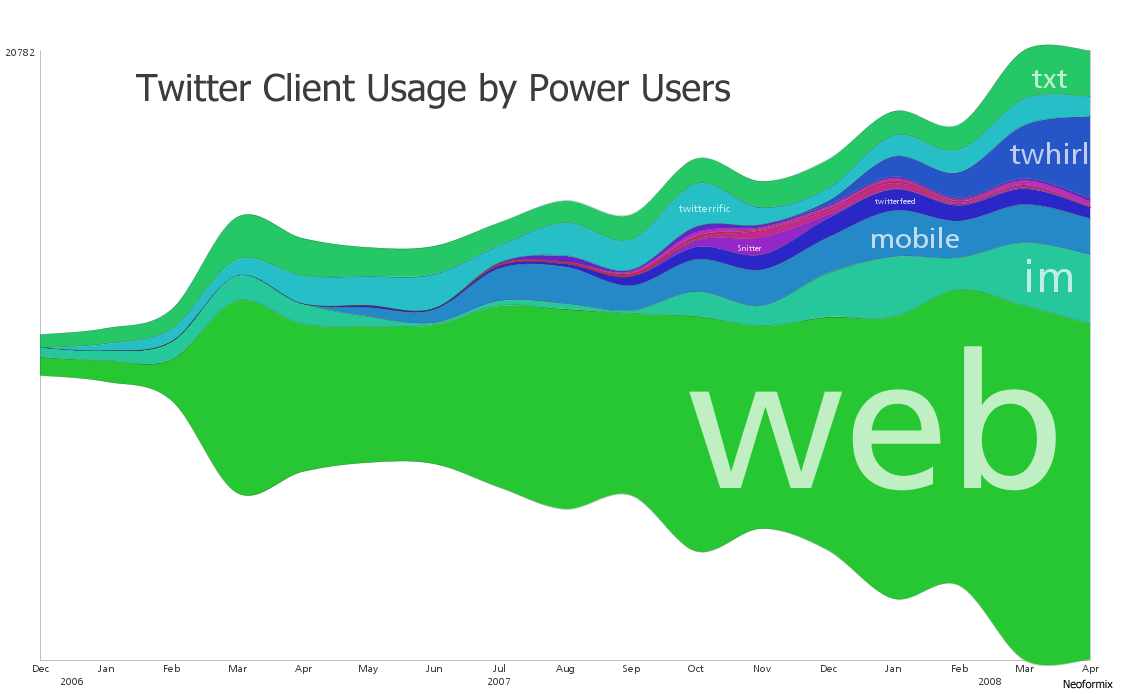
I have mentioned before the wonderful stream-like visualizations created by Lee Byron. I've written some code so I can create my own using whatever data I want. The one above was constructed using the twitter data from The StatBot. You can click on it to see a larger version of the image. I left out the first few months which had a very low volume of data so this one runs from Dec 2006 to Apr 2008.
For a small number of series a simple line graph would be superior because you can directly see which values are larger at each point in time. These StreamGraphs do a better job of emphasizing the sum at each point and the breakdown into the various series. I think StreamGraphs are also better at showing lots of series that dominate for short parts of the timespan of interest. For example see the image below that shows movie revenues. There are a great many movies illustrated and each one is only present in a fairly small part of the overall range of time.

Lee Byron and Martin Wattenberg have written a short paper describing the design decisions and algorithms behind these types of graphics. Have a look at Stacked Graphs - Geometry & Aesthetics (pdf) if you are interested in the details.
Top Twitter Users Over Time
By: Jeff Clark Date: Fri, 06 Jun 2008
Using data from The StatBot again I've built some graphs detailing usage of the top twitter users over the May 2006- May 2008 period. A line graph with this data is too crowded to interpret properly unless we restrict it to only a few top users so I decided to create a set of bar graphs instead. The pink bars are the highest for that month and the highest month of all is the last scobleizer month - 2005 tweets for April 2008. Here are a few observations:
- chrisbrogan has the most tweets overall but his totals were eclipsed in most months by newmediajim
- scobleizer jumped in quickly in Mar 2007 and had the most tweets of anyone in his first month of use
- down at #21 'ev' seems to have the highest use during the first few months. This isn't surprising since 'ev' is Evan Williams, Co-founder of Twitter
- guykawasaki and problogger are high in the overall usage rankings despite starting later than many of the others
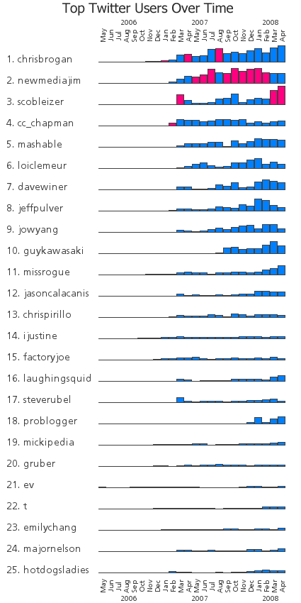
Twitter Client Usage Over Time
By: Jeff Clark Date: Fri, 06 Jun 2008
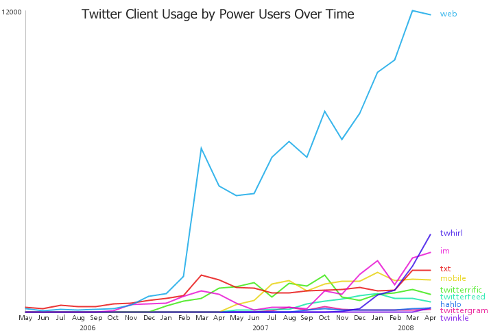
I've constructed a graph showing how use of Twitter clients by power users has changed over time. I used a dataset containing all the tweets from the power users in the Twitterific Top 100 list which was graciously provided by Yuvi, over at The StatBot. Two full years of data, from May 1st, 2006 until April 30th, 2008 were used for the analysis. The main things that jump out for me are:
- Web client use dominates
- txt client use seems to have plateaued between Mar 2006 and Mar 2008
- very rapid recent growth for Twhirl
- decent growth for im
- all the curves are fairly spiky
There have been some other recent posts giving statistics on the clients used most often to post updates to Twitter. One, from ReadWriteWeb, was called How We Tweet: The Definitive List of the Top Twitter Clients and was based on a random sample of over 37,000 tweets from the public timeline. The results were posted April 2, 2008 so I presume the data was collected shortly before then. The top 3 clients from their survey were:
Visit the original post for full results.
Yuvi, more recently, did a similar analysis based on the data he provided to me. He listed a number of findings by constrasting the two datasets including that the power users make use of both SMS txt messages (10% vs 5%) and Mobile Twitter (6% vs negligible) much more often than the typical user. He also claimed that the power users are using Twhirl less than the typical user (5% vs 7%). I believe this claim is incorrect.
The two studies mentioned above show an average client usage over very different time periods. The ReadWriteWeb study uses data from a 24 hour period around April 2, 2008 but the StatBot analysis uses a complete list of tweets that span a timeframe from March 21st, 2006 until May 25th, 2008. Drawing comparisons between two datasets based on such vastly different time periods should be done very cautiously. Twhirl is relatively new and Yuvi's analysis used lots of historical data before Twhirl was available.
The StatBot analysis showed that on average it was the 6th most popular client. In fact, if you look at the graph above at the point between Mar and Apr 2008, which corresponds to when the 'typical user' study was done by ReadWriteWeb, you can easily see that Twhirl was actually the second most popular client for power users. I've looked at the power user data for all tweets between Mar 31st and Apr 2nd, 2008 and there were 241 for Twhirl out of 1833 total - 13% , which is much higher than the ReadWriteWeb result of 7% for typical users. This makes sense to me - power users have more of an incentive to install a specialized client than an average user who doesn't use twitter very often.
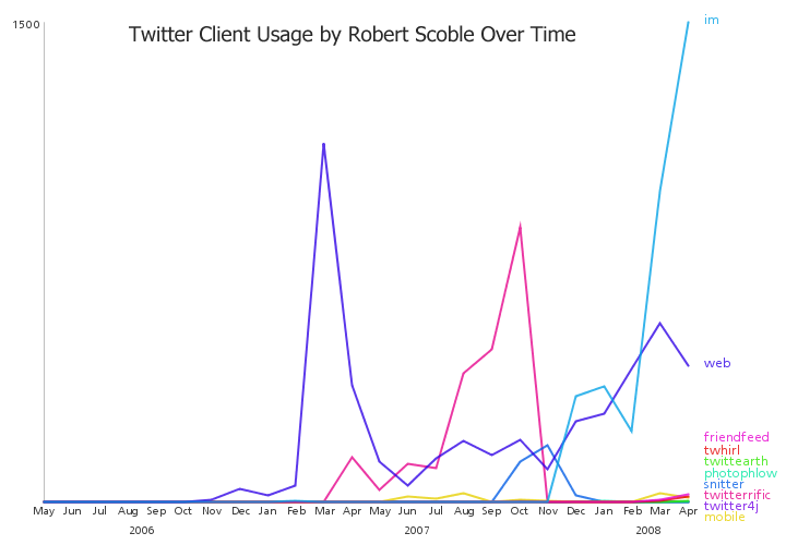
Just for fun, (well, and to try and get them to link to me ! ), I have generated graphs for two of the top power users: Robert Scoble and Chris Brogan. Note that the clients are coloured differently in the three graphs. Ideally, for easy comparison, they should be consistent. Here are a few observations concerning their patterns of use:
- Scoble has a huge peak for use of the web client around Mar 2007 and a lull in overall usage in June 2007
- Scoble switched to be a heavy user of twitterific for the last half of 2007 and again had a peak in usage
- Starting in Nov 2007 Scoble switched from twitterific to im as his primary client - web usage still common as well
- Scoble dabbles in many other twitter clients as well
- Brogan had a large drop in web client use at the same time as Scoble - Mar 2007, but didn't drop as far
- Brogan has used the mobile client a great deal since Jun 2007
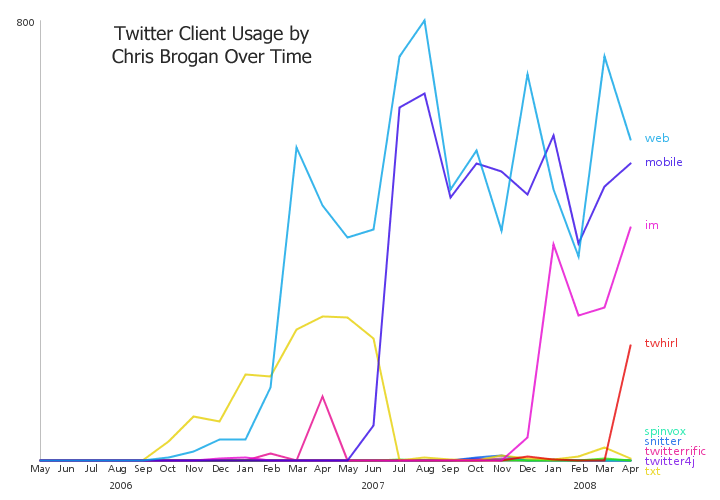
TwitArcs
By: Jeff Clark Date: Thu, 29 May 2008
I've combined some visuals from a side project related to linguistics with twitter data to create TwitArcs. It takes the latest 100 tweets for a twitter ID or term of interest and creates a list representation that has arcs connecting messages sent to the same users or that use the same primary term. You can click on the left side to load the tweets for a new user, on the right side to load the tweets for a specific term, and in the middle to visit the actual tweet.
Thanks to Twitter and Summize for the data and Processing.org for the tools. Give TwitArcs a try !
TwitArcs (static image)
Twitter Spectrum Changes
By: Jeff Clark Date: Tue, 20 May 2008
I've slightly improved the Twitter Spectrum application so that clicking on words used in conjunction with both terms properly use OR in the query. I also changed the default search terms to 'from:jasoncalacanis' and 'from:scobleizer' to show how you can compare the tweets from two users rather than related to two terms.
Twitter Spectrum (static image)
Twitter Spectrum
By: Jeff Clark Date: Thu, 15 May 2008
Just for fun, I've modified my News Spectrum application to take data from Twitter instead. Its called Twitter Spectrum of course ! It uses the wonderful Summize which provides excellent search capability for Twitter data.
As before, one topic is coloured blue, the other red, and the associated words are coloured and positioned based on how highly they are associated with the two topics. Click on any word to see the related tweets. Give Twitter Spectrum a try ! As always, feedback is welcome.
Thanks to Twitter and Summize for the data, Processing.org for the tools, and Chris Harrison for the inspiration behind the design.
Twitter Spectrum (static image)
News Spectrum
By: Jeff Clark Date: Tue, 13 May 2008
Introducing News Spectrum ! It is a visualization of the words used for two topics in the latest results from Google News. One topic is coloured blue, the other red, and the associated words are coloured and positioned based on how highly they are associated with the two topics. Click on any word to see the related Google News results.
This is a generalization of my recent Obama McCain News Spectrum that allows you to enter your own terms of interest. Press the 'Enter' key to generate the spectrum after entering your words. The layout algorithm has also been improved to minimize the number of overlapping words. Give News Spectrum a try ! As always, feedback is welcome.
Thanks to Google News for the data, Processing.org for the tools, and Chris Harrison for the inspiration behind the design.
News Spectrum (static image)
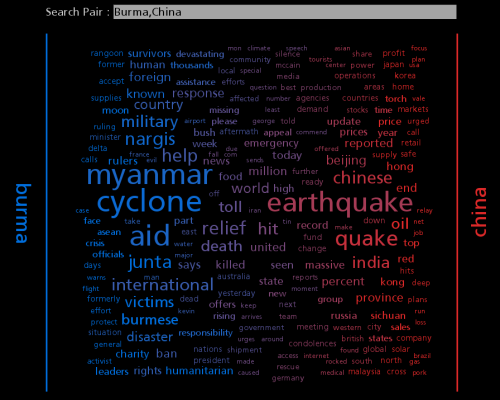
Obama McCain News Spectrum
By: Jeff Clark Date: Mon, 12 May 2008
I was thinking about the Word Association Spectrums created by Chris Harrison and thought it might be interesting to create something similar using live data. I've come up with a little application that gets the latest google news results for two terms of interest and generates a word spectrum based on the words found in the results. I removed stop words in order to highlight the words more likely to be of interest. It's an obvious drawback that there are often many hard to decipher overlapping words but it's kind of fun to play with nevertheless. This initial version shows a news spectrum related to the terms 'Obama' and 'McCain'.
Obama McCain News Spectrum (static image)
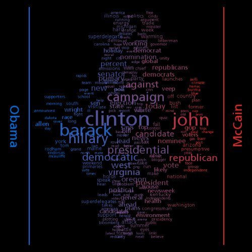
(More...)
Disease Gene Map
By: Jeff Clark Date: Fri, 09 May 2008
The New York Times has published an interesting interactive diagram depicting the relationship between various diseases and the genes that are known affect them. The large circle in the image below is zoomed in on one part of the diagram. [via FlowingData]
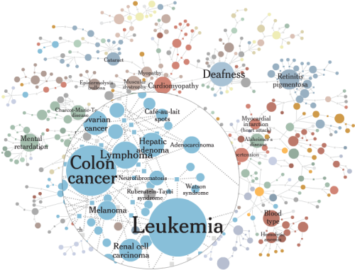
Word Association Spectrums
By: Jeff Clark Date: Fri, 09 May 2008
Chris Harrison has a wonderful collection of visualizations one of which I featured recently in More Color Name Graphics.
Chris recently posted a set of beautiful Word Association Spectrums based on an extremely large dataset from Google containing word bigram distributions. The example shown below is for the words 'war' and 'peace'. The horizontal position of the various words indicate whether they more frequently follow 'war' or 'peace' in the analyzed text. So the word 'memorial' is positioned very close to the left (at the bottom) because the bigram 'war memorial' occurs much more often (normalized by overall counts) than 'peace memorial'. The vertical position is random.
My own Document Contrast Diagrams also stretch out words along a horizontal axis based on the strength of association between two poles. My diagrams try and express a lot more information as well - probably too much. Chris's Word Association Spectrums carry less information. This simplicity allows for a much more elegant design. He has generated spectrums for other interesting word pairs like 'kids:adults' , 'good:evil', and 'american:chinese'. I might like to see versions that don't show the common prepositions so that the nouns, verbs, and adjectives stand out more.
Word Association Spectrum for War and Peace (click to visit Chris Harrison's Post)
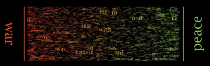
May 6th Speech Contrast Diagram
By: Jeff Clark Date: Wed, 07 May 2008
I ran the speeches delivered by both Obama and Clinton last night after the May 6th primary results and used them to build a Document Contrast Diagram. See the link for a description of how to interpret the diagram.
May 6th Primary Speech Contrast Diagram (click to see larger version)
May 6th Primary Speech Cloud Comparison
By: Jeff Clark Date: Wed, 07 May 2008
I have taken the speeches delivered by both Obama and Clinton last night after the May 6th primary results and used them to build a Document Cloud Comparison. It shows which words were used together by each speaker using linked word clouds. A static image is shown below for references to the word 'change' to give you a flavour but the real fun comes with exploring the interactive application.
If you enter a blank focus string in the application it shows a standard word cloud and colors words that are unique to one speaker or the other. The top words used by Obama and not by Clinton include 'side' , 'down', 'government', 'values', 'yes', 'lead' , 'life', 'kind', 'trust', and 'united' . Those used by Clinton uniquely include 'keep', 'feel', 'journey', 'working', 'invisible', 'west', and 'story'.
'change' Associations and References (static image)
Give it a try yourself. The application is written in Java so you may have to wait a few seconds for it to start up.
(More...)
State of the Union Sentence Bars
By: Jeff Clark Date: Thu, 01 May 2008
As I pointed out in my last post, Directed Sentence Drawings generated from a text make it extremely difficult to see in what order the various topics were discussed and that a simple bar for each sentence in the order they occurred in the text and coloured by topic would be much better in most respects. I've built a graphic to show what I mean. I have also added the most frequent topic words for each set of 10 consecutive sentences.
State of the Union - Sentence Bars with Topic Colours (click to see larger version)

Click on the up arrow below if you found this interesting:
Directed Sentence Drawings
By: Jeff Clark Date: Thu, 01 May 2008
In my post earlier today about Sentence Drawings I mentioned that the overall shape of the graphic doesn't really express anything useful. I have come up with a variation on the idea that tries to address this.
In the sentence drawings produced by Stephanie Posavec or David Sparks each line segment is turned 90 degrees to the right relative to the previous one. This makes the overall shape highly sensitive to minor variations in the text which is why the overall shape doesn't carry much meaning - it's almost random.
I call my diagrams Directed Sentence Drawings because the direction of the line segments are a function of their topic. As before, each sentence is assigned a topic or remains neutral based on the vocabulary it contains. I place a neutral point in the middle of the diagram and four other topic points form a diamond shape around it (see below). For the State of the Union diagrams produced below I used the four topics Government, Domestic, Economy, and Security. The algorithm is as follows:
- start at the neutral point
- find the topic for the sentence and use it to set the color for the line
- draw the line from the current position towards the topic that it is about
- the length of the line is proportional to the length of the sentence
- if the line is continuing in the same direction as the last segment, draw a small circle at the starting point
- if the line is reversing direction, use a small arc to shift it over so it doesn't overlay the previous segment
The diagram immediately below is constructed from the State of the Union Address for the year 2000. It shows there were many sentences about both Domestic and Economic issues, a fair number concerning Government and fewer about Security. The dominant colours give this away but also the overall shape makes it obvious. There is a greater density of lines near the Domestic and Economic topic nodes.
Directed Sentence Drawing for SOTU 2000
This next diagram is for the SOTU of 2001, the first delivered by George W. Bush. It's obvious that it was much shorter, had even less discussion of Security issues than Clinton's in 2000, and also not much sustained discussion about Domestic issues.
Directed Sentence Drawing for SOTU 2001
The SOTU for 2002 was delivered after 9/11 and clearly shows that Security has become the predominant concern.
Directed Sentence Drawing for SOTU 2002
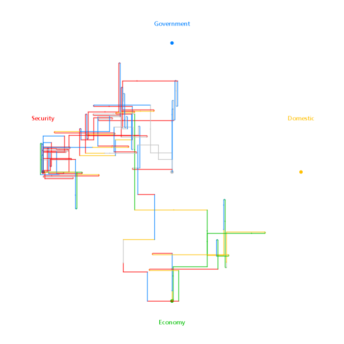
This last diagram is for the SOTU of 2008 and shows that Security is still very topical but that Economic and Governmental issues are starting to recapture attention.
(More...)
More Sentence Drawings
By: Jeff Clark Date: Thu, 01 May 2008
I posted a few weeks back on Stephanie Posavec's interesting graphics constructed from the text of Kerouac�s On the Road. One of her pieces featured Sentence Drawings that were generated using each sentence in sequence with line segments coloured to reflect the topic and sized based on the length of the sentence.
David Sparks has constructed a set of similar sentence drawings for the State of the Union addresses delivered by Bush over his 8 years in office.
David Spark's Sentence Drawing for SOTU 2008 (click to see graphic with all 8 addresses delivered by Bush)

I find these interesting to look at. However, the dominant visual feature is the overall shape of the graphic and I don't think it really expresses anything useful.
More Color Name Graphics
By: Jeff Clark Date: Fri, 25 Apr 2008
Dolores Labs has posted an update on how people have used their color name data in various ways. They linked to my own Color Names Explorer - thank you very much ! Their post is called Color flowers, networks, photos, and even 3D and has several more interesting views of this data. The one that really caught my eye was by Chris Harrison who created a flower-like image by rendering the names in their associated color and varying the position by hue along the radius. I don't think many of these images, including my own, are particularly useful, but they sure are interesting to look at !
Chris Harrison's Color Name Flower (click to see larger version in original article)
Color Name Flower Closeup

Portfolio
By: Jeff Clark Date: Sat, 19 Apr 2008
There is a new Portfolio link available from all pages on my weblog. It links to a simple index of my most interesting or useful applications and gives a pretty good idea of the kinds of things I like to create.
I'm currently available for data analysis or visualization projects if anybody is interested in working together. I live near Toronto, Canada but I'm open to projects done remotely. I would be happy with creative projects that vary in size from a few days to a few months of work. Send me an email if you are interested.
Pennsylvanian Debate Word Cloud Comparison
By: Jeff Clark Date: Thu, 17 Apr 2008
I have taken the words spoken by both Obama and Clinton during the Pennsylvanian Democratic debate held on April 16th, 2008 and constructed from them a Document Cloud Comparison. Basically, it lets you see which words were used together by each speaker using linked word clouds. A few static images are shown below to give you a flavour but the real fun comes with exploring the interactive application.
If you enter a blank focus string in the application it shows a standard word cloud and colors words that are unique to one speaker or the other. The top words used by Obama and not by Clinton include 'politics' , 'decade', 'election', 'economic', 'somehow', 'generation' , 'mission', 'forward', and 'problem' . Those used by Clinton uniquely include 'york', 'begin', 'world', 'best', 'support', 'administration', 'police', and 'hope'.
'Country' Associations and References (static image)
'jobs' Associations and References (static image)
Give it a try yourself. The application is written in Java so you may have to wait a few seconds for it to start up.
(More...)
Pennsylvanian Debate Comparison
By: Jeff Clark Date: Thu, 17 Apr 2008
I have taken the words spoken by both Obama and Clinton during the Pennsylvanian Democratic debate held on April 16th, 2008 and constructed from them a Document Contrast Diagram. See the link for a description of how to interpret the diagram.
It shows that they spoke roughly the same number of words but with Obama speaking slightly more. Both were slightly positive in overall emotional tone with some areas of negativity related to guns and security for Clinton and taxes for Obama. There was a great deal of overlap in the words used by the two speakers with the words 'kind', 'Democrats' , 'important', 'country', 'make', 'work', 'president', 'can', 'take' , 'right', and 'guns' being frequently used by both. 'Know' was used a lot by both but more often by Clinton. They both spoke each others names much more than their own but Obama used Clinton's name more often than the reverse.
Key words used frequently and uniquely or much more often by Obama included 'true' , 'statement' , 'economic' , 'issues', 'election', 'confident', 'George' , 'American', 'policy', 'politics', 'income', 'change', 'General', 'ideas', 'Chicago', and 'individuals'. Words used frequently and uniquely or much more often by Clinton included 'decisions', 'stay', 'withdraw', 'Iran', 'failed', 'begin', 'world', 'military', 'best', 'York', 'administration', 'Philadelphia', 'impose' , 'order', 'police', and 'oil'.
Pennsylvanian Debate Contrast Diagram (click to see larger version)
Pennsylvanian Democratic Debate
By: Jeff Clark Date: Thu, 17 Apr 2008
I added the transcript for the Pennsylvanian Democratic debate held on April 16, 2008 to the interactive Transcript Analyzer. The image below is smaller (and more blurry) than from the application but gives a rough idea of what was discussed by which candidate and when. Here are the primary topics covered in order:
- mixed introductory comments (jobs + health + foreign + policy)
- guns + religion
- wright + remarks
- foreign + policy + iraq + iran
- tax + economy + jobs
- guns + ban
- mixed closing comments (jobs + health + foreign + policy)
Notable by their absence were the words 'immigration' and 'nafta' .
Democrat Debate - Apr 16th, 2008 ( click for interactive application )
One small refinement was made to the application. The counts and bars for the various words will now also include simple plural variations. So references to 'jobs' will also include 'job', and references to 'gun' would also include 'guns'.
Give the Transcript Analyzer a try yourself and, as always, feedback is welcome !
Stephanie Posavec
By: Jeff Clark Date: Sun, 06 Apr 2008
One of the areas I have been exploring here on Neoformix is the notion of constructing graphics in an algorithmic fashion from textual data. The site NOTCOT has just published an article on some interesting work by Stephanie Posavec that explores this same idea. She has constructed a number of different works based on the text of Kerouac�s On the Road. From NOTCOT's article:
The maps visually represent the rhythm and structure of Kerouac�s literary space, creating works that are not only gorgeous from the point of view of graphic design, but also exhibit scientific rigor and precision in their formulation: meticulous scouring the surface of the text, highlighting and noting sentence length, prosody and themes, Posavec�s approach to the text is not unlike that of a surveyor.
Here are a few images that will give you a taste and a rough idea of what they mean. Although definitely more on the artistic side of information visualization, I like these images and the ideas behind them a great deal.
Obama/Clinton Economic Speech Contrast Diagram
By: Jeff Clark Date: Fri, 28 Mar 2008
Recently both Clinton and Obama delivered speeches related to the economy. Clinton's was more focussed specifically on the housing crisis. I took the text of Clinton's Halting the Housing Crisis and Obama's Renewing the American Economy and created a Document Contrast Diagram.
It clearly shows that they were about the same length, both slightly positive in overall emotional tone but Clinton's text varied more in tone. The large blue word circles for 'mortgage', 'housing', 'crisis', 'families', 'foreclosure' show the primary topic of interest for Clinton. Obama's mostly unique key terms were 'American', 'financial', 'risk', 'system', 'regulatory', and 'institutions'. The blue segments in the middle of Obama's speech show that he used words in that section more strongly associated with Clinton overall. This is where he discussed the housing crisis.
Obama/Clinton Economic Speech Contrast Diagram (click to see larger version)
Color Names Explorer
By: Jeff Clark Date: Thu, 27 Mar 2008
Dolores Labs recently did an interesting experiment where they showed many people samples of colors and asked them what they should be called. They posted a graphic that showed the color names that people used for the various colors.
Dolores Labs' Color Name Cloud (click to see larger version in original article)
They also posted the raw data for other people to play with. Martin Wattenberg at IBM Research took the data and created a much more beautiful graphic. Nathan at FlowingData discusses the design differences in the post A Little Bit of Design Goes a Long Way With Infographics.
Wattenberg's Version of the Color Name Cloud (click to see larger version in original article)
I decided to try my hand at building a simple interactive 3D explorer for the data as well. I combined entries with the same name and found the average RGB values. The frequency count was used to highlight the more common names by scaling the size of the text in a manner likely similar to that used by Wattenberg. I then plotted the names in 3D using the red (x), green (y), and blue (z) components of the color value.
Color Name Cloud - initial view
Color Name Cloud - zoomed in view
The initial view is similar to Wattenberg's but not spaced out as nicely. My version also suffers from the fact that the size of the name depends on both frequency of use and how much blue the color happens to contain since the more blue a color has the closer it is drawn to the front of the display.
You can try out the color name explorer below. Can you find the shade somebody called 'baby poop' ?
(More...)
Ontario Budget Speech 2007-2008 Contrast Diagram
By: Jeff Clark Date: Wed, 26 Mar 2008
I'm a proud citizen of Canada and have decided to include a bit more analysis of Canadian-themed data and text in the future.
Yesterday the 2008 Ontario budget speech was delivered which outlines the governments' priorities for the coming year. I have constructed a Document Contrast Diagram from the text of the 2007 Ontario Budget Speech and the 2008 Ontario Budget Speech.
Document Contrast Diagram for 2007/2008 Ontario budget Speeches (click to see larger version)
My first post on Document Contrast Diagrams will give some guidance on how to interpret the image. Here are a few things I noticed that are illustrated by the diagram. You may have to view the larger version to see some of these details.
- The 2007 speech was slightly longer.
- Overall, both speeches had a positive emotional tone.
- Some of the primary words common to both speeches were 'Ontario', 'years', 'Speaker', 'health', 'today', 'improve', 'municipalities', 'care'
- Common words used a bit more often in 2007 include 'Budget', 'economic', 'rates', 'province', 'support', 'provide'
- Common words used a bit more often in 2008 include 'business', 'tax', 'plan', 'help', 'communities', 'continue', 'public'
- Words used much more often in 2007 include 'child', 'children', 'families', 'means', 'reassessment', 'surpluses', 'reserve', 'greenbelt', 'clean', 'car'
- Words used much more often in 2008 include 'invest', 'jobs', 'government', 'students', 'school', 'grants', 'skills', 'training', 'build', 'create', 'infrastructure', 'partner', 'Toronto'
- The 2007 speech had no segments of strong negative emotional tone.
- The 2008 speech had a couple of segments of moderately negative tone - one associated with 'jobs' and the other with 'funding'.
Super Tuesday Contrast Diagrams
By: Jeff Clark Date: Tue, 25 Mar 2008
The image below shows the Document Contrast Diagram from the remarks made by both Clinton and Obama after the Super Tuesday primaries on Feb 5th.
Document Contrast Diagram for Clinton/Obama Super Tuesday Remarks (click to see larger version)

My first post on Document Contrast Diagrams will give some guidance on how to interpret the image. Here are a few things I noticed that are illustrated by the diagram. You may have to view the larger version to see some of these details.
- The two segment columns show that Obama's speech was longer - it had roughly 40% more words.
- There was a pretty strong difference in the vocabulary used. There are lots of large word circles that are coloured strongly red or blue.
- There were many common words as well. Some of the most frequently used words that were used about the same number of times by both speakers are: 'Thank', 'mortgage', 'voted', 'states', 'year', 'President', 'war', 'deserve', 'health', 'across', 'challenges', and 'young'.
- Words used frequently and primarily or only by Clinton include: 'America', 'day', 'voice', 'opportunity', 'world', 'life', 'country', 'child', and 'nation'.
- Words used frequently and primarily or only by Clinton include: 'Washington', 'time', 'different', 'can' , 'change', 'cannot', 'Yes', and 'boys'.
- The emotional tone varied more in Obama's speech than in Clintons.
- The segment with the most negative tone in Obama's speech occurred around the middle and was related to 'Bush'.
- The segment with the most negative tone in Clinton's speech occurred near the end and was related to 'war'.
- Overall, both speeches had a positive emotional tone.
Document Contrast Diagrams
By: Jeff Clark Date: Thu, 20 Mar 2008
A Document Contrast Diagram is a visual summary of the content of two text documents that illustrates shared words, words that are unique to one document or the other, word frequency, relative size of the two documents, distribution of emotional tone within the documents, related words based on co-occurence, and the most common word in each document segment. Have a look below at the Document Contrast Diagram for the 2007 and 2008 US State of the Union (SOTU) Addresses. If you wish you can click on the image to see a larger version.
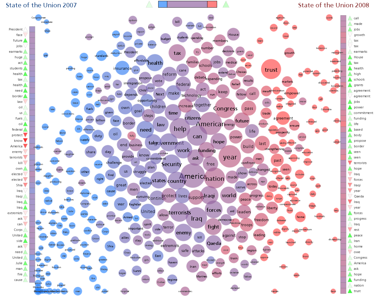
I'm hoping that much of the following is reasonably intuitive but here are a number of points regarding interpretation:
(More...)
Contrasting Document Pairs
By: Jeff Clark Date: Wed, 05 Mar 2008
I've been consumed lately by the idea of taking two distinct documents and creating a large, visually interesting, static image that compares and contrasts them. I don't have time at the moment to explain how to interpret these but have a look at the images below. The blue text is the State of The Union Address for 2007 and the red is that for 2008.
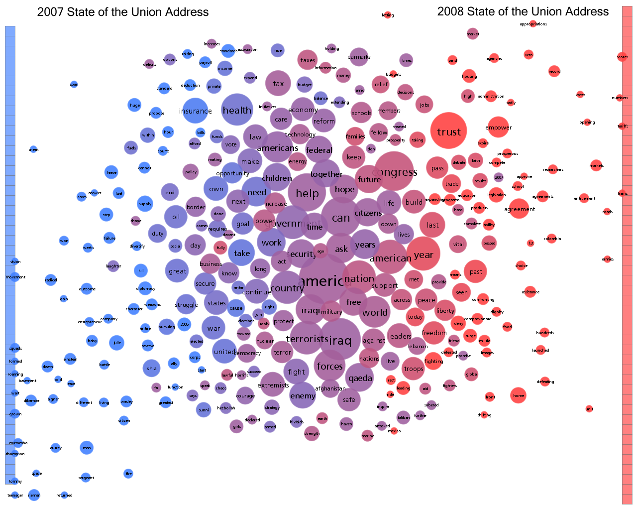
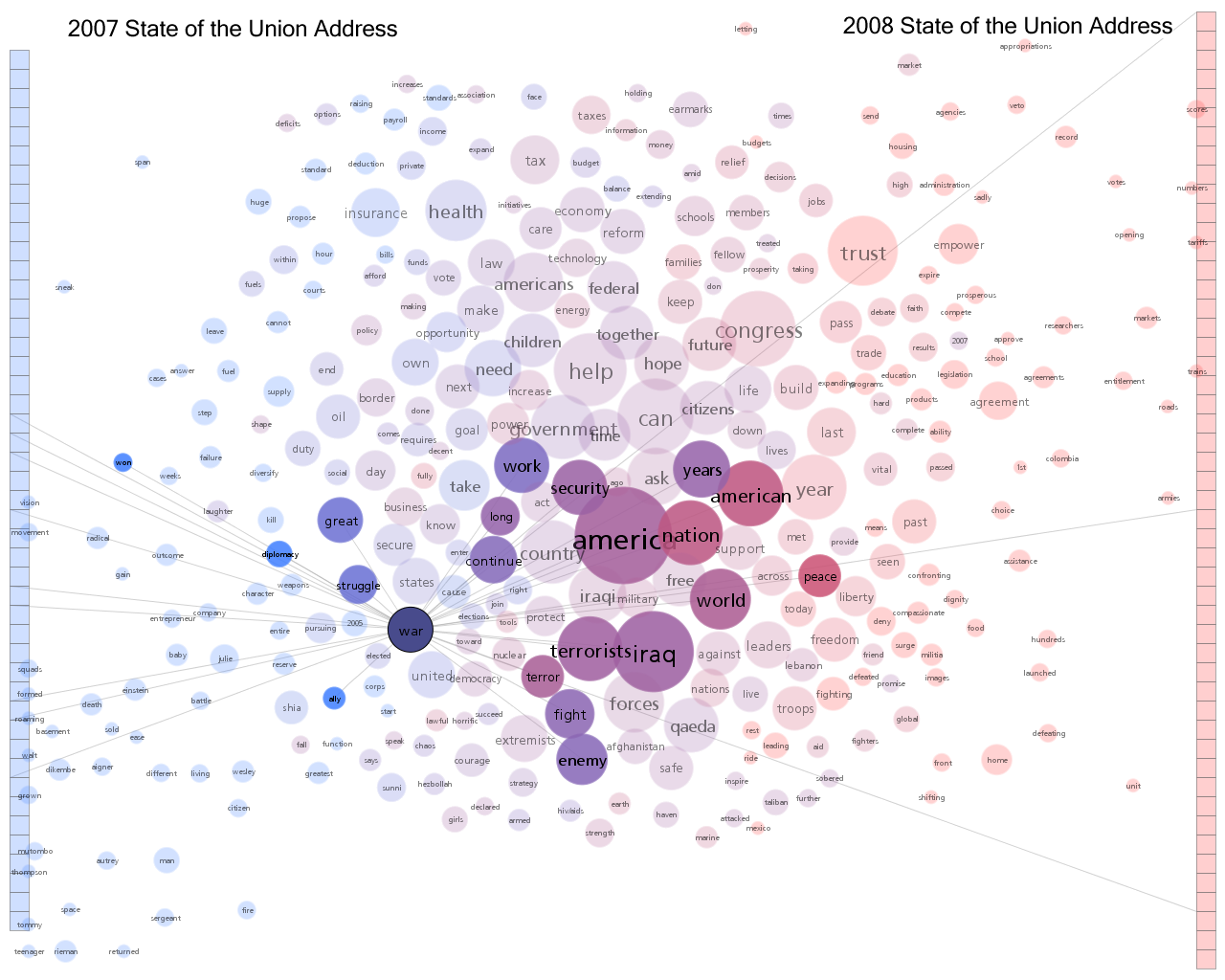
Click on the images to see larger versions. The idea needs work still but it's starting to look promising.
Movies Ebb and Flow
By: Jeff Clark Date: Fri, 29 Feb 2008
Last week the New York Times published an interactive graphic called The Ebb and Flow of Movies: Box Office Receipts 1986-2007. It does a pretty good job of showing how the revenue of various movies rose and fell over time as well as more global patterns. The design does make it hard to directly compare movies against each other. It would be neat to pick a bunch of movies and see a set of traditional line graphs starting from the same point. Here is a close up:
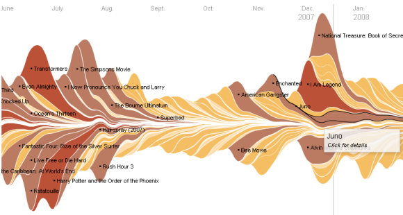
And here is 4 years of data with labels showing the summer blockbuster periods. You can also clearly spot the peaks at the end of the years.
Stream Graph
By: Jeff Clark Date: Fri, 29 Feb 2008
Lee Byron has done some other interesting work. One that really caught my eye when I first saw it is this stream-like visualization of music listening habits over time. The data comes from the Last.fm records for a particular user.
In the author's words:
After thinking about how I could show this whole sum in a presentable form, I decided on a sort of layered histogram. Each colored sliver represents a different artist listened to in the last 18 months. The sliver moves through time left to right growing thicker where it was more popular and thinner where it was less. The color indicates the first time the artist was listened to, warmer colors being more recent and cooler being further back. As a new artist is listened to it is put onto the outsides of the graph. The result is a wiggling tour through your listening history past.
Lee describes it as 'a sort of layered histogram' but I think of it as a 'stream graph' - it nicely shows how something varies over time and looks like a stream to me.
Poetry Visualizations
By: Jeff Clark Date: Thu, 28 Feb 2008
Back in 2006 I wrote about Martin Wattenberg's work called The Shape of Song and how it illustrates the repetitive patterns in music using translucent arches that connect identical passages of notes. At the time I mused about doing something similar for text:
Perhaps poetry or lyrics from songs might have an interesting structure but I suspect most text data wouldn't have enough repetition at the token or word level for this idea to be fruitful.I did eventually develop the idea into Document Arc Diagrams that uses similarity of vocabulary.
I just stumbled across Children's Poetry & Limerick Visualizations by Lee Byron which stems from Wattenberg's concept as well. Lee describes the image below with these words
The arcs represent rhyme, alliteration, homophone and repetition. Steps underneath the line represent rhythm. You can see these elements clearly represented in the classic childrens poem: "Hickory Dickory Dock".
Interesting work.
Ohio Democratic Debate
By: Jeff Clark Date: Wed, 27 Feb 2008
I added the transcript for the Ohio Democratic debate held on February 26, 2008 to the interactive Transcript Analyzer. The image below is smaller (and more blurry) than from the application but gives a rough idea of what was discussed by which candidate and when. Here are the primary topics covered in order:
- health + insurance
- nafta + jobs
- foreign + policy + war + iraq
- speeches + talk + action + health + insurance
- reject + farrakhan + jewish
- various, no strong theme except perhaps nominee
It's also interesting that 'immigration' was mentioned in passing only once during this debate but was a primary topic in Texas. Also 'education' was not given any real attention.
Democrat Debate - Feb 26th, 2008
I have made another minor refinement to the application. Beside the word lines are shown the number of times each word was used by each candidate. For example for this debate 'Iraq' was used 8 times by Obama and 5 times by Clinton.
Give the Transcript Analyzer a try yourself and, as always, feedback is welcome !
Obama Momentum
By: Jeff Clark Date: Mon, 25 Feb 2008
I'm sure almost everybody reading this entry is aware of the tight race in the US democratic primary between Clinton and Obama. There is a huge amount of coverage over this exciting and extremely important contest. A concept much-discussed lately is momentum. I've created a simple graphic to try and visualize the momentum.
The darker blue area shows Clinton's delegate counts over time. The lighter blue shows how much Obama's counts exceed those of Clinton. The small numbers show the actual difference at a point in time. For example, after Feb 5th (Super Tuesday), Obama had 30 more regular pledged delegates than Clinton - not counting super delegates.
Hillary Clinton currently has an advantage in super-delegates (241 to 181 for Obama) and this makes the race closer than depicted above. However, super-delegates support is not fixed - they are free to change who they support up until the time of the convention.
(More...)
Texas Democratic Debate
By: Jeff Clark Date: Fri, 22 Feb 2008
I just added the transcript for the Texas Democratic debate held on February 21, 2008 to the interactive Transcript Analyzer. The image below is smaller (and more blurry) than from the application but should give a rough idea of what was discussed by which candidate and when. Here are the primary topics covered in order:
- Texas + Health
- change
- Cuba
- economy + tax
- immigration
- border
- words
- health
- Iraq + war
Democrat Debate - Feb 21st, 2008
I did make a minor refinement to the application. The bars for the words of interest are now coloured to show the speaker. This makes it easy to tell, for example, that Obama used the word 'Iraq' in 7 separate segments but Clinton only used it in one segment.
Give the Transcript Analyzer a try yourself and, as always, feedback is welcome !
Typographic Design
By: Jeff Clark Date: Thu, 21 Feb 2008
Pixish is a new site devoted to connecting visual artists with people interested in exploring and possibly using their work. You can sign up and post 'Assignments' that describe what you are looking for or you can submit designs to fulfill assignments. The site is still in beta mode and had a few hiccups when I played with it yesterday but it's an interesting idea.
Just for fun, I created a couple of designs with a modified version of Word Hearts and entered them into an assignment. They are looking for a T-Shirt design for typography lovers. Here are small versions of my 2 entries:
Effectiveness of Animated Transitions
By: Jeff Clark Date: Wed, 20 Feb 2008
In a few of my previous interactive applications, namely Digg Explorer and the Race Results Analyzer, I have used small 'data objects' that get smoothly animated between different locations. Sometimes the set of data objects represent a data graphic - a pie chart or histogram for example.
I have just come across a research paper and video by Jeffrey Heer and George Robertson where they investigate the effectiveness of animated transitions in statistical data transitions. Their conclusion was that animated transitions can significantly improve graphical perception. The video is high quality and explains the ideas and results very well.
Note that this research did not use multiple constituent data objects as in my applications but the conclusion is likely valid in this context as well.
Obama-McCain Potomac Primary Speech Comparison
By: Jeff Clark Date: Wed, 13 Feb 2008
I have taken the remarks made by both Obama and McCain after the Potomac Primary results were in and constructed another Document Cloud Comparison. As before, a few static images are shown below to give you a flavour but the real fun comes with exploring the interactive application.
If you enter a blank focus string in the application it shows a standard word cloud and colors words that are unique to one speaker or the other. The top words used by Obama and not by McCain include 'change' , 'tax', 'health', 'college', 'bush', 'lobbyists' , 'jobs', 'rich', and 'iraq' . Those used by McCain uniquely include 'promise', 'serve', 'friends', 'strength', 'faith', 'dreams', and 'challenges'.
'Hope' Associations and References (static image)
'War' Associations and References (static image)
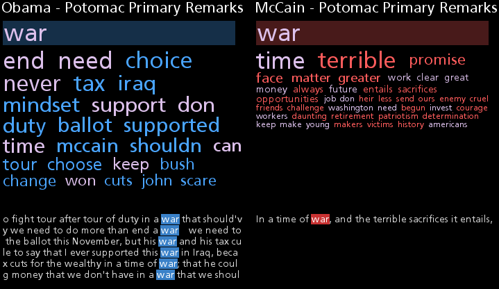
Give it a try yourself. The application is written in Java so you may have to wait a few seconds for it to start up.
(More...)
Word Hearts
By: Jeff Clark Date: Sun, 10 Feb 2008
I've been playing around with words and shapes again and just posted a little application I call Word Hearts that lets you generate heart shapes filled with words. Here are two sample images:

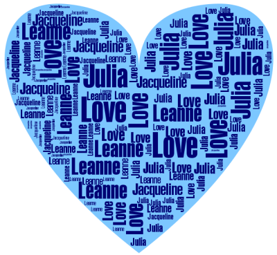
It's just in time for Valentines Day so have some fun!
Clinton-Obama Super Tuesday Speech Comparison
By: Jeff Clark Date: Wed, 06 Feb 2008
I have taken the remarks made by both Clinton and Obama after the Super Tuesday results were in and constructed a Document Cloud Comparison. A few static images are shown below to give you a flavour but the real fun comes with exploring the interactive application.
Most Common Words (static image)
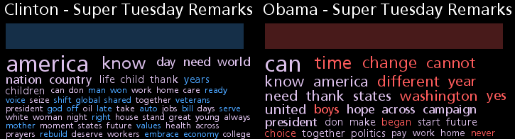
This first image shows part of the list of most common words for both speeches. Clinton mentions 'America' most frequently, Obama the word 'can'. Clinton uses the terms 'god' , 'auto', 'veteran', and 'economy' which aren't mentioned at all by Obama. Interestingly, Obama's top unique words are 'time' and 'change'.
'Hope' Associations and References (static image)
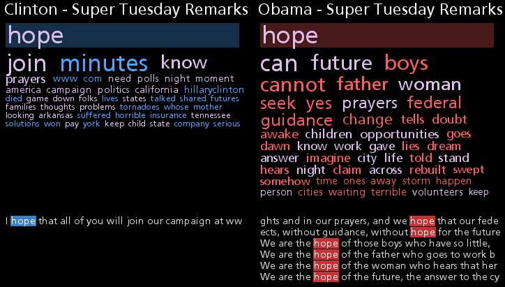
The references to the word 'hope' clearly show Obama's use of repetition and rhythm. This is shown again in his use of the words 'time' and 'change' as shown below.
'Time' & 'Change' Associations and References (static image)
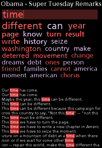
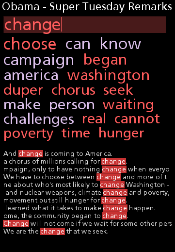
The last reference to 'change' caught my eye - We are the change that we seek. It's the declarative form of a famous quote by Gandhi - You must be the change you want to see in the world.
It's much more interesting to try it out yourself. Click on 'more' to give it a try. The application is written in Java so you will have to wait a few seconds for it to start up.
(More...)
Document Cloud Comparison
By: Jeff Clark Date: Mon, 04 Feb 2008
Word Association Clouds appear to be an interesting way to navigate within a document and get an understanding of the concepts discussed. I've also been playing around with the idea of using two of them linked together in order to explore the similarities and differences between two different documents.
The image below shows an example using the State of the Union addresses for both 2007 and 2008. The two clouds show the words related to the focus word in both documents in the same manner as for the single Word Association Cloud. The only difference is that colour is used to indicate words that are unique to one document or another. The words in blue on the left are unique to the 2007 SOTU and those in red on the right are unique to the 2008 SOTU. As before, you can click on a word to bring it in focus or click on the top edit box to change it. The clouds are linked in this case so that they always show the same word for both documents.
Document Cloud Comparison (static image)
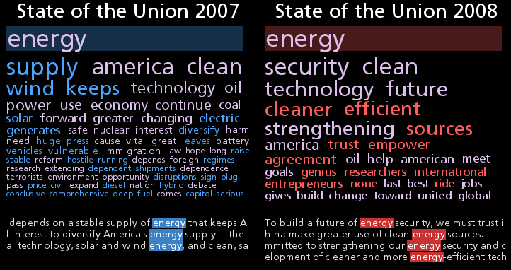
We show here the words associated with 'energy' in both of the transcripts. The word 'supply' is most highly associated with 'energy' in the 2007 version and the blue colour shows that it isn't even used in the 2008 address. You can also easily see that 'wind', 'solar', 'electric' and 'vehicles' were all used in relation to 'energy' in 2007 but were not even mentioned in 2008. In 2008 the word 'security' is the most highly associated term. It does appear in 2007 but is not as prominent in relation to 'energy'.
It's much more interesting to try it out yourself. Click on the image or 'more' to give it a try.
(More...)
SOTU 2008 Arc Diagram
By: Jeff Clark Date: Fri, 01 Feb 2008
The image below is a Document Arc Diagram generated from the text for the State of the Union Address for 2008. There is some interesting structure evident. There are two very distinctive groupings of arcs. The first is focused on domestic issues and arises from repeated use of the terms America, Americans, Congress, trust, tax, veto, health, housing, technology, and jobs. The second group of arcs is based on repeated use of the terms America, Qaeda, troops, terrorists, iraq, iraqi, afghanistan.
You can enter your own text for analysis with the Document Arc Diagram Application.
State of the Union Adress, 2008
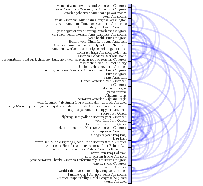
California Democratic Debate
By: Jeff Clark Date: Fri, 01 Feb 2008
I just added the transcript for the California Democratic debate held on January 31, 2008 to the interactive Transcript Analyzer.
Democrat Debate - Jan 31st, 2008
Boing Boing Word Trends
By: Jeff Clark Date: Thu, 31 Jan 2008
I have adapted my recent Digg Trends tool so that it can analyze data about weblog posts. A new version exists called Boing Boing Word Trends that loads summaries of the latest 500 posts from Boing Boing and lets you explore which words are used together and how usage has varied over the recent past.
Give Boing Boing Word Trends a try !
Word Association Clouds
By: Jeff Clark Date: Wed, 30 Jan 2008
The American president recently presented the State of the Union Address for 2008. I noticed this Tag Cloud representation of the text. I'm sure there are several others already on the web as this is a standard analysis these days for any text of interest. It does a pretty good job of summarizing the content by listing the top keywords with a font scaled to their frequency.
In my recent tool Digg Trends I introduced something I call a Word Association Cloud. Visually, a Word Association Cloud looks like a standard Tag Cloud except the topmost word is made distinct in some manner. I've been using a faint block of color behind it. Rather than using font size to represent a simple word frequency the size here illustrates how good the correlation is with the primary word.
Word Association Cloud (static image)
In this example the primary word is 'Afghanistan' and the cloud clearly shows that the major words associated with it are 'iraq', 'america', 'freedom', 'pakistan' etc. The references within the text are also shown. I'm basically counting how often the various words occur near 'Afghanistan' but I'm also weighting this count based on how far apart the words are. You can click the primary word to enter edit mode and change it to whatever you wish. Or you can simply click on one of the associated words to make it the new primary word. This lets you navigate around easily to explore different words. If you change the primary word to a blank then a standard tag cloud is presented.
It's a simple idea but seems to give a useful perspective. I'm guessing somebody somewhere has done this before but I'm not aware of any examples. Please let me know if you find some. Give the Word Association Cloud for the State of the Union Address a try !
(More...)
Digg Trends
By: Jeff Clark Date: Tue, 29 Jan 2008
The design of the Digg Election Story Analyzer has been improved and generalized so that it can be used for all the topics and subtopics available on Digg. I'm calling the result Digg Trends. The tool loads the latest 500 popular stories for the desired topic and analyzes the text found in the story titles and descriptions. The image below shows the current results for the 'Technology' topic.
Static image - click it to launch the interactive application
The Digg Trends analysis focuses on four words at any given time. A different color is used for each. The graph at the top shows how the number of references to each of the four words varies over time. You can turn off the 'Stacked' checkbox to show a line graph which does a better job of showing which word is referenced the most at any given time.
For much of this past month of January, 2008 Apple has had much greater attention within the Digg community than Microsoft, Google, or Digg itself. There was a large spike in Apple references around Jan 16th which corresponds to the announcement of the MacBook Air at MacWorld. Attention to Digg was higher than Apple around January 23rd.
(More...)
ButterBeeHappy
By: Jeff Clark Date: Tue, 22 Jan 2008
Recently I completed a small freelance project for the site ButterBeeHappy.com . Basically, the site lets you easily keep a journal of those things that make you happy or that you are grateful for. There is research to suggest that doing so has psychological benefit. The site is free to use and I've been enjoying using it the last couple of months.
My small piece of the puzzle is called the Honeycomb Navigator. It lets you see the words used most often in your entries as well as which other words are associated with them. You can also explore the things that made you, or other people, happy by hovering over and clicking on particular cells.
HoneyComb Navigator (static image)
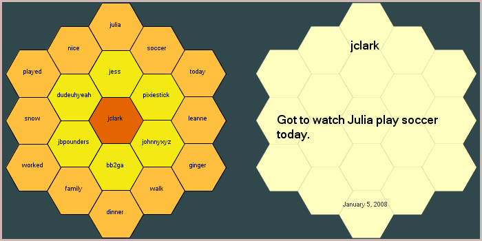
In the example image the central hex on the left shows a particular user, in this case it's me - jclark. The outer hexes show the words most commonly used in my recent entries: julia, soccer, today, leanne etc. The middle ring of hexes on the left are the other users that most often used these same words in their entries. If you mouse over a user hex the right-hand area shows a random entry from that user. If you mouse over a word hex the right-hand area shows a random entry containing that word. You can click on a word or user to make it central.
You can try out the navigator by itself below or visit ButterBeeHappy.com to sign up yourself !
(More...)
South Carolina Democratic Debate
By: Jeff Clark Date: Tue, 22 Jan 2008
I have added the transcript for the South Carolina Democratic debate held on January 21, 2008 to the interactive Transcript Analyzer.
Democrat Debate - Jan 21st, 2008

Here are a few simple patterns that I noticed:
- The first phase of the debate covered the topic of the economy, taxes, and poverty
- After this there was a long fragmented exchange between Clinton and Obama that included many references to Reagan
- Edwards finally jumped in with some substantial segments but this was followed up by another long Clinton-Obama exchange
- This led into a section where Clinton and Edwards attacked or questioned Obama over his pattern of voting 'present'
- Health care was the next major topic and occurred during the middle of the debate
- This was followed by discussion of war and Iraq
- Then a segment devoted partially to poverty, gender, race, and health
- A section near the end was devoted to lobbyists and McCain
Digg Election Story Analyzer
By: Jeff Clark Date: Mon, 14 Jan 2008
I have just posted another tool to my projects section. This one is called the Digg Election Story Analyzer and shows the trends in word usage over time and word associations for stories that reached popular status in the Digg US Elections 2008 topic. The tool loads the latest 500 popular stories and analyzes the text found in the story titles and descriptions. An 'attention timeline' and tag clouds of related words are then displayed.
Here are a couple of images to give you a taste. Of course, it's always more fun to just give the Digg Election Story Analyzer a try!
Transcript Analyzer Update
By: Jeff Clark Date: Sun, 06 Jan 2008
I have updated the Transcript Analyzer so that you can view different transcripts. Both the Democrat & Republican debates in New Hampshire on January 5th are available. There are two other debates as well.
Democrat Debate - Jan 5th, 2008
Republican Debate - Jan 5th, 2008
These images are a little compressed compared to the actual application but a few things still immediately jump out at me:
- The Republican debate was characterized by more shorter exchanges between participants than the Democrat debate
- 'health' was discussed pretty heavily in both
- 'immigration' was discussed in the Republican but not the Democrat debate
- During the Republican debate Romney had rapid-fire exchanges with Paul, then Huckabee, Thompson, McCain, and finally Guilani. No other candidate showed the same pattern.
Top Posts for 2007
By: Jeff Clark Date: Mon, 31 Dec 2007
Here are the top ten posts on Neoformix that were visited the most often by people during 2007. All but two of them (6 and 9) are interactive applications written in Java/Processing and allow you to explore some data or create an interesting image.
Thanks to everyone who visited the site over the year, especially those who sent me feedback or linked to my content. Best wishes to everyone and may you have a happy, productive, and interesting 2008 !


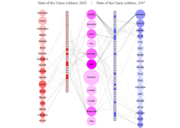
Text Snowflake Creator
By: Jeff Clark Date: Mon, 17 Dec 2007
Like lots of people this time of year I've been thinking about snow. Actually more than thinking - I've been shovelling it, walking in it, driving in it, and playing in it. My latest Text Toy stays with the snow theme. It allows you to generate snowflake-like graphics from a few words or phrases.
Check out the interactive application for the Text Snowflake Creator. You can enter your own text to generate images like:
Lot's of people have been having fun with the Big Small application I posted a couple of weeks ago. In fact, I've had a couple of days with more than 25,000 pageviews. Not too bad for such a simple application !
Digg Story Graph
By: Jeff Clark Date: Fri, 07 Dec 2007
The information provided by the Digg API is quite rich and very relevant to the community of Digg users. I've created a second visualization using the API, this one focussed on the relationships between the latest popular stories. The Digg Story Graph is an interactive visualization that shows the relationships between recent popular stories on Digg through the use of node and link diagrams. Stories can be visually connected through shared vocabulary, common topics, domain, submitter, or date submitted.
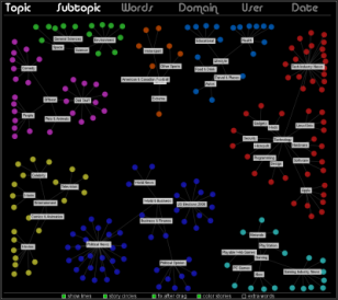
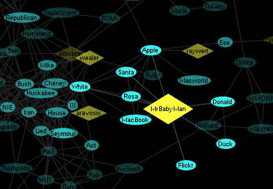
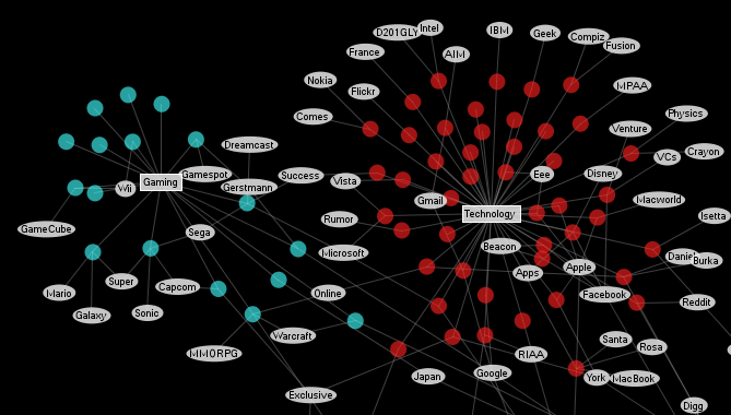
There is also a large version of the Digg Story Graph available. It requires 900x800 pixels for proper display and a decent CPU for good responsiveness. The smaller version shows the 100 latest popular Digg stories. The larger version will show 200 and support more word nodes.
Give it a try !
I survived the Digg Storm
By: Jeff Clark Date: Tue, 04 Dec 2007
My Digg Explorer has attracted some attention of late culminating in it reaching the front page of Digg late last night. In the span of a couple of hours it received about 5,600 views, and reached a total of more than 7,000 views for the day. To put this in perspective, it's more than my site usually gets in a month. The application and my server handled the load with no trouble and remained very responsive throughout.
I did have a little bit of excitement when Digg decided to add new features to their site immediately before my app went popular. I was a little concerned they might break my application but the only impact was that two new top level categories had no predefined colour and appeared white. Within a few minutes I added colours for the new categories and had it posted to my server.
Thanks very much to everyone who dugg my little application, especially Reg 'Zaibatsu', Muhammad Saleem, and Andrew Sorcini who really got things rolling yesterday. I would also like to thank Stan Schroeder for the write-up in mashable - Beautiful Digg Tool Provides Wealth Of Interesting Data. Thanks also to Daniel Burka, the creative director at Digg, and Tom Carden of Stamen Design for triggering the attention I got within their organizations. Stamen partnered with Digg to produce the very popular Digg Labs visualizations of Digg data.
Big Small Application
By: Jeff Clark Date: Mon, 26 Nov 2007
I have posted the interactive application called Big Small in my projects section. Now you can enter your own text to generate images like:
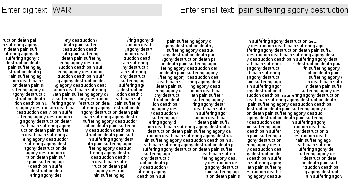
Big Small
By: Jeff Clark Date: Fri, 23 Nov 2007
Something big made from something small. This is a simple static image from my latest Processing experiment.

Digg Explorer v1.1
By: Jeff Clark Date: Wed, 21 Nov 2007
I have added a new graph of the top Users to the Digg Explorer. I also fixed a bug in the domain parsing logic.
Digg Explorer
By: Jeff Clark Date: Tue, 20 Nov 2007
This is a tool for exploration of the 500 most popular recent stories from Digg. Visually it is very similar to my recent Race Results Analyzer in that it uses small circles to represent items of interest which are fluidly positioned in various ways to emphasize patterns of interest.
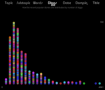
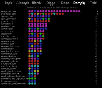
Have a look at the Digg Explorer.
Race Results Analyzer
By: Jeff Clark Date: Wed, 07 Nov 2007
I ran another race this past weekend, this time a 10K. The race results are online in a simple tabular format provided by SportsStats. The data set is fairly rich and contains an athlete's name, city , age bracket, gender, and time. I have created a little tool to help explore this type of data. Some sample graphs are shown below.

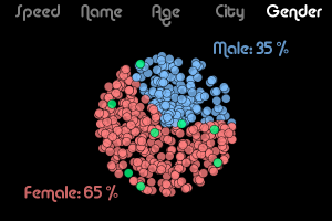
The little circles represent athletes: red for women, blue for men, and green for selected. You can click on any circle to select it (or de-select if already selected). You can also click and drag the mouse to change the selection status of everything within the selection rectangle. The little circles smoothly transition from their old to new locations when a new graph type is chosen.
Give it a try !
(More...)
Transcript Analyzer
By: Jeff Clark Date: Fri, 02 Nov 2007
Transcripts or scripts can be very rich data sets if you are comfortable with writing code to analyze text. I have created an interactive Transcript Analyzer for exploring the transcript of the recent Democratic debate in the US. One thing I focussed on was to illustrate 'who said how much and when'. I noted this as a weakness in the NYT tool in my earlier post.
Refer to the image below. The top section shows the distribution of some selected words within the text across a 'timeline' which goes from left to right. Each speech segment is the same width and the height of the small white bars show the number of occurences of that word for that segment. You can add new words with the text box in the top right corner or you can remove existing words by clicking on them.
Right below the word distribution graphs is a similar coloured set showing a spectral decomposition of the text based on who spoke and how much was said. In this case the bar heights give the amount of text for each segment. Click and drag the mouse left to right to move along the timeline and show the actual text for 3 consecutive segments. Mousing into this lower region will cause the blocks to expand and show more text.
image only - click here for interactive version
I think the separated or spectral timeline might be an effective approach to showing this kind of information. From the display in the image above we can glean:
(More...)
NYT Transcript Analyzer
By: Jeff Clark Date: Fri, 02 Nov 2007
The New York Times has produced an interactive transcript visualizer that allows exploration of the transcript for the recent Democratic debate in the US. It shows word count by speaker with a simple bar graph and illustrates the size of the various speech segments with a multi-strip rectangular region. It also supports highlighting a search term within the transcript. The tool doesn't do a great job of showing who spoke when. I would also like to see the capability of highlighting multiple search strings in the display. On the whole, I think it is quite well done.
[Link discovered via the open house project]
Election Visualization
By: Jeff Clark Date: Wed, 31 Oct 2007
Patrick Dinnen over at Hogtown Consulting has produced an interesting visualization of election results. It's an interactive application built using Processing, my favourite toy of the moment. Currently the data used is for the Ontario 2003 election but the idea could, of course, be applied more generally.
I did have trouble running the application using IE 7 on Win XP - it shows a tiny window rather than the desired size but it works fine for me using Firefox.
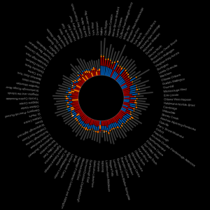
Electricity and Oil Consumption
By: Jeff Clark Date: Tue, 30 Oct 2007
Here are a couple of simple bar charts showing which countries consume the most electricity and oil per person. I only included countries with more than 1 million people in the analysis. The data comes from the CIA World Factbook.
This first one shows the top countries for electricity consumption per capita. The top countries are mostly rich and cold with the exception of some oil-rich nations.
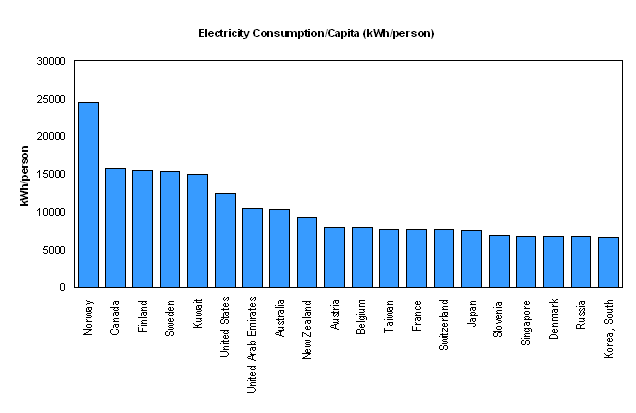
This second graph shows the countries having the highest per capita consumption of oil. Some heavy oil producers show up (Kuwait, UAE, US, Canada ) as well as some smaller highly developed countries (Singapore, Hong Kong, Taiwan).
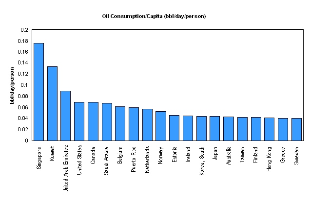
I Ran a Half Marathon
By: Jeff Clark Date: Tue, 16 Oct 2007
One of the reasons I haven't been posting much lately is that I was training for a half-marathon. Running about 40 miles a week does tend to cut into your free time for other activities. As a solitary sport it was possible to squeeze it in here and there without too much impact on the time I value so much with my family.
I ran the Toronto Half Marathon this past Sunday. It went pretty well - no rain, nice and cool, no blisters, no serious pain, and I ran it a bit faster than planned. My final time was 1:48:33 and I finished 813th out of 3494 competitors. Not bad for my first try. I'm feeling pretty good after the race although walking down stairs is a bit of a problem. On the whole it has been a very rewarding experience.
Here is a picture taken by my daughter with perfect timing at the finish. The second graphic has some information provided by runpix. I like the little finish line visualization - in the live version you can hover over the dots and get details about who the people were that finished around you. The runners all wear timing chips so they have all these details available.
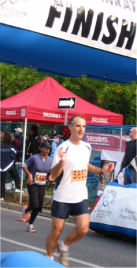
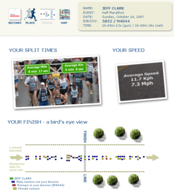
Jury Duty
By: Jeff Clark Date: Tue, 16 Oct 2007
Another reason I haven't been posting much lately is that for the last month I have been a member of a jury for a criminal trial. We arrived at our verdict last week and found the defendant guilty of 5 separate charges, the most serious of which was impaired driving causing death.
It was strange and difficult having responsibility over a decision that would have such a large impact on a person as well as his family and friends. It was also difficult hearing and seeing, day after day, all the detailed words and images related to such a tragedy. The person killed in the accident was a good friend of the accused so our verdict found the driver criminally responsible for the death of his friend. I certainly felt some sympathy for the man but our decision had to be based on evidence only - 'without sympathy or prejudice'. I'm thankful that our duty did not include any sentencing.
It was certainly an emotionally powerful experience - one that I will never forget. I take away a great many positive things including a stronger appreciation for my own personal freedom and newfound respect for our law enforcement and judicial systems in Ontario, Canada. However, I think the most positive aspect of the whole experience for me were the other people that served with me as members of the jury. The fact that 12 randomly selected people, of various ages, from all walks of life, would turn out to be so intelligent, friendly, funny, and supportive has made a deep impression on me.
Language Family Radial Treemap
By: Jeff Clark Date: Sun, 09 Sep 2007
Anil Dash has a short post pointing out an interesting graphic that illustrates the relationships between Indo-European languages. It's from the American Heritage Dictionary of the English Language and is a variation on the Radial Treemap idea I described last year.

Democracy Index Graphs
By: Jeff Clark Date: Sat, 08 Sep 2007
A couple of weeks ago The Economist published a report giving a 'Democracy Index' for the various countries of the world. It's an interesting set of data but the various references to it that I saw only included short lists of the top and bottom ranked countries. I have created a few graphs that might prove interesting based on this information plus some other data from the CIA World Factbook.
This first graph shows the number of countries having a democracy index in the given range. I counted how many were in each .5 sized bucket. For example, the first bar shows that there was only 1 country (North Korea) with index in the range 1.0-1.5 .
The second graph shows the number of people living with a democracy index in the given range. The large spike at 2.5-3.0 is due to China and the one at 7.5-8.0 to India.
The fact that the top ranked countries are all relatively small (Sweden, Iceland, Netherlands, Norway, Denmark...) is suggestive that perhaps there is a relationship between size of country and the level of democracy. This third graph is a scatterplot of the democracy index vs the population for each country. The population is on a log scale because of the huge variation in country size.
(More...)
Word Trees from Many Eyes
By: Jeff Clark Date: Sun, 02 Sep 2007
I don't believe that I've mentioned yet the excellent resource Many Eyes. It was created by IBM's Visual Communication Lab. In their words:
We believe that visualizations gain power when multiple people use them to communicate, and that communication gains power when multiple people can visualize and explore information together. We want to democratize visualization, enabling anyone on the internet to publish powerful interactive visualizations and start their own data conversations. Many Eyes is designed to bring that power to you.The Visual Communication Lab was created by the brilliant Martin Wattenberg and includes the amazing Fernanda Viegas and this product of the lab shows the quality of the people behind it.
The latest style of visualization unveiled at Many Eyes is called a Word Tree which is a method to visualize the different contexts that a word or phrase presents within a body of text. The example below shows an analysis of the phrase 'young king' in 'The Compleat Grimm Fairy Tales'. Click on the image to see the live visualization which lets you easily navigate to other words or phrases.
Home Planet Defense
By: Jeff Clark Date: Fri, 24 Aug 2007
Introducing Home Planet Defense ! It's a strategy game where you build and upgrade bases to protect your home planet from alien ships. I hope you have as much fun playing it as I did creating it !
Shared Word Diagram Fix
By: Jeff Clark Date: Fri, 01 Jun 2007
I have fixed a problem in the Shared Word Diagram application. If the relative frequency of the words in one column was much less than that in another then you would see a large number of words overlapping that were impossible to read. It's changed now so that there is a minimum spacing in such situations so that the words are readable. This makes the tool much more useful for comparing differrent versions of the same document.
Thanks to Stewart McKie for pointing out the problem. Check out his site scriptcloud which lets you create content clouds from a screenplay.
Shared Word Diagrams
By: Jeff Clark Date: Sun, 27 May 2007
I have just posted another application for exploring the structure of text documents. This one lets you compare and contrast two documents by showing both the unique and shared vocabulary and the distribution across the documents. Here is an example static image:
The two columns of squares represent the two documents. The longest document will be shown with 50 segments. In this case, the rightmost blue column is the larger of the two and represents the American State of the Union Address for 2007. The trivial (stop) words were discarded before analysis. For this example the topmost square segment covers the first 51 words of a document, the second segment the next 51 etc.
The leftmost column of word circles show the high frequency words that are present in document 1 (State of the Union 2002) but are not present at all in the second document. The rightmost column of words show those unique to the second document and the central column has the words common to both. The bigger the circle the more frequent the word. The circles are ordered in each column by average position of the word in the documents where they appear which roughly minimizes the number of connection crossings.
Hovering over a word (in the interactive application, not this static image), in this case 'terrorists', will show which segments of the documents contain the word. Darker connecting lines indicate more occurences in that segment. It will also highlight with colour the other words occurring in the same segments. So, for this example, we can easily see that:
- The word 'terrorists' occur in both documents
- It occurs right at the beginning of the speech in 2002 and spans the first third
- It is spread out over the middle third in 2007
- In 2002 it is associated with the words: thousands, camps, destruction, trained, training, mass, threaten, throughout, and Islamic
- In 2007 it is associated with: local, success, Middle, East, Shia, extremists, safe
- In both speechs it is associated with: war, America, country, world, iraq
The interactive application is available here for Shared Word Diagrams. This version lets you enter your own text for analysis - see the form at the bottom of the application. Have fun and let me know if you discover any especially interesting examples.
Arbitrary Text in Document Arc Diagrams
By: Jeff Clark Date: Thu, 03 May 2007
There is a new version of the Document Arc Diagram tool that allows anyone to enter their own text and generate diagrams. Visit the project page, fill in the form in the bottom of the page, and press the button. Have fun !
Interactive Application for Document Arc Diagrams
By: Jeff Clark Date: Sun, 29 Apr 2007
I have posted the interactive application for Document Arc Diagrams. There are 10 documents available for analysis at the moment. I hope to allow processing of arbitrary user text within the week.
Document Arc Diagrams
By: Jeff Clark Date: Sat, 28 Apr 2007
I have written before about Martin Wattenberg's Arc Diagrams for visualizing structure within strings. They are an intriguing way of visualizing repetition at varying scales within a linear sequence. When applied to music they produce beautiful images that illustrate the structure. I noted that for most narrative text these diagrams likely wouldn't work very well because of the lack of regular repetition but that it might be fruitful to explore some lower dimensional derived feature of the text.
In my recent exploration of ways to visualize arbitrary text documents I tried out something visually inspired by Wattenberg's Arc Diagrams. Rather than using arcs to connect identical patterns within a document I'm connecting instead segments that contain similar words. Here is the algorithm:
- break the document up into a stream of words
- throw away any 'stop words' (a, at, of, the ...)
- divide the remaining stream of more interesting words into 50 equal segments based on linear position
- calculate a similarity metric between each pair of segments based on the amount of overlapping words
- draw a diagram where the document segments are connected by arcs with the transparency determined by the similarity between the segments. Use a threshold so that weakly connected arcs don't get drawn at all.
- show the top two words for each arc drawn at both segment endpoints
Update:The interactive application is available now for Document Arc Diagrams.
Here are a few sample diagrams:
Despite the arbitrary nature of the segmentation the technique appears to reveal some aspect of the document structure in a visually interesting manner. In Alice in Wonderland, for example, it shows what appears to be four distinct scenes present in the last half of the text. The third is highlighted in orange and has as high frequency words Alice, Mock, Turtle, and Gryphon. The third example is for the lyrics of a song and shows darker lines because the similarity between segments is stronger. There are also regular patterns that repeat multiple times which isn't surprising for song lyrics. It would be interesting to use a line-based or syllable/phoneme-based segmentation for song lyrics rather than the simplistic approach taken here.
I will post an interactive application soon that will let anyone explore a fixed set of documents.
Database Of Information Graphics
By: Jeff Clark Date: Sat, 14 Apr 2007
I recently came across an interesting searchable database of information graphics built by the Parsons Institute for Information Mapping. The database contains over 1200 examples of information visualization images. Their stated goal is to build the most comprehensive, manually annotated (and taxonomically classified) information graphics database in the world.
Here a few sample images taken from the results of the search for graph:
 |  |
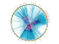 |  |
 | 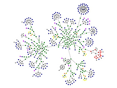 |
(More...)
A Text Visualization Tool
By: Jeff Clark Date: Thu, 22 Mar 2007
The idea of an interactive tool to explore the structure of a text document has always intrigued me. Visually highlighting key terms from a document and the relationships between them might be an effective way to gain new insights. I have been playing around for a while creating such a tool and have decided it's interesting enough to show here. There are quite a few things I don't like about it but I'm going to set it aside for a bit.
I don't like to embed java applications directly in my feed so the real application can be found farther down this post - the part that you have to read directly on my site. Here is just an image:
(image only - the interactive application is farther down)
The top left set of connected circles represents a partial view of a graph showing inter-relationships between words. There is a central ring of the primary words of interest and a secondary outer ring of some other words related to the central set. Click on an inner word to remove it from the central ring. Click on an outer word to add it to the central ring. In either case the words on the secondary ring are dynamically adjusted to show the 'most important words' related to the central set. The strength of the connections between the inner words and all the others are shown with simple lines. You can also hold down the number '1' key while clicking to make that word the only central word.
The top right shows a collection of bar graphs giving the distribution of the primary words across the entire document. Underneath it is a small map showing the distribution of the words across the entire document. The bottom right gives a list of other interesting words that aren't already in the circle diagram. By 'interesting' I mean high frequency but modified so that capitolized words are boosted. These words can be clicked on to add them to the central diagram. The bottom left gives excerpts for the word last hovered over. There are 5 or 6 files you can explore by clicking on the upper left '?' icon.
Give it a try !
(More...)
An Interactive Word Graph
By: Jeff Clark Date: Sun, 04 Mar 2007
I have borrowed some aspects of the visual design of Elastic Tag Maps for a new interactive version of a word frequency graph. Here is a simple image of the results in case you have trouble running the java application. It shows a word graph for the 2007 State of the Union Address that I used as an example in Word Frequency Graphs. This time, however, I've done away with the ellipses and only draw the connections when you hover over a node.
(image only - the interactive application is farther down)
(More...)
Elastic Tag Maps
By: Jeff Clark Date: Sat, 03 Mar 2007
I mentioned in Optimal Representation of Text Documents that a tag cloud can be used to illustrate high frequency terms in a document but doesn't show any real structure of that document. One way to improve this is to position the tags in a cloud so that tags which are used together in the document appear close together in the cloud. Tag clouds usually show their terms in alphabetical order or are sometime sorted in increasing order of frequency.
Moritz Stefaner at Well-formed data.net has developed something he calls Elastic Tag Maps which have the property of related tags being positioned near each other. In his words:
Tag clouds are ordered the wrong way: Tags denote concepts. As such, they have meaningful relations to each other. Tag clouds are ordered alphabetically or by size - it would be much more effective, if tags that belong together could also be presented together. Some of these relations can be deduced automatically, by observing how tags are used: Some tags might always appear together, others sometimes and others never. If tags co-occur frequently or have many common 'neighbors', you can be sure the concepts denoted will be related in some manner.
Here is an example of his that gives the idea. It's interactive so be sure to play with it to get the full effect.
(More...)
State of the Union Project
By: Jeff Clark Date: Sun, 18 Feb 2007
In my last post I used the text of this years State of the Union address as an example. Brad Borevitz has created an interesting visualization of the entire corpus of the State of the Union addresses from 1790 to 2007.
You can see which specific terms are more prominent in a given address relative to the entire corpus. The horizontal position of the words on the graph give the average position within the specific address being viewed. You can compare any two documents or see a great many statistical details about specific terms. It's certainly an intriguing application.
Word Frequency Graphs
By: Jeff Clark Date: Sat, 17 Feb 2007
Here is a rough attempt at illustrating the meaning of some text with an automatically generated diagram.

Even without an understanding of how the document was constructed much can be understood from the words that are present. A quick glance at some of the words in the bigger ovals suggests a rough idea of the topic: america, iraq, help, health, congress. The connections between some of the words give more hints: federal-government, health-insurance, fight-enemy, american-forces, united-states, ask-congress, qaeda-terrorists, iraqi-security. Notice how my brain ordered them in the way that makes the most sense, united-states rather than states-united, even though no direction is evident in the diagram connections.
The text this diagram was based on obviously includes information related to the american government and the security situation in Iraq. The fact that 'health-insurance' is prominent together with the presence of other terms like 'children' and 'congress' suggest the document wasn't focussed exclusively on the situation in Iraq. In fact, this diagram was constructed from a transcript of the 2007 State of the Union address.
(More...)
Optimal Representation of Text Documents
By: Jeff Clark Date: Thu, 15 Feb 2007
Given a text document, what is the 'best' way to concisely represent the content within say - a 600x600 pixel region ? One procedure that would probably give good output is this:
- Find a person with excellent knowledge of the document topic and extraordinary literary skills
- Have them read and ponder the document and a set of related documents
- Give them lots of time to formulate a summary short enough to be easily legible within the 600x600 pixel space constraints
- Have it read by many people with varying degrees of knowledge of the domain and literary ability
- Pass the feedback from this sample of readers back to the summary author
- Let the summary author adjust the summary if she wishes
- Iterate over steps 4-6 until the author is content
This would be a time-consuming and expensive option. What is the best automated way to solve the same problem ? Perhaps software that reads the text and automatically produces a summary ? I don't have any experience with the state-of-the-art in auto-summarization but I suspect it often doesn't work very well.
How about tag clouds of the most frequent non-trivial words ? They would highlight high-frequency words but don't show any real structure within the document. I'm sure we can do better.
I suspect software that detects named entities (people, places, organizations, products etc) might be a useful component of a solution. Perhaps something that creates a diagram illustrating the key entities and relationships between them would be useful.
Any ideas ?
In Defense of Pie Charts
By: Jeff Clark Date: Sun, 14 Jan 2007
My recent post on Boing Boing featured an example Multi-level Pie Chart. Michael Janssen has written an interesting post entitled Learned Bad Ideas that was prompted by his reaction to the graphic. As you can likely guess from the title of his post he didn't like it very much.
Michael starts with some discussion of bar charts and the fact that they are great for comparing the relative size of different quantities. No argument there. He then discusses Pie Charts which includes -
"Pie charts are the bad seed of the graph world. They aren't very useful, hang out a lot, and don't help you much. The worst thing about pie charts is that they aren't even good at the thing they're supposed to be the best at: comparing relative sizes."
He isn't alone here. For many reasons they are often rejected outright by people with education in information design. The words of Edward Tufte carry a lot of weight:
"Tables are preferable to graphics for many small data sets. A table is nearly always better than a dumb pie chart; the only thing worse than a pie chart is several of them, for then the viewer is asked to compare quantities located in spatial disarray both within and between pies - Given their low data-density and failure to order numbers along a visual dimension, pie charts should never be used."
- The Visual Display of Quantitative Information, pg. 178
I have a great respect for Tufte and a lot of sympathy for this perspective. Yes, people have difficulty comparing angular regions, yes, Pie Charts are over-used in the business world, yes, they have very low data-ink ratio, and yes, a simple table showing the data is often much better. However, I disagree that they should never be used. I disagree also with Michael's assertion that Pie Charts are supposed to be best at comparing relative sizes.
I think, rather, that Pie Charts are best at visually illustrating the proportion of a part in relation to the whole.
They are the visual analog of the mathematical concept of percent. Look at the following bar chart:
Can you easily tell what fraction of the whole is represented by A (red) ? Sure, with the scale present, and even
without it you can figure out that the red bar is roughly half of the total. But is it immediately obvious ? I don't
think so. Not nearly as obvious as it is in the pie chart for the same data:
The circle is the natural design element that best represents the whole so it shouldn't be surprising that a pie chart is a good way to illustrate the proportion of a part in relation to that whole. A 4 year old child can tell you that red has the most and is about half of everything by looking at this chart. The same child can tell red is the biggest in the bar chart - even more easily in fact. I'm not disputing that relative quantities can be more easily compared with length than with angles. However, I don't think many 4 year olds would be able to figure out from the bar chart that the red is about half of the total.
Pie charts are also immune to the distortion caused by a change in scale. With bar charts it's easy to lie
(or to put it differently - emphasize the variability in the data rather than the true proportion) by changing the scale.
This chart uses the same data as the other two but visually exaggerates the difference between red and the other categories.
With bar charts you also can't be sure that all the data is visible. What if there are bars chopped off on the right ? You can't
tell. The visual constraint imposed by the circular form of the pie chart insures that you notice if this occurs.
(More...)
What's a Link From Boing Boing Worth ?
By: Jeff Clark Date: Thu, 11 Jan 2007
I was very happy to recieve a link from Boing Boing this past Monday. Thanks for the enthusiastic entry Xeni !
For those of you curious about such things here is a simple graph of my pageviews for this week. The 8th was of course the day I got the link from Boing Boing. I recieved roughly 10,000 pageviews over the course of 3 days from their link. The graph also includes a non-negligible amount of traffic from stumbleupon.com directed at my recent post on Carl Sagan. The Boing Boing traffic tailed off pretty quickly almost back to normal levels for me after a few days.
Boing Boing 2006 Domain Links
By: Jeff Clark Date: Sun, 07 Jan 2007
I've taken a look at the outgoing links from Boing Boing over the course of 2006. The total number of outgoing links is 22,714 and these are distributed across 8,081 unique domains. This astounding breadth of sources goes a long way to explaining the great diversity of material on the site. They truly are a directory of wonderful things.
The following table shows the top 25 'high-level' domains (not counting Boing Boing itself):
| Rank | Domain | Links | % |
| 1 | blogspot.com | 818 | 4.0% |
| 2 | flickr.com | 635 | 3.1% |
| 3 | amazon.com | 498 | 2.5% |
| 4 | wikipedia.org | 475 | 2.3% |
| 5 | youtube.com | 390 | 1.9% |
| 6 | google.com | 258 | 1.3% |
| 7 | wired.com | 253 | 1.2% |
| 8 | makezine.com | 225 | 1.1% |
| 9 | typepad.com | 211 | 1.0% |
| 10 | nytimes.com | 186 | 0.9% |
| 11 | eff.org | 167 | 0.8% |
| 12 | craphound.com | 165 | 0.8% |
| 13 | bbc.co.uk | 164 | 0.8% |
| 14 | npr.org | 156 | 0.8% |
| 15 | livejournal.com | 136 | 0.7% |
| 16 | cnn.com | 123 | 0.6% |
| 17 | xeni.net | 110 | 0.5% |
| 18 | yahoo.com | 107 | 0.5% |
| 19 | tinynibbles.com | 94 | 0.5% |
| 20 | neatorama.com | 93 | 0.5% |
| 21 | blogs.com | 92 | 0.5% |
| 22 | digg.com | 85 | 0.4% |
| 23 | iftf.org | 76 | 0.4% |
| 24 | chaoskitty.com | 75 | 0.4% |
| 25 | worth1000.com | 69 | 0.3% |
Together these top 25 domains account for about 28% of all the outgoing links from boing boing - again excluding the links to their own site. Note however that several of these are actually weblog hosting domains and really represent many distinct sites. For example, the domain blogspot.com actually represents 407 distinct weblogs. The top 25 blogspot sites are:
| Rank | Top Blogspot Sites | Links |
| 1 | positiveapeindex.blogspot.com | 46 |
| 2 | reversecowgirlblog.blogspot.com | 33 |
| 3 | bibliodyssey.blogspot.com | 17 |
| 4 | johnkstuff.blogspot.com | 17 |
| 5 | hooptyrides.blogspot.com | 13 |
| 6 | hubber.blogspot.com | 12 |
| 7 | easydreamer.blogspot.com | 10 |
| 8 | swapatorium.blogspot.com | 10 |
| 9 | jollysocratic.blogspot.com | 10 |
| 10 | bbemporium.blogspot.com | 10 |
| 11 | upgradetravel.blogspot.com | 10 |
| 12 | watchismo.blogspot.com | 9 |
| 13 | spluch.blogspot.com | 9 |
| 14 | izreloaded.blogspot.com | 9 |
| 15 | musicthing.blogspot.com | 8 |
| 16 | bldgblog.blogspot.com | 8 |
| 17 | dannysland.blogspot.com | 7 |
| 18 | mazenkerblog.blogspot.com | 6 |
| 19 | dooooooom.blogspot.com | 6 |
| 20 | todaysinspiration.blogspot.com | 6 |
| 21 | operationeden.blogspot.com | 6 |
| 22 | indiauncut.blogspot.com | 5 |
| 23 | recordingindustryvspeople.blogspot.com | 5 |
| 24 | jergames.blogspot.com | 5 |
| 25 | nfttu.blogspot.com | 5 |
Similarly, the typepad.com domain represents 77 distinct sites, livejournal.com 75, and blogs.com 21. This suggests that the real top 25 distinct sites covers less than 28% - probably more like 22% with the most common, flickr.com yielding only about 3%. This is truly a long tail distribution.
(More...)
Scoble Weblog Analysis
By: Jeff Clark Date: Sun, 07 Jan 2007
If you are interested in my analysis of Boing Boing you might find it worthwhile to check out this analysis of Robert Scoble's weblog. It was done by a young man named Yuvi in India. He focused primarily on which domains were linked to within Scoble's site. This is something I haven't explored yet with the Boing Boing data but seems like a good idea. Well done Yuvi !
Boing Boing 2006 Statistical Analysis
By: Jeff Clark Date: Sat, 06 Jan 2007
I have redone some of the more interesting parts of my analysis of the weblog Boing Boing using all of their posts from 2006. It was easy for me since I already had the code to harvest and analyze the data and I was curious about the trends.
This first graph shows a simple time series of the total number of words published over time. It shows a pretty obvious peak around March-April 2006 with a drop-off towards the end of this year back to the productivity level seen in 2004-2005.
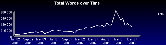
The second graph shows the breakdown by author over the same period. It shows quite clearly that the peak described above was not due to a particular author - each of them had their highest productivity around that same period.
Let's look more closely at the 2006 time frame. There is obviously a great deal of fluctuation including some obvious periods of inactivity for some of the authors. Cory at the end of the year, Xeni in June and late November, David for a short time at the end of April, and Mark for a short time in mid-October.
(More...)
Carl Sagan
By: Jeff Clark Date: Wed, 20 Dec 2006
Today is the 10th anniversary of the passing of Carl Sagan. Many people are posting about Carl and the impact he has had on their lives so I thought I'd join in with my own thoughts.
When I was a boy of 12 years I read Sagan's Dragons of Eden: Speculations on the Evolution of Human Intelligence. It was heady stuff for me at the time - cosmology, evolution, the nature of intelligence, DNA, and on and on. I knew a little bit about most of these things but to see it all interwoven and presented in such a clear fashion was a revelation.
One thing that still stands out in my memories of the book was the whole idea of brain/body mass ratio and the relationship to 'intelligence'. The idea of measuring physical characteristics, combining them mathematically in a sensible fashion, and relating them to something so abstract made a deep impression on me at the time. The following graph from the book has been stuck in my head ever since.
I went on to read Broca's Brain: Reflections on the Romance of Science and probably most of his other non-technical writings. He was an extraordinary popularizer of science and he strongly influenced my lifelong interest in science. Thanks Carl.
EagerEyes
By: Jeff Clark Date: Sat, 16 Dec 2006
I've just stumbled across EagerEyes and found lots of interesting discussion and examples about data visualization. The post that caught my own eager eyes was about this image:
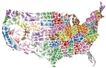
The author, Robert Kosara, describes it like this:
What would happen if you were to connect all the ZIP codes in the US in ascending order? Is there a system behind the assignment of ZIP codes? Are they organized in a grid? The result is surprising and much more interesting than expected.
There is lots of great content here and links to several more interesting blogs that were new to me also.
TileBars
By: Jeff Clark Date: Thu, 30 Nov 2006
TileBars are small rectangular graphics that represent documents and illustrate the frequency and distribution of sets of related terms across the documents. The concept was developed in the 90's by Marti Hearst, currently at UC Berkeley.
Here is an example:
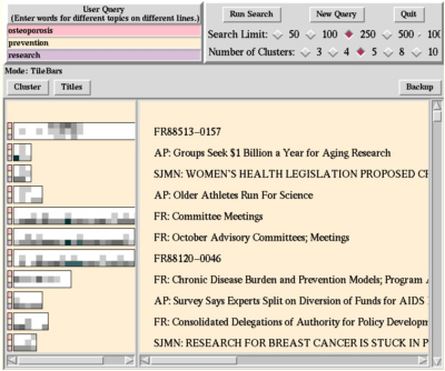
The differing lengths of the bars illustrate the relative lengths of the documents and each row of small squares
is shaded to show the frequency of the corresponding termset in that region of the document. In Marti's words:
The goal is to simultaneously and compactly show:
- the relative length of each retrieved document,
- the frequency of the topic words in the document, and
- the distribution of the topic words with respect to the document and to each other.
I like this idea but it hasn't seemed to have made it's way into popular use.
Digg Topic Popularity over Time
By: Jeff Clark Date: Mon, 13 Nov 2006
The social content website Digg publishes a comprehensive archive of the stories that reached 'popular' status on the site. This archive extends back until December 2004 and includes the subtopic assigned to the story and the current number of Diggs. I have done some analysis of the data for the period Jan 2005 to the end of Oct 2006 and have produced several graphs illustrating the evolution of topic popularity over time.
This first graph shows how many popular stories there were for the various top level topics. The timeframe was subdivided into 24 equal buckets so the measure on the vertical axis represents how many popular stories there were from that topic in a time period slightly less than a month (22 months of data / 24 periods ~= 28 days). The two obvious features of this first graph are the dominance of technology stories over time and the addition of the World and Business, Videos, and Sports topics in mid-2006.
Now we examine the various subtopics in the technology topic over time. We see that the general tech_news category is a sizable fraction of the total and that apple and design have shown strong recent growth.
(More...)
Weblog Link Explorer
By: Jeff Clark Date: Tue, 24 Oct 2006
 I have been playing around with Processing and
Technorati data and have constructed a small application for
exploring the links to a weblog.
I have been playing around with Processing and
Technorati data and have constructed a small application for
exploring the links to a weblog.
See the small image to the right for an example. The central circle is the weblog of interest and all but one of the surrounding circles are weblogs that link to it. The top yellow circle is the weblog previously at the central point - note that the arrow direction is reversed since the arrow shows the link direction. Hover over the outer circles to see the excerpt containing the link. Click on the outer circles to visit those weblogs in a browser window or click on the arrows to change the central weblog of interest. You can also use the entry field at the top to enter an arbitrary weblog to focus on. The little red bars show the authority of the weblog - more red means a greater number of other weblogs that link to it.
Enough with the words - give it a try !
(More...)
More Topic Flowers
By: Jeff Clark Date: Sat, 14 Oct 2006
I have created a few more example Topic Flowers for some popular weblogs. I used the weblog text from each site as of Oct 14th. The colour legend and rules for interpretation are shown at the end of this post.
 | Scobleizer |  | Drawn! The Illustration and Cartooning Blog |
 | lifehacker |  | The Huffington Post |
 | Daily Kos |  | blog maverick |
 | Science Blog |  | Boing Boing |

(More...)
Interactive Reddit Story Graph
By: Jeff Clark Date: Tue, 10 Oct 2006
Just for fun I've created a visualization of articles submitted to Reddit. It presents a dynamic graph starting from the 'hottest' stories of the moment and lets you build up a more complex structure by adding related stories.
Rectangles represent articles and each one has a circle connected to it that shows the user name of the person who submitted it. You can add new articles to the graph related to an existing one by hovering over it and clicking when it is expanded. You can also add more submitted by a given user by clicking on user nodes. A right-click (or space bar) on an expanded article will open that document in a new browser window. Dark red stories have a high Reddit score and white stories a low score.
(More...)
Mapping the Blogosphere
By: Jeff Clark Date: Tue, 19 Sep 2006
I've enjoyed reading Data Mining by Matthew Hurst since before I started blogging myself. He has lots of excellent content in the domains of data mining, computational linguistics, and visualization. Here are a couple of his graphs representing tribes in the blogosphere. These and many more interesting visualizations can be found in his graphs category.
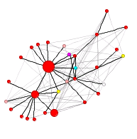
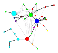
Characteristics of Top Reddit Submissions
By: Jeff Clark Date: Mon, 18 Sep 2006
Most of you have probably seen the website Reddit. Basically, it allows people to submit links which are subsequently voted up or down by others. Based on these votes, Reddit determines the most popular or most controversial links over different periods of time and allows people to browse this information in different ways on the website. There are other features of the site as well but I want to focus on link popularity. Are there some common characteristics of the top-ranked links on Reddit ?
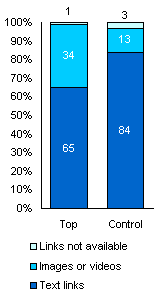 I started this analysis by getting two sets of links from the site. The top 100 links of all-time and, to use as a control,
the links numbered 500-599 from the 'new - today' list. These two lists of links were both taken as of September 13th, 21:45 EST.
By choosing fairly low ranked links from the 'new - today' list the second set should contain items that are average to low in popularity
relative to all the links submitted. I was hoping that by contrasting these two sets I might discover something interesting about top-rated links.
I started this analysis by getting two sets of links from the site. The top 100 links of all-time and, to use as a control,
the links numbered 500-599 from the 'new - today' list. These two lists of links were both taken as of September 13th, 21:45 EST.
By choosing fairly low ranked links from the 'new - today' list the second set should contain items that are average to low in popularity
relative to all the links submitted. I was hoping that by contrasting these two sets I might discover something interesting about top-rated links.
1. Images and Videos
Most of my analysis has been based on the text of the linked items. Before I could proceed to do this I had to exclude all the linked items that are primarily non-textual in nature - in other words, videos and images. This little graph shows how many links were 'not found' or 'videos and images' out of the 100. It clearly shows that there are many more photos and videos in the top rated links than in the control set.
The quantities measured in the next 3 analyses don't depend on the absolute number of documents in the sets so all 65 of the top rated list and all 84 of the control list were used.
2. Number of Words / Link
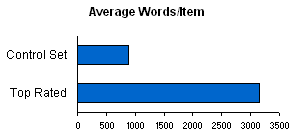 After excluding the links mentioned above I gathered the text for each remaining link. An automated tool was used to convert the HTML to
text and then I manually removed any text related to website navigation, feedback or comments. My goal was to analyze the primary content
of the linked web page.
After excluding the links mentioned above I gathered the text for each remaining link. An automated tool was used to convert the HTML to
text and then I manually removed any text related to website navigation, feedback or comments. My goal was to analyze the primary content
of the linked web page.
I wrote a simple tool to count the number of words for each link in both sets. The average number of words/link was 882 for the control set and 3151 for the top rated links. The top rated links have many more words per item than the control set.
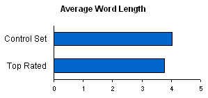
3. Average Word Size
I also calculated the average word length in the two sets of documents. The top rated links had an average word size of 3.77 characters/word and the control set average was slightly longer at 4.02 characters/word. There does not appear to be a significant difference in the average size of words between the two sets.
(More...)
We Feel Fine
By: Jeff Clark Date: Sat, 02 Sep 2006
We Feel Fine describes itself as 'an exploration of human emotion, in six movements.' It's a set of interesting visualizations of recent weblog posts that contain the phrases 'I feel' or 'I am feeling'. It's a very dynamic application so you really should visit the site to get a feel for it. This first image gives a snapshot of the 'Madness' view where the posts are represented by small geometirc shapes that move around. Selecting a post gives the text snippet containing the phrase of interest.
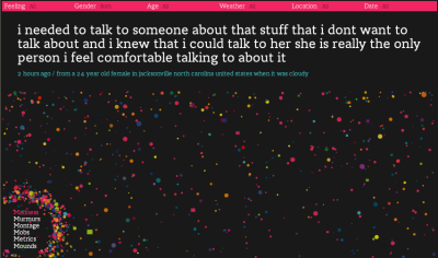
This second image shows the 'Mobs - by Feeling' view which gives a graph showing the most common feelings with a little horizontal bar chart.

(More...)
Problems With Topic Flowers
By: Jeff Clark Date: Sat, 26 Aug 2006
The Topic Flower concept has been fun to play with for the last little while. The idea of automatically transforming words into some highly visual form that illustrates some specific features of the text is intriguing to me. However, I'm not sure this particular visualization would be practical for most real world problems.
Here are some of the problems I see with this form:
- Low information density - I'm showing the top three topics using colours and two other features of the text using petal shape and the amount of 'hair'. That's five attributes shown using quite a large image. There are lots of ways we could show the same amount of information that would be much more compact. It would be difficult to show more than 20 or so Topic Flowers in the same visual space on a computer display. This makes them impractical to use in many situations.
- Over-reliance on colour - Can you tell the difference between a small amount of orange or red on the edges of petals ? What about people who are colour-blind ?
- Some information carrying features are too subtle - The amount of little hairs on a topic flower are difficult or impossible to estimate for smaller images.
- Some strong visual features of a Topic Flower carry no information - The number of petals for each level is random. This has a large visual impact on the flower. It could mean that the shape of two Topic Flowers could be quite different even if the text they were both based on was almost identical. This random feature also interacts with the 'petal shape' which is supposed to carry useful information. By this I mean that rounded petal shapes are supposed to mean something about the text but the roundness of the petals also depends on a random number. The randomness muddies the interpretation.
- The visual attributes only show qualitative differences. I'm measuring specific values for certain features of the text but only showing which topics are highest - not the actual measured values.
- The images take too long to generate.
- I'm sure there are other weaknesses that I've missed as well.
Many of these problems could be addressed with a better implementation but I suspect some of them are fundamental.
Topic Flowers Flickr Tag
By: Jeff Clark Date: Wed, 23 Aug 2006
I have added a new Flickr tag for Topic Flowers including a couple of example images. What does the text on your website look like ? Or your favourite quotation ? Who can produce the most attractive image ? Use the online tool to make your own and share them on Flickr.
Topic Flowers: Genesis vs Revelation
By: Jeff Clark Date: Wed, 23 Aug 2006
Thanks to Andrew Fischer for generating Topic Flowers for the books of Genesis and Revelation in the bible.
 | 
|
Google News Topic Flowers
By: Jeff Clark Date: Tue, 22 Aug 2006
I have generated Topic Flowers for the current top 2 articles in Google News for the categories Business, Sci/Tech, Sports, and Health. Here they are with links to the articles and their topic as defined by Google:
| 1 |  | Business - | I'll be back, says fallen Wall Street dotcom star |
| 2 |  | Business - | Smoke in cabin forces plane evacuation |
| 3 |  | Sci/Tech - | Astronomers offer proof of unseen 'darkmatter' |
| 4 |  | Sci/Tech - | Pluto Seems Poised to Lose Its Planet Status |
| 5 |  | Sports - | Yankees finish historic sweep of Red Sox |
| 6 |  | Sports - | U.S. opts for new formula |
| 7 |  | Health - | Chemical Reaction May Have Caused Eye Infections |
| 8 |  | Health - | Accutane acne drug raises cholesterol, fat levels |
(More...)
Topic Flowers
By: Jeff Clark Date: Tue, 22 Aug 2006
Introducing Topic Flowers - artificial flowers generated from text. Just give it a try - type or paste in some text and press the 'Create' button. You may have to wait 10-60 seconds for the image to appear. You may also have to click once to activate the application before you can type text or click on the button. Below the application are some guidelines for interpreting the flowers.
(More...)
Generating Flowers From Text
By: Jeff Clark Date: Tue, 22 Aug 2006
In a previous entry I introduced a simple topic hierarchy and I've used it to characterize weblog posts by measuring which topics were more prevalent in a given document. This can be considered a dimension reduction technique that attempts to capture important aspects of a document with just a few numerical quantities. In data visualization it is often useful to use graphical objects whose elements (e.g. position, shape, size, colour, orientation, etc.) are bound to a given set of numerical quantities. These are usually called glyphs. Some examples are Chernoff Faces and Star Plots.
I recently began investigating a tool called Processing which is an open source programming language and environment for people who want to program images, animation, and sound. I came across an interesting example that generated reasonably attractive quasi-realistic images of flowers. I've enhanced this so that I can create flower-like images whose characteristics are driven by features derived from arbitrary text. Most of these features are related to what high-level topics are evident in the text so I call the generated images Topic Flowers.
Here are a few examples with the text used to generate them.
 | A University of Tasmania PhD fine art student, King is also artist-in-residence at the university's school of medicine. And it is there, more than in an artist's studio as such, that she creates her best work in glass vials. King grows the membrane over marble-sized glass forms and then incorporates it into her sculptures. She wants her work to confront viewers and provoke thought and debate. "Contemporary art is perfectly placed in an influential position to promote biotechnology," King said. (Link) |
 | I love art. |
 | The science of today is the technology of tomorrow. - Edward Teller |
(More...)
The Shape of Song
By: Jeff Clark Date: Sun, 13 Aug 2006
Another interesting visualization by Martin Wattenberg is The Shape of Song. It illustrates the repetitive patterns in music using translucent arches that connect identical passages of notes. The following image shows one instrument track from the Beatles song 'We Can Work It Out'.

This java applet allows you to see many other examples. The visualization method was introduced in the paper Arc Diagrams: Visualizing Structure in Strings in 2002.
Perhaps poetry or lyrics from songs might have an interesting structure but I suspect most text data wouldn't have enough repetition at the token or word level for this idea to be fruitful. However, it might prove interesting to apply it on lower dimensional derived features of written english.
Boing Boing Analysis - Part 8
By: Jeff Clark Date: Tue, 08 Aug 2006
One of the more interesting measurable quantities for a weblog post is the number of inbound links. I have gathered some data regarding the number of incoming links to the posts on Boing Boing for 2005 - thanks Technorati! The incoming links were counted in early August 2006. What does this information show ?
This Radial Treemap shows the topic hierarchy coloured by the average number of incoming links/post. Dark green segments have at least 1 incoming link/post and the dark red have less than 1/2 incoming link/post. On average, it is clear that for 2005 at least, posts on Technology, Society, and Science tend to have more incoming links than Economy, Recreation, or those posts that were unclassifiable by my categorizer (labeled None). Most of the high-level topics do show considerable variation within their subtopics. For example, Music is quite high but Arts in general are just medium.
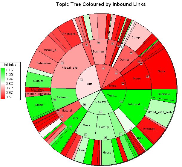
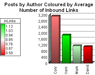
(More...)
Boing Boing Analysis - Part 7
By: Jeff Clark Date: Thu, 03 Aug 2006
Here are a few more interesting views of the Boing Boing post data.
This Radial Treemap shows the topic hierarchy coloured by the number of images/post. It shows quite clearly that topics with a visual emphasis like Visual Arts, Drawing, Television, Photography, and Comics have more images/post than average. Some other topics have much fewer than average, including Business, Information Technology, Law, and Intellectual Property.
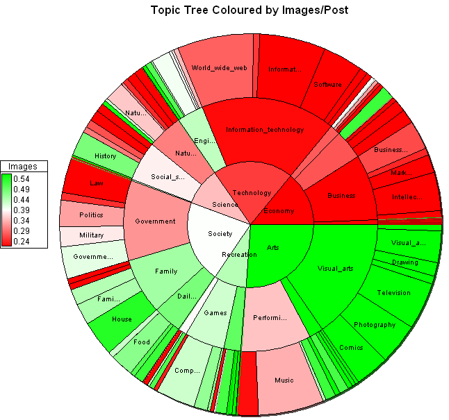
Here is a simple graph of the top level topic share over time. It shows more variability in the first year which is quite natural given the low volume of posts in 2000. Afterwards the share is pretty stable with perhaps a slight increasing trend for Arts at the expense of Technology.
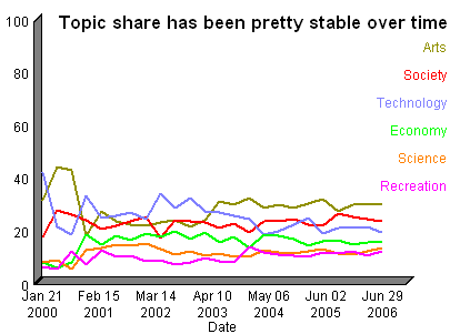
(More...)
Topic Emphasis By Author in the Boing Boing Weblog
By: Jeff Clark Date: Wed, 02 Aug 2006
From my last post we have a pretty good high-level picture of the topics covered overall by the Boing Boing weblog. What about the individual authors ? Which topics do they write more about ? Look at the figure below. It shows the breakdown by author for the 50 most popular 3rd level topics. The 3rd level topics are the most specific ones defined in my simple topic hierarchy.
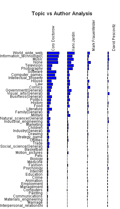
This is interesting but much of the detail for Mark and David is hidden because of their relatively lower output compared to Cory & Xeni. We can do much better by scaling each column of bars independently so that they show the relative emphasis on that topic for each author. We can also use colour to highlight topics where the author writes a higher (green) or lower (red) proportion of their posts.
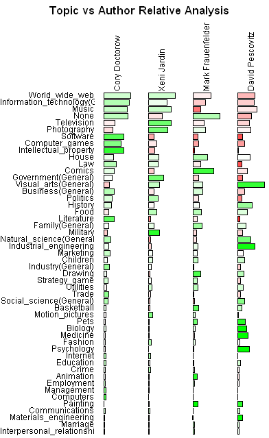
(More...)
Boing Boing Analysis - Part 5
By: Jeff Clark Date: Sun, 30 Jul 2006
We've looked at a number of aspects of the weblog Boing Boing over the last little while. The topics discussed included things like posts over time by author, day of the week analysis, images/post by author, outbound links and acronym use. This continues our analysis by examining in more detail the contents of the actual posts. What are they writing about ?
The Radial Treemap shown below illustrates which topics from my simple topic hierarchy get more emphasis. This is scaled by the number of words written on the various topics. Posts which didn't match any of the topics very well were grouped under None.
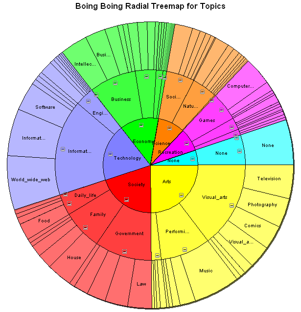
Here are the first 3 high-level topics shown by themselves so more details are clear.
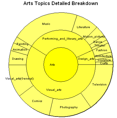
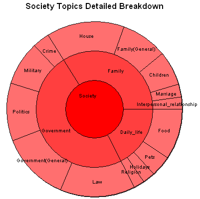
These diagrams do seem to give a reasonable weight to the topics that Boing Boing seems to emphasize although before I did the measurement I expected that Technology would be larger than the Arts and Society topics.
How well is the categorizer working ? Let's look at the posts which most closely match some of the given 3rd level topics.
For Photography:
- Top Ten Digital Photography Tips (2003/03/26)
- Infrared portrait photography (2005/11/10)
- Digital Sensor Is Said to Match Quality of Film (2002/02/11)
(More...)
A Simple Text Categorizer
By: Jeff Clark Date: Sat, 29 Jul 2006
I've created a simple tool for categorizing text. I started by defining a topic hierarchy. I was hoping to reuse an existing one but had no luck finding one I thought was suitable. The end of this entry shows what I came up with.
For each topic in the hierarchy I grabbed the text in the corresponding wikipedia entry and produced from it a word-based feature vector indicative of the topic. This excluded stop words (a, the, and, or ,of, ...) as well as any words which appeared in more than 30% of the topic entries. I also manually tuned it by passing through all the topics and deleting words that I thought were too generic.
(More...)
Radial Treemap for US Auto Sales
By: Jeff Clark Date: Thu, 27 Jul 2006
Here is another example of a Radial Treemap (or Multi-Level Pie Chart). See the previous post for an introduction to the idea.
This chart shows US auto sales for Jan-Jun 2006 using data from Morgan and Company. I've shown detail graphs for both Asian and European brands as well.
Some quick take aways:
- European and Asian brands are approaching 50% of sales
- North American brands are showing negative growth compared to last year
- European and Asian brands are showing positive growth overall compared to last year
- Toyota sales are about the same as Chrysler's and are approaching Fords.
(More...)
Multi-level Pie Charts
By: Jeff Clark Date: Thu, 27 Jul 2006
I promised a few months ago to describe something I call a Multi-level Pie Chart or Radial Treemap. I spent some time developing the idea as an alternative to the standard Treemap a few years ago before discovering that it had been done before. Despite the fact the idea has been around since 2000 it seems to be little known.
I will illustrate the concept using survival data for the people on board the RMS Titanic which sank in 1912. The information I am starting from includes a record for each person on board, their gender (Male, Female), class (First, Second, Third, Crew), age (Adult, Child), and whether they survived (Yes,No).
We can use simple pie charts to show the proportion of people in the various passenger classes or the relative proportion of Males and Females.
A Multi-level Pie Chart lets us see the proportion for second-order breakdowns. How many First Class passengers were Female ? How many crew were Male ? See the figure below. I think it is fairly intuitive. The inner circle shows exactly the same pie chart we started with giving the proportions for Passenger Class. The second ring out from the center gives the data representing gender. The angular region representing crew is in yellow and is subdivided into Crew-Male and Crew-Female regions based on the gender proportion for all crew members. Similarly for the other passenger classes.

(More...)
Thanks for the Link, Boing Boing !
By: Jeff Clark Date: Tue, 18 Jul 2006
Thanks for the link Cory ! My traffic has jumped to about 5500 pageviews today from, well, pretty much zero since I started posting. I'm guessing there aren't many weblogs that get their very first link from such a quality site.
Thanks also to Andy for the link from Waxy.org. Check out their own interactive tool for looking at Boing Boing posts from 2000-2005.
Boing Boing Analysis - Part 4
By: Jeff Clark Date: Sun, 16 Jul 2006
This continues our analysis of posts from the weblog Boing Boing. Today we will look at outbound links from posts and acronym use.
This first graph shows the familiar set of bar graphs showing posts by the various authors over time. This time, however, the bars are coloured to show the average number of outbound links per post. There are some interesting patterns here. Cory averaged around 2.5 links/post from 4Q 2001 - 2Q 2003, dropped down to 1.7 for most of 2003-2004, but then recovered more recently. Xeni was atypical once again in that her posts averaged noticeably more outbound links than the other authors. Since she started posted the average was in the range 4-5 outbound links/post. David has gradually increased his links/post over time and Mark averages a bit fewer than the others.
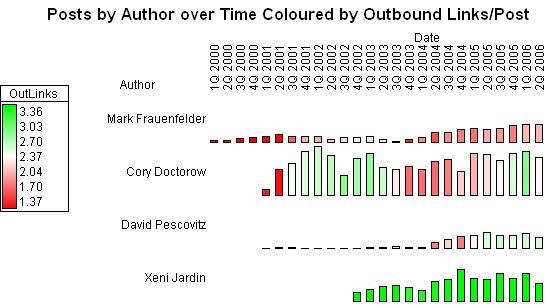
For this next part of the analysis the use of acronyms were measured within the posts. An acronym for the purposes of this study had 3 or more uppercase alphabetic characters without intervening punctuation.
(More...)
Boing Boing Analysis - Part 3
By: Jeff Clark Date: Fri, 14 Jul 2006
Another easy to measure aspect of a weblog post is the number of images embedded within it. The following contains a bar graph for each Boing Boing author showing the number of posts they made over the various quarters since 2000. The colour of the bar indicates the average number of images per post in that time period.
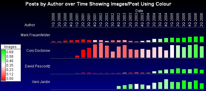
This graph show a number of interesting things. First of all, there were virtually no images in posts prior to about 4Q 2001. Looking at the data with a finer grained time scale (which isn't shown here) confirms that the first images occurred in October 2001.
Cory, Mark, and David averaged about .15 images/post in 2002. When Xeni started posting in late 2002 she averaged a much higher .5 images/post. There is also an obvious trend of more green over time for all the authors. In 2006, Xeni, Mark, and David averaged about .8 images/post with Cory having a somewhat lower images/post density of .5 .
(More...)
Boing Boing Analysis - Part 2
By: Jeff Clark Date: Thu, 13 Jul 2006
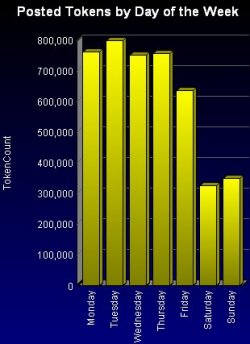 This continues our analysis of the posts from the Boing Boing weblog.
The question I'm interested in exploring now is what is the distribution of Boing Boing posts by day of the week ?
This continues our analysis of the posts from the Boing Boing weblog.
The question I'm interested in exploring now is what is the distribution of Boing Boing posts by day of the week ?
This bar graph to the right shows the number of posted tokens for each day of the week in total for the period January 2000 to June 2006. It looks quite clear that there is less published on Friday and even less on the weekend. Over this entire time period, on average, there is roughly half as much published on a weekend day compared to a day during the week.
Has this been true since inception or have there been some periods where the pattern hasn't held ?
(More...)
Boing Boing Analysis - Part 1
By: Jeff Clark Date: Tue, 11 Jul 2006
The weblog Boing Boing provides a convenient archive of all their posts since they started back in 2000. The collection has enough detailed information to support some interesting exploration. I'll be showing some results here over the next few weeks that look at various aspects of the posts made on Boing Boing in the period Jan 2000-Jun 2006.
This first graph shows a simple time series of the total number of tokens published. The total time span was divided into 50 equal length periods and the total number of tokens published in each period was plotted. Binning the data into 50 periods smooths the series. It shows a rough linear trend with a few obvious dips in August 2002 and December 2003.
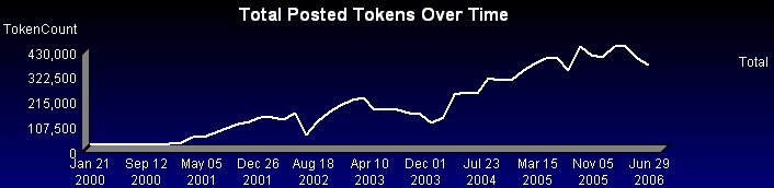
The next graph shows the same information for each individual author on Boing Boing. This clearly shows that Cory & Xeni together account for a large fraction of the text published over the last few years. Note that this 'tokencount' includes all text quoted from other sources. The dip in publishing volume for August 2002 was due entirely to a drop in Cory's production. This occurred, perhaps not coincidentally, just prior to Xeni starting to publish.
(More...)
World Population Treemap
By: Jeff Clark Date: Thu, 20 Apr 2006
 Here is another more recent example of a treemap developed by the Hive Group. The statistics are taken from
the CIA Factbook. It would be interesting to be
able to colour by population growth rate.
Here is another more recent example of a treemap developed by the Hive Group. The statistics are taken from
the CIA Factbook. It would be interesting to be
able to colour by population growth rate.
Radial Treemaps
By: Jeff Clark Date: Tue, 11 Apr 2006
In the previous post I briefly described an application based on a type of visualization called a Treemap. They are definitely a useful technique in the right context but after exploring them a bit I found the generated images a bit unsatisfying. The things that I dislike about them are:
- the irregularity of the layout
- the hierarchies are not clearly expressed
- it's difficult to illustrate multi-level hierarchies
 Problems 2 & 3 are nicely addressed by a variation which Kai Wetzel
calls a Circular Treemap.
This design has the obvious drawback that the visualization is no longer
space-filling - you can't fit as much information into the same area as with
the standard rectangular treemap.
Problems 2 & 3 are nicely addressed by a variation which Kai Wetzel
calls a Circular Treemap.
This design has the obvious drawback that the visualization is no longer
space-filling - you can't fit as much information into the same area as with
the standard rectangular treemap.
Another variation that occurred to me which sacrifices some information density
for perhaps a more natural form is what I have called a 'Multi-Level Pie
Chart'.
(More...)
Map of the Market
By: Jeff Clark Date: Sun, 09 Apr 2006
A few years ago I stumbled across an interesting visualization of stock market information. It is called Map of the Market. It shows the market capitalization and fluctuations over time of hundreds of publicly traded companies. It was created in 1998 so many of you have likely seen it before. I wanted to mention it here because it triggered a renewal of my own interest in the area of data visualization.
This application was created by Martin Wattenberg who is currently
a researcher at IBM. I think it does an excellent job of organizing large quantities
of data in a useful fashion.
(More...)
Welcome to my Weblog
By: Jeff Clark Date: Sat, 08 Apr 2006
Hello and welcome to my weblog! Since this is my first entry here it seems natural to introduce myself and give you some idea of what I intend to write about.
(More...)