Neoformix Review 2008
By: Jeff Clark Date: Wed, 31 Dec 2008
I think it's natural at the end of the year to look back over the previous 12 months and assess what was accomplished. This post is my attempt to summarize what I think my key contributions were this past year on Neoformix. They aren't necessarily the most popular posts and are ordered chronologically rather than by any notion of importance. I hope this proves useful to those of you who are new to Neoformix or just want a quick review of the key ideas presented during 2008.
I would also like to mention here that many of these ideas were inspired by or build upon the work of other people. I have tried my best in the original posts to give credit where it was due. Feel free to contact me at any time if you think I have forgotten someone.
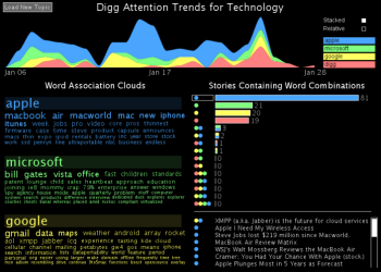 |
Digg Trends is an interactive tool that shows the trends in word usage over time and word associations for stories that reached popular status on Digg. |
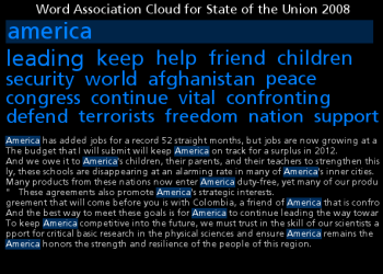 |
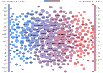
Word Association Clouds look like standard tag clouds except the topmost word is made distinct in some manner. They show which words are related to the highlighted topic word through colocation in a text of interest. You can type in a new word or click on any associated word to navigate around easily and explore how different words are related in a document of interest. The references within the text are also shown. |
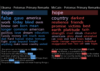 |
The Document Cloud Comparison tool links two Word Association Clouds together to support exploring the similarites and differences between two documents. |
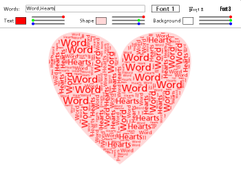 |
Word Hearts is a tool that automatically fills a heart shape with any words you like. This was fun to make and the ideas eventually led me to the tools to create Word Portraits. |
 |
A Document Contrast Diagram is a visual summary of the content of two text documents that illustrates shared words, words that are unique to one document or the other, word frequency, relative size of the two documents, distribution of emotional tone within the documents, related words based on co-occurence, and the most common word in each document segment. |
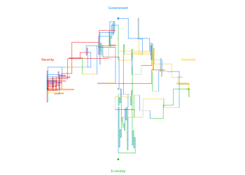 |
Directed Sentence Diagrams evolved from the artistic work of Stephanie Posavec. They are my attempt to create something similar that perhaps has a bit more utility. The overall shape and color highlights some aspects of the topics discussed within the text as well as the order and length of the sentences. |
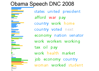 |
Sentence Bar Diagrams use a simple set of bars to show the sentences in a text. The bars are colored based on the primary topic of the sentence and the most common interesting words for a set of sentences are also shown. |
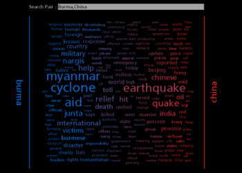 |
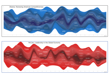
News Spectrum is a visualization of the words used for two topics in the latest results from Google News. One topic is coloured blue, the other red, and the associated words are coloured and positioned based on how highly they are associated with the two topics. This idea was later used with a different data source to create Twitter Spectrum which was also my first use of the rich Twitter data set. |
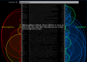 |
Twitter Arcs takes the latest 100 tweets for a twitter ID or term of interest and creates a list representation that has arcs connecting messages sent to the same users or that use the same primary term. You can click on the left side to load the tweets for a new user, on the right side to load the tweets for a specific term, and in the middle to visit the actual tweet. |
 |
Document StreamGraphs apply the StreamGraph idea to documents. The document is split up into 25 equal sized segments and the word counts are done within each segment. These segments are used in place of time along the horizontal axis of the StreamGraph. This document StreamGraph again focuses on capitolized words but ignores a few common ones like 'Mr' and 'Mrs'. I'm also using a longer format for the graph and showing two labels for each word series - one on the left half of the graph, and one on the right. The difference in label size for the same word can show whether it was used more frequently in the first or second half of the document. |
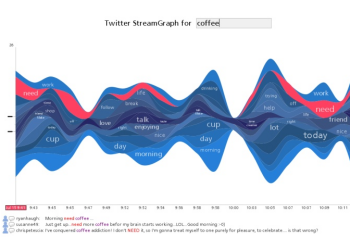 |
Twitter StreamGraphs is an interactive tool that shows the trends in word usage over time for twitter messages from a particular user or that contain a given search term. |
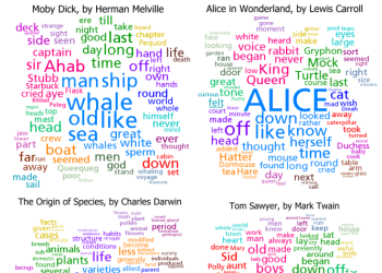 |
Clustered Word Clouds are an extension of the common word cloud idea. The words are partitioned into clusters based on how often they were used near each other in the base text. The largest clusters are then shown with the words in them positioned near each other and highlighted with color. |
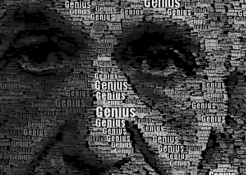 |
Word Portraits are images that are reconstructed using words in various sizes and colors. I create mine with custom code written in Processing. Here are a few examples: Obama, Einstein, World Peace, and Eyes from i's. |
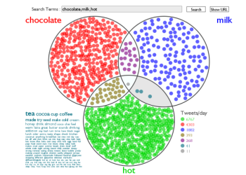 |
Twitter Venn takes two or three search terms and creates a Venn Diagram showing the rate of tweets containing the search terms in the various combinations. A tag cloud can also be shown for one of the regions. |