Circos
By: Jeff Clark Date: Mon, 27 Apr 2009
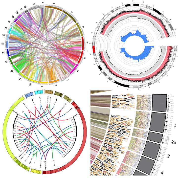
FlowingData recently had an interesting guest post about an alternative way of visualizing tabular data. It was by Martin Krzywinski and featured his visualization tool called Circos. Circos can produce a wide variety of information-rich, radial-based diagrams.
Some of the comments on FlowingData were quite negative and inspired a follow-on post by Nathan titled Narrow-minded Data Visualization. His post and the many related comments are interesting reading for those who care about data visualization and the tension between traditional/novel , expert/amateur, and cautious/exuberant approaches.
Some of these diagrams are very information-dense and might be a challenge to decode for those without much experience in interpreting them but I believe they are likely a powerful technique in the right situation. I suspect that no matter what your feelings are on the utility you will find it stimulating to examine a few example diagrams created with Circos.