Obesity Slopegraph
By: Jeff Clark Date: Tue, 26 Feb 2013
Last week the wonderful Guardian Datablog published an interesting post called Obesity worldwide: the map of the world's weight. It contains a map that shows with color the rates of obesity around the world. The accompanying chart gives data for different time frames and for both male and female which you can select and view on the map. When I saw the chart I immediately thought of a number of interesting questions that could not be easily answered with the map or chart.
- What is the trend over time?
- Do these trends exist worldwide?
- Which countries are exceptions to the trend?
- Which countries have the highest or lowest rates of obesity?
- Are there large gender-based differences in obesity rates in various countries?
Much of my past work has been driven by personal curiousity. That, together with my own background in science, have shaped my work such that most of it has been exploratory in nature. Recently I have been thinking more about the storytelling or communicative aspect of data visualization. This has been triggered by my admiration for the amazing work of the New York Times Graphics Department, and the writings of Alberto Cairo, Robert Kosara, Andy Kirk, and Jonathan Stray.
I decided try and build an interactive visualization that helped answer the questions above. I also tried to build something that explicitly highlighted some of the more interesting aspects of the data without sacrificing freeform exploration. I settled on using a Slopegraph which was first described by Edward Tufte and is featured on the cover of Cairo's excellent book The Functional Art.
This first image shows the trend for male obesity organized by continent. It's a difficult problem to show labels for so many countries along one axis so I tried to alleviate it by letting the user expand or hide countries by continent group. In this case 'North America' is expanded to show its' individual countries. Labels are only shown if they don't overlap with others. The largest countries by population are placed first.
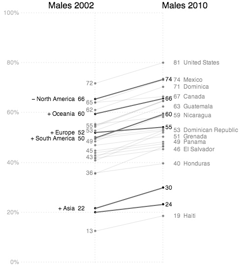
Individual country lines can be clicked on to emphasize them with colour.
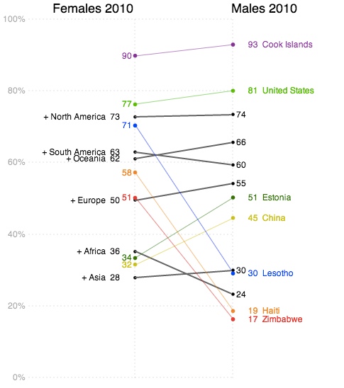
The third example shown below charts female values on the left against male values on the right in order to emphasize gender differences.
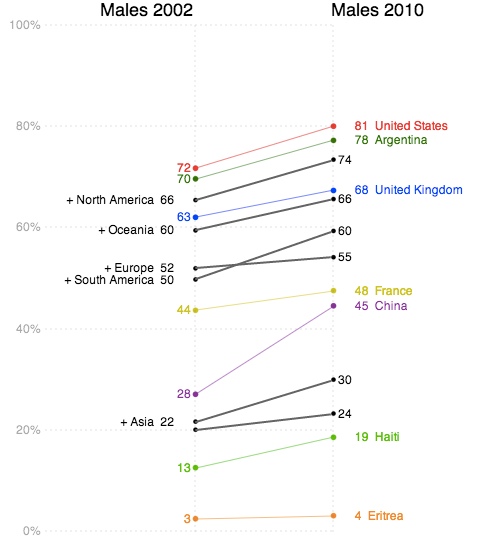
The interactive visualization includes a 'stepper' that takes the user through four different views. This helps introduce functionality gradually as well as serving to emphasize important patterns in the data.
In addition to the people and organizations mentioned above I would like to acknowledge the people behind Processing and Processing JS which was used to build the application. The code for the dashed lines comes from J David Eisenberg. Thanks!