Swine Flu Deaths - Altered
By: Jeff Clark Date: Tue, 24 Nov 2009
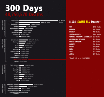
I believe that the recent Swine Flu pandemic has been dramatically overplayed in the media. This morning I came across the image below on dataviz.tumblr.com that shows the number of deaths in the last 300 days from various causes including Swine Flu. There are a lot of things done really well here - the most important of which is that the deaths due to swine flu are put in a proper context.
Unfortunately the choice of using a solid red bar for emphasis beside the bar graph for Swine Flu deaths confuses the message because at first glance the bar can be interpreted as an extension of the bar graph itself. The first impression (and for some viewers the only impression) is that the deaths due to swine are exceptionally high - the very myth that the graphic is trying to dispel.
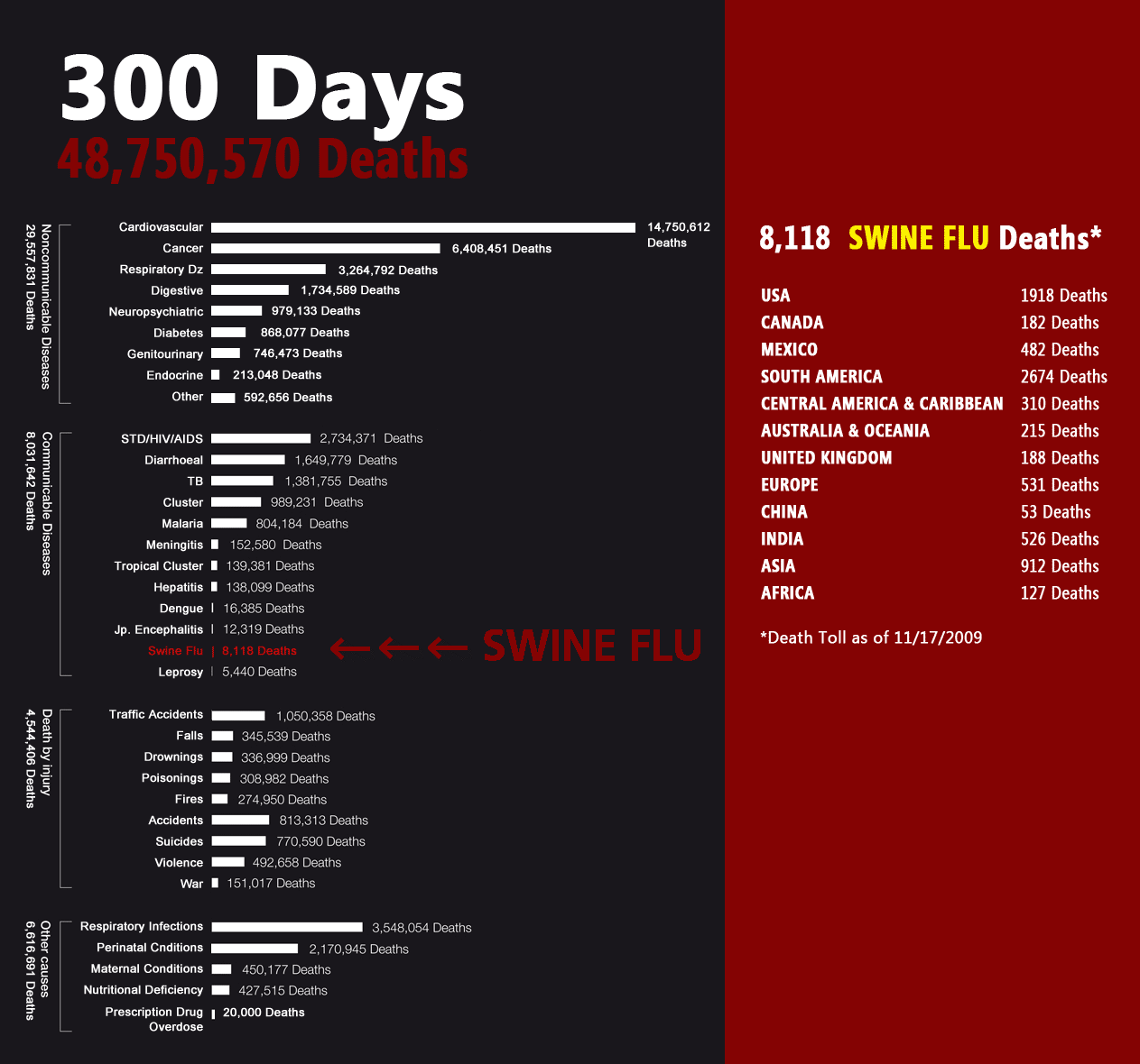
I have made a small intervention to the graphic that I believe makes the message less likely to be confused. The bar has been replaced with a text label and three arrows that can't be confused with an extension of the graph itself but still draw attention to the relatively small number of deaths for Swine Flu.
Unfortunately there is no reference on dataviz.tumblr.com to either the source of the original graphic or the data depicted. If anyone knows then send me a note and I'll add proper attribution here.