Sparklines for MLS Season
By: Jeff Clark Date: Tue, 25 Oct 2011
Edward Tufte defines Sparklines as intense, simple, word-sized graphics, that should also be high-resolution. They are a very useful technique, especially when combined with the idea of small multiples.
I generated the example below based on the results of the 2011 Major League Soccer regular season. In this case, a whisker-style sparkline was generated for each team to show the complete Win-Loss-Tie sequence for the season. A small upward blue bar shows a win, a grey bar in the middle a tie, and a downward red bar is, of course, a loss.
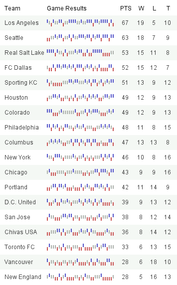
The graphic succinctly illustrates how each team did over the season. A few interesting tidbits:
- Los Angeles was consistently strong over the entire season
- Real Salt Lake ended the season poorly with 4 losses then 2 ties
- Sporting KC had a horrible start going 1-6-1 but then recovered well
- DC United had no wins in their last 6 games
- Vancouver had many more ties in the first half of the season than the second half