Democracy Index Graphs
By: Jeff Clark Date: Sat, 08 Sep 2007
A couple of weeks ago The Economist published a report giving a 'Democracy Index' for the various countries of the world. It's an interesting set of data but the various references to it that I saw only included short lists of the top and bottom ranked countries. I have created a few graphs that might prove interesting based on this information plus some other data from the CIA World Factbook.
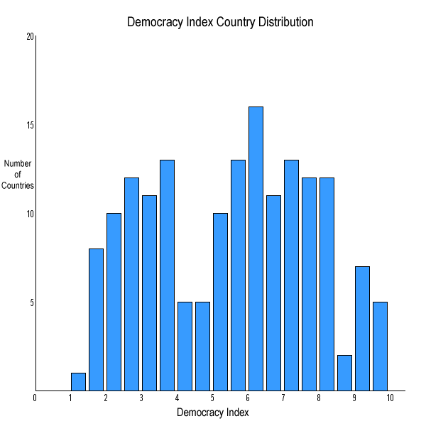
This first graph shows the number of countries having a democracy index in the given range. I counted how many were in each .5 sized bucket. For example, the first bar shows that there was only 1 country (North Korea) with index in the range 1.0-1.5 .
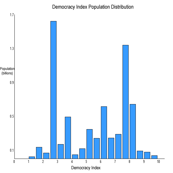
The second graph shows the number of people living with a democracy index in the given range. The large spike at 2.5-3.0 is due to China and the one at 7.5-8.0 to India.
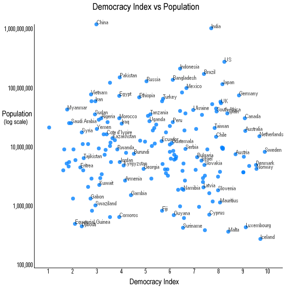
The fact that the top ranked countries are all relatively small (Sweden, Iceland, Netherlands, Norway, Denmark...) is suggestive that perhaps there is a relationship between size of country and the level of democracy. This third graph is a scatterplot of the democracy index vs the population for each country. The population is on a log scale because of the huge variation in country size.
This shows no obvious relationship between the 2 variables.
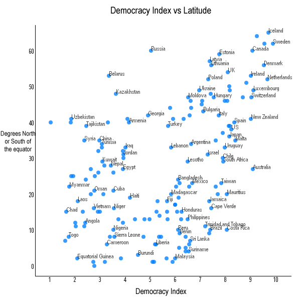
This last graph plots the index against distance from the equator for each country. Actually, I used the latitude as reported by the CIA World Factbook. I don't know but presume that this reflects the latitude of the capitol city. There does appear to be a mild relationship between the index and latitude.
There are many other country characteristics that might be interesting to explore - for example GNP per capita, population density, literacy rates, status of women, and geographic area.