Boing Boing 2006 Statistical Analysis
By: Jeff Clark Date: Sat, 06 Jan 2007
I have redone some of the more interesting parts of my analysis of the weblog Boing Boing using all of their posts from 2006. It was easy for me since I already had the code to harvest and analyze the data and I was curious about the trends.
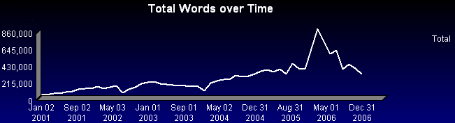
This first graph shows a simple time series of the total number of words published over time. It shows a pretty obvious peak around March-April 2006 with a drop-off towards the end of this year back to the productivity level seen in 2004-2005.
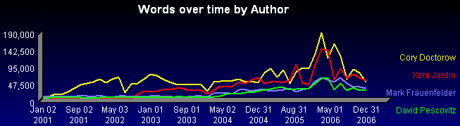
The second graph shows the breakdown by author over the same period. It shows quite clearly that the peak described above was not due to a particular author - each of them had their highest productivity around that same period.
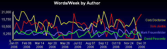
Let's look more closely at the 2006 time frame. There is obviously a great deal of fluctuation including some obvious periods of inactivity for some of the authors. Cory at the end of the year, Xeni in June and late November, David for a short time at the end of April, and Mark for a short time in mid-October.
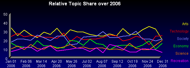
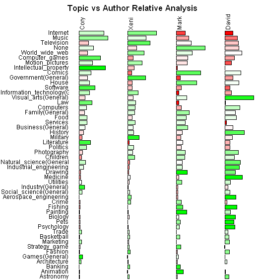
The relative topic share remained reasonably consistent over the year.
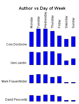
The analysis done earlier this year showed individual author differences in their posting patterns over the day of the week. This graph which includes only 2006 data illustrates that they continued the same pattern. Cory and Xeni post almost as much on the weekend as during regular weekdays. David and Mark post much less frequently on the weekend.
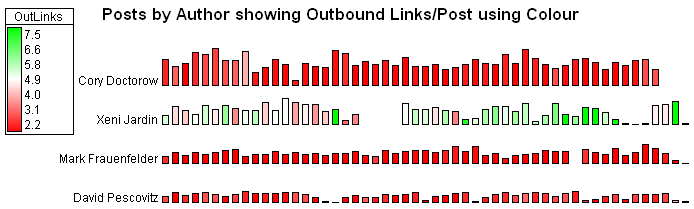
The following two graphs also show patterns continuing for 2006 that were uncovered on 2001-2006 data.
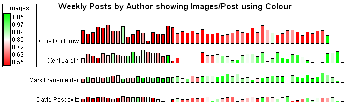
The colouring of the graphs indicate pretty clearly that Xeni and Mark include lots of images in their posts, David has many periods where he has a lot as well and Cory tends to not include as many. The second graph shows also that Xeni includes many more outbound links than the others.
This final graph shows the various topics the authors write about. Each column of bars is scaled independently so that they show the relative emphasis on that topic for each author. We also use colour to highlight topics where the author writes a higher (green) or lower (red) proportion of their posts compared to the others.
Some related posts:
Recent:
Boing Boing 2006 Domain Analysis
Older:
Boing Boing Analysis - Part 1 (Posts Over Time by Author)
Boing Boing Analysis - Part 2 (Posts Breakdown over Day of Week)
Boing Boing Analysis - Part 3 (Images/Post over time by Author)
Boing Boing Analysis - Part 4 (Outbound Links/Post and Acronym use by Author)
Boing Boing Analysis - Part 5 (Topic Hierarchy)
Boing Boing Analysis - Part 6 (Topic Emphasis by Author)
Boing Boing Analysis - Part 7 (Images/Post for Topics and Topic Share over Time)
Boing Boing Analysis - Part 8 (Incoming Links)