Boing Boing Analysis - Part 3
By: Jeff Clark Date: Fri, 14 Jul 2006
Another easy to measure aspect of a weblog post is the number of images embedded within it. The following contains a bar graph for each Boing Boing author showing the number of posts they made over the various quarters since 2000. The colour of the bar indicates the average number of images per post in that time period.
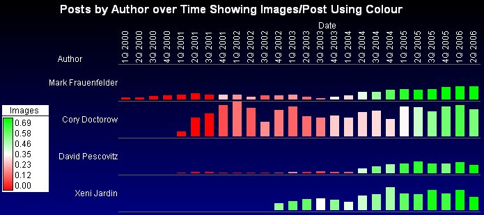
This graph show a number of interesting things. First of all, there were virtually no images in posts prior to about 4Q 2001. Looking at the data with a finer grained time scale (which isn't shown here) confirms that the first images occurred in October 2001.
Cory, Mark, and David averaged about .15 images/post in 2002. When Xeni started posting in late 2002 she averaged a much higher .5 images/post. There is also an obvious trend of more green over time for all the authors. In 2006, Xeni, Mark, and David averaged about .8 images/post with Cory having a somewhat lower images/post density of .5 .
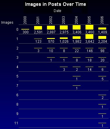
This next graph shows how many posts had exactly n embedded images for each year. For example, in
2001 there were 2591 posts with no images, 123 posts with 1 image, and 3 posts with 2 images.
Not only are there more images/post over time but there are also many more multi-image posts in the later years.
Related Links:
Boing Boing Analysis - Part 1 (Posts Over Time by Author)Boing Boing Analysis - Part 2 (Posts Breakdown over Day of Week)
Boing Boing Analysis - Part 3 (Images/Post over time by Author)
Boing Boing Analysis - Part 4 (Outbound Links/Post and Acronym use by Author)
Boing Boing Analysis - Part 5 (Topic Hierarchy)
Boing Boing Analysis - Part 6 (Topic Emphasis by Author)
Boing Boing Analysis - Part 7 (Images/Post for Topics and Topic Share over Time)
Boing Boing Analysis - Part 8 (Incoming Links)