Twitter Client Usage StreamGraph
By: Jeff Clark Date: Tue, 10 Jun 2008
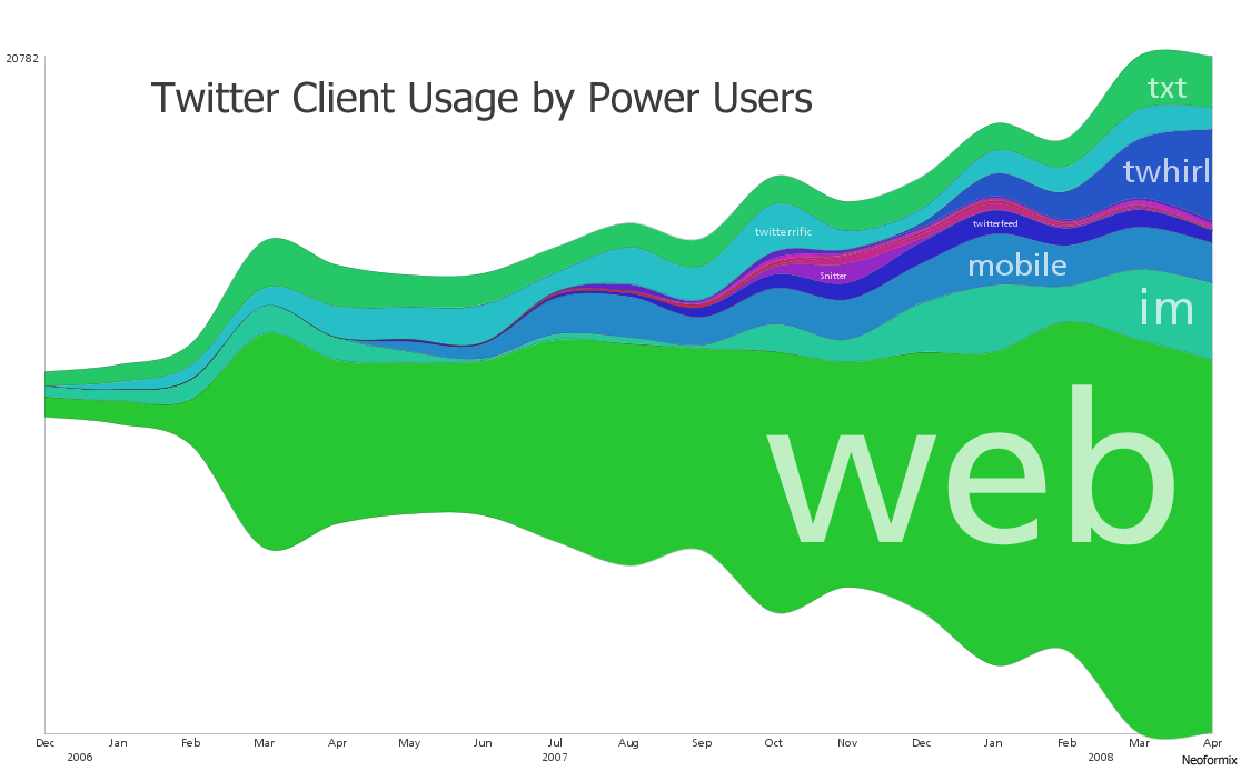
I have mentioned before the wonderful stream-like visualizations created by Lee Byron. I've written some code so I can create my own using whatever data I want. The one above was constructed using the twitter data from The StatBot. You can click on it to see a larger version of the image. I left out the first few months which had a very low volume of data so this one runs from Dec 2006 to Apr 2008.
For a small number of series a simple line graph would be superior because you can directly see which values are larger at each point in time. These StreamGraphs do a better job of emphasizing the sum at each point and the breakdown into the various series. I think StreamGraphs are also better at showing lots of series that dominate for short parts of the timespan of interest. For example see the image below that shows movie revenues. There are a great many movies illustrated and each one is only present in a fairly small part of the overall range of time.

Lee Byron and Martin Wattenberg have written a short paper describing the design decisions and algorithms behind these types of graphics. Have a look at Stacked Graphs - Geometry & Aesthetics (pdf) if you are interested in the details.