Stream Graph
By: Jeff Clark Date: Fri, 29 Feb 2008
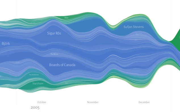
Lee Byron has done some other interesting work. One that really caught my eye when I first saw it is this stream-like visualization of music listening habits over time. The data comes from the Last.fm records for a particular user.
In the author's words:
After thinking about how I could show this whole sum in a presentable form, I decided on a sort of layered histogram. Each colored sliver represents a different artist listened to in the last 18 months. The sliver moves through time left to right growing thicker where it was more popular and thinner where it was less. The color indicates the first time the artist was listened to, warmer colors being more recent and cooler being further back. As a new artist is listened to it is put onto the outsides of the graph. The result is a wiggling tour through your listening history past.
Lee describes it as 'a sort of layered histogram' but I think of it as a 'stream graph' - it nicely shows how something varies over time and looks like a stream to me.