Movies Ebb and Flow
By: Jeff Clark Date: Fri, 29 Feb 2008
Last week the New York Times published an interactive graphic called The Ebb and Flow of Movies: Box Office Receipts 1986-2007. It does a pretty good job of showing how the revenue of various movies rose and fell over time as well as more global patterns. The design does make it hard to directly compare movies against each other. It would be neat to pick a bunch of movies and see a set of traditional line graphs starting from the same point. Here is a close up:
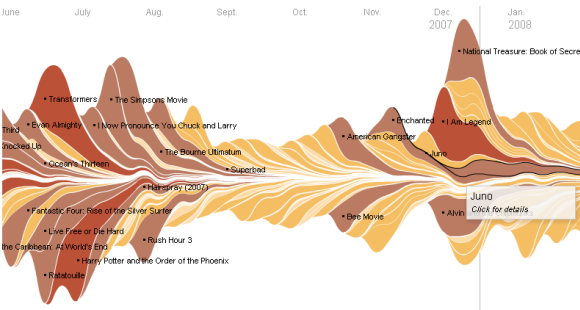
And here is 4 years of data with labels showing the summer blockbuster periods. You can also clearly spot the peaks at the end of the years.
