Charting the Beatles
By: Jeff Clark Date: Mon, 18 Jan 2010
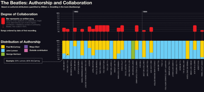
Michael Deal has published an interesting collection of graphics in his Charting the Beatles project. This first snippet below shows the beginnings of a graph illustrating authorship and collaboration in songwriting throughout their song collection. The full graphic clearly shows the trend towards less collaboration over time in songwriting, the increasing contribution from George, and increasing contribution by outside contributors.
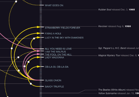
This second image is from a chart showing references in Beatles songs to earlier songs. There are full images and several other interesting graphics on his site.