Multi-level Pie Charts
By: Jeff Clark Date: Thu, 27 Jul 2006
I promised a few months ago to describe something I call a Multi-level Pie Chart or Radial Treemap. I spent some time developing the idea as an alternative to the standard Treemap a few years ago before discovering that it had been done before. Despite the fact the idea has been around since 2000 it seems to be little known.
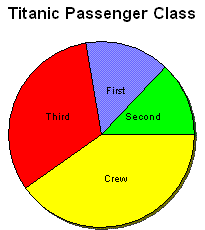
I will illustrate the concept using survival data for the people on board the RMS Titanic which sank in 1912. The information I am starting from includes a record for each person on board, their gender (Male, Female), class (First, Second, Third, Crew), age (Adult, Child), and whether they survived (Yes,No).
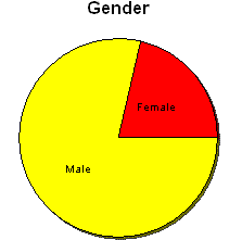
We can use simple pie charts to show the proportion of people in the various passenger classes or the relative proportion of Males and Females.
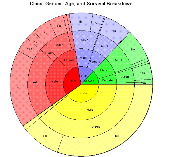
A Multi-level Pie Chart lets us see the proportion for second-order breakdowns. How many First Class passengers were Female ? How many crew were Male ? See the figure below. I think it is fairly intuitive. The inner circle shows exactly the same pie chart we started with giving the proportions for Passenger Class. The second ring out from the center gives the data representing gender. The angular region representing crew is in yellow and is subdivided into Crew-Male and Crew-Female regions based on the gender proportion for all crew members. Similarly for the other passenger classes.

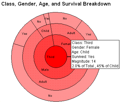
The idea can be extended to as many levels as desired. The figure below illustrates this and also shows one potential problem for this type of layout - many of the 'slices' will be thin and difficult to clearly label.
These images were created with an interactive tool that has a number of capabilities designed to alleviate this. One of these methods is to hide various segments to give more space to the remaining ones. This image hides everything but the Third class passengers and also uses a tooltip to show details on one particular segment.
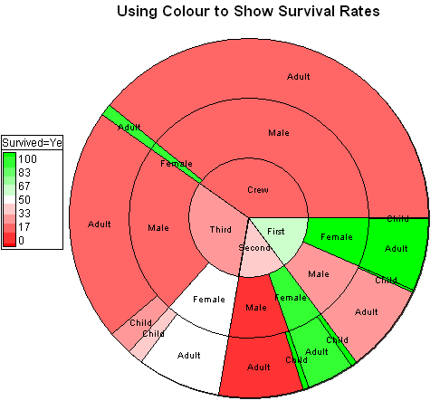
Another useful capability is to have colour carry important information. The graph below shows the survival rate using a green-red colour gradient. Bright green represents 100% survival and bright red is 0%. The nodes are sorted by survival rate as well. A number of things can be seen at a glance:
- Female survival rate was higher than males within every passenger type
- Survival rates for passenger class was in the order First, Second, Third, and finally Crew
- First class, female, adult passenger survival rate was close to 100% (actually 97.22%)
- Male children in third class berths had a survival rate comparable to crew (around 25%)
- Within almost all Class/Gender combinations, children had higher surivial rates than adults
- The worst survival rate was for second class adult males (around 8%)