Twitter Venn Examples
By: Jeff Clark Date: Thu, 18 Dec 2008
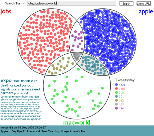
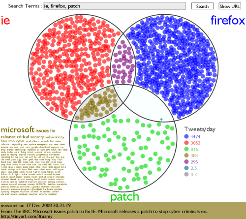
Here are a few more examples of Venn Diagrams made using my new tool Twitter Venn. You can click on any of the images to jump into the tool loaded with the same terms to see how it looks right now. Note that the number of tweets represented by the colored circles varies between different analyses. For example, in the first 2 images the number of small green circles appears to be roughly the same but they represent 816 matches in the first case and 236 in the second.
This first example clearly shows the tight association between 'ie' and 'patch' at the moment - the relationship is much much stronger than it is between 'firefox' and 'patch'. Thanks to shazzzam for the idea.
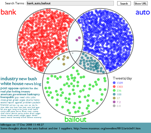
This diagram shows that the chatter on twitter related to bailouts is much stronger at the moment for 'auto' than 'bank'.
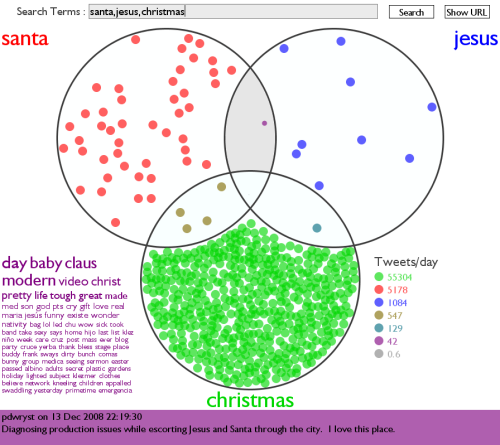
In the context of tweets that mention 'Christmas' the santa to jesus ratio is about 4:1 .
There is a relatively large number of tweets currently referencing the triplet 'jobs', 'apple' , and 'macworld' . Note some of the intriguing keywords in the tag cloud - 'mean', 'cult', and 'death'. This seems to be caused by a number of references to the title of a popular Digg article called 'MacWorld Pullout Signals the Death of (the Cult of) Mac'.