Digg Topic Popularity over Time
By: Jeff Clark Date: Mon, 13 Nov 2006
The social content website Digg publishes a comprehensive archive of the stories that reached 'popular' status on the site. This archive extends back until December 2004 and includes the subtopic assigned to the story and the current number of Diggs. I have done some analysis of the data for the period Jan 2005 to the end of Oct 2006 and have produced several graphs illustrating the evolution of topic popularity over time.
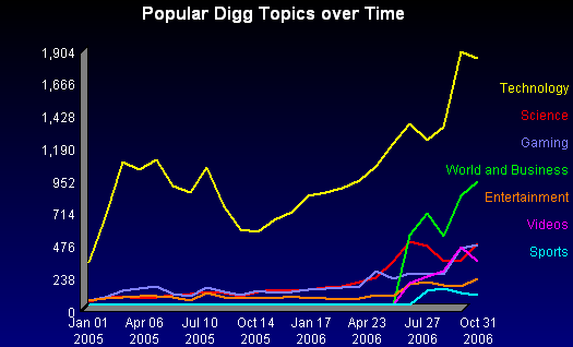
This first graph shows how many popular stories there were for the various top level topics. The timeframe was subdivided into 24 equal buckets so the measure on the vertical axis represents how many popular stories there were from that topic in a time period slightly less than a month (22 months of data / 24 periods ~= 28 days). The two obvious features of this first graph are the dominance of technology stories over time and the addition of the World and Business, Videos, and Sports topics in mid-2006.
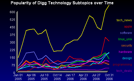
Now we examine the various subtopics in the technology topic over time. We see that the general tech_news category is a sizable fraction of the total and that apple and design have shown strong recent growth.
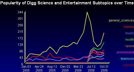
I've created a few more similar graphs but have combined some of the topics together. This one shows the Science and Entertainment subtopics. Historically, the general_sciences subtopic has dominated over movies and music. In the middle of 2006 an abrupt drop in general_sciences can be explained by the addition of several new science subtopics - health, space, and environment. Many of the stories that used to be placed into general_sciences are distributed across these new science-related categories. Television and celebrity were also added this year as new entertainment subtopics. Their share of the popular stories so far appears to be quite low.
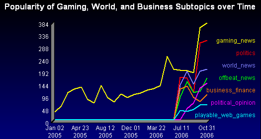
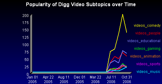
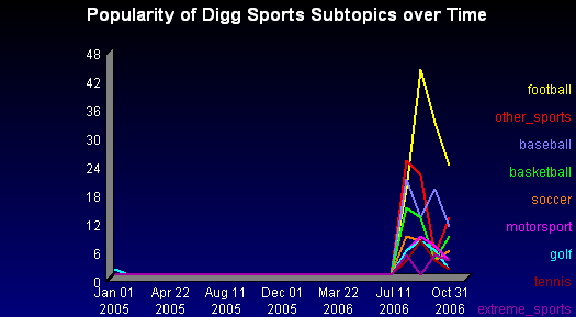
I'll show the other three with minimal commentary since you can easily spot the trends yourself.
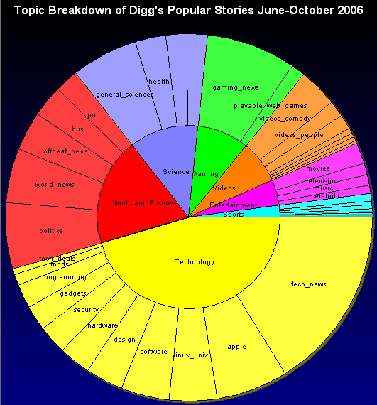
This next graph uses a Multi-level Pie Chart to illustrate the topic and subtopic breakdowns since all the new subtopics were added in June of 2006. Several of the slices are too small to label clearly but it does give an interesting overall picture.
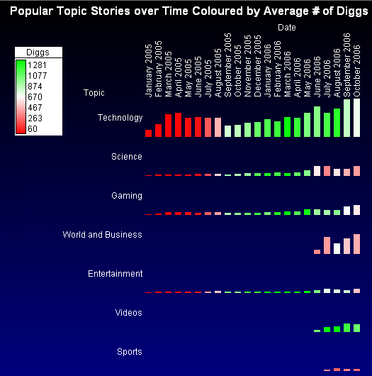
The last graph shows topics over time using simple bar graphs which are coloured to show the average number of diggs for those topics in the given time periods. You can spot many of the general trends illustrated by the graphs above but can also see some interesting new facts. There is a general 'greening' over time reflecting that popular stories on Digg get more diggs now than they used to. Or perhaps, stories becoming popular leads to their getting more diggs now than before - the relationship is not a simple causual one. Popular stories from the new World and Business and Sports topics seem to have fewer diggs than the other topics. Also, the popular video stories have a very high number of diggs on average.
Overall, this analysis hasn't uncovered anything likely to be surprising to people familiar with Digg. The site had an early focus on technology and this remains the most popular topic for users. However, the recent additions of new categories has broadened the appeal and is likely to help Digg capture a larger overall audience. The recently added Sports topic is the weakest by far and it seems likely to remain relatively small in the short term.
Some Related Neoformix Links:
Analysis of the Boing Boing weblogCharacteristics of Top Reddit Submissions
Visit Digg to support or comment on this story.