Datavis Blue-Red Connections
By: Jeff Clark Date: Fri, 02 Mar 2012
The recent post on Data Visualization Field Subgroups had an interesting reaction on Twitter that I didn't expect. Many people that were placed in the 'red group' by the community detection algorithm in Gephi joked about being part of the 'team' and being happy to represent it and be grouped together with the others. Jen Lowe lightheartedly suggested a scrimmage at #eyeo between the red and blue. There was much less reaction from the 'blue group', likely because I'm embedded within the reds myself and so they likely paid more attention to my posts and the subsequent reaction on twitter.
There does, indeed, seem to be two fairly cohesive groups of people here but I suspect there are very many connections between the groups as well. We can use some simple network analysis to get a feel for this. Here are a few statistics calculated on the blue and red groups only:
| Characteristic | Blue | Red |
|---|---|---|
| Number of Nodes | 216 | 244 |
| Total In-Links | 6734 | 5712 |
| Total Out-links | 6070 | 6376 |
| Avg In-Links | 31.18 | 23.41 |
| Avg Out-Links | 28.1 | 26.13 |
| Total Intergroup links | 665 | 1329 |
| Total Intragroup links | 5405 | 5047 |
| Percent Intergroup links | 10.96% | 20.84% |
Both groups are pretty similar in most respects. The primary difference is that blue group members have on average more incoming links and that the percentage of intergroup links going from someone in one group to someone in the other is roughly double for reds. Remember that a link from A to B means that A referenced B in a tweet through a reply, a retweet, or just mentioning them in some context. When considering just the links between these two groups the people in red are referring to the people in blue at twice the rate of the reverse.
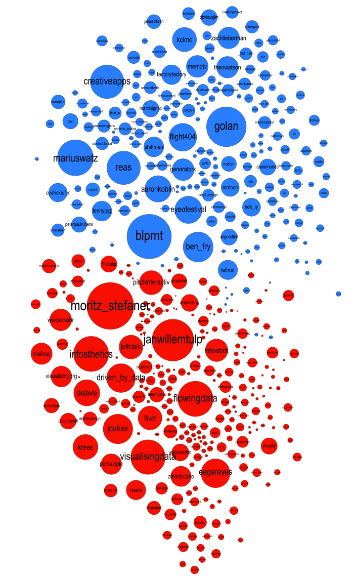
If you look at the graph showing both groups together (edges not drawn) it's clear that some nodes, for example blprnt and pitchinteraciv, are on the border between the groups which suggests they likely have a fair number of cross-group connections.
By looking at the details of the connections and their strengths we can quantify the 'blueness' or 'redness' of any particular node. This indicates how embedded they are within their own group. We can also do this separately for both incoming and outgoing links but I'll keep it simple for now and show one value that reflects both types of links together. This first table shows the top blue accounts (by degree) sorted by how 'blue' they really are.
| Blue Account | Degree | Blueness % |
|---|---|---|
| factoryfactory | 134 | 99.03 |
| kcimc | 166 | 98.5 |
| theowatson | 147 | 98.39 |
| shiffman | 136 | 97.51 |
| memotv | 149 | 96.78 |
| zachlieberman | 148 | 96.38 |
| flight404 | 191 | 93.69 |
| reas | 231 | 92.76 |
| creativeapps | 232 | 90.46 |
| golan | 276 | 88.57 |
| mariuswatz | 249 | 87.18 |
| generatorx | 149 | 86.99 |
| aaronkoblin | 181 | 85.62 |
| seb_ly | 123 | 84.42 |
| cedrickiefer | 126 | 84.18 |
| lennyjpg | 135 | 77.7 |
| ben_fry | 207 | 73.75 |
| eyeofestival | 187 | 73.19 |
| blprnt | 309 | 66.23 |
| feltron | 132 | 54.73 |
You can see that feltron, blprnt, eyeofestival, and ben_fry are all tending towards the red which matches what we see in the network graphic where they are on the border. This table below shows how 'blue' the top twitter IDs are that were placed in the red group. Again we see that some accounts had significant linkages to the blue group.
| Account | Degree | Blueness % |
|---|---|---|
| pitchinteractiv | 165 | 35.48 |
| moritz_stefaner | 326 | 24.34 |
| jeffclark | 163 | 18.27 |
| janwillemtulp | 290 | 18.25 |
| driven_by_data | 198 | 17.71 |
| mslima | 146 | 15.9 |
| wiederkehr | 149 | 14.48 |
| visualizingorg | 142 | 11.49 |
| datavis | 180 | 10.34 |
| krees | 172 | 7.98 |
| mbostock | 154 | 7.57 |
| infosthetics | 243 | 7.45 |
| noahi | 133 | 6.17 |
| flowingdata | 244 | 5.77 |
| periscopic | 140 | 4.66 |
| visualisingdata | 239 | 2.46 |
| eagereyes | 199 | 1.44 |
| albertocairo | 138 | 1.36 |
| jcukier | 204 | 0.8 |
| filwd | 163 | 0.44 |