Datavis Subgroup Word Analysis
By: Jeff Clark Date: Mon, 05 Mar 2012
This is Part 4 of a set of posts related to the analysis of the Data Visualization Field on Twitter. For context or more information you may want to read those other posts first. They are:
- The Data Visualization Field on Twitter
- Data Visualization Field Subgroups
- Datavis Blue-Red Connections
In the previous posts we have seen that there are two fairly cohesive subgroups of twitter accounts that emerged from our analysis of the original 1000 accounts. I've been calling them the 'blue' and the 'red'. They were determined by looking exclusively at the references to twitter IDs within the tweets that were sent.
Presumably the fact that there are two fairly distinct groups would also be reflected in what they are discussing. I've done some analysis of the words used within the tweets for both groups. English stop words ('the' , 'and' , 'or', ... ) and other words commonly found in tweets ('new', 'via', 'like', 'day', ...) were excluded. Word clouds definitely have their limitations but I believe they can be an effective way to get a qualitative feel for a body of text. I have used Wordle to construct word clouds for the two groups.
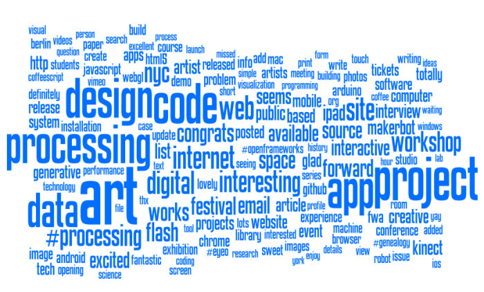
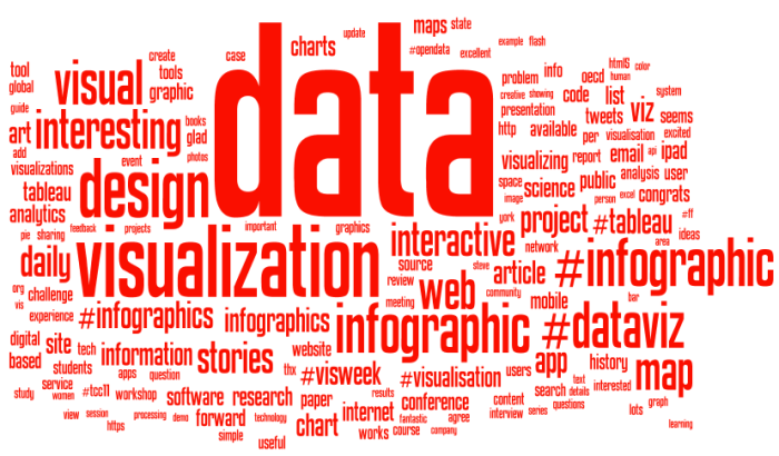
It's clear that the blue group tweets a lot about 'art', 'code', 'design', 'processing', 'project', 'app' and 'workshop'. The red group tweets about 'data', 'visualization', 'design', 'infographic', and 'visual'. There is some overlap for sure but it's clear that they emphasize different things in what they are talking about.
Right from the very start I was calling the whole set of accounts the 'Data Visualization Field'. Of course, a more accurate description was that I was looking at the 'Set of Accounts on Twitter Connected Through Tweet Mentions from @moritz_stefaner, @datavis, @infosthetics, @wiederkehr, @FILWD, @janwillemtulp, @visualisingdata, @jcukier, @mccandelish, @flowingdata, @mslima, @blprnt, @pitchinteractiv, @bestiario140, @eagereyes, @feltron, @stamen, and @thewhyaxis'. It doesn't exactly roll off the tongue. From looking at these word clouds it appears that the red group could reasonably be named 'The Data Visualization Field' and the blue group something like 'Computational Artists and Designers'.
If we want to contrast these two groups more directly we can look for words that are used much more frequently in tweets of one group than the other. I've done this for words that met both an overall frequency threshold and an author support threshold - they were used by at least 10% of the group members. The bar charts show the frequency proportion. So, for example, in the large sample of tweets I looked at from both of the two groups if you count the number of times the word 'makerbot' was used then 99% of those instances were in tweets from people in the blue group.
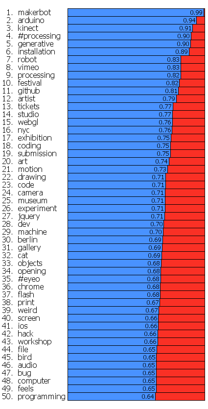
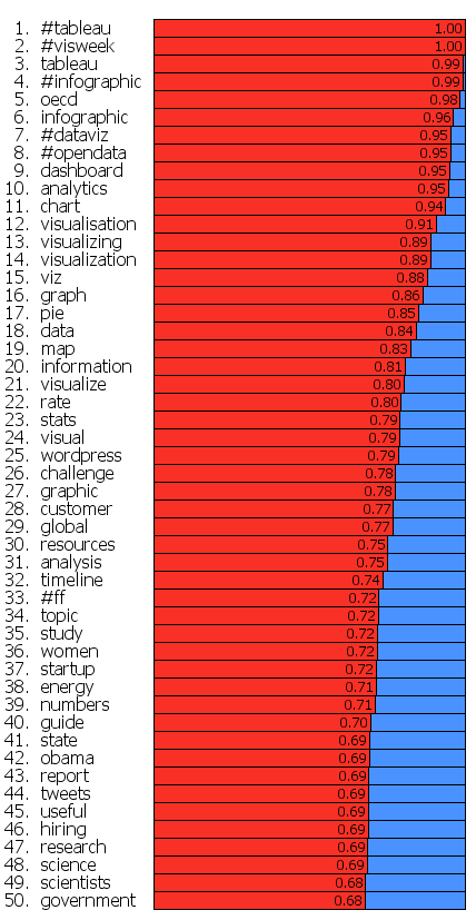
This shows even more clearly the different things that these two groups emphasize.