Super Tuesday Contrast Diagrams
By: Jeff Clark Date: Tue, 25 Mar 2008
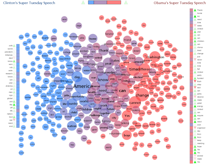
The image below shows the Document Contrast Diagram from the remarks made by both Clinton and Obama after the Super Tuesday primaries on Feb 5th.
Document Contrast Diagram for Clinton/Obama Super Tuesday Remarks (click to see larger version)

My first post on Document Contrast Diagrams will give some guidance on how to interpret the image. Here are a few things I noticed that are illustrated by the diagram. You may have to view the larger version to see some of these details.
- The two segment columns show that Obama's speech was longer - it had roughly 40% more words.
- There was a pretty strong difference in the vocabulary used. There are lots of large word circles that are coloured strongly red or blue.
- There were many common words as well. Some of the most frequently used words that were used about the same number of times by both speakers are: 'Thank', 'mortgage', 'voted', 'states', 'year', 'President', 'war', 'deserve', 'health', 'across', 'challenges', and 'young'.
- Words used frequently and primarily or only by Clinton include: 'America', 'day', 'voice', 'opportunity', 'world', 'life', 'country', 'child', and 'nation'.
- Words used frequently and primarily or only by Clinton include: 'Washington', 'time', 'different', 'can' , 'change', 'cannot', 'Yes', and 'boys'.
- The emotional tone varied more in Obama's speech than in Clintons.
- The segment with the most negative tone in Obama's speech occurred around the middle and was related to 'Bush'.
- The segment with the most negative tone in Clinton's speech occurred near the end and was related to 'war'.
- Overall, both speeches had a positive emotional tone.