State of the Union Project
By: Jeff Clark Date: Sun, 18 Feb 2007
In my last post I used the text of this years State of the Union address as an example. Brad Borevitz has created an interesting visualization of the entire corpus of the State of the Union addresses from 1790 to 2007.
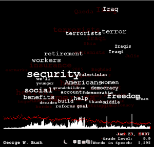
You can see which specific terms are more prominent in a given address relative to the entire corpus. The horizontal position of the words on the graph give the average position within the specific address being viewed. You can compare any two documents or see a great many statistical details about specific terms. It's certainly an intriguing application.