Toronto 311 Visualization
By: Jeff Clark Date: Fri, 06 Sep 2013
The calls people make into the 311 service line in Toronto give an interesting glimpse into the pulse of the city. The City of Toronto makes this data available through their Open Data initiative. I did some analysis and design work with it to produce a visualization for illuminating time-based patterns during 2012.
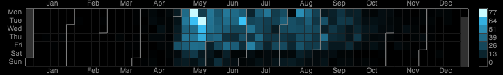
The visualization is a set of small multiple calendar heatmaps, one for each data series. The one shown above is for reports about 'long grass and weeds'. I was inspired to use this visual form by this example: Vehicles involved in fatal crashes by Nathan Yau. I experimented with a few different visual methods but this one did the best job of revealing both the seasonal and day of week patterns. I chose to use a unique colour scale for each series in order to maximize the amount of detail.
The image below shows the top 20 most common types of requests. Click on the image to load the full sized version. You can also view all the data series with an interactive version of the Toronto 311 Visualization.

This was created with Processing JS and contains information licensed under the Open Government Licence - Toronto.