In Defense of Pie Charts
By: Jeff Clark Date: Sun, 14 Jan 2007
My recent post on Boing Boing featured an example Multi-level Pie Chart. Michael Janssen has written an interesting post entitled Learned Bad Ideas that was prompted by his reaction to the graphic. As you can likely guess from the title of his post he didn't like it very much.
Michael starts with some discussion of bar charts and the fact that they are great for comparing the relative size of different quantities. No argument there. He then discusses Pie Charts which includes -
"Pie charts are the bad seed of the graph world. They aren't very useful, hang out a lot, and don't help you much. The worst thing about pie charts is that they aren't even good at the thing they're supposed to be the best at: comparing relative sizes."
He isn't alone here. For many reasons they are often rejected outright by people with education in information design. The words of Edward Tufte carry a lot of weight:
"Tables are preferable to graphics for many small data sets. A table is nearly always better than a dumb pie chart; the only thing worse than a pie chart is several of them, for then the viewer is asked to compare quantities located in spatial disarray both within and between pies - Given their low data-density and failure to order numbers along a visual dimension, pie charts should never be used."
- The Visual Display of Quantitative Information, pg. 178
I have a great respect for Tufte and a lot of sympathy for this perspective. Yes, people have difficulty comparing angular regions, yes, Pie Charts are over-used in the business world, yes, they have very low data-ink ratio, and yes, a simple table showing the data is often much better. However, I disagree that they should never be used. I disagree also with Michael's assertion that Pie Charts are supposed to be best at comparing relative sizes.
I think, rather, that Pie Charts are best at visually illustrating the proportion of a part in relation to the whole.
They are the visual analog of the mathematical concept of percent. Look at the following bar chart:
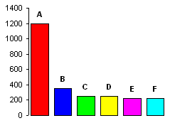
Can you easily tell what fraction of the whole is represented by A (red) ? Sure, with the scale present, and even
without it you can figure out that the red bar is roughly half of the total. But is it immediately obvious ? I don't
think so. Not nearly as obvious as it is in the pie chart for the same data:
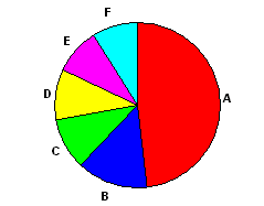
The circle is the natural design element that best represents the whole so it shouldn't be surprising that a pie chart is a good way to illustrate the proportion of a part in relation to that whole. A 4 year old child can tell you that red has the most and is about half of everything by looking at this chart. The same child can tell red is the biggest in the bar chart - even more easily in fact. I'm not disputing that relative quantities can be more easily compared with length than with angles. However, I don't think many 4 year olds would be able to figure out from the bar chart that the red is about half of the total.
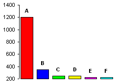
Pie charts are also immune to the distortion caused by a change in scale. With bar charts it's easy to lie
(or to put it differently - emphasize the variability in the data rather than the true proportion) by changing the scale.
This chart uses the same data as the other two but visually exaggerates the difference between red and the other categories.
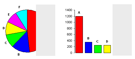
With bar charts you also can't be sure that all the data is visible. What if there are bars chopped off on the right ? You can't
tell. The visual constraint imposed by the circular form of the pie chart insures that you notice if this occurs.
Here is the data in a table with an extra bonus column showing the percentage.
| Category | Units | Percent |
| A | 1200 | 48% |
| B | 350 | 14% |
| C | 250 | 10% |
| D | 250 | 10% |
| E | 225 | 9% |
| F | 225 | 9% |
Nice and clear. All the details are there with no distortion caused by visual trickery. As I said before, I agree with Tufte that this is often much better than a chart. But what about the 4 year old ? For her the pie chart is still more intelligible.
So, for all those charts you design for 4 year olds it might be acceptable to use a pie chart - what about the rest of us ? Well, by suggesting that something is easier for a relatively untrained mind to understand I'm really suggesting that the important information is evident without the use of higher-order symbolic processing or a lot of experience in the domain. For any mind, educated or not, if something can be interpreted at the visual level without requiring logic or memory then it can be understood intuitively, automatically, and very quickly.
What about somebody unfamiliar with the symbols we use to represent numerical quantity ? Or an old guy squinting at a powerpoint slide from the back of the room ? He can't read the numbers in a table but can glean some insight from a simple pie chart. What about somebody monitoring multiple information displays who needs to recognize a pattern denoting an emergency state and act quickly ? If the intent is to clearly and quickly communicate the proportion of a part in relation to the whole then a pie chart might be an effective solution - perhaps even the best solution.
There's another important case. Often real-life data has uncertainty associated with it. Imagine in the data above that all the values have an uncertainty of +-7% (of the whole). Showing the data in a table or even a bar chart encourages viewers to compare the relative sizes and come to conclusions like B is bigger than E. In reality, given the uncertainty in the quantities this conclusion is highly suspect. The only statistically valid conclusion you can make given this level of uncertainty is that A is around 1/2 of the whole and the others are much less. This is exactly the information carried most effectively by the pie chart.
The weakness of pie charts for illustrating the relative proportions between similar-sized slices can be an advantage when you are really trying to communicate something much simpler. It's often better to hide irrelevant information in order to more clearly communicate a key idea.
Another advantage of the pie chart form is that there is an obvious point of symmetry - the central point of the circle.
This makes it possible to effectively use a pie chart as a locator when overlayed on some other graphic form - a map for example.
You can also vary the radii within a set of pie charts to illustrate absolute magnitude differences. The use of a pie chart
as a locator on a map can be combined with varying the radius to illustrate magnitude.
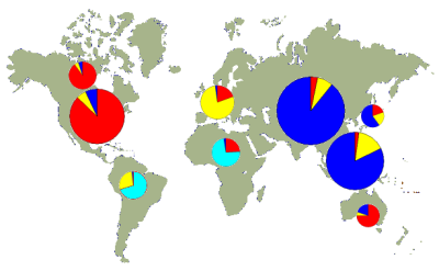
There are, of course, other acceptable ways to present this information. Some are superior in certain respects to this method but I suspect that it would be difficult to design something as good as this at illustrating how the data varies with lattitude, longitude, or clusters around particular geographic regions. Given any reasonably complex set of data there are a great many potential patterns, trends, and structural relations that may be present. There are lots of horrendous ways of representing the data but surely there is no one ideal method. The 'best' visualization is the one that most clearly emphasizes the facet under discussion.
I don't accept the information design dogma that pie charts should never be used. Pie charts have weaknesses but they also have many strengths. Put them back in your bag of tools and pull them out when appropriate.