Cameron/Brown Contrast Diagram
By: Jeff Clark Date: Tue, 13 Oct 2009
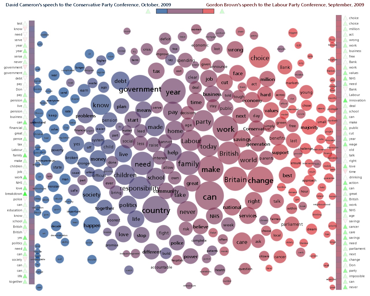
Last week I produced several Document Contrast Diagrams comparing speeches by various political leaders in the UK. The diagrams were used in an article for The Times called How the party leaders' speeches compare. See the article for all three diagrams and a description of how to interpret the diagram. The one for David Cameron and Gordon Brown is shown below.
Thanks to Jonathan Richards and The Times for the opportunity to get some exposure for the technique.